Here's how Microsoft describe the new logo:
The wordmark is a customized version of our corporate font Segoe. We retained the lowercase ‘b’ in tribute to our Bing logo heritage and to provide a slightly less obtrusive stance. The descender on the ‘g’ has been slightly modified to curve upward in a friendlier manner and the cut on the top of the ‘b’ mirrors the angle on the cut of the ‘t’ in our Microsoft logo. The kerning pairs of the ‘i’ and the ‘n’ are exactly the same as the ‘i’ and the ‘n’ in the Windows wordmark. The symbol, a stylized ‘b’, evokes a sense of movement, direction and energy. The color loosely pays tribute to the orange dot from the previous Bing logo while also fully embracing the Microsoft color palette and taking inspiration from one quadrant of the corporate flag logo.
The Microsoft design principles rely, in part, on grid layouts. Often called Swiss or International style, this grid layout system has roots in mapping coordinates and provides a balanced and consistent approach to design. When we place the new Bing logo on a simple grid, it instantly aligns to the layout, offers consistent angles, sightlines and balance and the new mark instantly feels at home alongside all Microsoft products.
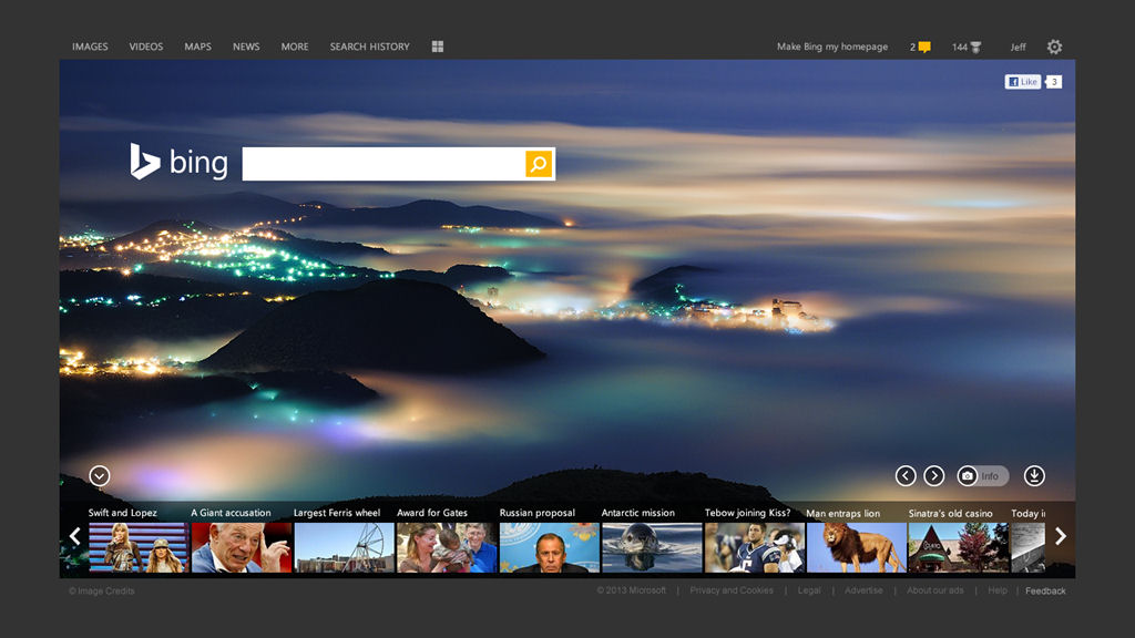
However, the logo is only one element of change to Bing's visual identity. The web version of the search service itself has be rewritten and now has responsive design that automatically adapats across different screen sizes. The new design also gives greater prominence to some existing features of Bing results, such as the Snapshot and Sidebar elements, which aims to provide contextually sensitive information for certain search queries.

The most significant change though is the introduction of the concept of "Page Zero" results, a way of letting users take action to refine a search before seeing the first set of results. This is done by showing a set of key search tasks associated with a query as user types. The intent is to make search faster and more accurate by refining a query before you arrives at the results page.

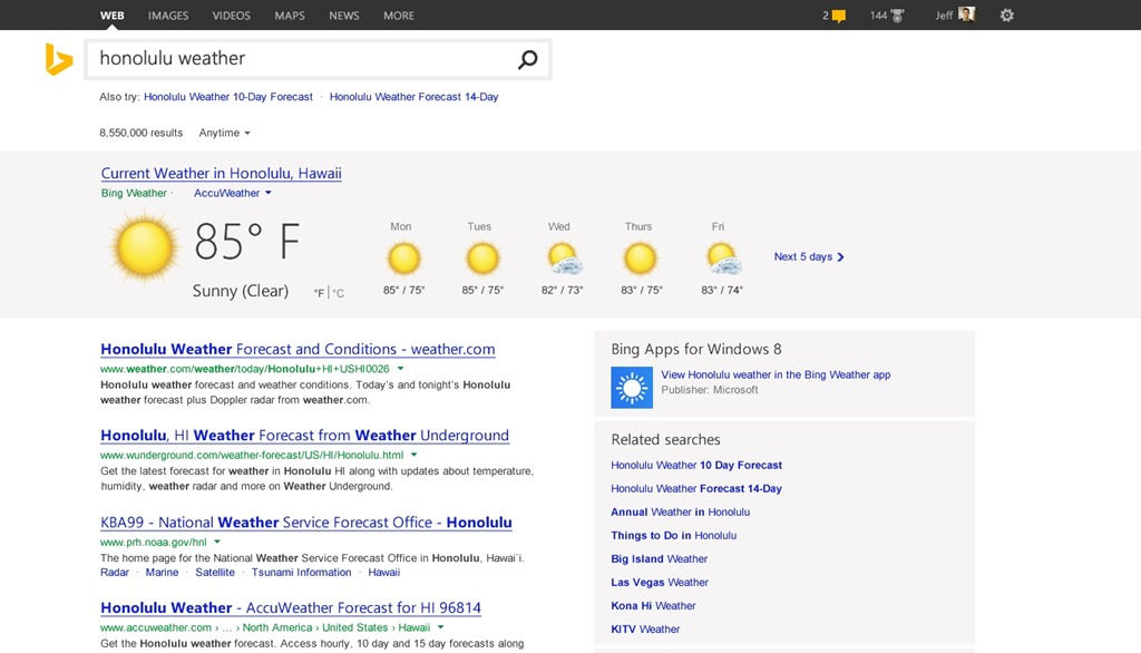
Another new element is Pole Position, which provides richer search results for queries when Bing has a high degreee of confidence that it knows what the intent of the user is (i.e. search results for which the answer is well known or understood). Such Pole Position results will be shown at the top of the results list and given a larger format (screen space). For example, search for "place name weather" will show a weather forecast for that place name. This feature is based on the technology used in Bing's existing Snapshot feature (structured data entities).

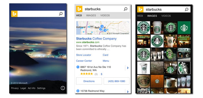
The new visual identity for Bing and many of the new features will be rolled out across all the devices and services that use Bing. Windows Phone users, in select markets, already have access to some of the new features as part of a recent update to Bing search on the phone. The new logo is likely to be rolled out to Windows Phone users in a future update.
The new features will also be available through the mobile web version of Bing. Indeed, this is part of the promise of the new responsive design of the web version of Bing,as Microsoft explain "results should look as beautiful on Surface or iPad as they do on a PC or Phone".

