Annoyingly, Microsoft still hasn't got Cortana working for Microsoft Health under this new version of the OS. Watch this space.
See here for my original Band review and see here in the Store for the corresponding Microsoft Health application.
Here's a walkthrough of the facelifted app:
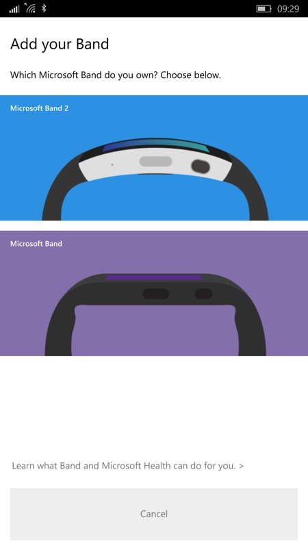
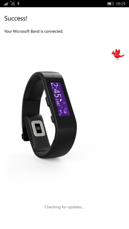
When first starting there's now a choice of each Band type/generation, so that the appropriate options can be shown. It's a slightly clumsy approach, but the images are clear and it's obvious what is happening. (What's with the winged creature, by the way....?)
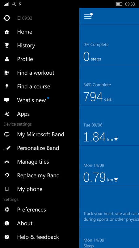
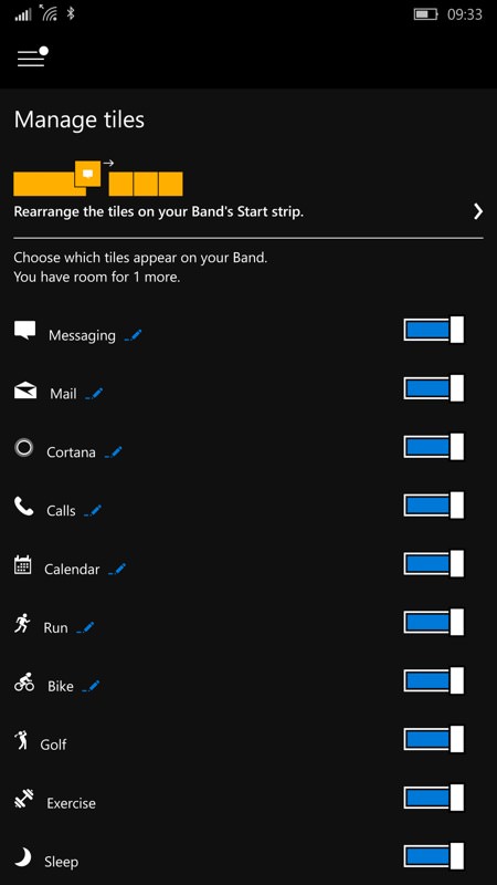
The main UI is now all in one pane, with all menu functions on the hamurger menu - it works well enough, since you're unlikely to use many of these daily; (right) managing tiles - note that you're still limited to 13 - this number needs upping slightly, in my opinion.
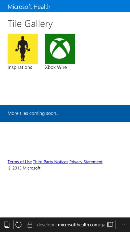
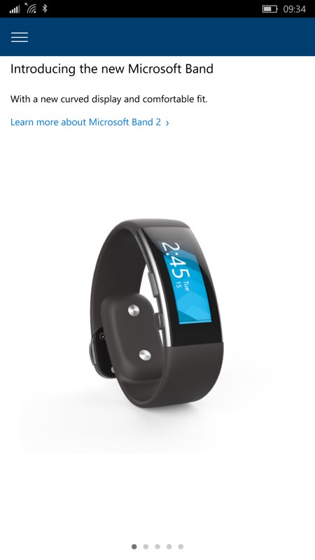
A link through to extra tiles passes the user through to the Store which is... a little bare, but given the stuff they announced for the Band 2, this will be fleshed out before the end of the year; (right) the 'What's new?' function runs through a brief slideshow, with links of the new Band and new functions...
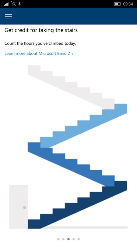
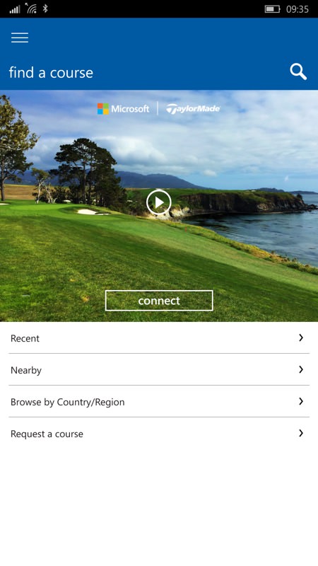
... including stair climbing (presumably using the Band 2's elevation sensor?) and (right) the still somewhat bizarre 'Find a course' and golf integration. Do THAT many Windows Phone/Windows 10 Mobile users play golf? Comments welcome if that's you!
I'm looking forward to both the application and Windows 10 Mobile being properly in step and to the Band 2 itself, arriving next month. Watch this space.
