Here's what's new since June 1st:
- Added swipe gesture to the side menu
- Added swipe gesture to the episode list
- UI improvements
- Bug fixes
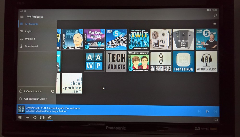
- Added compatibility with Hololens
- Added Portuguese language support
- Added Russian language support
Here's the new version in action:
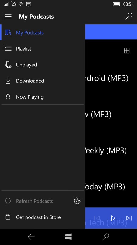
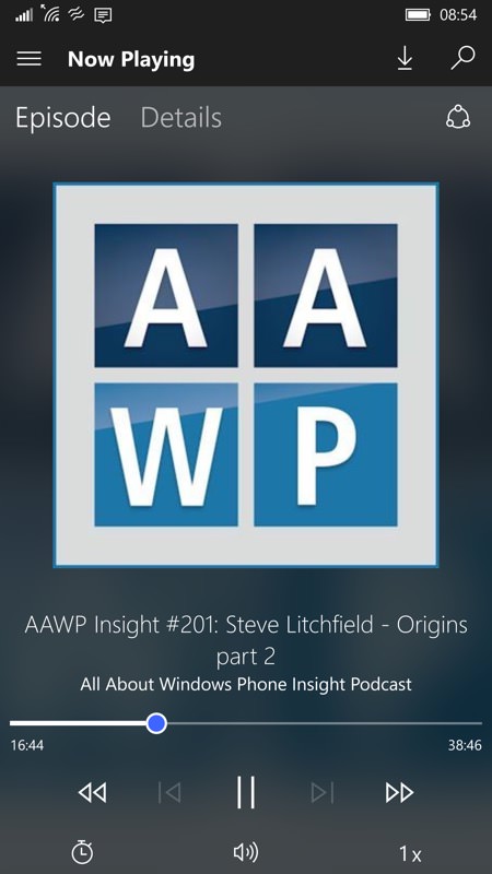
Swiping out from the left brings the hamburger menu - this is how this UI idea works on other platforms (i.e. not just when you tap the hamburger itself!), so it's good to see; (right) Grover Pro's interface is so clean and pretty - AAWP has basic album art, but the layered background works brilliantly on more complicated artwork. Plus clean and functional controls, all styled after Groove Music.
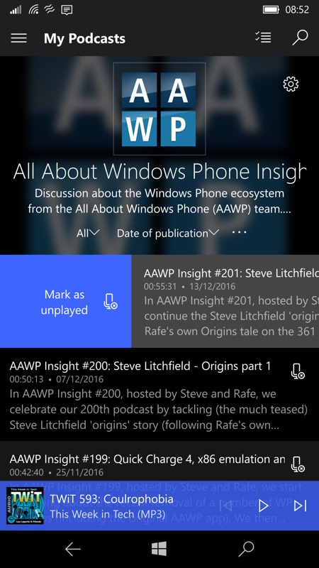
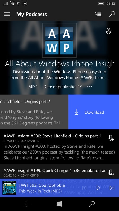
In any list of episodes, there are now swipe left and right options, letting you micro-manage these with a single gesture. Nicely done.
As ever, you can buy Grover Pro here in the Store - it's well worth the couple of pounds. Right now it's the most fully featured UWP podcatcher on Windows 10, though we're still waiting for the likes of BringCast to mature and for OneCast to finish development.
PS. Usual bonus shot of a Continuum hook-up:
