From the earlier article:
One of the key benefits of Google Now for Android is that it offers contextual information about you, where you are and where you've got to get to. OK, there's extra movie, and sport and flight stuff too, but that's all handled in Windows Phone with live tiles for the specific applications. What I wanted to show here though, was setting up a core of your Start screen to show much the same information as Android's famous Google Now system.
Google Now is developing all the time as Google gets it to dig ever deeper into your email and Calendar, but the core ideas/cards are ones that it is easy to get close to on Windows Phone with minimal effort:
- Summary of what's coming up for you in your various calendars
- Weather now and the weather that's coming up tomorrow
- The fastest (driving) route home from your current location
- The fastest (driving) route to your place of work (or wherever)
Google Now on Android covered the above with aplomb, though often confused users by having the widget appear to change size, depending on how much information there was to display at any one time. Apologies if you can already see where I'm going with this, but Windows Phone is also set up nicely to handle the same information, out of the box. Specifically on the Nokia Lumia devices, which is where the cropped demo screenshot below comes from.
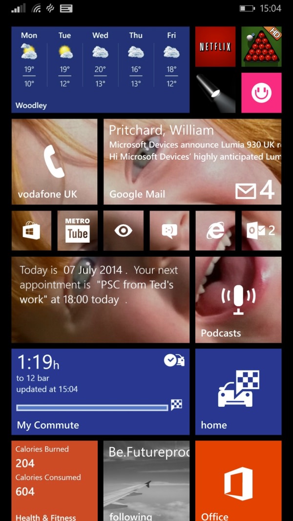
Here's the end product, I'll include some commentary below:

Some notes, from top to bottom:
- The latest version of the (Bing) Weather utility, whose live tile toggles between a 'now' view and the useful five day forecast shown.
- Tiny shortcuts to four commonly used applications of mine, plus the main Phone tile.
- My Gmail inbox, with the largest tile size here showing not only the number of emails since the last time I checked, but also the sender, subject and first line of the latest email to be received. Useful when something urgent comes in, etc.
- More shortcuts to common apps of mine, note that I've grouped the ones which support transparent live tiles here so that they help out the whole block of background image, one of my nieces smiling at me(!)
- Simple Calendar, here experimenting with its chatty 'Brooks' theme. The app isn't perfect, and I keep changing my mind about it, but it's here for now. I think the developer could do a lot more with this particular (paid for) option.
- A large tile to my current podcasting client. Here the default Windows Phone 8.1 app, which I'm playing with and am hoping improves soon. But this could equally well be to any number of other podcasting clients, of course.
- 'My commute', part of HERE Drive+, updated regularly to take into account live traffic conditions.
- A shortcut to my home location in Drive+, i.e. tap this from anywhere and get navigation back to my house.
- Bing Health & Fitness, something else I'm going to experiment with - with a summary of calories burned and consumed. Don't expect too much from me here!
- Large tile shortcuts to Flickr Booth (set here to show feeds I'm following, though other options are available, of course) and Office, which I'm starting to use more and more.
It's a fair cop that what I've ended up with isn't really anything like Google Now. It's something different, with pros and cons to each system. Under Windows Phone 8.1, Microsoft wants to show you things of interest to you all the time, even if they haven't changed since the last time you looked, whereas Google's Android system works much more on a 'here's something new, please look at it and then swipe it away' basis.
Also notable is that Google Now works well to intercept and integrate packages and flights, all gleaned from your Gmail. Package and flight trackers are available, with live tiles, for Windows Phone though, so could be added here if needed.
Comments welcome on how you get on with Windows Phone 8.1's Start screen. What tricks have I missed? Any other live tiles of interest to our readership?
