When is a flagship not a flagship? The 'affordable flagship' that is the Lumia 830 might have the branding of a flagship, but that feels more like the sales and marketing team looking for a hook. Steve's taken a look at this issue, but it's worth highlighting the issue because it does muddy the message that is being put out around the Lumia 830. The handset is many things, it has many powerful features, but there is a notable chasm between this handset and a theoretical 'all-up' Lumia device running Windows Phone 8.1 and the Lumia Denim additions.
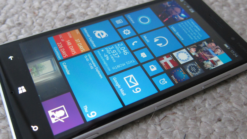
Out of the box, the Lumia 830 immediately starts to send out mixed signals. Let's begin with the shape of the handset. Taken in relief, the 830 is a square handset. It has corners that, while not brutal, are certainly aggressive in providing a 90 degree turn. The front glass cover is raised very slightly and has domed edges, but it's not flush with the chassis edge.
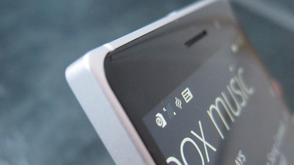
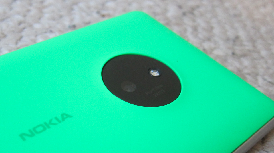
Yet the glass highlights the styling issue. It is slightly curved at the edges, the visible corners are curved far more than the case, and it gives the impression that the squared silver chassis is actually a third-party metal bumper. Turn the handset over, and the back of the handset - a removable coloured cover, here in a rather bright Kermit green, is all soft curves, chamfered edges, and a rising plateau for the camera.
The 830 is not easy on the eye. People are committing to this handset for two years on a typical contract, or spending a notable amount of money. People buy things that look nice. The 830 does not fall into the nice category. 'Quirky' might work for US sitcom castings, but it doesn't work in your local Carphone Warehouse (other third-party retailers are available).
Compare this to the impact of the Lumia 735's Fabula design language. Which looks the better handset, and which is the affordable flagship?
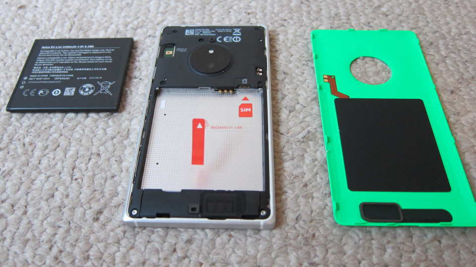
Like the Lumia 735, the Lumia 830 has a user-replaceable battery, microSD card support, and uses a nanoSIM card to register on a network. While the nanoSIM standard is the one to go for nowadays, most users upgrading to this handset will need to find a SIM cutter to get their current miniSIM or micoSIM card into the slot. A Qi wireless charging coil set is also integrated into the removable back cover (you will need to supply your own charging plate), and of course these covers are available in a number of colours to mix and match with your mood and outfits.
Microsoft's focus with the Lumia 830 is to pitch it as an 'affordable flagship' handset. I take that to mean that it has a huge number of benefits and an excess of power compared to the other handsets in the Lumia range. The big push is on the rear camera. With a sensor size of ten megapixels it is 'outsized' by many competing handsets at the high-end of the mid-range devices. Pixels aren't everything (as Steve will tell you shortly), and the 830 comes with the PureView branding. What PureView actually delivers has changed on a handset by handset basis - in the case of the Lumia 830 the handset comes with the optical image stabilised lens, but does not feature the over-sampling or post-capture reframing.
Not that it means much, but to my eye the pictures coming out of the camera are sharp, with good colour reproduction and not too much processing. Steve will no doubt go into more detail on the imaging with an in-depth review of the 830 next week.
And so we come to the rest of the hardware. Once more I come back to the phrase 'affordable flagship' and wonder how this ties in with a late 2014 handset that is using the Snapdragon 400 series chipset running at 1.2 GHz. There's nothing wrong with that hardware choice as such - coupled with Windows Phone's lean requirements, the Lumia 830 certainly feels snappy and responsive in a way that a 'flagship' should.
Anyone with a passing interest in specs though (and that means people who like the term 'flagship') are going to peg the Lumia 830 as a mid-range device, running older hardware. The chipset matches the budget-busting Moto G Second Generation announced last month (which itself is using the same chipset as the original Moto G from 2013).
The same goes for the screen. Yes it's historically one of highest pixel counts on Windows Phone (720x1280) but the pixel density is under 300 dpi, and with resolutions creeping up all round, the 830 looks under-provisioned once more.
When you get the 830 into your hand, all these numbers fall away as you realise the experience counts (the chipset really does have enough spare capacity, you don't need the extra camera megapixels, the screen and the ClearBlack display mean dpi is not an issue). The question is, can the marketing of the handset get this over to the consumer? A direct comparison in store, or simply checking numbers online because the retail assistant is trying to push a handset with a higher bonus for themselves, will leave the Lumia 830 on the shelf. That would be a shame, but the honest view is that this has been an issue for Windows Phone since it was launched, and the message about more 'power' at a lower spec has yet to break out into the public consciousness.
Existing Windows Phone users will feel at home with the Lumia 830, although as noted in my look at the Lumia 735, the additions to Windows Phone 8.1 have diminished the unique features of the Windows Phone Design Language into something a little more like the Android and iOS methodology of doing business - notification areas, text that wraps around, various font sizes so everything can be read. I'm a bit more used to it now, and part of me prefers the much more information-dense approach the UI is taking with 8.1 and Denim.
This does mean that the Lumia 830 is going to be more accessible, with a shallower learning curve, for anyone coming to the platform from iOS and especially from Android. I still can't decide if providing something that is familiar is a good thing (more accessibility) or a bad thing (because why change to something very similar?) Time will tell. I hope and suspect it will be the former.
There's a nice heft to the Lumia 830. It's not a svelte machine and at 150g it's going to be noticeable in your pocket, although it's not overly heavy. 8.5mm is seen as a thick machine by 2014 standards, but I've never bought into the 'go thin' argument for smartphones (or supermodels, come to think of it) so I'm happy with this part of the design. While I miss the smooth curves of the Lumia 735, the 830 does sit well in the hand, with just enough curve on the blunt edges to be noticeable but not cause any pain. It's also far easier to grip the metal chassis and I doubt the 830 is going to slip out of my hand in the near future.
The size of the screen does mean that reaching the top right corner with my thumb is not an easy task, but the Windows Phone UI tends to put the more popular features and controls on the bottom of the screen, and thus within easier reach. The smaller live tiles are harder to read, and while the three-column layout gives you more density of information, for me it is packing in a little bit too much for my older eyes.
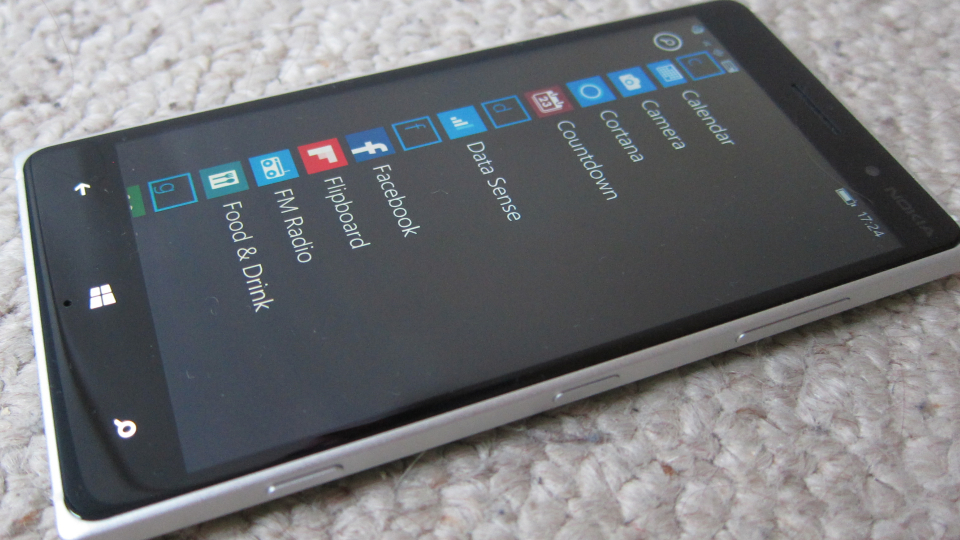
It's hard to go wrong with a Windows Phone handset when you give it a decent set of specs and respectable build quality. As long as you hit the basics, you'll have a strong and competent handset. And that's what the 830 is... strong and competent. On first impressions, it doesn't deliver any more than that. The styling is muddled, the specifications are out of sync with the marketing, and it lacks overall focus. Given this is a handset that was being worked on during the transition to Microsoft, that's perhaps understandable, but it shouldn't be an excuse.
Steve's going to take a review of the handset after the weekend, and I'm interested to see what he thinks. I'm also interested to see how the 830 feels after a month or so of use. My immediate impression is that it works, it works well, but it lacks a touch of refinement that I have come to expect from Nokia (or at least Nokia-branded handsets).
Editor (Steve)'s note: at the 830's launch, one of the main USPs was the integration of the camera with new ultra-fast Lumia Camera software and innovations such as 'Dynamic flash' - I'll investigate this next week too, hopefully, here on AAWP.
