Even today in 2015, anyone picking up a Google Nexus 6, also with 6" screen, quickly dismisses it for day to day use because "it's just too big". So, in the evolution of smartphone form factors, it turns out that there is a limit after all. It's just that Nokia took a stab in the dark at the new trend - and missed the mark by around half an inch.
Even Samsung, originators of the 'phablet' concept, have only gone to 5.7" for their Galaxy Notes, and most new flagship phones are now in the 5.2"-5.5" range. And there's a reason for this - as you go above 5" (plus associated bezels, speakers and controls), phones - obviously - become harder to hold and harder to use.
Now, don't dismiss me as an unadventurous phone 'wimp', I've lived with 4" and 5"-screened phones long term, have tried all operating systems, in fact my longest period of useage, outside of my beloved Nokia 808 and 1020, was the 5.5"-screened Galaxy Note II. Although I couldn't wrap my hand right round this (my classic test of security of grip), I was able to pocket this and use this easily.
But, as with that current Nexus 6, every time I try and use the Lumia 1520 (or indeed the 1320, announced at the same time) I last about a day before concluding that the absolute size gets in the way too much and that I'd rather downsize again slightly. (I know, I know, first world problems, but I'm using to having a lot of phones around and being able to choose!)
Here's how the Lumia 1520 was launched, back in 2013:
Continuing to redefine smartphone innovation, Nokia introduces its first ever large screen Lumia smartphones, the Lumia 1520 and Lumia 1320. With a six inch screen and the latest software advancements for Windows Phone, the Lumia 1320 and Lumia 1520 are perfectly suited for entertainment and productivity. A new third column of tiles on the home screen means people can see and do more on a larger screen. Bringing larger displays to the award-winning Lumia design, the new format is coupled with some of the most advanced camera innovations so people can capture and share the world around them.
The Lumia 1520 offers the latest imaging innovation from Nokia - a 20MP PureView camera with optical image stabilization (OIS) enabling sharp images even in the dark as well as oversampling and zooming technology similar to the Lumia 1020. In addition to the new Nokia Camera and Nokia Storyteller applications, the Lumia 1520 offers a 6-inch screen and a vivid 1080p full HD display for outstanding outdoor readability. People can bring their videos to life with Nokia Rich Recording, an unparalleled audio capture using four built-in microphones. With Microsoft Office built in, documents can be edited and shared easily for maximum productivity.
So 'redefining smartphone innovation' then. And it's all true, the 1520 was a stab in the dark, size-wise, recognising what everyone now knows was indeed a growing trend, that of using our phones for entertainment, gaming and work.
I suspect that a bunch of managers and designers sat in a meeting around the beginning of 2012 and, in the context of a world of Lumias that maxed out at 4.5" screens, wondered how high to go. Resolution was a no-brainer, Snapdragon 800 chips supporting 1080p were then becoming available. The CBD tech was there for the display, the PureView camera has been successfully scaled down to 20MP, all that was left was to decide on how large this next-gen phablet should be.
And, in truth, a 6" screen was a reasonable guess in terms of leap-frogging the likes of the Galaxy Note range, i.e. guessing where the 'bar' would be by the end of 2013. Where Nokia fell down, as often happened at the company, was in testing the concept in real life - several handsets over the last decade were triumphs of technology over practicality (think Nokia N93, N97, N86, E7, for example). In the 1520's case, Nokia was this close to a masterstroke.
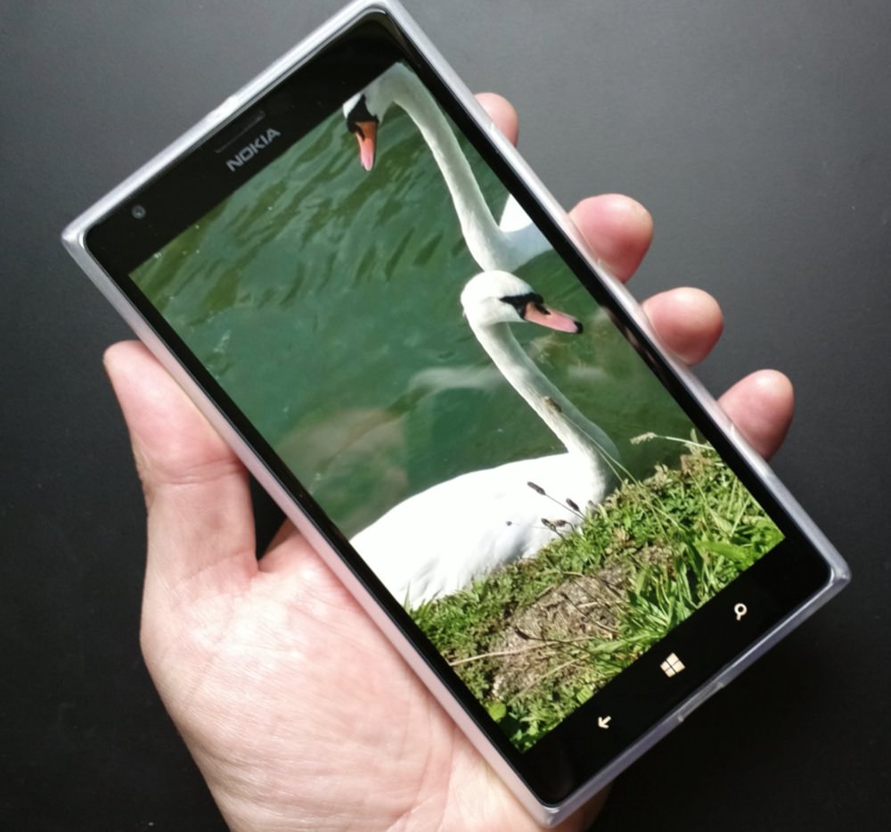
An extra 0.3" doesn't sound like much, but combined with the polycarbonate unibody, the extra screen size made for a phone that was hard to carry securely, meaning that (as in the promo above) a case was essential. Which then adds further to the bulk (ref my round-up of 1520 case options here).

Lumia 1520 in a minimalist TPU case
So a 'reasonable guess' turned out to be a step too far. As Nokia would have found if they'd approached the device along the lines of Jeff Hawkins and the original PalmPilot - he famously carried around various blocks of balsa wood until he'd found the perfect size, weight and shape, and then designed the internals to fit.
The problem is that the 1520 demos wonderfully, everyone's impressed by the screen size and clarity. But it's OK for them, they don't have to carry it around all day!
_____________
PS. The same applies to the 1320, which was picked up by enterprise, by businesses, who immediately gave feeback along the lines of 'we love the idea and value proposition, but it's slightly too large', which is how the recently announced Lumia 640 XL was born, with 5.7" display. So we got there in the end, even if it took a massively stormy couple of years for Nokia, its designers, and engineers - many of whom are now unemployed, of course.
