Having surveyed a number of likely candidates, I'll summarise some of the main objections to Windows Phone that were raised.
"Support for services. I don't really use any Microsoft services, while Google services work reasonably, but not 100%."
Actually even the latter is being kind, since the lack of a native Google Drive, Google+ or YouTube client are, with the best will in the world, rather large holes in Windows Phone's Google support. However, it's also fair to say that for someone completely ensconced in the Google ecosystem, Android is a much better fit - even iOS plays very nicely with all of Google these days.
Having said that, Microsoft's SkyDrive is arguably better integrated into mobile than Google Drive, Google+ is easy to access via the mobile web interface and there are good third party YouTube clients, so a Windows Phone user isn't too hampered in terms of overall functionality.
"The application list is a waste of screen real estate."
The apps list is sparse, it has to be admitted, and I agree that swiping twenty or so times to get to an application starting with the letter 'Z' would be very frustrating. However, the key to the app list is the way index letters are hyperlinked - tap any and you get an alphabetic grid, just tap on the letter you want and there (usually) is your application. In real world use, it's no slower than using an iPhone or Symbian or Android-style swipeable grid of icons.
I do agree that Microsoft should make this alphabetic hyperlink system more obvious though. Part of the issue is that this grid jumping system only appears once you have more than about 40 items in your application list. Perhaps there could be a one-time pop-up hint once your application list has grown enough for the hyperlink system to be activated?
"App selection is poor, still missing official apps for many major and popular services. This is improving, but it has been about 3 years now."
Again, fair comment, though which services you need will vary hugely from user to user. For me (Steve) the lack of a Google+ client is the only item missing from what I expect a smartphone to provide, though I know that items like Instagram (coming soon) and some niche banking applications are critical to others.
The iPhone and its 'app' world has accustomed users to having an app for everything, even if it's only a shell over a mobile web site. I'd argue that it's just as efficient to just use the underlying HTML5 web site in a decent browser. But, as with most of these issues, whether there's an 'app gap' at all will depend on the user's individual needs. Certainly 95% of bases are covered as of today, at the end of 2013.
"I hate the way section and app titles are too big to fit on screen and scroll on to the next."
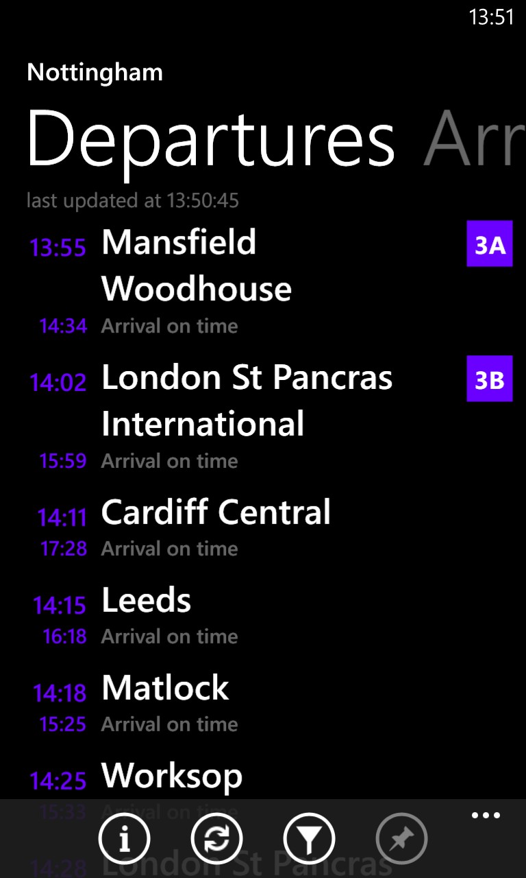
I can see how this might not be to personal taste and, initially, looks messy. The idea of part of the 'next' pane peeking out to the left or right (see below-left) is an obvious usability thing, so that new users know that's there's more content available with a quick swipe, which makes sense when you think about it. Certainly I've been in Android or Blackberry OS 10 applications and mystified about where a particular function is, only to discover that it was off the screen and needed a swipe from the right direction, or was buried in a menu. At least Windows Phone gives a visual clue as to what's going on.
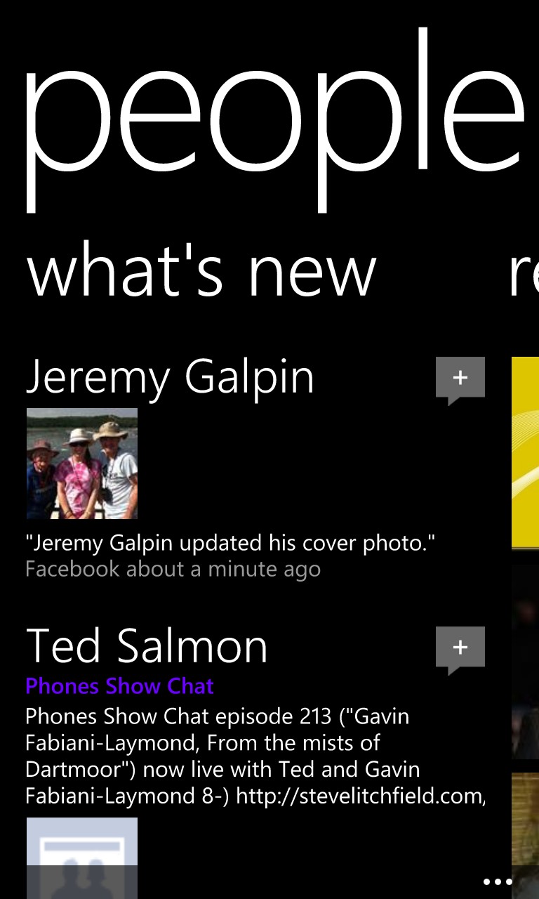
The large fonts used are a stylistic thing, though I agree the device is overused - the gigantic 'people' legend shown below-right is a good example of where the style is taken far too far - what a waste of space.
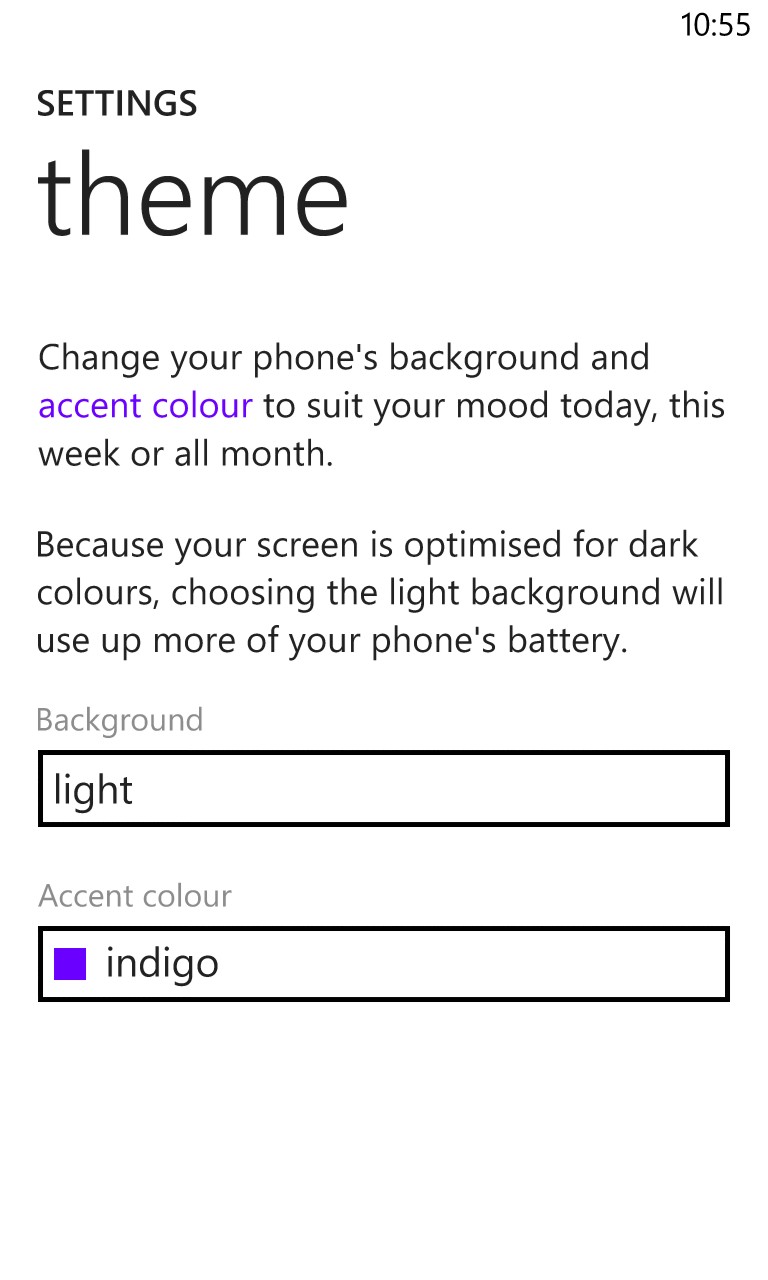
"Everything's too dark themed, I prefer white backgrounds."
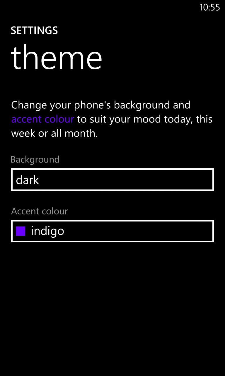
Quite a few Windows Phone devices (e.g. Nokia Lumia 820, 925, 1020) have AMOLED screens and the default to 'Dark' is more power efficient for these - but it's trivial to switch the themes to 'Light' in Settings>Theme>Background if your Windows Phone has an LCD screen (e.g. Nokia Lumia 620, 920, 1520, etc). The difference is shown below:
"Microsoft development of the OS is too slow."
Progress always seems slow to those on the outside, who don't see the effort, the planning, the testing. However, it's fair to say that some resources were probably siphoned away from Windows Phone with Microsoft's commitment to getting Windows 8.1 out of the door. Nokia's programmers have also been busy, of course, hopefully without too much interruption from the planned buyout by Microsoft.
So, a fair criticism, but one that's hard to quantify!
"I hate the long (all relative admittedly) waits for apps to load on WP."
In fact, there are very few remaining top flight applications for Windows Phone which leave you staring at "... resuming..." for a second or so. Microsoft's own Skype is something of a culprit here - which is fairly inexcusable, as it's their own OS. But delays while applications load are now, as a rule, shorter than delays while the user thinks what to do next, or uses his or her fingers to swipe and select the appropriate icon or tile, or even than the transitions that welcome in each new app or screen.
It's also worth noting that picking a 'running' application from the carousel (long press the 'back' key) almost always brings it up on screen faster - though once you've included the time taken to bring up the carousel and then swipe across it's usually faster to have just tapped the application icon or tile in the first place...!
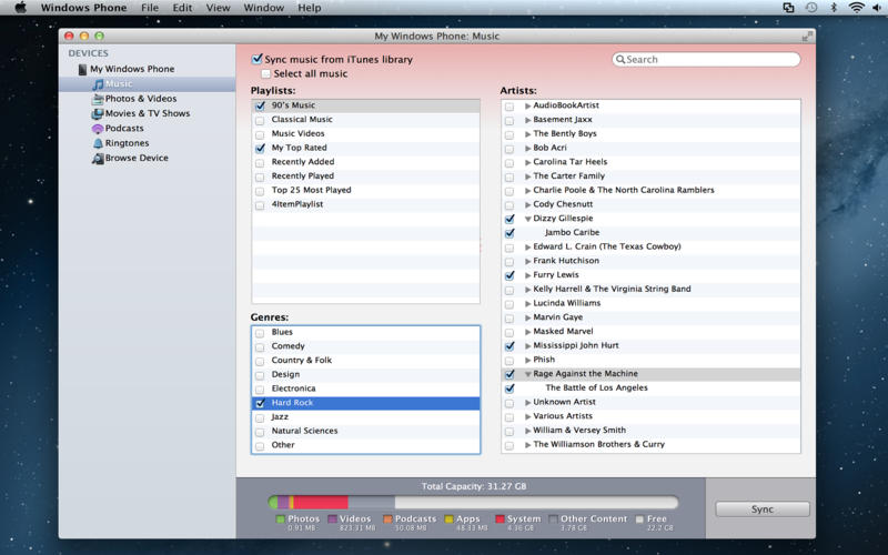
"I use a Mac, putting me off using Windows on the phone."
While the integration of Windows Phone 8 to Windows on the desktop is undoubtedly tighter, the presence of an official Microsoft Windows Phone application for the Mac means that the choice of desktop OS isn't a problem. The Windows Phone app hooks into iTunes, iPhoto and Aperture and manages all media transfers, just as it would under Windows.
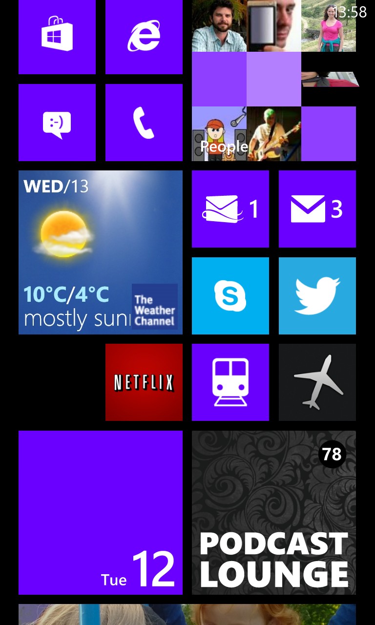
"The live tile numbers don't show unread/undealt-with items, just new items since the last time I used each app."
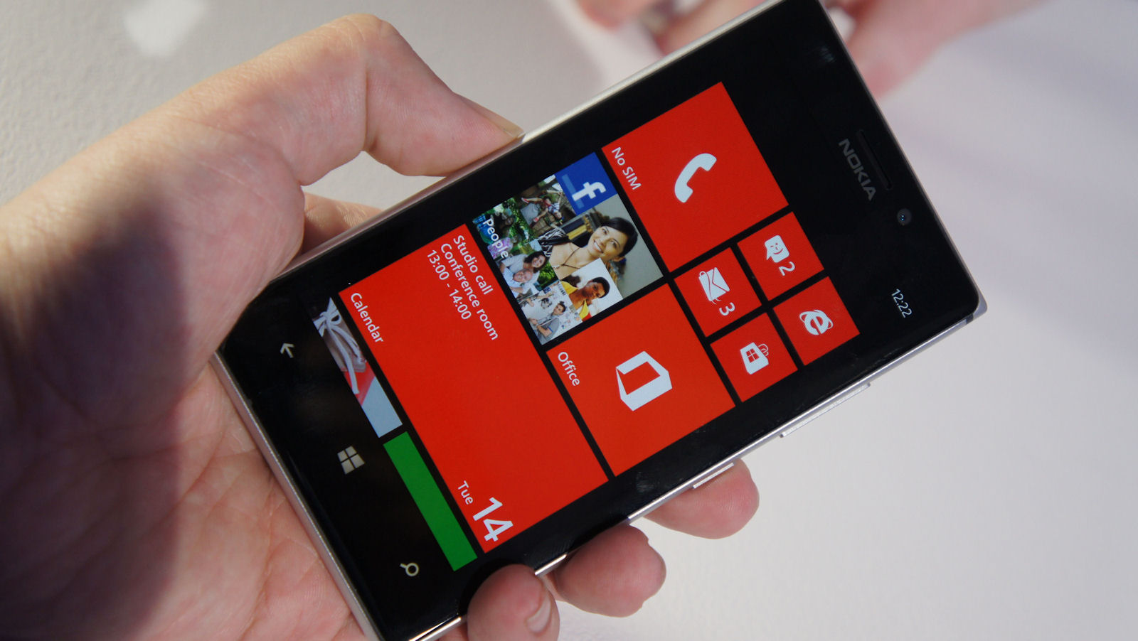
Microsoft's idea is that what most users want is a summary of what's new (as shown shown above), but I agree that having the counts reflect the number of unread/unmanaged items might be preferable for power users. In fact, this has been complained about enough over the years that I can't believe it isn't an option in Settings that might be toggled.
"I don't want to sync my PIM data with a desktop application."
You don't have to - all PIM sync is done via the cloud (outlook.com etc.) - even better, this PIM sync is done to both Microsoft's and Google's servers (the latter via CardDav and CalDav), so you really can keep your Google email and PIM on a Windows Phone 8 device.
"The built-in email client defaults to showing no pictures."
This is an obvious programming decision made to help people manage their cellular bandwidth - only a small proportion of people are on unlimited cell data tariffs. And even those that do have unlimited data will see emails appear faster when in less than stellar coverage areas. OK, so it's one more tap if you want pictures as well - I agree with Microsoft's thinking here.
"The built-in email client and web browser have no intelligent text reflow - resulting in stupid sideways scrolling."
Initial rendering of rich text emails shows up fine, perfectly wrapped, but multi-touch zooming into emails does result in rendered paragraphs ending up off-screen. As with web browsing, this is a limitation of the rendering capabilities of the Internet Explorer engine used - hopefully automatic text reflow can be built into a future version.
In fairness, quite a few browsers in the mobile world also don't have text reflow, plus there's a school of thought which says that reflowing in the first place is wrong from a design standpoint because it breaks how the content provider wanted the page/text to look. It would be nice to have the option, though!
"The front-end UI is totally inflexible compared to Android (widgets, etc.)"
This is an unfair criticism, since Windows Phone 8 is just as customisable in this regard as Android. It's just.... different, and with widgets effectively replaced by live tiles. As ever, it's what you're used to.
Microsoft's philosophy for the Windows Phone Start screen is that you should get an instant overview of what's new and important in one glance and, if set up properly, this is exactly what happens. We'll pencil in some more tutorials, but in the meantime see this one, plus see my own personal Start screen set-up.
"I can't use the notification tones I want to for SMS."
Custom SMS tones are indeed not supported yet, but I'd argue that this is an extremely niche user requirement. Custom ringtones are far more prevalent/requested and these have been supported (by choosing within a contact record) for ages in Windows Phone.
"There's only one universal volume setting."
Yes there is. And I agree it's sometimes a pain. But I've also seen people struggle with Android devices, adjusting the 'wrong' volume control, so there's some benefit in keeping things simple. You can argue either way. As with several ideas on this page, maybe separate controls could be made available as an option for those who know what they're doing?
"There's no Google+ client, no way to auto-upload photos to Google."
Indeed. Partly this is down to Google not wanting to help out a competing OS, and partly this is because there's no proper Google+ API that applications can be hooked into. If you're a Google+ power user then an Android device would definitely be better - at least, right now.
Google+ is actually very usable at a basic level in Windows Phone, via Internet Explorer, though it's obviously not as slick as a dedicated client would be.
"There's no Notifications summary pane."
Again, Microsoft's vision for the Start screen is that users shouldn't need a separate notifications view - the live tiles should tell you what you need to know and direct your fingers. I tend to agree - it's a right pain on Android constantly having to clear a dozen notifications, of which I only really care about a couple. Not once in two years of using Windows Phone have I thought "I wish there was a separate view listing all the things which just happened."
In fact, a notifications tile offering just the summary that's being wished above is planned for the next version of Windows Phone, so I guess this proves that Microsoft does listen to its users. And, being a live tile, you can just remove it if you don't want the functionality. Keeping everyone happy!
_______
Thanks to the geeks named above whose brains I picked for the objections listed above!
What do you think as a reader? Are any/many of the above objections showstoppers for you personally?

