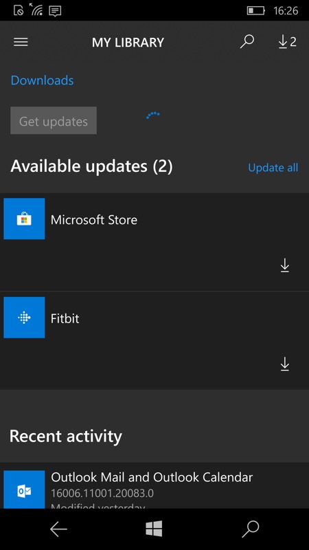
The screens here are from my Lumia 950 and exact UI characteristics will vary according to other phones, screen sizes and resolutions, but I'm pretty sure the Store is a mess for them all now.
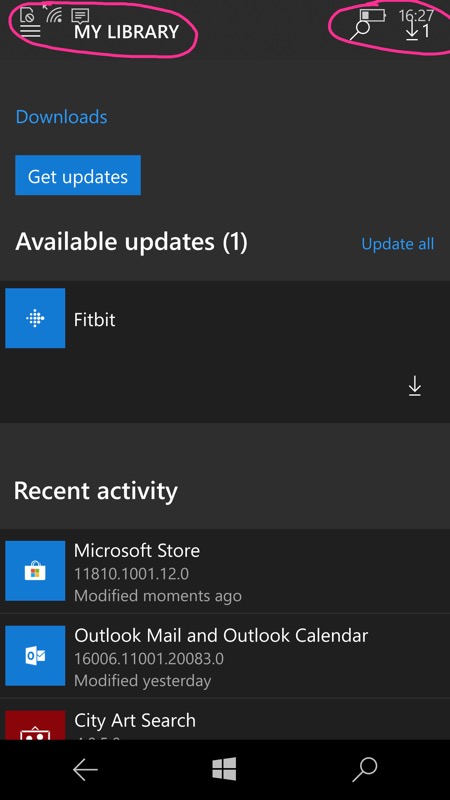
On the left, the (already broken a bit) Store before yesterday's update. On the right, the hamburger menu and search/download controls are now shifted up into the status bar, meaning that only half their area can be tapped, which is a usability disaster. It's clear that precisely no one at Microsoft bothered to even check the new Store version on a single Windows 10 Mobile device. Sigh.
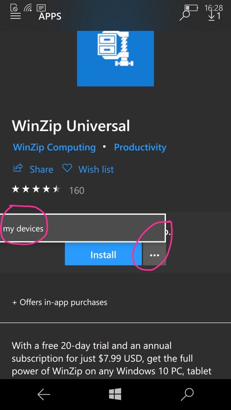
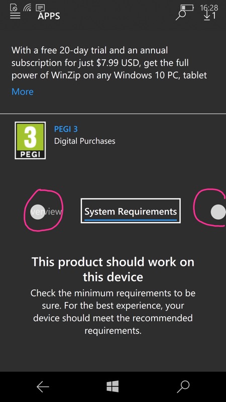
Two more examples of it all going pear-shaped for the Store UWP client under Windows 10 Mobile. On the left, note that the pop-up is missing two complete words, 'Install on'. On the right, the entry for every application or game is now broken up into four tabs: Overview, System Requirements, Reviews, Related. Which is fair enough, but you can't see more than one and a half of these tab titles at once and you can't swipe over - you have to hit the little arrows in the circles. Which you can't see anymore because this update broke the cosmetics such that it's white on white.
Now, as I say, the 'Windows 10 everywhere' philosophy, UWP applications and loads of common code mean that the Store does still work. (As you'd hope, given that the platform still has up to a year of official support and security updates left.) So, for example, you can still tap the hamburger menu - you just have to be more precise, to hit the lower half of each control. And once you've tapped on the application/entry section you want, the section headers appear near the top of the screen over a scrolling/swipeable main pane, which is actually quite cool.
So, viewed like this, with the Store being a functional necessity to get new applications installed and to update existing ones, I guess there's no showstopping problem. But I did want to highlight to Microsoft and to the world at large that I noticed the increasing number of glitches. I care. And, I suspect, so do you, if you're reading this on AAWP.
Will Microsoft go back over their Store code to make the UI 100% useable again under Windows 10 Mobile (now a year behind the Desktop OS branches and counting)? I doubt it. I do think we're stuck with the current state of affairs - maybe we should be grateful that it all still works?
Still - you'd have thought that with a near-trillion dollar market cap and 131,000 employees across the world, that one person, even an intern or trainee, could have been tasked with trying out new Store client updates on an actual Windows phone? Just one?