One small caveat is that the Fluent Design transparencies that are now part of the UWP app's make-up on Windows 10 Desktop aren't here under Mobile, but then this graphical flair does rather eat up processor power and thus battery, so it's fair enough.
Here's the relevant screenshot proof:

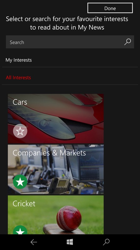
Even though you might already have News set-up, this update does encourage you to go through your 'favourite' news categories and perhaps pick some more. Of note is that the previous hierarchical system is now presented in a flatter form, with popular news categories presented as-is.
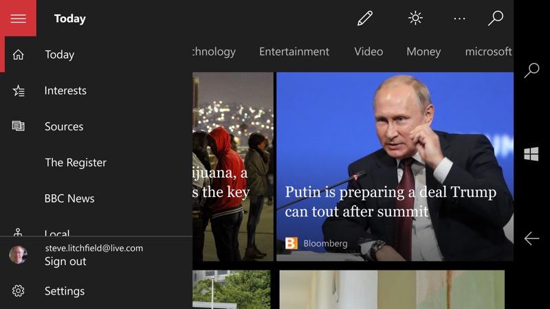
Now, pay attention, as what's shown here is the 'old' News application in landscape mode. Aside from the red accent, notice mainly that the hamburger menu overlays the main content. Now look at the two screenshots below:
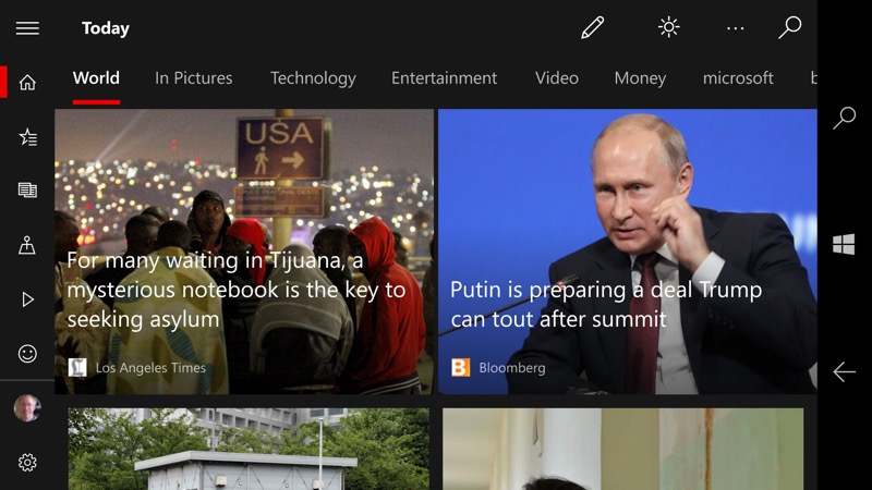
First of all, there's the dropping of the garish red hamburger menu control. Secondly and most importantly, when you tap this control, you get:
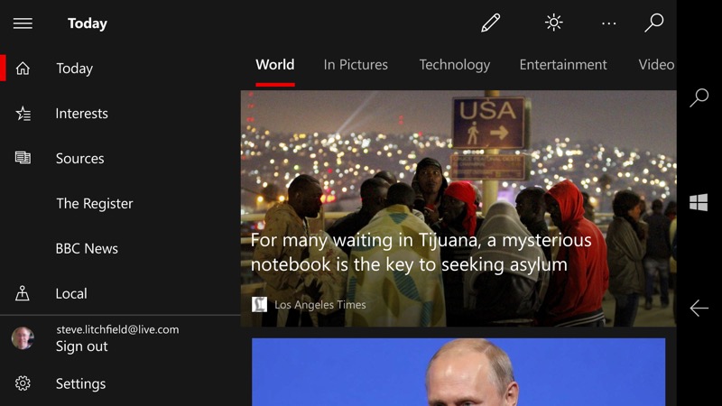
...with the menu sliding into place as content, i.e. you can browse around with this all toggled on. And the main content is then restricted to the space outside the hamburger menu. I doubt this is for usability, it's more likely that this is for clearer use on other Windows 10 tablets and hybrids.
News should already be on your Windows 10 phone, so just look in the Store for updates.