Here's my attempt at a changelog (I'll update this if I find anything official):
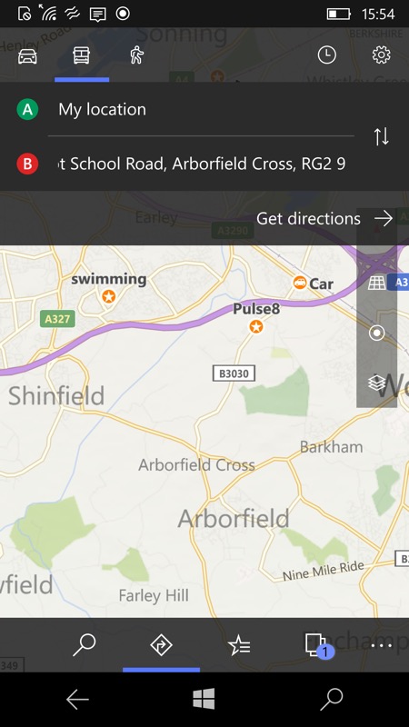
- Fluent Design and transparency throughout (with some examples shown below)
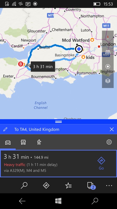
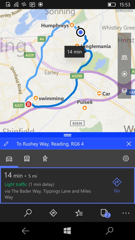
- Traffic analysis is now colour coded
- Traffic delays are now shown, separate to expected journey times
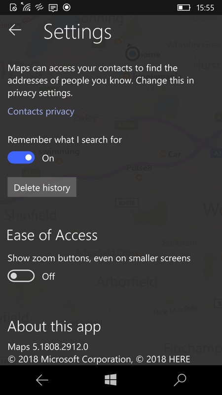
- The option for a 'live tile' is gone in Settings, presumably because there's no need for it anymore - live tile map information never really took off under Windows 10
- There's an extra back arrow control at the top left of the Settings pane, to return to the main map screens
Here's the new version of Windows 10 Maps in action:


Note the colour coded traffic assessments (red - yellow (not shown) - green, etc.) and the numerical readout of the 'delay', here on a typical long and short journey. Note also the transparency of the floating control panel.


Note the Fluent Design added to the drop down panes too - you can see the map underneath the route planning fields on the left and even underneath the Settings pane on the right, above. Also notice the absence of a 'Live tile' toggle for the first time.
You can update yourself in the Store in the usual way...
