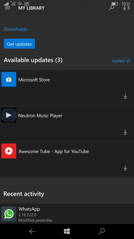
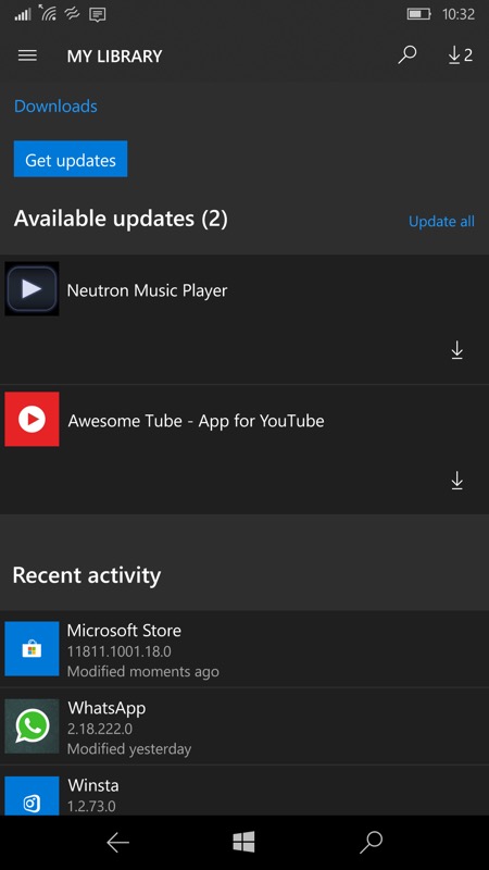
Here we go then, below left is the broken Store layout (see the top of the display) before today, then there's the Store update waiting and, when applied, on the right is the fixed layout:


It's a simple fix, ostensibly, but given that the touch targets for the hamburger menu, search and downloads were all overlapping the top system bar, it's great to have no overlap again!


In fact, everything's now tidied up across the board. Not perfect - at least on smaller screens - but certainly very usable.
Now, I'm not so delusional as to think that Microsoft remembered the pigs ear they'd made of the Store update for Windows 10 Mobile and went back to assign programmers to fix things. What's happened here is that, in the process of tidying up the Store UWP client for tablets, laptops and new hybrids coming along with different screen resolutions, they've inadvertently also fixed things for 'ye olde' Windows 10 Mobile.
But hey, we'll take what we can get at this stage, eh?
