Review: The Guardian
Score:
74 %
Information on the go. That's what a mobile phone is good for, be it a voice call, a text, or the news headlines. The Guardian newspaper in the UK has a strong track record of innovation online, and its Windows Phone application promises its editorial content and news in a Metro UI styled interface. It delivers on that promise, and with a little bit more. But is it enough to beat its mobile website?
Version Reviewed: 1.0.0.0
Buy Link | Download / Information Link

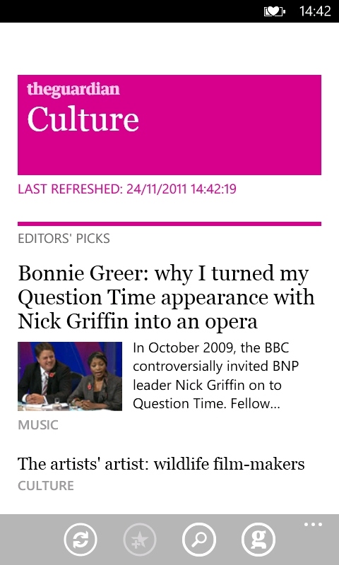
Presenting you with an alternative "big G" on your start screen, this in-house -developed application presents you with a panoramic interface that starts with a front page of top stories at The Guardian, before a quick swipe will take you to the different sections of the paper, and your own favourite sections for a tailored view, and the current most viewed items across The Guardian site so that you can see what's going on of importance in the world... and the current Formula 1 news.
This isn't cut down content either, from what I can see it carries all the content, as well as a significant amount of The Guardian's archive when you search for a story.
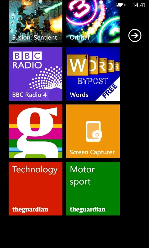
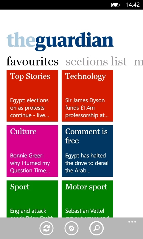
Personalisation and organisation in and out of the application.
The Guardian also produces a lot of multimedia and audio content, much of which is included in this application. Video content plays on the screen, while audio podcasts (including the popular Tech Weekly podcast) can be played in the background both while you look round the rest of the application, but also as background audio while you use the rest of your phone - The Guardian app integrates into the music+video system of Windows Phone, showing as an application and using the onscreen volume and playback buttons. Assuming you maintain connectivity, this is a nice alternative to downloading the podcast.
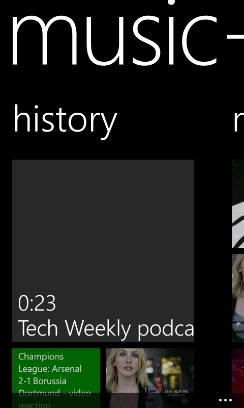
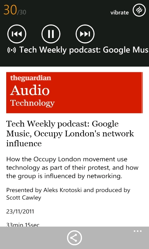
Integration with music+video
The app takes advantage of a lot of the unique UI options that Windows Phone presents the developer. With various sections to the newspaper, each of them can be pinned as a favourite inside the application, but also to your start menu as a tile. The favourites section also echoes the tiled look on top of the standard Metro panorama look. It stays true to the handset, and feels correct, while helping The Guardian app stand out from other media reading applications.
You have other options here for displaying stories, both to tweak the font size on individual articles and reorganising your favourite sections view. Disappointingly, the sharing option is only to fire out a link via email, rather than a more comprehensive system that could include social networks (such as the option in the web browser). It seems an obvious area where an on-device application should have a strength, and be more functional than a web page, not less.
The Guardian application gets the news to you, and the ability to bookmark a section is a nice touch, helping you get to the areas that are important to you quickly and easily. Balancing that though, it sometimes feels a touch slow, as if the application is struggling to get the data and lay everything out on the screen. Even on the 1.4GHz Nokia Lumia 800 there are too many moments where the screen is white, and the loading pixels are moving across the display.
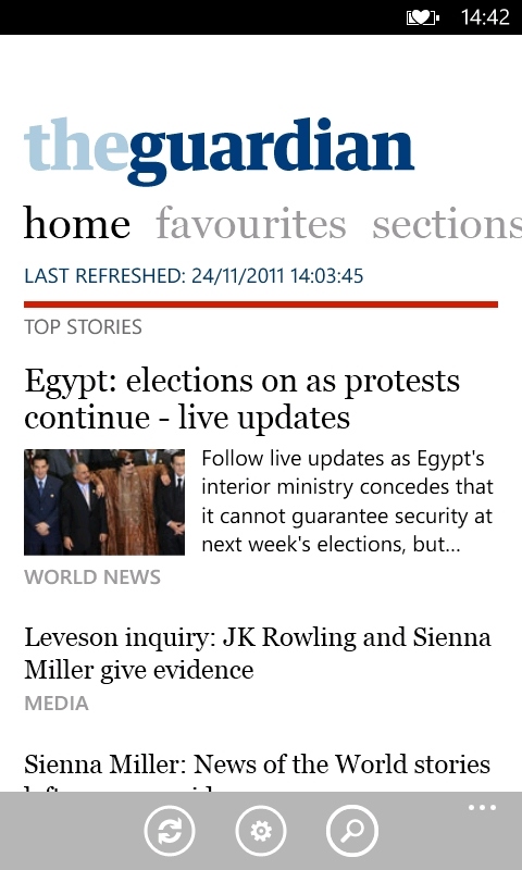
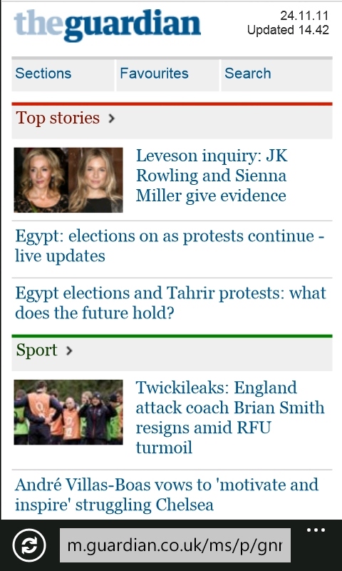
Application on the left, mobile browser version on the right. Which do you prefer?
But ultimately the biggest flaw in The Guardian on Windows Phone is this... the mobile version of their website, running in Internet Explorer (or pinned as a tile on the start screen) is faster, looks nicer to my eye, is more flexible, and feels better (background podcast playing aside). Some of you may prefer a standalone app, but for me The Guardian's app is the biggest advert for well designed HTML5 mobile sites yet. For others, it's the app all the way. It really will come down to personal preference to decide which free route you'll take to read the content.
Reviewed by Ewan Spence at
