Review: Blocked In
Score:
83%
Sometimes all you need to do to keep people coming back to your Windows Phone game is to implement all the basics really well, add in a touch of consistent design, and let the original concept of the game shine through. That's what Sour Green Plums has done with its puzzle game Blocked In.
Version Reviewed: 2.9.0.0
Buy Link | Download / Information Link
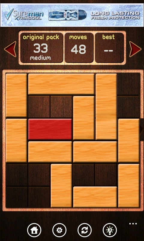
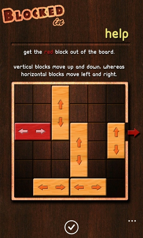
It's a game design you've likely seen many times before, on many different platforms (initially called Rush Hour and designed by Nob Yoshigahara, it started as a board game and progressed from there). It is built around a 6x6 grid where you have one 'target' 2x1 block that you need to push through the exit gap on the right hand side. In your way are various other blocks that can be slid along their shortest edge. The catch (and what gives the game its puzzling strength) is that the grid is almost completely filled up with interconnected blocks. To move your block to the goal means moving a lot of pieces out the way, which can't be moved until others are moved, and so on...
It's gloriously frustrating.
I love this concept, and I tend to download most versions of the game when I see them in an app store - assuming they pass the "does it look like some love, care, and attention has been invested in coding?" test. Given I'm reviewing Blocked In, and we're not known for being vicious to applications here on AAWP (if we find something that needs work, more often than not we'll drop a quick email to the developers rather than score it as minus twenty seven on the site), this version of the game must be doing something right.
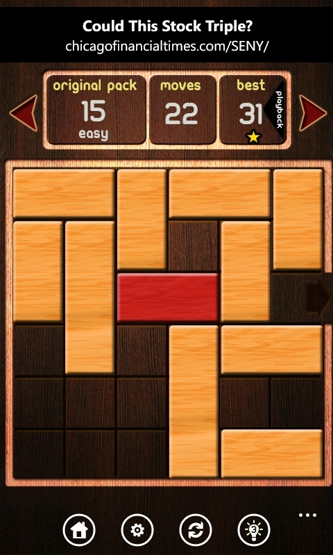
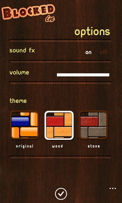
The screenshots are the first indicator. The blocks look solid, as if they have some heft, and aren't simple and functional blocks of colour. The 'original' theme does look a little bit gumball, but interestingly it's not the default choice. That belongs to the wood effect tiles which lend a nice warmth to the proceedings. The stone theme looks hard and brutish, and will appeal to some but not me.
The rest of the interface is clear to use and understand. The blocks are incredibly responsive to a finger swipe, have a nice sound effect when they move, and everything reacts like I feel it should. There are moments where I have seen what needs doing and started rapid fire moves, and there is no slow-down or stutter in the code as the blocks are shoved around in a frenzy.
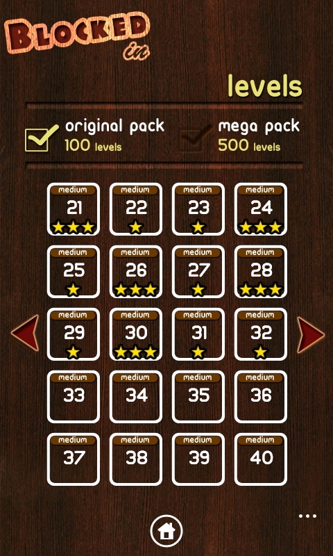
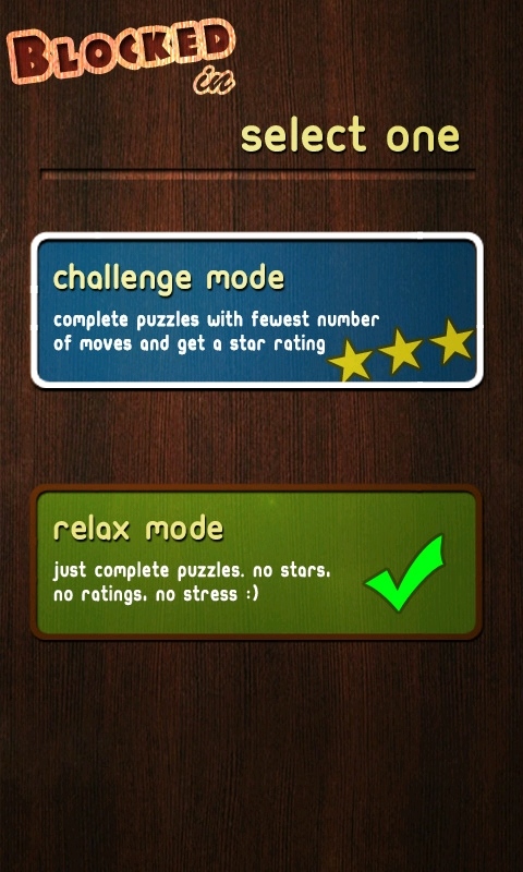
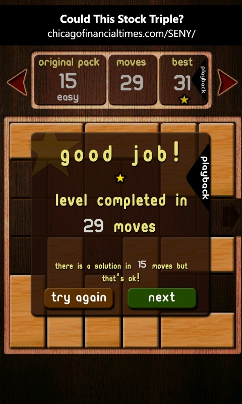
I especially like that when you launch the app, you get taken directly to your next unsolved level, rather than the interstitial home screen. This is available from the menu under the home icon, but by taking you straight to the puzzles, Blocked In feels like it is being kind to the user and respectful of their time. It does have a basic ranking system so you can see how close you got to the 'perfect' solution of least moves, but if even that upsets you, it's a simple matter to change the play mode out of 'challenge' and into 'relax' mode, where the star rating and minimum move counter is hidden.
No pressure, just the puzzles, or the puzzles and then the extra dimension of being perfect? The choice is yours.
I think the only issue is that when you hit the 'restart this level' button, a regular Windows Phone dialog box pops up at the top of the screen, and it takes me out of the well designed game interface. With lots of customer led updates to the code-base, I wonder if this is already on the to do list of Sour Green Plums?
Blocked In is not the sort of game you can play for a long time before it gets boring, but diving in for four or five levels at a time is a great way to play the game. Blocked In makes sure no time is wasted if this is your approach. With 600 levels to go through I doubt the challenge will run out in the near future.
Priced at £1.49/$1.99 (or as a free to download ad-supported version), Blocked In is great value for money, professionally put together, and a great example of how to design and implement a Windows Phone game. Thoroughly recommended.
Reviewed by Ewan Spence at
