Review: Time Mobile
Score:
65%
Joining the ranks of news websites with their own Windows Phone applications is Time. While Time Mobile doesn't break any new ground in presentation, the strong content and ethos of the weekly news magazine shines through in the content of this application. The UI needs a bit of love and attention, but I can just about forgive that for a first release.
Version Reviewed: 1.0.0.0
Buy Link | Download / Information Link
It's worth divorcing the content and the interface here, because there's no doubt that one of the key values in Time Mobile is the content. You are going to get analysis here, you will get taken beyond a simple headline and into the nuts and bolts of a story, and more often than not you'll find yourself thinking about the arguments in an article. That's smart writing.
Because of the length of many articles, I'm very glad that there is a "save" feature in Time Mobile. Choosing 'save' from the menu (which you will need to expand, there are no icons, screen real estate is maximised for as many words as possible) and the application will remember the article for you, but unfortunately not your place in the article. Any time you want to go back to your articles, just click the 'saved' menu choice at the top of the 'section' screen in the main panorama view to get the list.


I think 'saved' is the wrong choice of word here, and 'favourite' would be a better choice. In fact, there are some parents of the interface where 'favourite' is the preferred term, even if it is the Americanised 'favorites' without the missing 'u'.
You have the ability to share any article around Facebook, Twitter, or via Email and Text. This is pretty much an expected feature now on any Windows Phone content application, and even though its inclusion is at a very basic level, it is welcome.
About the only option not hidden away is the 'Legal' option that is present on almost every page and menu - which takes you out of the main flow of the application and launches an embedded web browser page to see what you can and cannot do with the content. A little bit of overkill where it's not needed in my opinion.
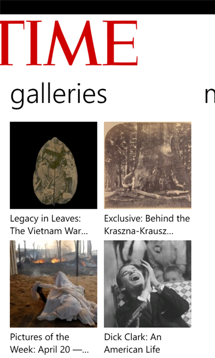
You also have the Time photo galleries and news video clips in the panorama, which are wonderful diversions and look glorious, but they feel bolted on to the application, as if they were added to the app specification at a later date.


Content aside (and it is wonderful content), the Time application itself is little more than a competent piece of code. It pulls down the news and content, and pops it in the appropriate section. Beyond the 'latest' starting point on the panorama, you'll be flipping across to the 'sections' tab rather a lot. I still think it's a cheat that they have a 'more' on this view - there's no reason why the seven sections on offer here could not be carried into the main 'sections' menu.
I'd love to see more customisation in the application, perhaps allowing you to have favourite sections paged directly into the panorama view, or an individual section pinned as a live tile. Currently Time has just one live tile - when you pin the application to the start screen, and it provides the image of the latest headline.
Finally, and a bit of a big omission for me... I'd like to see a search option added to the application.
There's nothing particularly wrong with Time Magazine's first application. Neither is there anything spectacularly right about it as well. As a v1.0 product, it's a great first step. It all works, it shows competence, and it hooks into a number of Windows Phone UI principles. It will do for now, but I'm expecting to see more in any later version.
Reviewed by Ewan Spence at
