Review: Amazon Mobile
Score:
77%
Amazon is one of the success stories of the internet, one of a handful of companies that are recognisable across the world just by their name, and everyone knows what they are for. With a goal of being there whenever (and wherever) you want to buy something, a client application for Windows Phone is a no-brainer. How does this retail experience compare to the alternatives Amazon offer?
Version Reviewed: 1.8.0.0
Buy Link | Download / Information Link
As Steve would rightly point out, Amazon already have a competent mobile website, why would you want to pick up an application to do the same thing? Isn't the future all HTML5 and doing it all in the web browser? That might be true if you can't get the mobile app for a specific service on your platform, but that's not the case for Windows Phone.
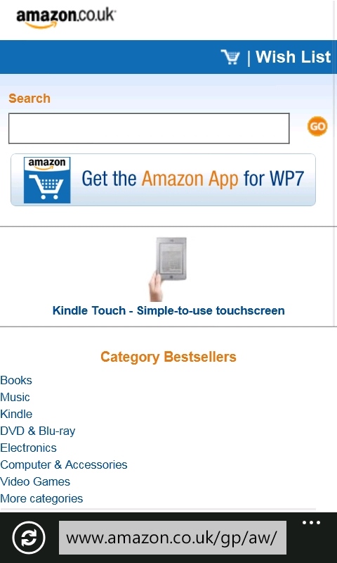
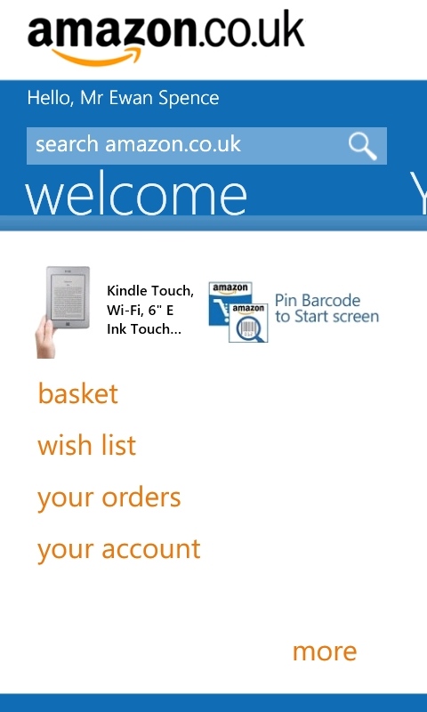
Mobile Web on the left, Mobile App on the right
Amazon's app for Microsoft's mobile platform does deliver the same functionality as the mobile site, but does it better. Not only does it deliver it in a Metro-styled environment that will feel comfortable to users, it also takes advantage of the opportunities available to a native application, the main one being the barcode scanner.
The idea here is that if you find something you want while out and about, you can scan the barcode with your smartphone's camera, and the Amazon Mobile application will find the item in the catalogue, and let you order it there from your phone, rather than from the store you're browsing in. A little cheeky, but hey, it's a dog eat dog world out there, and Amazon wants every advantage they can get.
So it's a bit of a shame that, on five books from my bookshelf, the app managed only one correct identification, failed to scan three of them, and decided that Piers Anthony was actually Isaac Asimov on the fifth. A bit of work is still needed here.
I'm sure that Amazon will be improving the database - after all it now knows about the mis-identification issue of Asimov/Anthony (because I was presented with a 'is this right?' check). Think of everyone using this, over every mobile OS, and the database will improve over time. And that's why they have this application. Amazon's goal is to make it as easy as possible for you to buy something from them. That's why you can pin the barcode scanner as a tile. That's why you can sign into your account and you stay signed in. That's why the rather dangerous to your bank balance '1-click' payment option defaults to being on. That's why they have an application as well as a website.
When you have an impulse to buy something, Amazon want to be there for you so they can capture the sale immediately.
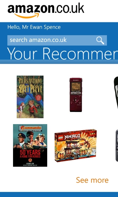
I love the fact that the first screen in the Metro UI panorama, the Welcome screen, lays out Amazon's priorities. The search box is the first item you can interact with, you then have two advert boxes, one to pin the barcode live tile, the second to buy a Kindle device (they'll never let Kindle go, will they!), then you have more traditional text choices. A swipe to the side will give you a recommendations screen of things Amazon will think you want to buy - a section I have always found to be 'scary' in its ability to present things that I never knew I wanted, but actually do want.
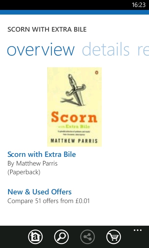
Back to the search though, because that's how most people will use this application... Searching, be it through the aforementioned scanner or the more traditional text box, will bring up a list of results with thumbnails. Each result carries details on the price (both for a new copy from Amazon, and the 'new and used' second hand trading section of Amazon), the star rating and number of reviews available, and if the item is covered by the Amazon Prime service (which offers discounts and faster delivery for a yearly fee). There's also a 'departments' filter you can use to narrow down the results on show.
There's a lot packed in to this view, and that's one of the main reasons there is so much scrolling through the results. Naturally, when clicking on an item, you get a full Metro view with each of these fields as another page to swipe left and right through

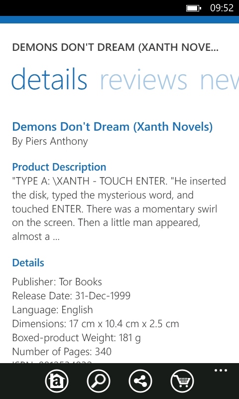
Buying is just as simple - hit the button, confirm your password, and then place the order. It's as good as done. One thing that I was expecting that is only partially in the application is the syncing of your 'basket'. Items that are in your basket (either to buy now or saved for later) from the deskbound web version of Amazon can be seen in the app, but when I place an item in the basket from the mobile version and don't complete the transaction... it's not visible in the basket the next time I go to Amazon, either on Windows Phone or on the desktop. A missed opportunity here, and that's rare for Amazon. It'll get fixed in an update.
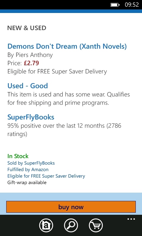
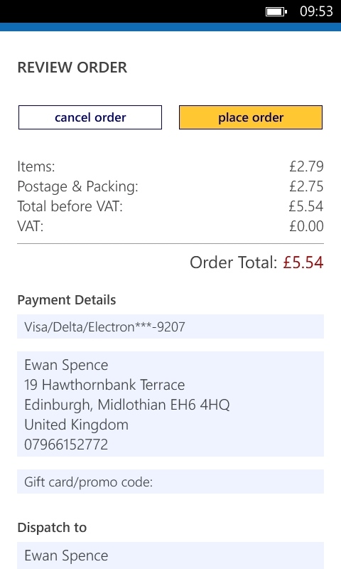
Amazon is a huge store, and while browsing aimlessly through the store with only a vague idea of what you want to buy is something that can be enjoyable on your deskbound computer, trying to find 'something new for a Nintendo DS' on the smaller screen of a mobile can be a frustrating scroll through some huge lists.
But that's not where the application's strength is. It's here when you have a retail itch to scratch and you have to buy something at that very moment in time. You can zap with the barcode, you can punch in an ISBN number, you can search with laser-like accuracy, and then you press buy.
And a day or two later, what you wanted will be on your doorstep. It's the closest thing to magic you will ever put on your mobile phone... until your bank statement arrives. If impulse buying is your thing, then the Amazon Mobile app is for you.
Reviewed by Ewan Spence at
