Review: LinkedIn (Windows Phone client)
Score:
73%
While it might not be as ubiquitous as Facebook or Twitter, the business-focussed social network LinkedIn is a vital part of the online life of many people. If you're looking for a more advanced interface than their mobile website (or the basic integration the service has inside the People Hub), then the LinkedIn Windows Phone client is going to be an application you will spend a lot of time with.
Version Reviewed: 1.0.0.0
Buy Link | Download / Information Link
LinkedIn is a network that I suspect many people are registered with and use more as a CV site than a social network. This application isn't really for them. It's for the people that are using all of LinkedIn's communications and facilities. I wonder if the number of choices the app has on the first panorama screen will be a surprise to some?
Like any social network, one of the key building blocks of LinkedIn is the activity stream, and this is the first screen on show when you open the application. There are times that this can look a little messy when it mixes in status updates from users, links they have posted, and automatic messages from LinkedIn (such as the number of your friends who have new connections), but the majority of activities will have the thumbnail on the left and text on the right, giving it a clean look... most of the time.
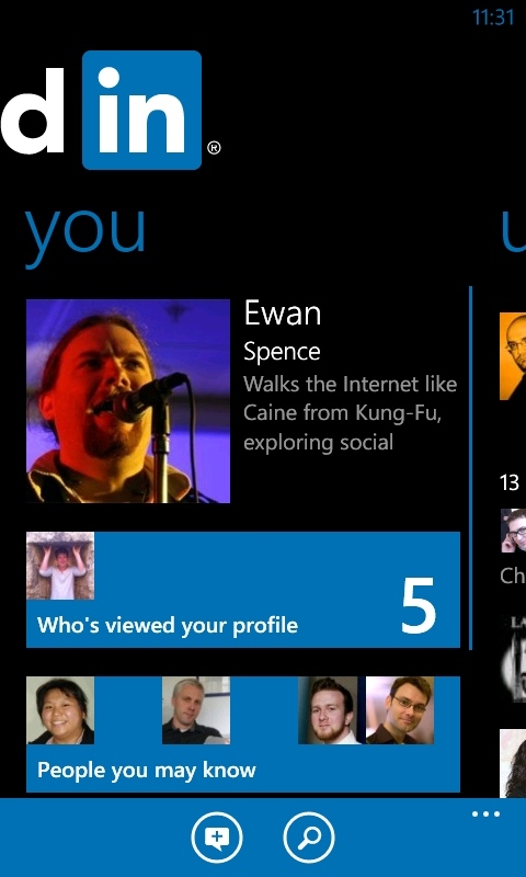
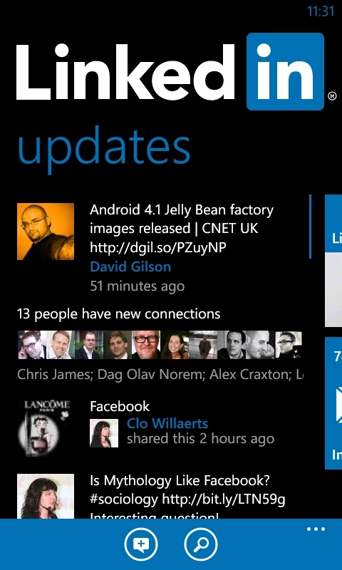
Given the richness of the data that LinkedIn can offer in the stream, I think I prefer this mix of message formats rather than a uniform look that would probably be a little harder to navigate quickly by sight alone with drop downs and having to select messages for more information. The other list view in the panorama is simply called 'You', and this is where you can deal with your account, making changes as required, browsing the people you are connected to, as well as browse and update your own activity stream.
I particularly like the 'who's viewed your profile' section, partly from a voyeuristic sense, but also when I send out proposals and invitations to companies and people.Wwatching them check out my LinkedIn profile an hour or so later is a welcome sign that they are taking some action.
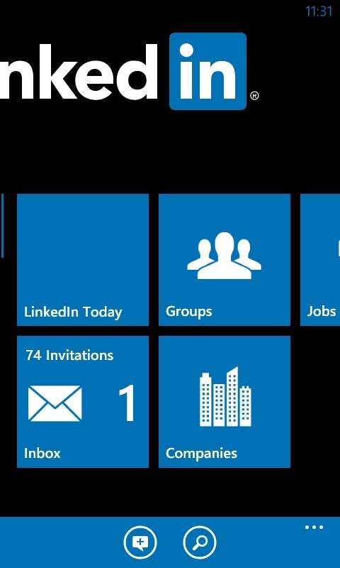
The core of LinkedIn is personal communication, and this is the big differentiator when you compare it to other social networks. A lot of LinkedIn is based around one to one communication, which is where the third of three sections in the panorama comes in. Built around a live-tile-esque menu system, this section lets you interact with content from other LinkedIn users with a bit more focus than the activity stream. The first and easiest to relate to is your personal inbox of messages, but two other panes (Groups and Companies) let you work with a subset of people in their respective areas. You also have 'LinkedIn today', which acts as a filter on stories across the whole network.
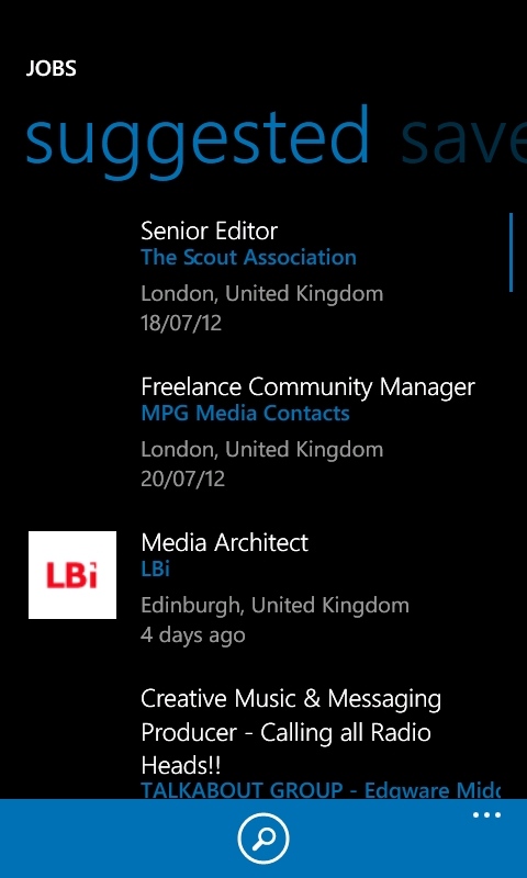
Finally, you have 'jobs.' Most people with even a passing knowledge of LinkedIn know that it's good for finding new jobs. The application will recommend potential jobs for you, depending on your profile and interactions. You also have a full search function to go beyond the recommendations. Unlike the online version of the site, you don't have as many options to tailor a search (just a single box). I think this is about the right level for a mobile app, especially as the recommendation engine seems to be working quite well for me (not that I'm looking for anywhere else, Rafe!)
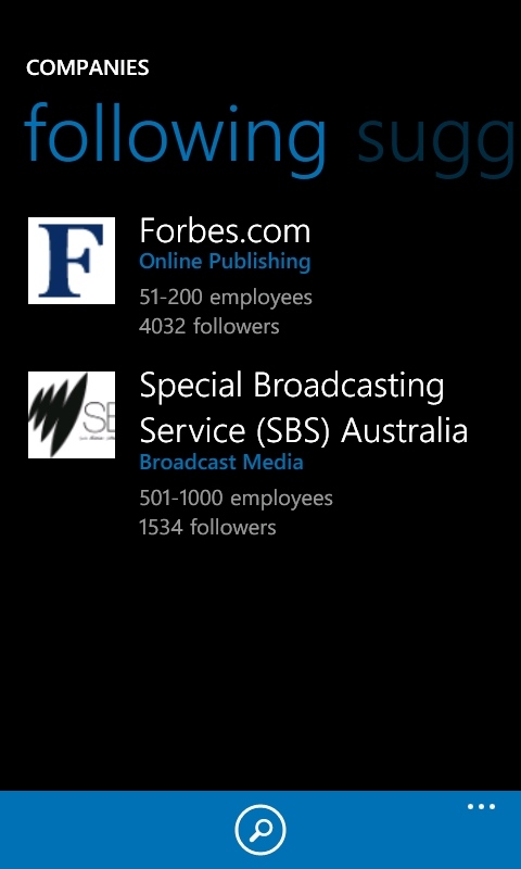
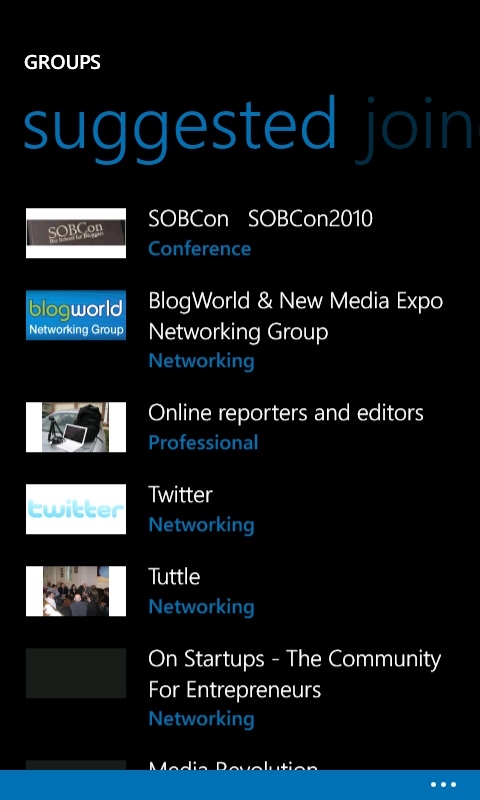
As a mobile application, LinkedIn does a lot of things right. While it doesn't bring over the full functionality of the desk-bound website, it brings over the right mix of accessibility and information. By sticking to the metro interface guidelines, LinkedIn makes good use of screen real estate, in a way that users will feel comfortable with.
It's not perfect, the application will not pick up on the spot colour used in your theme, forcing the LinkedIn shade of blue over the application, and it doesn't seem to cache a huge amount of data, so as you scoot back through the application, screens will try to be reloaded, rather than showing the data from a minute ago. The LinkedIn Windows Phone app doesn't feel speedy, and that's a shame, because in terms of information it is doing a lot of things very well.
As with any social network client, how useful you find LinkedIn on Windows Phone will depend a lot on how much you use LinkedIn. If it's little more than a contacts database to you, then the addition of LinkedIn into the People Hub for contacts and status message updates will be enough and you don't need to look any further.
But anyone using LinkedIn seriously will find this application as useful as Facebook is to those hooked on Mark Zuckerberg's network. If that's you, then this is definitely in the recommended pile of Windows Phone apps.
Reviewed by Ewan Spence at
