Review: Sally's Spa (Xbox Live)
Score:
53%
Sally's Spa (or as it is listed in the Marketplace, Sallys Spa) is the sequel to Sally's Salon, previously available on Xbox Live in an 'LE' (Luxury Edition) version which took the price to £3.99. Spa is a slightly less expensive £2.99, so is it obviously less luxurious. Unfortunately yes, this is an Xbox Live title that feels more like a contractual obligation than a game title that someone has developed with love and enthusiasm.
Version Reviewed: 1.0.0.0
Buy Link | Download / Information Link
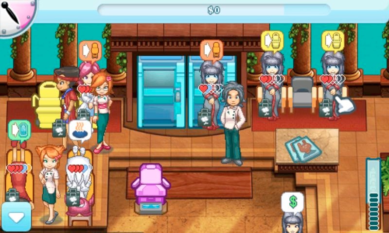
Sally's Spa has a rather simple premise - as Sally you need to manage your spa throughout a working day (one level represents one day) and serve the needs of the customers as they come into the spa. Let's follow the movement of one customer. They arrive at reception, and let you know (through a speech balloon) what service they would like in the spa. Tap on them and then tap on the location in the spa with that service. The customer will head there for the treatment. You might need to specify exactly which treatment (e.g. the colour and design of the nails they would like), and then you wait until that treatment is over. They may want more, or they may be finished and ready to pay; in which case tap them and then the cash register so you can get their money and have them leave as a happy customer.
![]()
The fun happens when you have more than one customer and you need to prioritise them - you have to keep them as happy as possible and get them through the spa as quickly as possible to not only get your fee but a generous tip as well. You might have three customers queueing up for two spaces at the nails station, so decide who to take first (various customers have different attitudes - some are happy to wait, others have a frustratingly low threshold for waiting), and hope the others won't get too annoyed at you.
Throw in multiple customers, various services at the spa, and very soon you'll be shuffling people around at a frantic rate trying to keep everyone happy and beautiful.
![]()
The format is exactly the same as the previous title, Sally's Salon, but that's where the similarities end. At a basic level the graphics are different and you have different services to manage, but that's not the main difference - what you'll recognise is that Sally's Spa manages to just miss the mark in so many areas that the sum of all these tiny errors is an uninspiring game with a poor relation to the Windows Phone environment, and not at all a patch on its prequel.
Somewhere in the All About Windows Phone office, Steve is trying to work out if we should leave the title as "Sallys Spa" or change it to "Sally's Spa" in the text. That might seem like a jokey point, but if the developers can't get the title right, what does that say about the rest of the game?
The faults continue on the menu screen. Not all the menu options fit on the screen, so you need to scroll through them. However, once you start to scroll you realise that you are scrolling because the menu is short by half the hight of one menu option. Rather than increase the screen area for the menu to gain a few more pixels, Gamehouse add in a scrolling system - and an inelegant one at that, with the scroll bar on the opposite side of the screen. It's ugly, it's not needed, and it sets the tone for the rest of the game.
Unlike Sally's Salon, Sally's Spa has you scrolling around the screen to see every part of your spa, and that includes seeing what customers want. It's frustrating that the game has added this scroll mechanic, Sally's Salon managed fine without it. A game relying on reactions and movement benefits from continuity of locations of the various spa stations. Why the graphics could not have been shrunk slightly to make this a single screen game I have no idea.
Oh and the demo version, with just one level, is woefully short to the point of being useless as a trial version.

This is a shame - because the game idea, and the implementation of the underlying engine show that Sally's Spa could have been a contender to join the live tiles on my start screen, but there are far too many little niggly errors and decisions that collectively weaken this game. There was something appealing about the first title in Sally's business empire, but all of that has been lost in this sequel.
My frustration is heightened because I know this could be a good game, but for whatever reasons Gamehouse have made all the wrong decision at the design process, and no amount of smart coding or nifty tricks can compensate for that. Perhaps when a 'luxury' edition of Sally's Spa arrives I'll find something that is worth playing, but frankly Gamehouse should have got this right out the box.They didn't.
Reviewed by Ewan Spence at
