Review: Twabbit
Score:
86%
It's something of a rite of passage for a geek with a new computing platform - to run through every single Twitter client in search of 'the one', the application that does everything perfectly. This was me on Windows Phone, with my personal search ending with Twabbit - it's slick, it's customisable, it's fast and, somewhat reassuringly, it's not (compulsorily) freeware. Meaning that there's a developer behind it who's being rewarded for his efforts and is therefore likely to carry on developing updates and fixes as needed in the future.
Buy Link | Download / Information Link
Get past the slightly odd name and you'll be right at home with Twabbit, with a panorama consisting of your Twitter timeline ('Home'), mentions ('Interactions'), direct messages ('Inbox') and 'Me', of which more later. Left and right swipes move you from pane to pane, as expected, and double tapping on a pane's header moves straight to the top, i.e. the most recent updates.
Note that, in the example screenshots here, Twabbit is 'dark', because it picks up the theme preference from Windows Phone's settings, as determined by the user (in this case, me, and I like dark themes!), although you can also override this in Settings, right down to picking a favourite photograph as a backdrop - cool, but incredibly distracting. Maybe a snap of the sky, or a lake, might work? Worth experimenting with, perhaps!
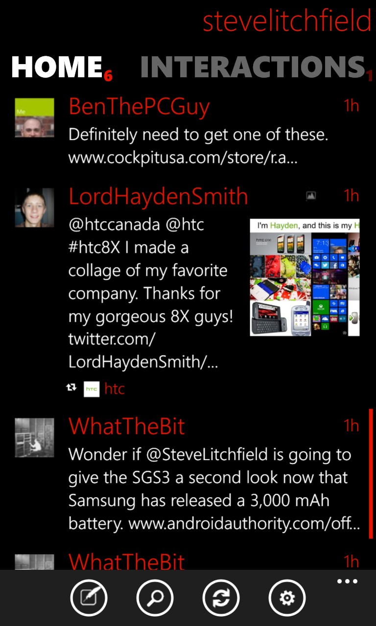
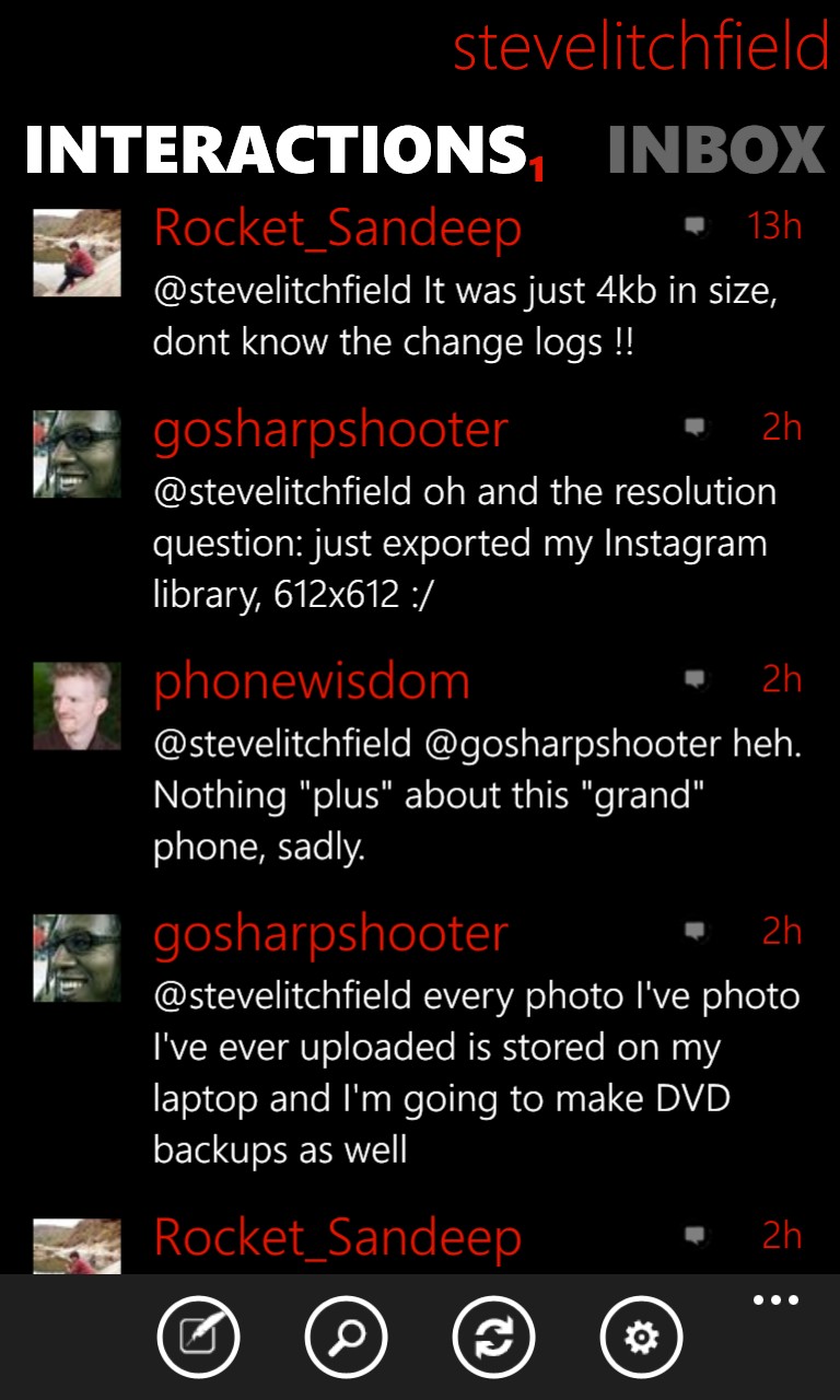
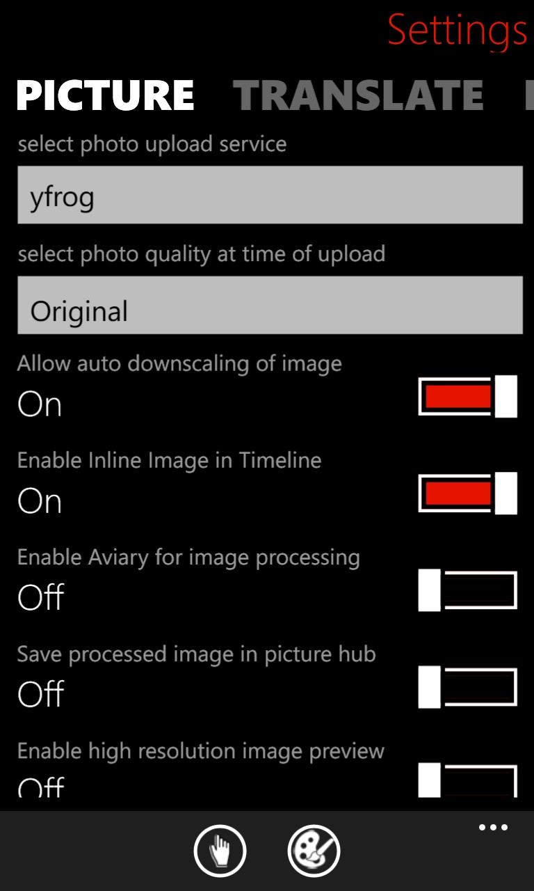
By default, in-line images are disabled, but turning them on is only one tap in Settings. The default fonts chosen work extremely well on 4.5" and 4.3" screens, though I imagine they might be on the small side on a 3.7"-screened phone and, thankfully, there's a comprehensive choice of font sizes in Settings, from 16 pt to 31 pt text.
There's pretty good use of space, though the header account name, while useful if you want to keep signed in with more than one account (which is supported here), is rather a wasted line of characters for 99% of users, I suspect.
The biggest draw for me with Twabbit is its speed. Not just the UI, though that's nippy, but the way it's been compiled to work well with Windows Phone 8. Background agents check for tweets, toast notifications (if enabled) pop up to warn you that you've been mentioned and, on resumption, you're back up and working with the application immediately, i.e. there's no waiting while the application resumes and grinds its gears. Major kudos to the developers.
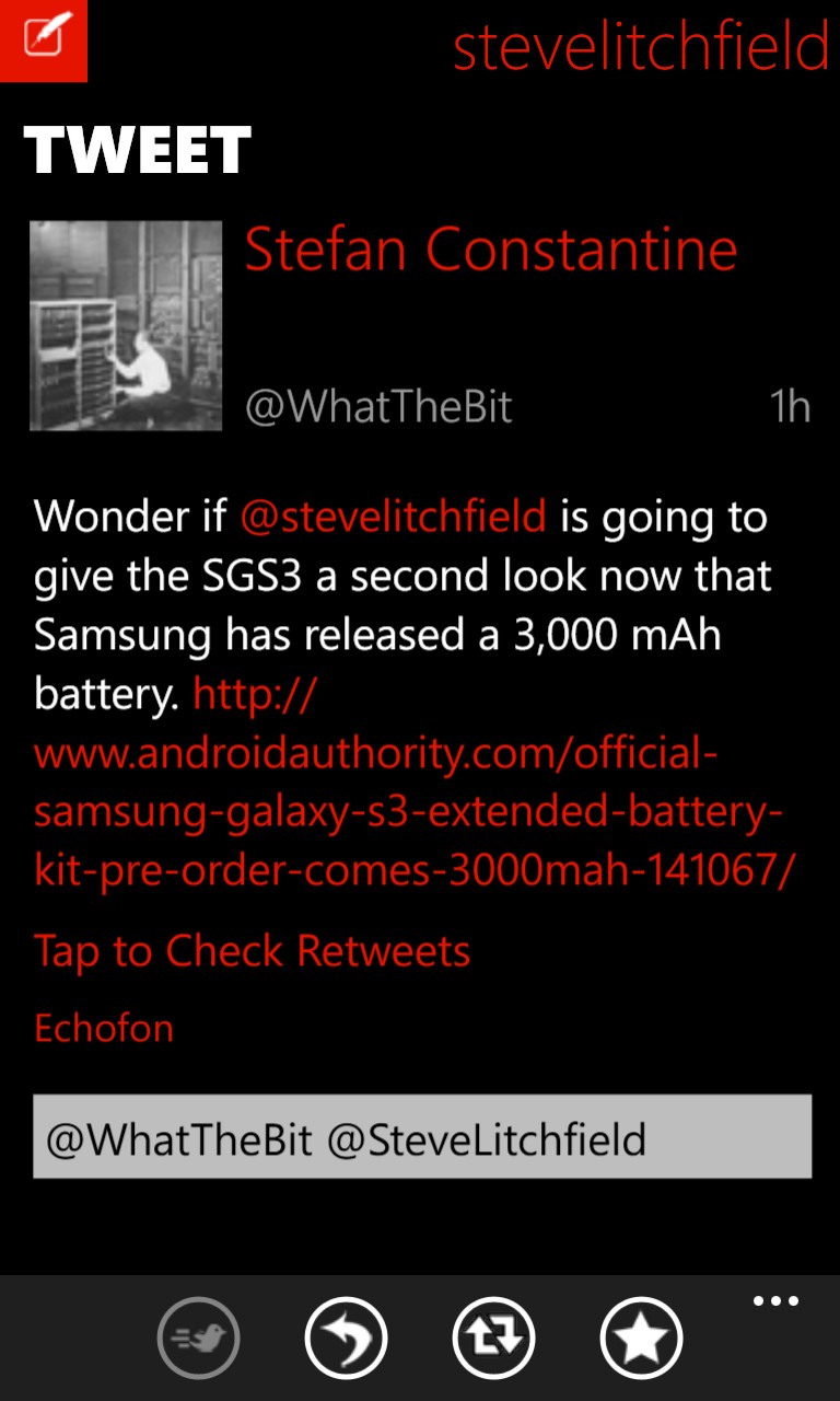
Tapping through to individual tweets brings up more, including the needed actions, a larger version of the peron's profile photo, properly hyperlinked versions of any URLs in the tweet and a pre-filled reply box:

By default, web URLs open up in a browser within Twabbit, which has the advantage of extra speed and a seamless experience - the frame around the page content reminds you that you're not in Internet Explorer - though there's the option to open all links in IE if you really want to.
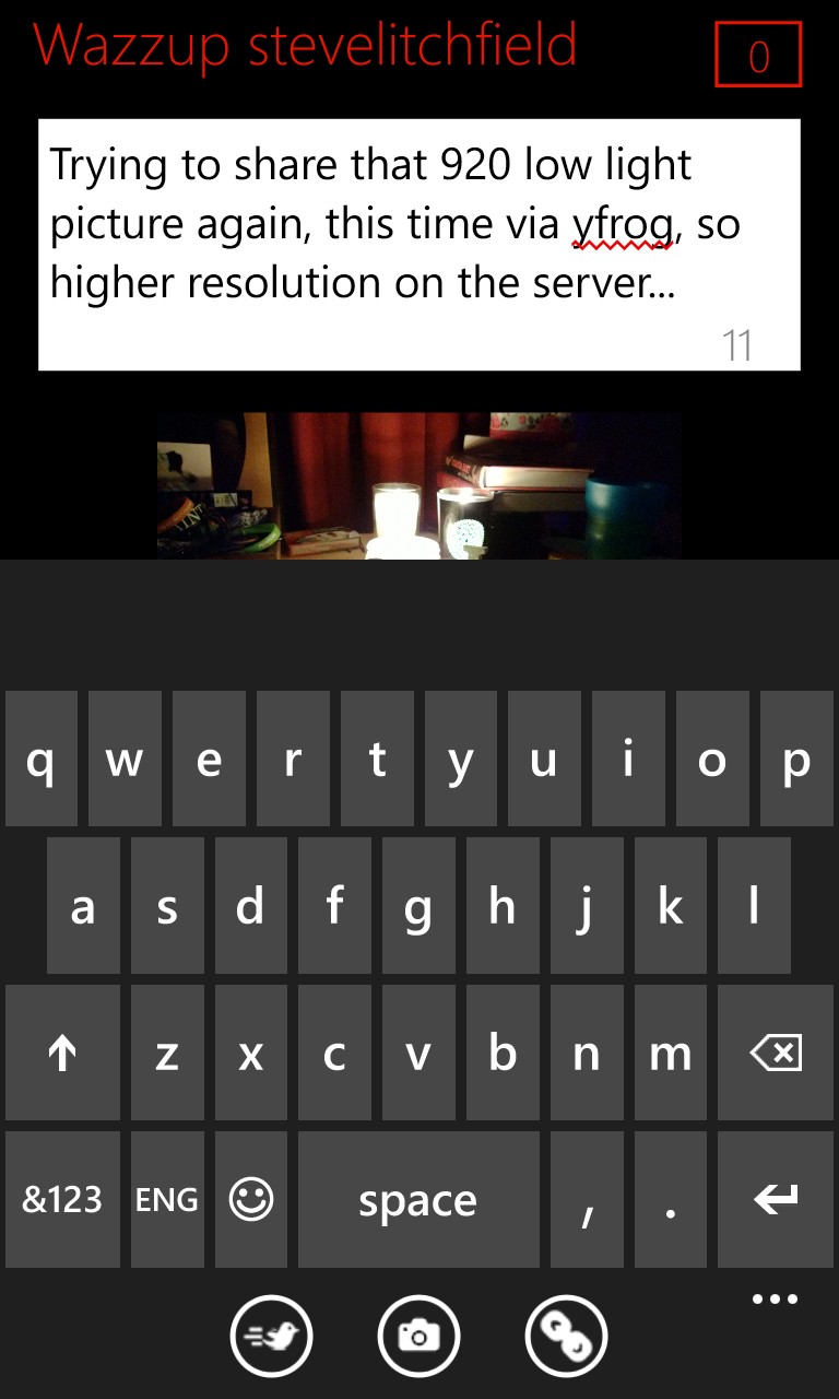
Twabbit ties into Windows Phone's sharing system, so it's easy to take a photo in the phone's Camera application and share it immediately, with Twitter, Twitpic and Yfrog being offered as Twitter-friendly photo hosts. And no (referring to the screenshot below), I'm no fan of the 'Wazzup' legend - or maybe I'm just too old for these hip, young social networks(!)
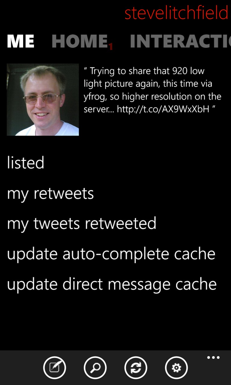
The 'Me' pane, surprisingly, doesn't list my essential Twitter statistics - rather, it concentrates on who I've been listed by, which of my tweets have been retweeted, and so on. The last two options above seem over-technical and I can't help but feel they should be accomplished automatically or hidden away in a menu at least.
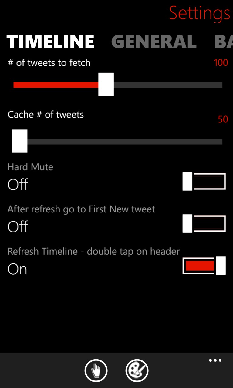
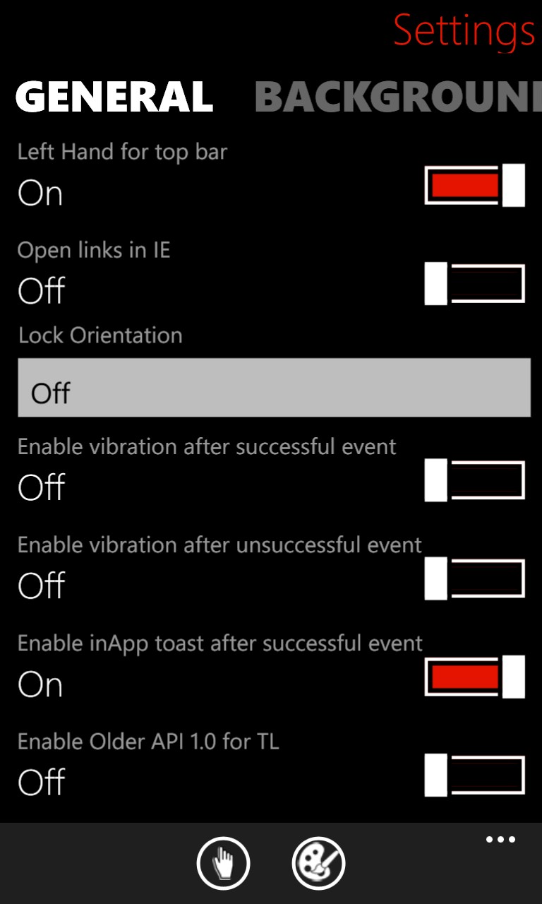
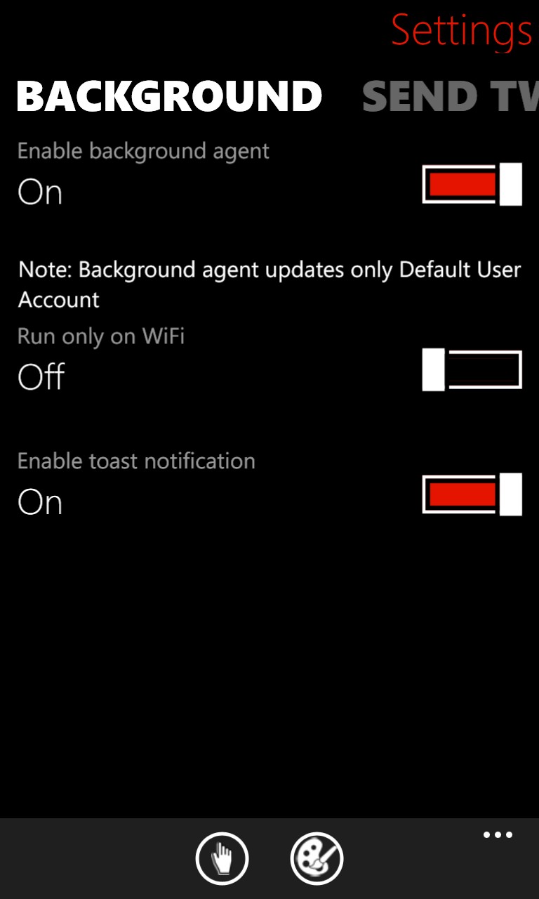
The Settings panes, as you'll see in the four screenshots below, are comprehensive, with the highlights for me being: the option to always show the most recent tweet or go to the first new one since the last check; the way Twabbit works in landscape as well as portrait modes, along with the setting here to lock orientation; the option to turn on background agents - well worth it for almost true multitasking, though apparently it only works with the main account at the moment; and the ability to choose what at quality you'd like photos uploaded:
There's a live tile, showing the number of interactions you've had since you last looked at the application, but otherwise it's just a shortcut to get back to Twabbit.
Finally, not shown here, but no doubt useful to some, are 'Pocket' and 'Instapaper' support, for filing away tweeted URLs for exploration later.
Overall, Twabbit has left me with a tremendously positive impression - it's massively customisable and, whatever your preferences for how a Twitter client should look and behave, there's a good chance that this will fit the bill.
As mentioned in my opening paragraph, there's something reassuring about Twabbit costing £1.29, as opposed to being free - it means that a developer is both receiving a reward and motivated to supporting the application and keeping fixes and updates coming. In fact, there's a trial version, too, but this does lose you screen real estate in terms of banner ads - if you're as fussy a Twitter client user as me, then I'd recommend just dipping into your pocket for the full application straight away - I can't imagine anybody who couldn't get Twabbit looking and working exactly as they wanted.
Excellent all round and a firm keeper on my Windows Phone 8 phone.
Reviewed by Steve Litchfield at
