Review: Samsung ATIV S
Score:
80%
And so to our third Windows Phone 8 'flagship' - except that in Samsung's case it's the only Windows Phone 8 device it currently makes (though see also here), so the point is moot. The ATIV S is an impressive device in several ways though, not least because it's got by far the largest screen in the WP8 pantheon, yet remains (just about) manageable and also offers full flexibility in terms of battery changing and memory expansion. A win all round? Perhaps - though the bundled extra software fails to get close to the package in the Nokia Lumias...
If there's one underlying theme in the smartphone industry, it's that every device is compromised in some way. Whether in hardware, in the OS or in add-on software, no one device and system rules them all, which is why sites like this are needed to point out the trade-offs and potential disappointments.
Not that there are too many of the latter with the Samsung ATIV S, which is a truly impressive smartphone whose only real weak point is that it's not blessed with the Nokia software bundle that each Lumia comes with. Of which more later, though note that most of this can be fixed with a few commercial purchases in the Windows Phone Store, if necessary.
Ostensibly a clone of Samsung's Galaxy S III, in fact the form factor has a very different case shape and many of the components are in different places, leading me to conclude that the ATIV S was inspired by, rather than being a copy of, the best-selling Galaxy S III. Certainly the corners are more traditionally rounded and the design looks (thankfully) a little more conservative - perhaps Samsung considers itself safer here from Apple's lawyers on Windows Phone, since the interface on this OS is so utterly unique.
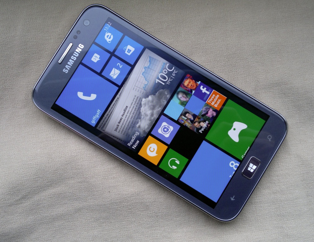
Dominating the ATIV S design are its front and back - which sounds trite, but bear with me. The front has the same 4.8" 720p Super AMOLED screen from the Galaxy S III and it's gorgeous. It's 'pentile' in that there aren't the same number of red and blue pixels as green, but the layout has been improved since the first pentile screens in the Android world a couple of years ago and you have to look extremely closely to see any differences when compared to the same screen contents on a RGB panel (as on the LCD-screened Lumia 920). Pentile is used because of the higher yields in the factory and because they have longer life, can be made thinner and are more power efficient, but no doubt some eagle-eyed reviewers will call foul here. I'd point out the tens of millions of Galaxy S III sold with this screen and how normal users have no complaints whatsoever.
AMOLED lovers (myself included) will adore the huge (the previous largest screen on a Windows Phone 8 device was 4.5", on the 920) high contrast display, with perfect blacks and gloriously saturated colours. It is said that photographs look too saturated on screen and this is perhaps true, but most users 'prefer' more colour rather than less, even if it does present the world in something of a 'dayglo' fashion. Certainly with the default dark theme, the black background to tiles and application icons (and, indeed, many of the applications) looks sumptuously rich by comparison to most LCD-screened phones. The Lumia 920's CBD PureMotion LCD is perhaps an exception here, with a contrast ratio that's close to AMOLED.
As ever, dark themes on an AMOLED-screened phone save a lot of battery power and it's good to see that Microsoft has now engineered most of the core Windows Phone 8 applications to respect the user's theme choice. Naughty exceptions to this are the Pocket Office suite (white backgrounds are somewhat enforced for documents, not unnaturally) and some of Samsung's add-on software, of which more later.
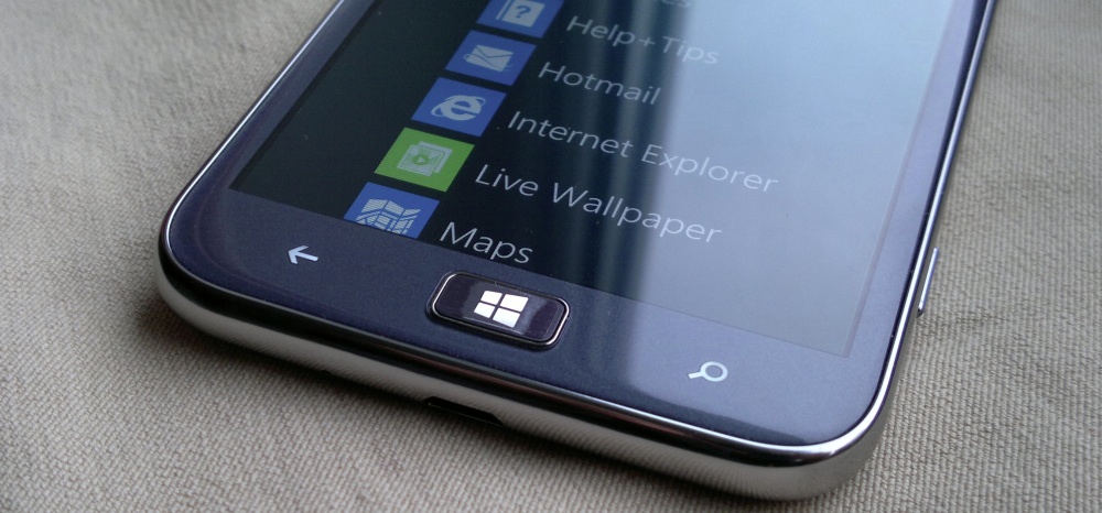
Below the 4.8" screen is a physical Start button, the equivalent of the same for 'home' on Android (etc.) The jury's out on whether this is good or bad - on the one hand, it breaks the all-touch flow of the interface. On the other, it provides physical feedback (both finding it and pressing it) and reassurance for new users, and also lets you wake up the screen, as an alternative to the side mounted power button. One disappointment is that this Start button isn't backlit - at all. Not that you can miss it, but it does look a little odd staying dark when using the ATIV S in dim conditions.
Flip the ATIV S over and there are unexpected delights in the finish and materials used by Samsung. The Galaxy S III had a gloss plastic that never really convinced in terms of quality - the ATIV S has, in principle, the same plastic rear, but the finish chosen is the most incredibly realistic faux-brushed stainless steel. With Samsung's usual accomplished fit for the cover (the ATIV S is very solid in the hand), the only clue you get that the back of this phone isn't metal is the temperature and feel to your fingers - real steel would feel cold, whereas the plastic feels like.... well, plastic. But in terms of looks, the ATIV S case is simply stunning.
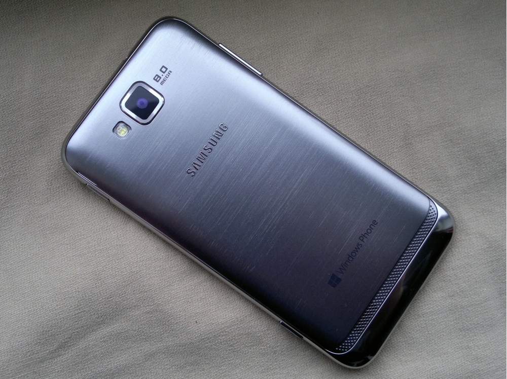
Set in the faux-metal is a single LED flash (as usual, disappointing for camera work, but useful as an LED torch, with a suitable freeware utility), alongside the 8 megapixel camera. There are some photo samples below, essentially performance is identical to that of the Galaxy S III here, a standard 1/3" BSI sensor with mature image processing software. Photos aren't up to the levels of quality and detail of the Symbian-based Nokia N8 and 808, and there's obviously heavy image processing going on, but (the Nokia Lumia 920's OIS-aside) this is about as good as it gets for a device with no camera specialism.
The samples here were taken in poor UK winter lighting. Roll on the summer! Click on each to download or enlarge the full photo:
When snapping shots, you can adjust the exposure, ISO and white balance, plus there's 'anto-shake' and 'auto-contrast' to play with if you're feeling brave.
Video capture is up to 1080p (720p and 480p also available) with decent sound at normal volume levels and continuous focus with a sample time of several seconds (about right - any shorter and you'd get too many 'hunting' effects). Here's a sample:
At the bottom of the faux-metal back is (ahem) a faux-metal grille, with a small mono speaker mounted behind the left hand side - sound is fairly loud but not of top quality. Perfectly adequate for speaker phone calls, but you're not going to enjoy podcasts or music much on this.
Below the faux-metal grille and around the ATIV S's edge is (you're getting the idea now, hopefully) a faux-Chrome surround. Yes, it's all plastic still, and easily dented in a drop, but again props to Samsung for a very decent looker. The physical buttons (power, volume up/down, camera) are all plastic as well and easy to find without looking, though rather curiously the one you'd use most (power) is actually the least prominent of the four. Strange.
In the hand, the ATIV S sits very well, thanks to the subtly rounded corners and chamfering around to the back. There's still some 'edge' to grip though, it's definitely easier to pick up a face-down ATIV S than a face-down HTC 8X.
Under the (faux-metal!) hood is a 2300mAh NFC-enabled battery - this is a standard Samsung component and should be easy to find, should you want to replace it or get a spare. It's also possible to pick up Samsung battery chargers online, for example in a desk-mounted set up. Putting the NFC antenna in the battery is a novel idea that Samsung has championed for a while now - it uses an extra connector to the battery, but this is far more substantial a connection than the typical pressure contact to a back cover NFC aerial, as on the Nokia 808 among others.
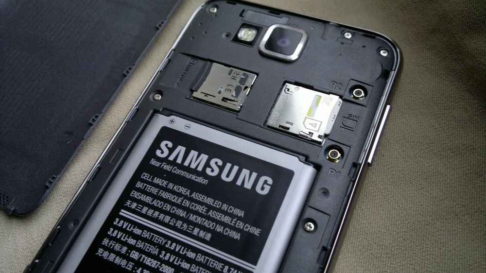
The microSD slot is rated up to 32GB - added to the built-in 16GB mass memory, this should be more than enough for anyone in 2013. The SIM is micro-SIM format, which seems to be standard these days (Apple-apart). Both cards have a sprung mechanism, i.e. push in to spring-eject.
Samsung do seem to have mastered the art of an ultra-thin battery cover which clips very securely in place - no less than 16 clips help the back cover stay put and stop any creaking or other signs of weakness. With other manufacturers claiming they can't implement removeable batteries on the largest smartphones because the required bay mechanism and back cover would make the phone too fragile, I can only point them towards 60 million Galaxy Nexus and S IIIs - and now this, the Ativ S as well. Well done Samsung - I, for one, am fully behind your design strategy here.
The internals of the Ativ S are powered by a Qualcomm MSM8960 Snapdragon chipset, with dual-core Krait 1.5 GHz processor and a Adreno 225 GPU - all of which sounds less than cutting egde compared to the latest 2013 Android models, but is in practice more than enough to keep everything in Windows Phone 8 moving along at great speed. Any waiting around in the interface here is due to the operating system's implementation of 'multitasking' (or lack thereof, sometimes), not due to lack of processor power.
Windows Phone 8 has been covered here in depth in other articles and review parts - suffice it to say that there's a more seamless impression of multitasking by increased used of fast-resuming applications and because the processor here is a lot faster than on the early Windows Phones. In practice, only badly written applications leave you 'resuming...' for any length of time and, as with the Lumia 920 with PR1.1 (including the Portico update), I felt comfortable using it as my main phone, with full application load out.
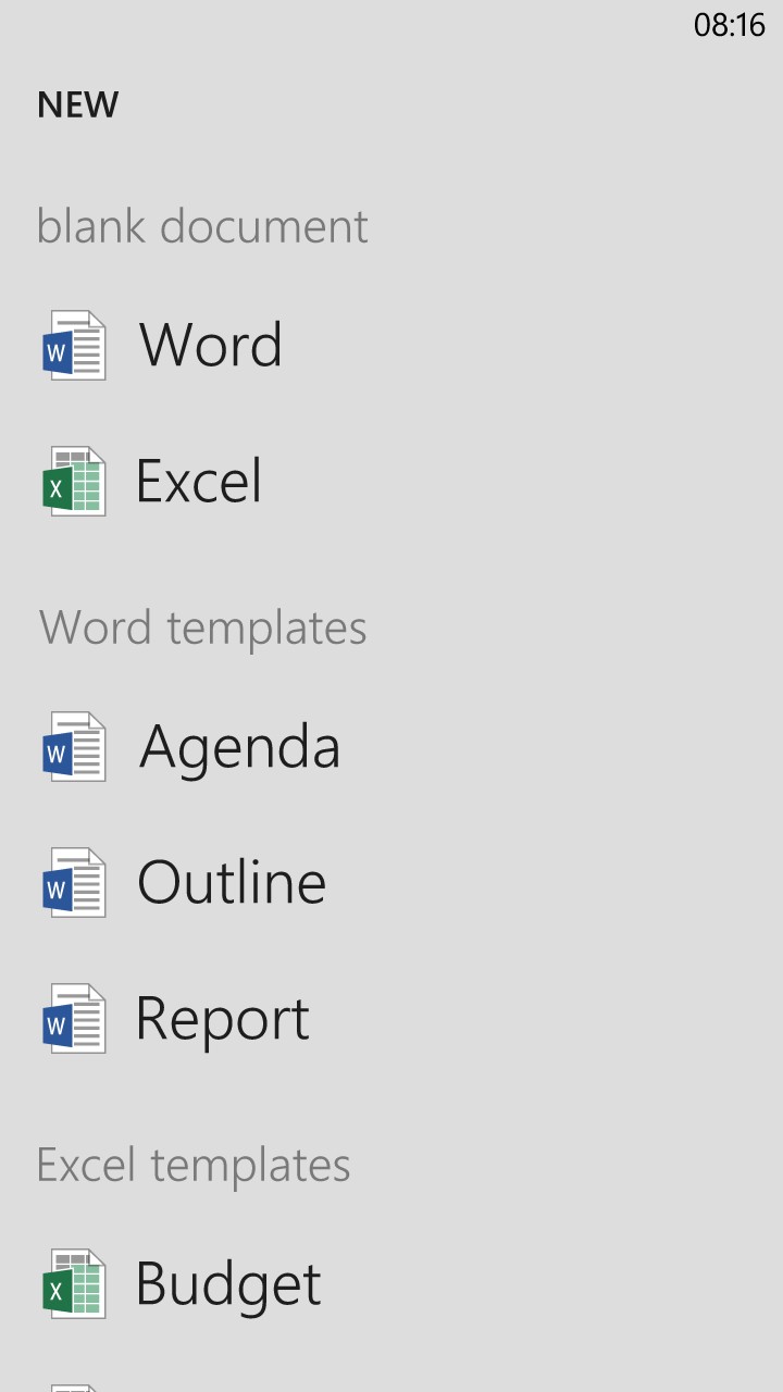
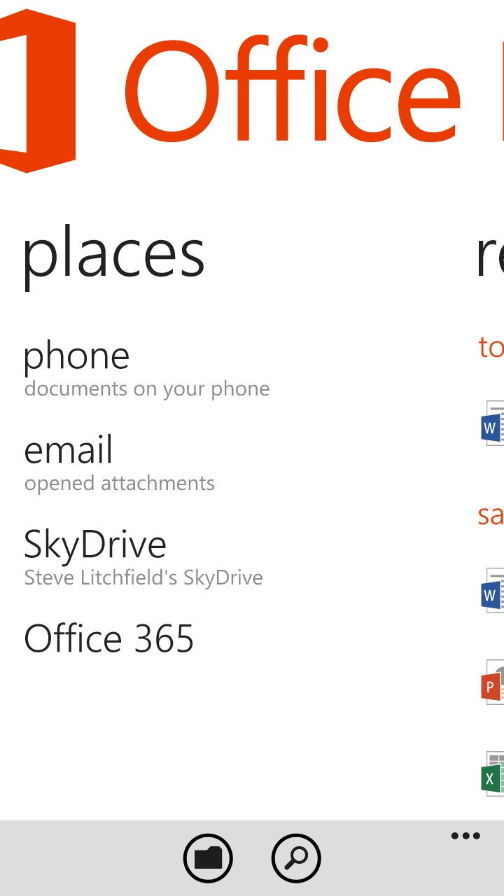
One main highlight for those coming from other phones will be the Microsoft property integration, principally Office and XBox. In practice, both have limitations and compromises (covered elsewhere on this site in other reviews), but the integration does work and the very brand names will be reassuring to many. Office (shown below) in particular, will be a boon to Outlook/Office/Sharepoint-centric businesses.
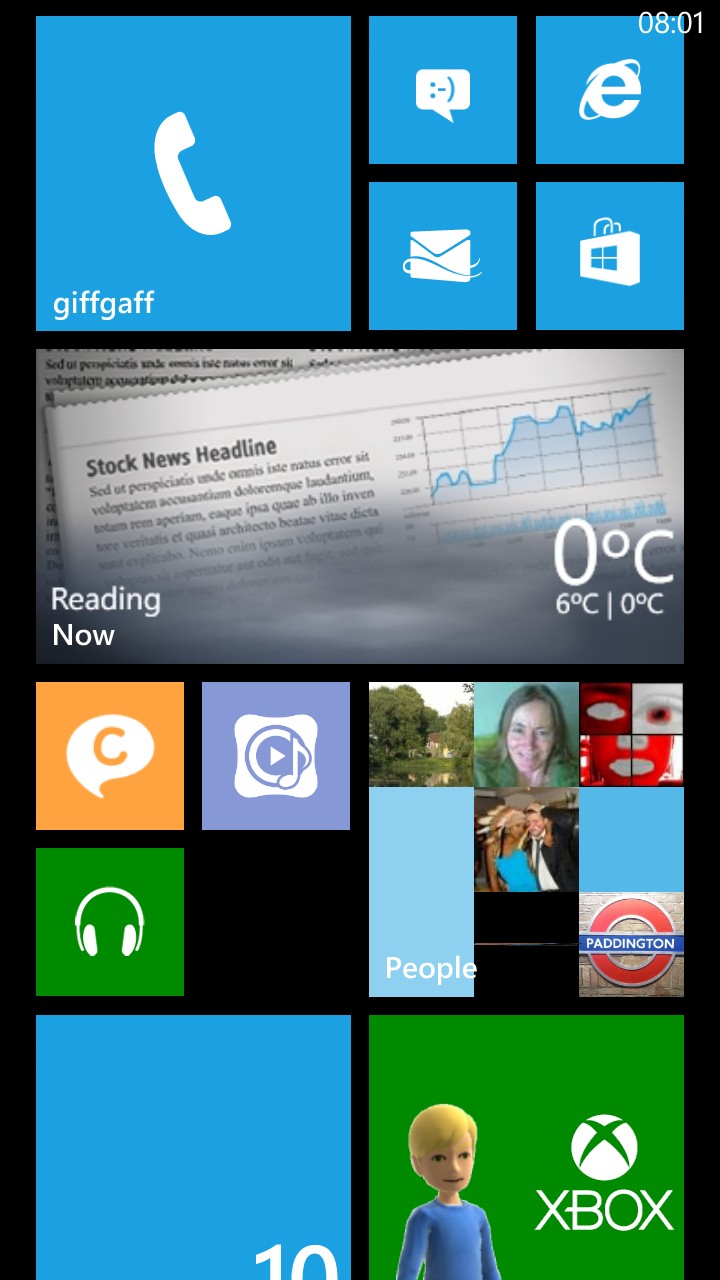
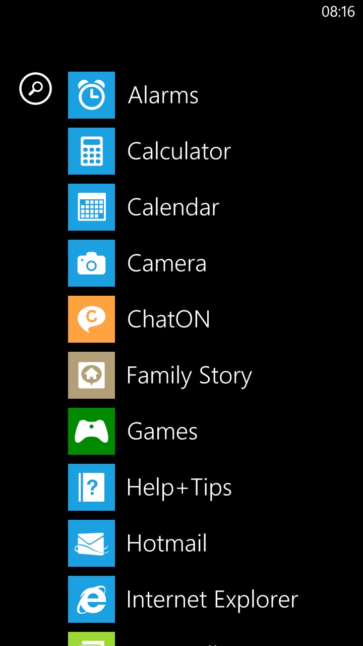
The most featured highlight of Windows Phone 8 in the press is the customisable Start screen - this is indeed fun to play around with. But the biggest changes for me are the faster interaction between the OS and its applications, plus the more flexible file management - it's not perfect, but the ATIV S's file system appears as a disk under Windows 7 or Windows 8 now, plus you can also save captured media to microSD.
Even better, you can now put in a microSD of MP4/WMV (etc) videos and MP3/AAC/M4A/WMA (etc) music and it's all picked up and played perfectly. With the huge 4.8" AMOLED screen, the ATIV S makes a sumptuous video player. Admittedly, you have to do a bit of fiddling to get streaming video from the likes of YouTube - the mobile site works fine but isn't terribly slick, while there's a 0.79p application in the Windows Phone Store (MetroTube) which ends up filling the gap for most people.
The lack of a decent first party YouTube client is just one facet of the lack of Google services for Windows Phone at the moment. It's fair to say that if you live your life in the Google cloud (Google Documents, Gmail, Google Drive, Google calendar, and so on) then you're still best off choosing an Android phone, but I'd argue that many of Microsoft's offerings are now approaching parity, for newcomers or those who haven't made up their minds yet. SkyDrive, Office 365, Outlook.com email, contacts and calendar all impress and are perfectly integrated into Windows Phone 8.
In terms of first party bundled software, Samsung hasn't done much more than facelift its existing Windows Phone 7 applications from late 2010. Samsung Now is a wide-ranging, but ultimately limited, attempt at an all-purpose online information tool. Weather forecast, news (from Yahoo! News, you can filter out categories of news that you're not interested in), stocks information (from Yahoo! Finance), currency info (ditto) plus the slightly odd 'Top tweets' panes, showing the most retweeted status updates, sorted by country (though no UK, curiously). Now is a great starting place for newcomers though, and appropriate given that this is mainly who Windows Phone itself is aimed.
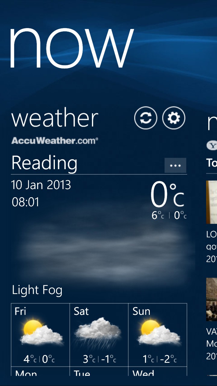
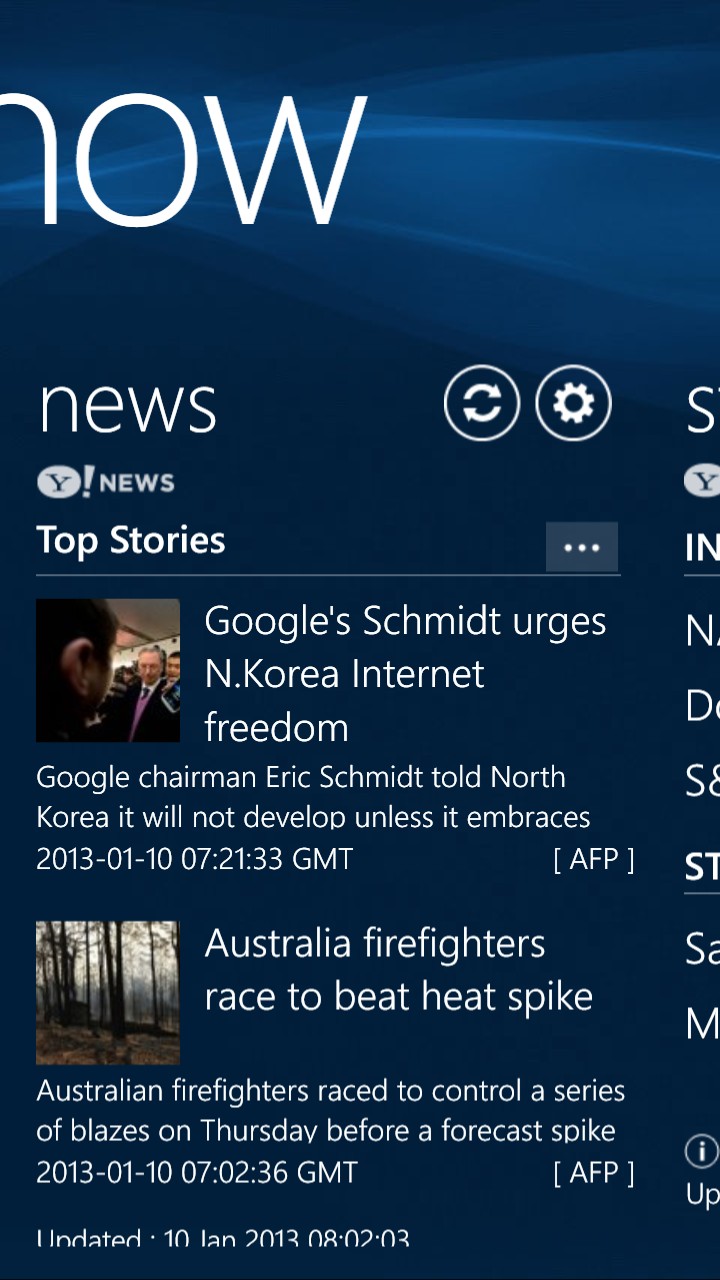
A walk through Now - the weather forecast system can be preprogrammed with a particular city or can use your location. Sadly, only the current temperature makes its way into the live tile - more could be done here. Right, the 'news' front page - scroll and tap on a story you want more on etc.
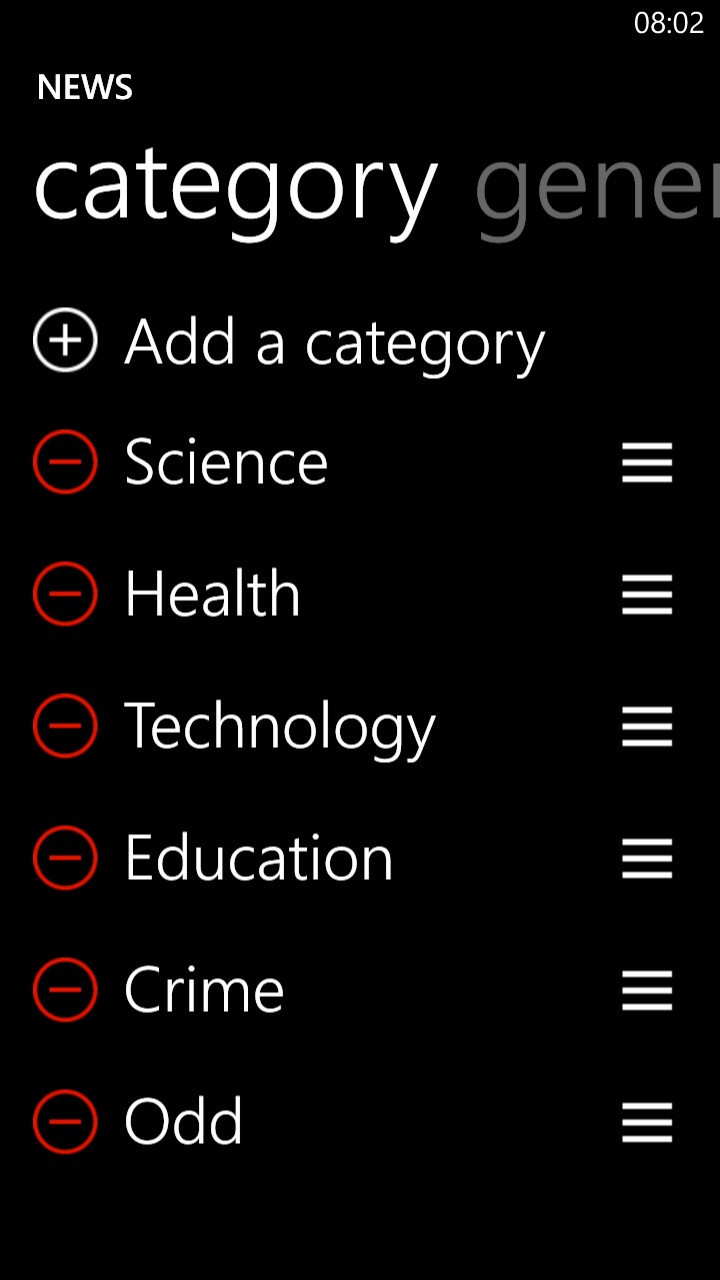
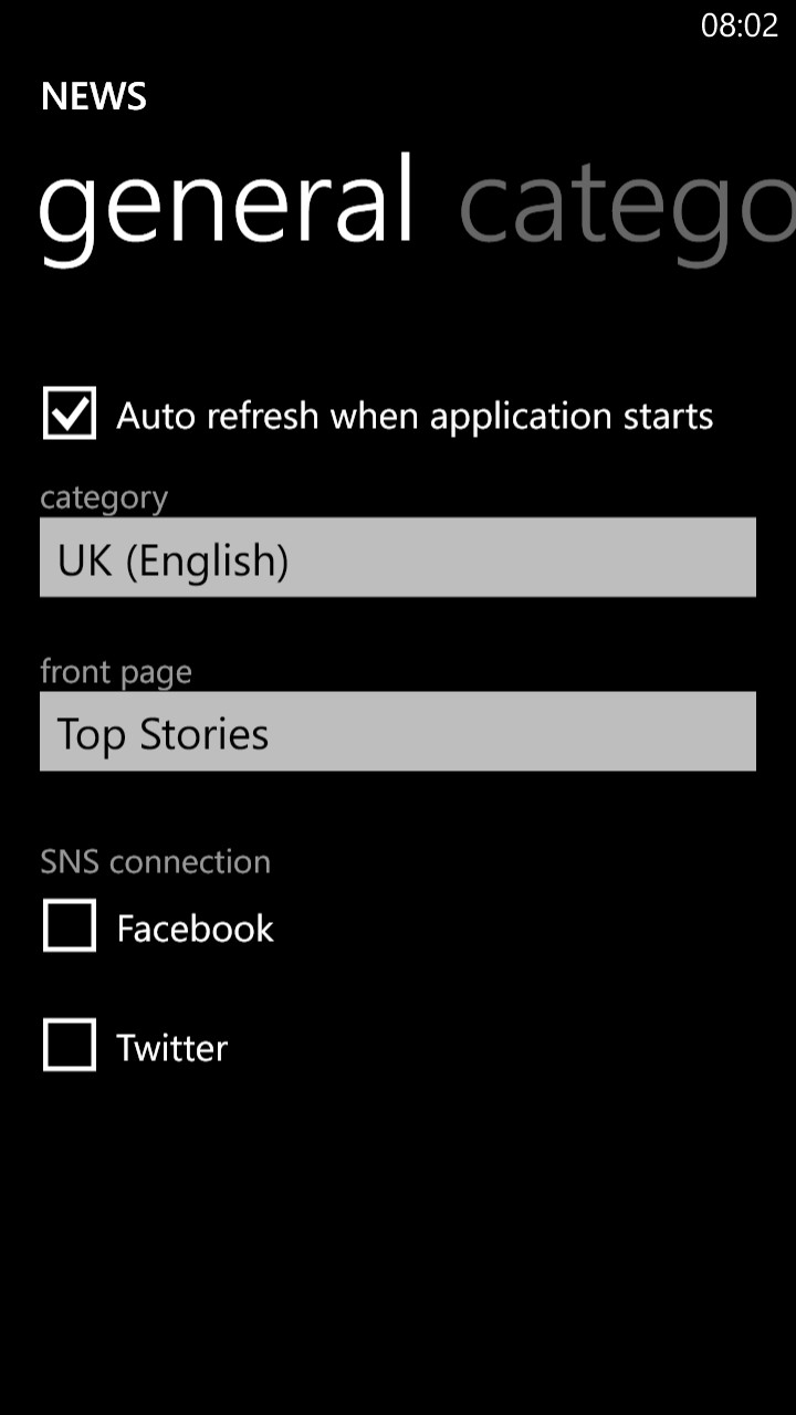
Left, removing some of the Yahoo! News categories ; Right, selecting the default news view and behaviour.

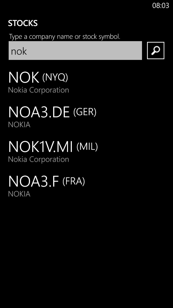
Left, the main stocks view, showing movement for the current day; Right, adding a new stock of your choice, for keeping an eye on...
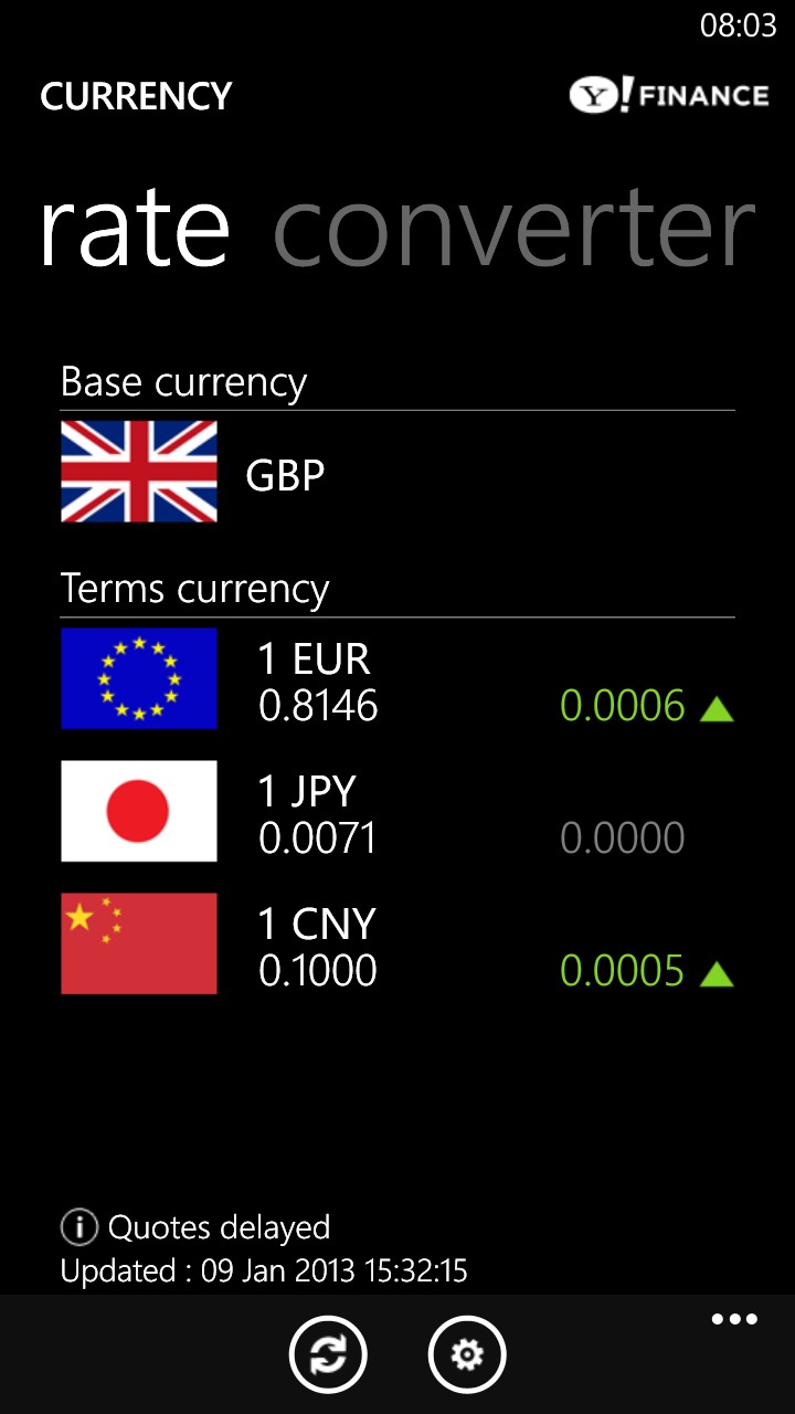
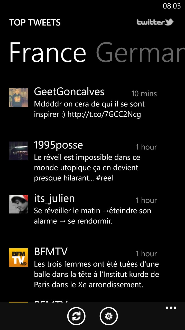
The currency status screen - swiping to the right gives a converter utility, very handy when travelling; Right, the 'top tweets' section is rather quirky, but fun to browse through, here in French!
ChatON is Samsung's cross-platform instant messaging and sharing tool. It looks pretty slick, but in a world dominated by BBM, Apple iMessage, Skype, Whatsapp and more, either I move in the wrong circles or ChatON has simply never taken off. These systems only work if most of your friends and family are also on them - and none of my friends and family had even heard of ChatON. Comments welcome though, if you're a fan.
Family Story is also unique to the Samsung ecosystem and cross-platform - and equally unheard of, I suspect. The idea is to invite your Samsung-owning family and friends to share group calendars, photo albums and event notifications. It's implemented slickly enough, but rather bizarrely it falls foul of duplicating one of Windows Phone 8's new features, i.e. the People Hub's 'Rooms', which is very, very similar. Of course, Family Story works across Samsung phones (i.e. a manufacturer), whereas Rooms works across all Windows Phone 8 devices (i.e. a software platform), so which you might think about using will depend on the balance of smartphones across your intended collaborators!


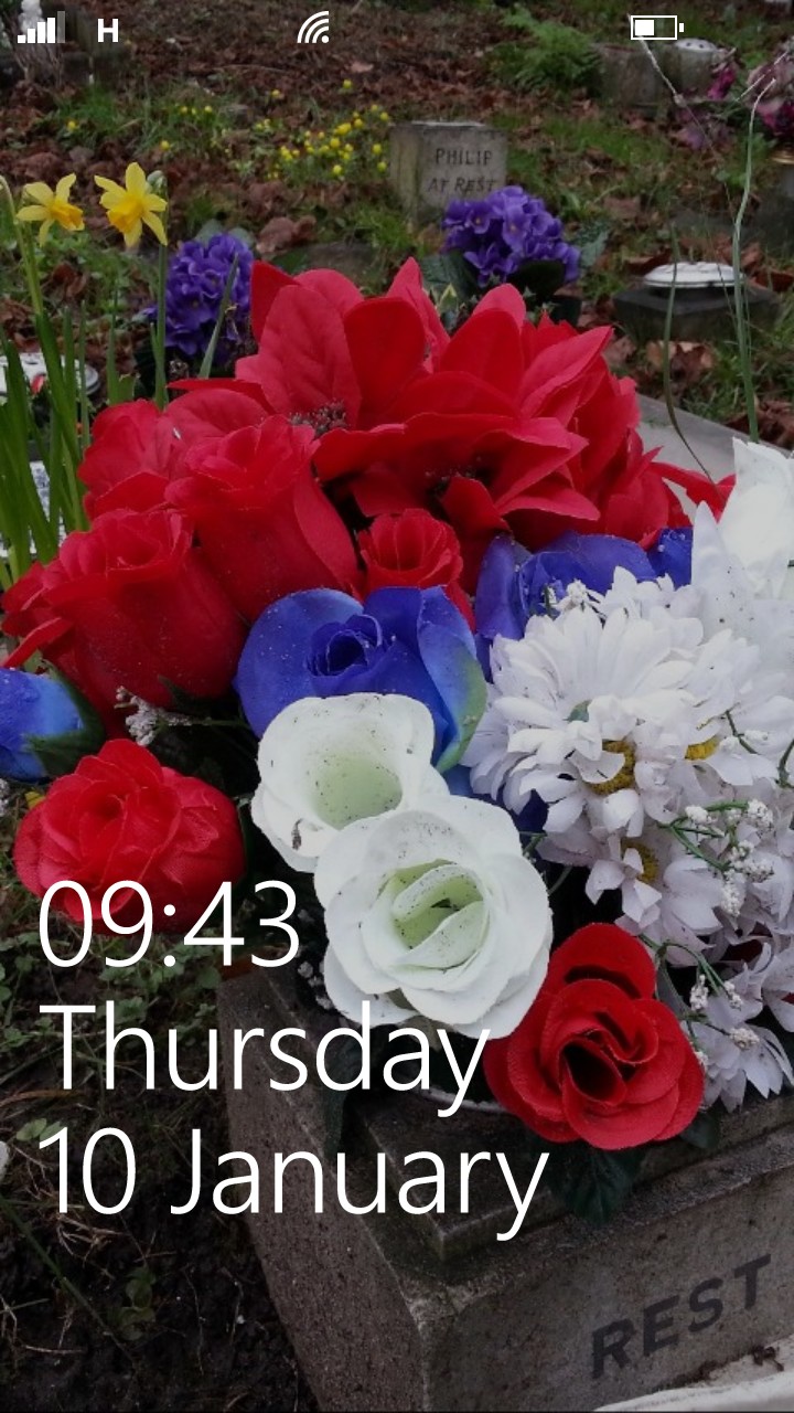
Live Wallpaper (nothing to do with the animated efforts of the same name under Android) is a simple selector for photos, which then appear in sequence on your lockscreen - so, for example, a set of favourite family photos - much as you already see under the Photo hub panorama, though this set of favourites isn't linked with that set, if you see what I mean. Sadly.

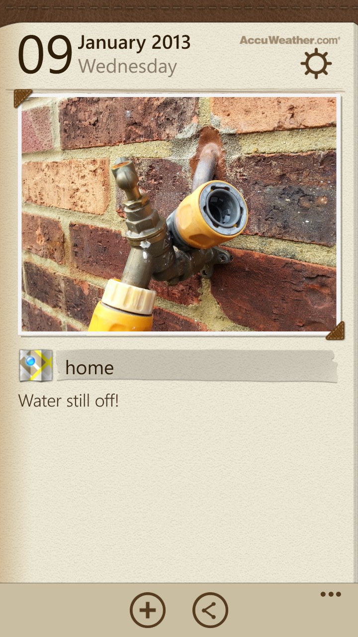
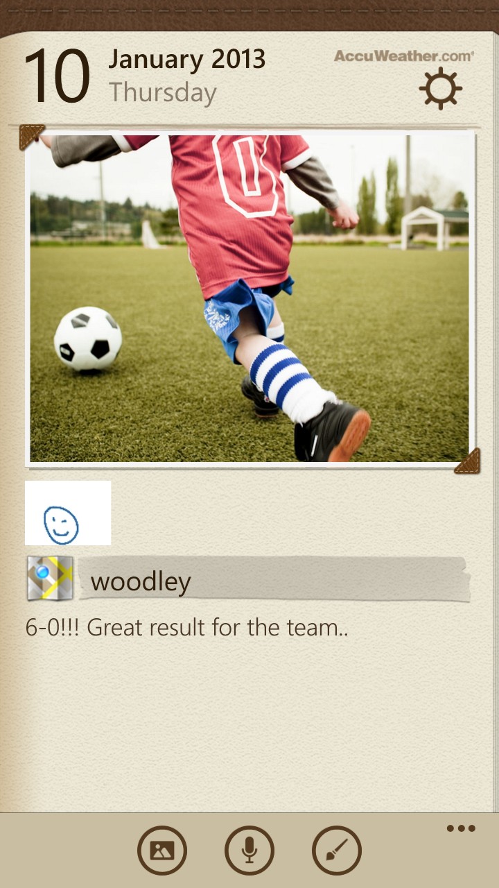
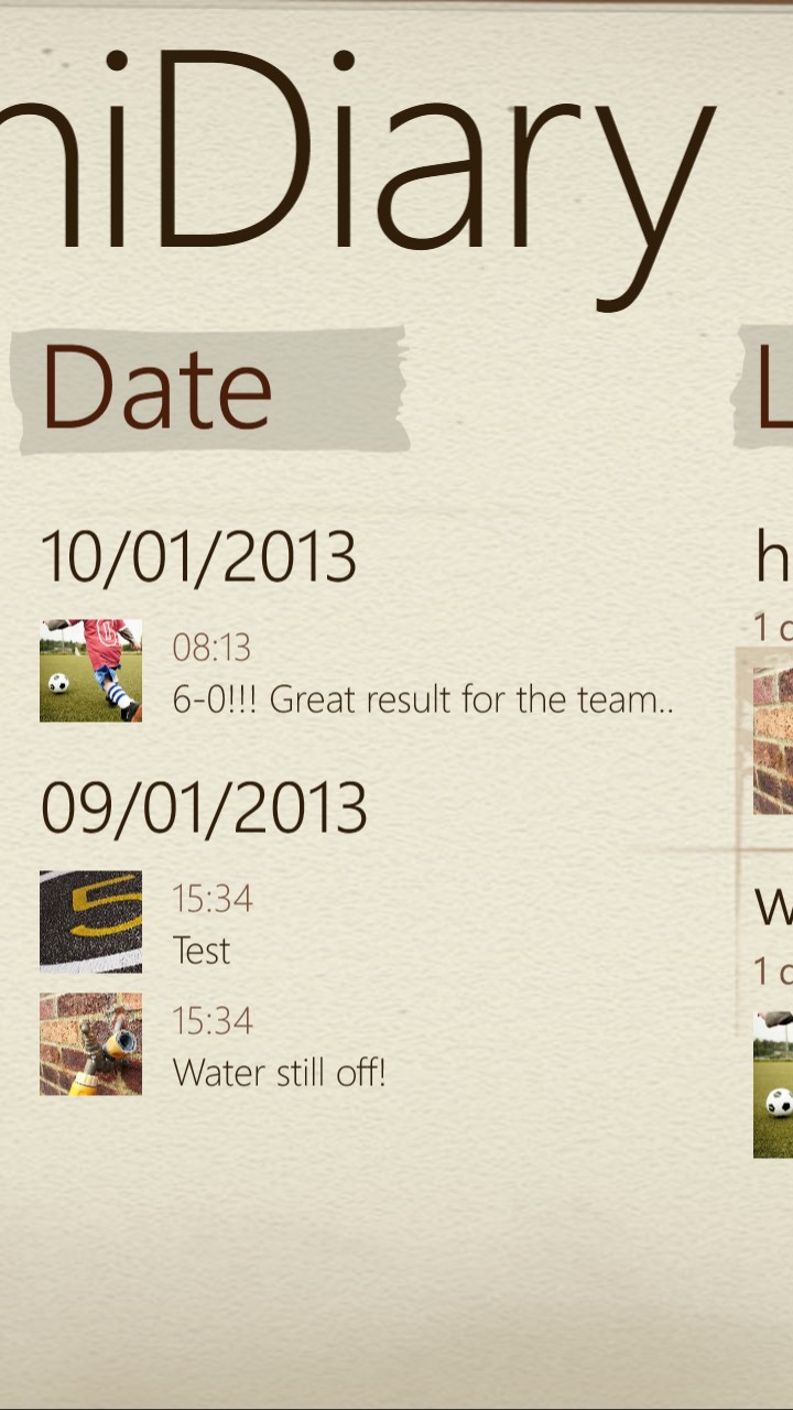
MiniDiary is a personal set of linked text notes, photos, scribbles and voice recordings, all organised by date. I normally scorn such insular data, but I was very glad to see that Samsung has now added the ability to at least back up the database to SkyDrive - and restore from it again later. So not quite any kind of standard export, but it'll do. Once nice touch is that your current location and weather are filled in automatically in a new entry, should you opt for this to happen.
Music Hub is a Samsung music store-centric front end. Dig through the commercial music opportunities and you can play your own music collection, but it's easier to just use the standard Windows Phone 'Music+Videos'. Slightly confusing for new users to have two ways into music, mind you. Presumably Samsung thinks it's worth it all just to have some new music-buying customers?
Photo Editor is a half decent image editor - you pick something from your Camera roll (or another album) and can then resize, rotate or crop it, plus apply a number of colour and novelty effects - yes, some of these are gimmicky, but it's fast, it's built-in and at least you won't have to go looking for a third party application. There's no sharing function, mind you, so if you then wanted to post edited results to a social network, you'll have to do this via the ('Saved Pictures' album and the) Photos hub as usual.


Aside from a few minor tweaks and a facelift, Samsung hasn't done much to these applications in the last year or so. You may remember Ewan criticising HTC for a similar lack of care? The extra functionality definitely qualifies under 'nice to have' rather than 'I must buy this model to get this function', with the latter perhaps being the case for the Nokia Lumia smartphones. Real time navigation is a true killer app - Nokia's Symbian phones have had this since 2007, and free since 2008. Google's Android platform introduced real time navigation (albeit requiring online connection) in 2009, so there's almost an expectation now when buying a smartphone, that navigation will be included.
Now the ATIV S does have Maps and, if you know how to work it, this gives basic direction directions that you can follow in text and graphical form, manually moving through the junctions. But no more than that. And, worse, when you bring up something on the map, you're prompted to look for 'directions' or 'drive here'. In either case you're then prompted to 'Search for an app in the Store', with the result that the only match is gMaps Pro, rather disappointingly. In fact, Navigon Europe is £73 and Navigation UK+IRL (in my case) is £31 and both are in the Store and should perhaps be highlighted. The extra price premium is unfortunate though and only goes to heighten the value proposition of the Nokia Lumia devices, especially those at the cheaper end of their range.
Navigation aside though, the extra bells and whistles of Nokia's software additions can be largely matched (or at least equivalenced) with a few timely downloads from the Store on the ATIV S, making the latter's unique selling points - its large and pleasing screen, its large capacity, removeable battery, its microSD expansion and flexibility, its use of faux-metal materials for a premium look (if not feel) - perhaps the critical factors in deciding which Windows Phone 8 handset to buy.
Samsung has done a good job with the ATIV S's hardware, producing something that's definitely desirable. The clever buyer will snap it up and, with some choice application additions, use it as the basis for a Windows Phone that will serve well for years.
_________________________
See also my ATIV S image gallery and video review in Phones Show 190. Thanks to Clove for the loan review hardware!
Reviewed by Steve Litchfield at


