Review: Twitter (official client)
Score:
65%
A little bit of a surprise this week, as an update was released to Twitter's Windows Phone client. It's been a long time coming, and with an update to the UI to bring it in line with the official client on other platforms, has the opportunity been taken to update the core functions of the app? Unfortunately not.
I've a bit of a love-hate client with Twitter (the company) and their relationship with Twitter applications. Through the new API policies, they've limited clients to either 100,000 users or double their user limit at the date of the new policy. This drives everyone back either to the website or the official mobile applications - two areas where Twitter completely control the experience. It's a far cry from the wild west of apps and interfaces that helped Twitter become the juggernaut it is today.
In all of this, the official Twitter client for Windows Phone has remained untouched, but this week somebody noticed it wasn't following the same design rules as the other first party clients, so out comes this week's update, taking the app to v2.0.0.1.
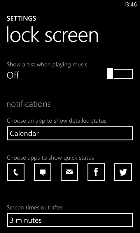
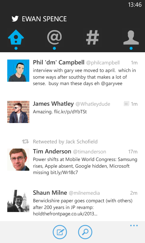
Let's be honest here, Twitter's official client on Windows Phone wasn't much cop. Beyond some casual checking of your account and replies, it didn't have anything magical about it. It had a tired washed out pastel palette, and I tended to avoid it as much as possible. On other platforms, the move to 'unify' the look and feel of the Twitter app met with anger and frustration at the loss of functionality and providing a lesser application than the previous version.
That's not the case with the Windows Phone version, which probably says a lot about how underwhelming the original application was. In terms of functionality and new features, beyond the changes to the UI I'm struggling to see what is different in this version... apart from conforming to the same base look as every other mobile Twitter app available.

Actually, there is something that has been removed that's upsetting me - the 'dark' theme. While it was never the deep black of the start screen, the dark theme of the Twitter app felt like it was close to fitting in with the UI on my handset.
There's no longer a colour choice. You'll be left with a lot of white pixels showing on the screen as Twitter forces the clean look on you (and the order of magnitude jump in battery usage to light up as much of the screen as possible on AMOLED-screened devices - boo!). Not following the user selected theme feels like bad form for an application, but there's a lot more to this client than the colour.
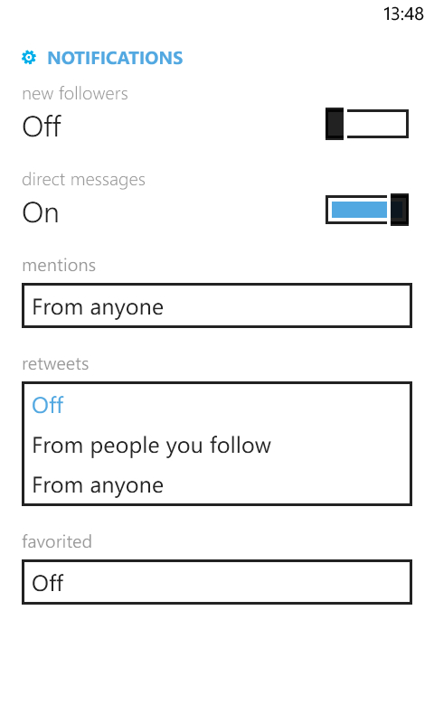
Unfortunately, the biggest missing element in the shake-up is the UI formerly known as Metro. Any attempt to follow this style in the main Twitter application window has been removed. While it might be present for the two panes in settings, and to hold the menu buttons along the bottom of the screen, you are firmly in the UI decided by Twitter here. If you're a handset switcher then this makes Twitter a recognisable experience, but that must be the minority of users - most people will have just the one smartphone, with one UI, and then Twitter comes along and takes over and says there way is better.
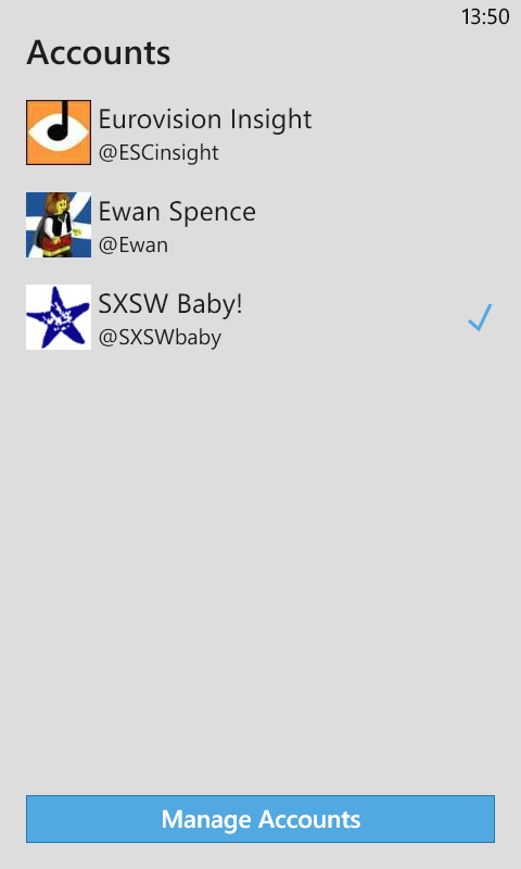
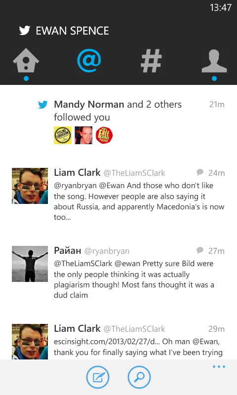
It's certainly different, with the four main views represented by four icons, for 'home', 'connect', discover' and 'Me'. You have the stream of messages from your Twitter friends under 'home', while 'connect' will show you people who have sent '@' messages and have started following you in the recent past. 'Discover' is the searching and filtering screen, allowing you to add your own search terms, although Twitter will suggest the popular hashtags to you that are trending in the world (and of course this is under Twitter's control, so expect to see some promoted topics in here), users it thinks you should be following, and options to find your friends.
The final tab is the 'me' tab, where you can see your Twitter stats and access your direct messages. This is quite pretty, but a lot of space is taken up showing you your nice bit image, your avatar, and bio text. Below this is information that is a touch useful (follower numbers, for example) before you you find the details on texts you have sent, which you will need to scroll to see.
I'm pretty sure I'll want to check my tweets a lot more than my profile.
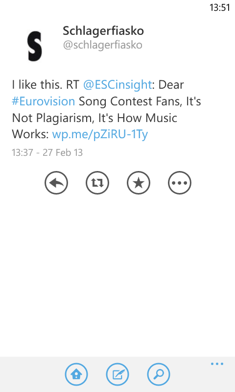
Hidden away on this screen is the small envelope icon that will lead you to your direct messages. For me, this is a part of Twitter that should have been far more prominent in the application. Why it is tucked away amazes me - I guess it's down to the fact that it is a lot harder to monetize private messages than those broadcast in the clear throughout the rest of the app/ecosystem.
Functionally, very little has changed and I still think that the People Hub does a better job of integrating Twitter than Twitter itself does. I'm also quite possessive of the Windows Phone UI, and to have this butchered to make the app look more like the app on other platforms defeats the purpose of coding an app for the platform - you might as well use HTML5 and a simple wrapper app and it would be more cost effective than reworking, once more, the tired layout that makes it harder to navigate Twitter on a mobile device.
In short, do it Twitter's way or else. And Twitter's way feels like they want you to search, and read your stream, but not fully interact with the community, while respecting their standards.
Probably the most disappointing thought on the app is, because of the 'official' moniker on it, the app will receive countless downloads, in essence justifying this method of using Twitter, when us old hands know more of the story and access this social network in much more consistent, satisfying ways.
Your comments welcome on this radical overhaul by Twitter on Windows Phone.
Reviewed by Ewan Spence at
