Review: Nokia Lumia 928 - Part 1 - Hardware
The first in this week's look at Nokia's American flagship, the Lumia 928 available exclusively on Verizon, looks at the hardware in the handset, the design, and the differences between this handset and the Lumia 920 and 925. Later on in the week, we'll have a look at Nokia's additions to Windows Phone 8 for the US market, and think about the 928's unique selling points, and if this is the handset to go for in America.
Introduction
Of course, labelling this handset as Nokia's flagship is an interesting move, given that the Lumia 928 is currently available in just one network, in one country - Verizon in America - although there are plans for a Canadian release with Rogers Wireless and Koodo Mobile. Other countries will have the Lumia 925 leading the charge, and there's a strong argument that the 920 is in place over the majority of territories.
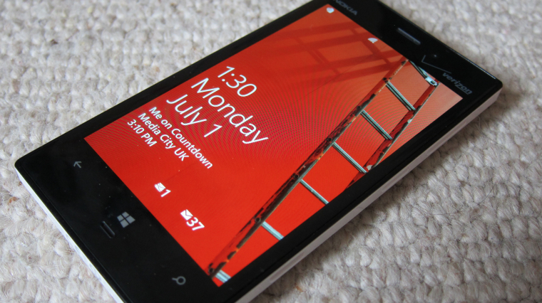
But let's run with the importance of the Lumia 928 to Nokia and Windows Phone. It is clearly an iteration on the Lumia 920, and takes many lessons from that handset, the majority of them subtle design changes in terms of styling.
It's also on Verizon, and many American smartphone fans hold up 'Big Red' as the network to be on in terms of data and coverage. A number of commenters have pointed to AT&T as being the limiting factor in moving to Windows Phone in the past - that has now been negated, and in some style. The Lumia 928 should be regarded as one of the best Windows Phones out there.
In The Box
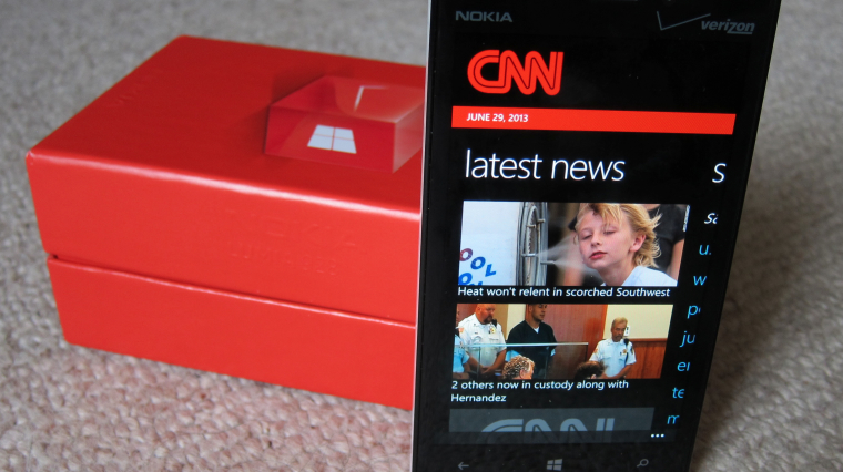
The Lumia 928 retail package follows the current minimal styling of Nokia, but taken over by Verizon. Red is everywhere, and the red tick and Windows logo are prominent, with just an embossing of the Nokia name on the side. It's laminated cardboard, with the raised tray holding the handset above the paperwork of warranty information, consumer information, radio emission information, roaming details, and the quick start guide.
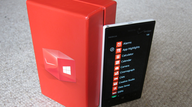
Accessories include the Nokia Fast USB charger, along with the charging and USB Data Cable... and that's it. While it would be unusual to have a silicon case in the box as standard, I'm pleasantly surprised at the lack of headphones or a headset. I've always preferred to use my own, and it reduces the build cost of the package, given that the US market is all about driving the initial handset cost as low as possible (the Lumia 928 is available with a two year plan for a subsidised handset cost of just $49).
Design and Materials
The Lumia 928 reviewed here has the white gloss effect on the rear case seen on some of the custom shells for the Lumia 620. I'm not a fan of this shiny look - it attracts fingerprints and it offers less friction in my grip compared to the black matt finish that is also offered. Personally I'd go for the matt option, but your best bet is to pick up both in-store and compare them directly.
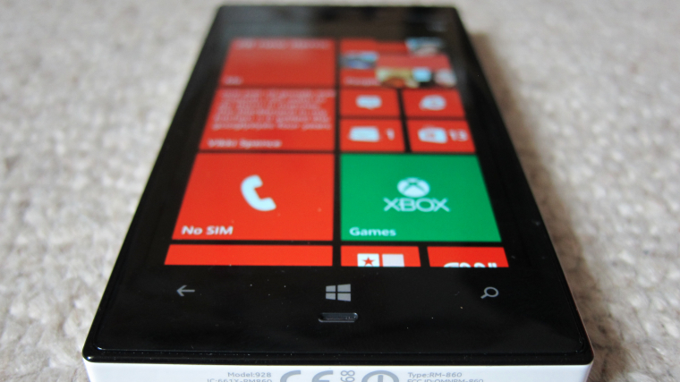
There's a very very slight bevel across the screen, but to all intents the front of the handset is flat up to about 3 millimetres away from the edge, before the front case curves quickly down to meet the edges of the handset.
All four edges of the Lumia 928 are flat, and at right angles to the screen plane. The right hand side has the familiar four buttons of the camera shutter, power and volume rocker, with the top edge holding all the ports (3.5mm audio, SIM card tray, and USB for power and data connectivity). The other two edges are left unencumbered, although much of the product data is inked into the bottom edge of the handset.
On the rear, you'll find much more bevelling than any other side, but I would say that at least two thirds of the back of the 928 is 'flat', but there's enough of a curve to fit nicely in my hand.
Also on the curve is the speaker. Lifting this up from the table and giving a clear channel for the sound to escape is a smart move, and while there is a little bit of reduction in the bass levels because of the absorption in the echo, it's at acceptable levels. It's also clear of my hand when holding the handset in landscape mode while playing games.
You also have the PureView branded Carl Zeiss lens under the Xenon flash and LED focussing light - more on that shortly - and the microphone that is used when the 928 is in speakerphone mode.
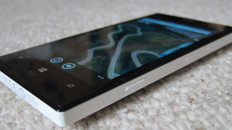
There's no getting away from it, the Lumia 928 is a 'boxy' handset compared to the curves and swooshes of the Lumia 920, or the bulging of the sides on the Lumia 820. It suits my personal preference, and it feels more mature than the 920 and 820 handsets before it. It's easy to grip in my hand, and very easy to lift off from a table, no matter if it is screen up or screen down.
The Lumia 928 will contrast well with the iPhone 5 and the Samsung Galaxy S4 in retail channels, The Galaxy S4 is a mix of different radial curves on every edge, while the rounded corners of the iPhone 5 will be contrasted nicely. Perhaps the only case of mistaken identity would be with the Sony Xperia Z, which has the same box-like functional design.
The Lumia 928 has dropped the need for a SIM ejection tool, with the caddy tray removable with a decent sized finger nail. As with other Windows Phone handsets, the 928 uses a microSIM, and with it currently an exclusive to Verizon, you'll get a suitable SIM card when you buy the phone.
The USB socket has moved back up to the top of the device - the Lumia 920 had it at the bottom of the unit, and it feels more natural for me to have it there, rather than a return to a similar location as we saw on the Lumia 800 and 900. With so much technology being packed inside these handsets it's a huge jigsaw to decide where everything goes, so perhaps it's a bit picky to query this location.
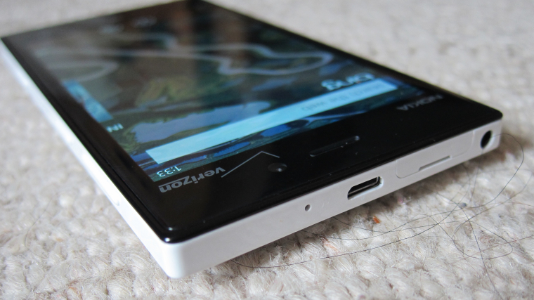
I'm torn on the styling of the Lumia 928. Personally I prefer the square boxy design that's on offer here, with just enough of a curve that stops the edges feeling harsh but still delivers a solid feel and a good grip. But it does look retro, and while it's easy to tell apart from the majority of smartphones that are in the same price point, that's because the design feels old. For me, form will always be subservient to function, but the modern smartphone needs to balance both areas, and I think the 928 needs to look a little more to the fashion style. That's not helped by a limited range of colours - matt black or gloss white is it, and I would have expected Verizon at a minimum to have a third model coloured in corporate red.
Size and Weight
The Lumia 928 is slightly smaller (ok, thinner) than the 920 it's partially replacing in the US (and also undercuts it in volume and weight). For reference, here's Rafe's table from the Lumia 928's launch:
| Device | Size (mm) | Volume (cc) | Weight (g) |
| Lumia 928 | 133.0 x 68.9 x 10.1 |
92.75 | 162 |
| Lumia 920 | 130.0 x 70.8 x 10.7 | 99 | 185 |
| Lumia 900 |
127.8 x 68.5 x 11.5 |
90 | 160 |
| HTC 8X | 132.4 x 66.2 x 10.1 | 86 | 130 |
| HTC One X | 134.4 x 69.9 x 8.9 | 84.4 | 130 |
| Samsung Galaxy S III | 136.6 x 70.6 x 8.6 | 82.2 | 133 |
| Apple iPhone 5 | 123.8 x 58.6 x 7.6 | 76 | 112 |
The Lumia 928 is a 'big' handset but over the last year or two the size of a high-end smartphone has sneaked up, so while the Lumia 900 was regarded as a large device, the 928 will be seen as a 'regular' size for a smartphone, even though it's actually larger and heavier than the Lumia 900.
From a practical point of view, I think the 928 gets the balance of size and screen correct. The black bezel between the screen and the edge allows you to have a bit of the ball of your thumb overlapping on the left, and the same with your fingers on the other side. I'd like to see a bit less black at the top and bottom of the screen, but I think that's led more by a case of needing the volume to get all the hardware into the 928 than a stylistic choice.
The Lumia 928 is (just about) a one handed smartphone, with some dead space on the right hand side of the screen and in the top-right corner that needs a lot of stretch from my thumb when held in my left hand. Windows Phone's UI does help a lot here, placing a focus on large buttons and clickable text. Because of the boxy styling, even at the stretch the phone feels safe in my hand, which was less true in the incredibly curvy 920.
Battery-wise, we're back with a sealed unit providing 2000 mAh. Nokia give that a standby time of up to 600 hours on 2G, but this will drop to 513 hours on a 3G network. Using data will have a significant impact on those numbers, and the Lumia 928 can manage around six hours of browsing time. Qi wireless charging is supported out of the box, but you will need to buy your own charging pads.
Screen Display
The screen is not vertically centred, with a touch more bezel at the bottom of the screen, that holds the three regular Windows Phone buttons (back, Windows, search). These are capacitive buttons, and while they are backlit, this will only kick in when the ambient light sensor decides it is dark enough. For a long time I thought the backlit nature had been dropped.
Above the screen you have the Nokia logo on the left, and Verizon's logo and tick on the right. A few times I looked down and thought the tick of Verizon was a scratch on the screen. It's not, but it's one of the most distracting elements on the front of the device - though I guess the network needs to get its branding somewhere!
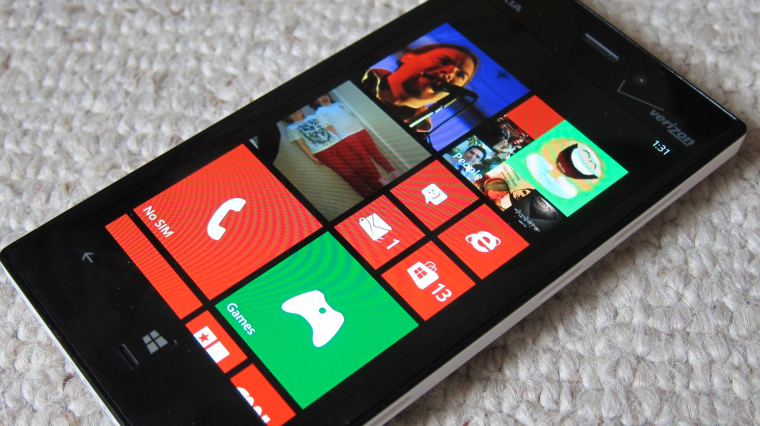
The screen itself is an 4.5 inch AMOLED screen, with a slightly more than 720p resolution WXGA resolution (1280 x 768 pixels). It features Nokia's ClearBlack technology that highlights the on-screen colours and creates a much inkier black. This is a change away from the LCD screen of the 920, and matches the technology that is being used in the Lumia 925, and all three use the PureMotion HD+ technology that was demonstrated last September.
The screen also has Nokia's super sensitive touch technology, allowing you to use the touchscreen while wearing gloves. This is particularly useful in colder environments, but also allows a number of third party stylii to be used easily with the display if that's your thing. This is toggleable in the settings, as it does use a little more battery power, but I'm happy enough to leave it on so that it's always there when needed.
This is no longer unique to Nokia, with a number of manufacturers bringing similar technology to the High Street, but it's still a good selling point for Nokia and Verizon to promote.
Internals and performance
The Nokia Lumia 928, as with all Windows Phones, uses Qualcomm Snapdragon architecture. In the case of the 928 it is an S4 chip, running two cores at 1.5 GHz. Alongside that there is 1GB of RAM, and 32GB of on board storage. The 928 does not have space for a microSD card to add in extra storage for your media files. That limits the 928 in the long term, but smart use of Microsoft's SkyDrive and moving files off your handset to your desk-bound computer should ensure you always have enough room free.
I'm glad that there isn't a 16GB option available, as it would leave this high-end device rather snug for storage once the user puts on some music and video. Given the importance of having good user feedback to build up Windows Phone's profile in America, sticking to just one model with 32GB of memory makes strategic sense.
Running WPBench on the Lumia 928 gives a score of of 235 (strictly speaking 234.98). That's slightly more than the Lumia 920's score of 228, and well ahead of the 88 that the Lumia 800 debuted with. Running a similar hardware family to the 920, that's not a surprising difference, and I would think that the tweaks and changes in Windows Phone in the last six months will be behind the slightly higher score rather than any hardware changes.
The Lumia 928 comes in one variant in terms of frequencies and LTE bands.
- 2.5G GSM/GPRS/EDGE – 850, 900, 1800, 1900 MHz; 2.5G CDMA 1xRTT/1x-Advanced - 800, 1900 MHz; 3G UMTS/DC-HSPA+ – 850, 900, 1900, 2100 MHz; 3G CDMA Ev-DO Rev. A - 800, 1900 MHz; 4G LTE Rel. 8 (UE Cat 3) – 700, 800, 900, 1800, 2100, 2600 MHz.
Specifically tailored to Verizon's 4G LTE network, the Lumia 928 gets some of the best data speeds possible on the network (although there are reports that it's still not as fast as other 4G LTE enabled handsets), while the HSPA+ circuitry allows you to maintain a decent data speed level if you go for data services while roaming internationally.
Conclusions
In terms of design, there is very little difference between the Lumia 925 and the Lumia 928. We'll be carrying on looking at the Lumia 925 in depth here on All About Windows Phone, but having spent some time with the Lumia 928, I'm really enjoying the handset. While it is an older style of design, it's one that works for me.
It is slightly larger than the Lumia 820 I've been using since the start of the year, and I would be more than happy to make the switch if I was based in America. And that's an important consideration to make with the 928 - it's not a replacement for the Lumia 920 (or 925), it's a sister product. Quite apart from the radio differences and network lock to Verizon(!), the American marketplace is slightly different to the rest of the world, with the networks commanding a lot more influence in the design and delivery.
Nokia wanted to get their best handset and technology onto the Verizon network, and the result is this custom build, the Lumia 928. It takes the best of Windows Phone, tweaks it for Big Red, and gives it a very attractive initial price of $49 on contract. There's a lot to like here, and if you're looking for a Windows Phone, there are no major flaws in the hardware.
I'll have part 2 of my review in a day or so, with a little help from Steve, looking at the Lumia 928's camera and imaging software, before finishing off by looking at the device's software bundle and other tweaks.
Reviewed by Ewan Spence at
