Review: Surfy (web browser)
Score:
77%
It's not often I review a web browser - for the very good reason that Internet Explorer in Windows Phone 8.1 is now pretty capable. And Surfy is no doubt based on the same underlying web rendering controls - but it claims to add all sorts of 'bells and whistles' too, making it well worth a look. (Note that I'll be reviewing several other third party browsers in the coming weeks, before declaring a favourite!)
Buy Link | Download / Information Link
Available in both free and paid forms, the main difference seems to be that the paid version allows the use of more than three tabs, which seems fair enough. In fact, the 'tabs' thing is one of the unique selling points of Surfy in the first place, with a desktop-like array of tabs across the top of the screen - not that spectacular in portrait mode, but extremely useful in landscape mode, especially when using the paid version and you can (visually) switch between six or seven tabs, say.
Tabs are useful then, though they do take up screen real estate - happily Surfy has an answer for that too, with a true full-screen mode, something which Internet Explorer sadly lacks. This also removes the bottom toolbar, the most obvious clunkiness from IE, and merely leaves a tiny arrow, bottom-right, for restoring the UI when needed. It's a system that works very well indeed, in both portrait and landscape modes.
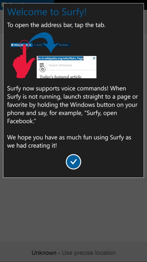

The opening tip pane - the voice control isn't touted, but isn't that reliable in real world use; (right) getting going, here on the CNN web site. Note the toolbar at the bottom, this moves to the right in landscape (below) and can be dismissed altogether in full-screen mode...

Note also the three tabs, desktop-style, along the top. With the paid version, you can have more than three!
So, two for two, how far can Surfy take me into its journey of add-on features? Next up are the various rendering modes. Now, sites already introduce a huge number of variables, by serving up different versions of their content on different platforms and devices, but on IE you're stuck with what you get. Not so in Surfy, with 'reading mode' (as it sounds, stripping out any fancy layout) and 'desktop mode'. This latter is curious, I presumed that this would make Surfy pretend to be a desktop browser, with appropriate user agents, but it seems that this doesn't work most of the time, leaving me constantly with a blank page, scrolling dots and, eventually, a crash of the application - the first chink in Surfy's armour?


In IE, this current NYT article is a disaster; (right) In Surfy it's no problem. Even less so in its reading mode, seen here!


Asking for 'desktop mode' was clearly too much, and a blank page merely preceded an app crash...; (right) there's session/URL restoration, at least, when you next start Surfy up....
The flaws then come quick and fast, rather sadly. The inertial scrolling is way too slow - on long home pages or long stories, you have to swipe and swipe and swipe, because the page scrolling is strictly limited in speed. There's an innovative 'listen to page' function, which reads the content out to you - a lovely idea and most of the heavy lifting is done by Windows Phone 8.1 itself, but the page is read from the first character behind the first image, leading to the first minute of a read back often consisting of all the menus and all the buttons and top level image descriptions. Eventually the main content is reached, but the moment's usually passed by that point. What should happen, of course, is that the browser should identify the main block of text, the main story on a page, and start from there.
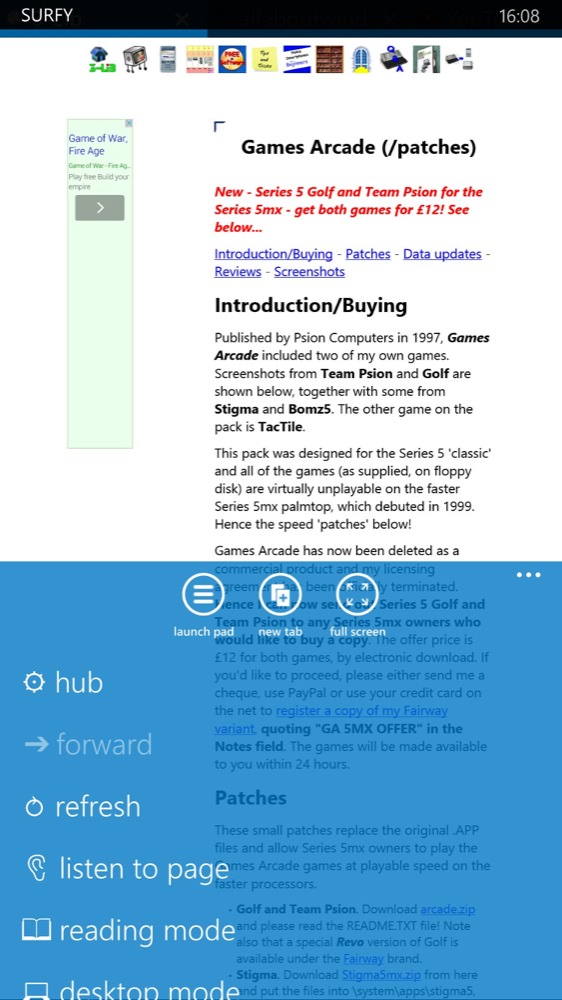
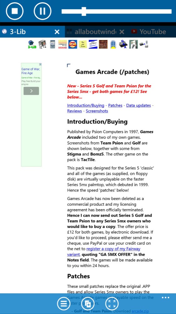
'Listen to page'? Wow. It works, too, albeit with far too much reading of screen 'furniture' as well....
Also definitely in the 'bells and whistles' category is a 'download video' function that pops up in the menu when on the likes of YouTube. There are standalone programs to achieve the same result, but it would have been nice to have it built into the browser. Sadly, every time I tried to use it, I got an error message and no file.
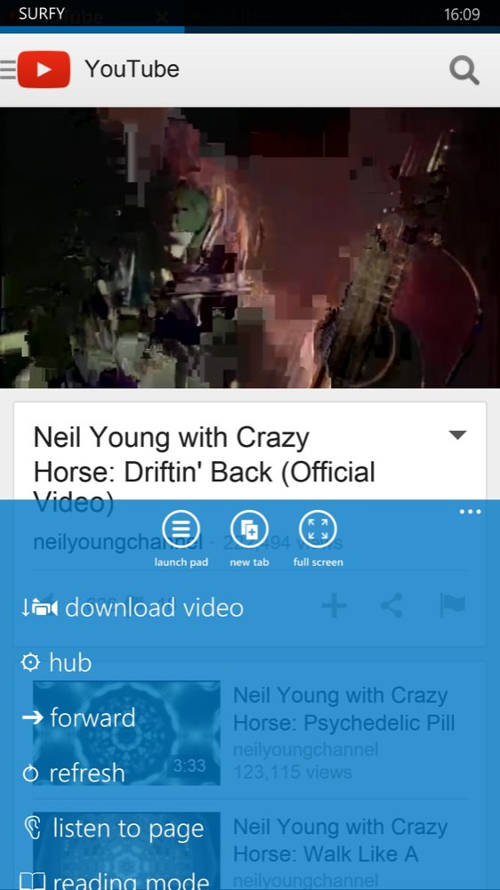

An integral video downloader didn't work too well....(!) Whatever, I did, nothing seemed to be able to be downloaded....
More successful are 'private browsing' (as you'd expect, but also turns the UI controls black as a reminder) and 'night dimmer', stopping you from getting blinded when reading web pages (with bright white backdrops) in the dark.


The night dimmer in action - works surprisingly well in pitch dark conditions; (right) the 'favorites' list, without (shock horror) a link to AAWP. Devs, you should be ashamed of yourselves!
A 'launch pad' provides graphical shortcuts to favourite pages and HTML5 games, the latter seemingly provided to help provide Surfy with a source of in-app income, and you can't add your own games to the mix. Happily, you can add your own pages, via the '+' control, though there's no 'favicon' use (sadly) and this pad rather overlaps with the main favourites listings, though at least you can get to the latter from the former.
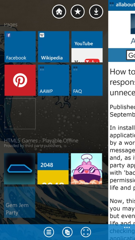
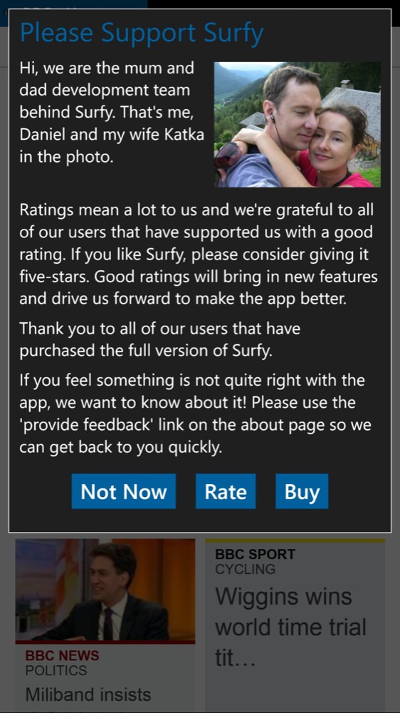
The slide-out 'launch pad', here with a couple of extra tiles added by me, and showing some of the HTML5 games ready to roll too...; (right) the rather cute About screen!
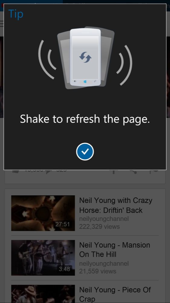
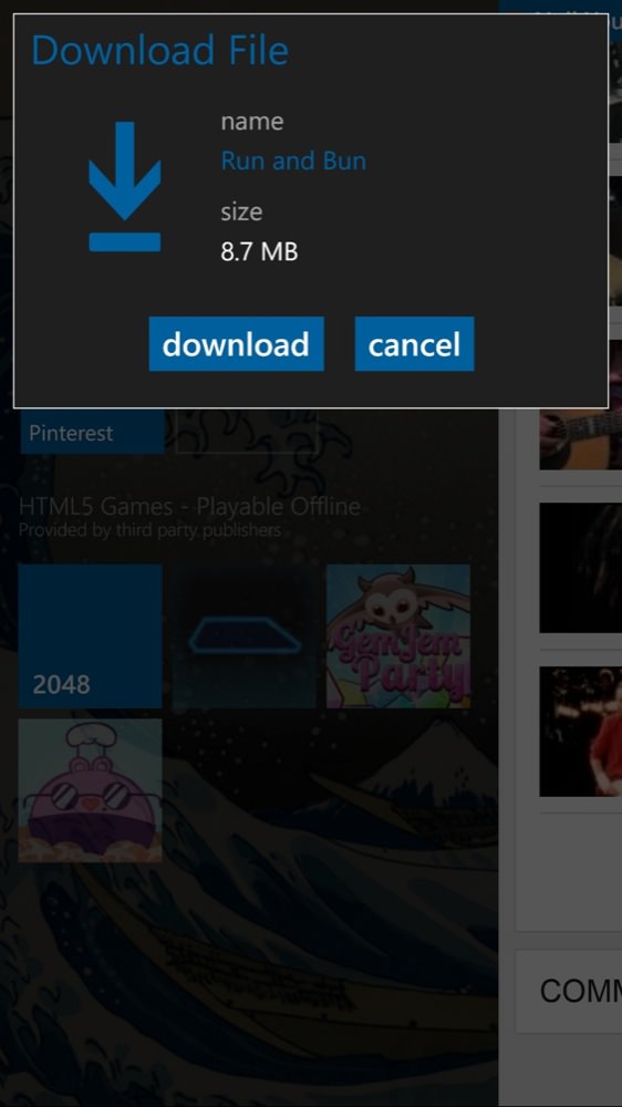
Yes, yes, there's shake to refresh, guaranteed to get you funny looks in public! (right) Each of the HTML5 games actually has to be downloaded, but they're tiny...

...and also fairly rubbish - and freemium. Best steer clear?
Add in a few orientation glitches after playing the aforementioned games and you can see that Surfy has something of a mixed report card. Having said that, there are selling points here that do make it worth loading up - and paying for. Being able to keep half a dozen tabs open (and see which ones) is valuable, being able to go truly full screen is a boon and the extra reading modes provide a way to potentially view pages which are eluding Internet Explorer. Just take the other functions with something of a pinch of salt - I'm sure the developers are onto some of the bugs and issues mentioned already.
There's actually more to Surfy than covered in this review, especially in the area of handling downloads, but as the browser is free to trial, why not grab it and have a play yourself? Even if it's not 100% reliable for you right now, I'd recommend keeping it installed and watching for updates.
Reviewed by Steve Litchfield at
