Review: Fenice for Twitter
Score:
64%
Now six months into development, I thought it high time to give Fenice for Twitter the review treatment. The bar is set high though - by Tweetium, by Aeries, and others, so any new Twitter client is going to have to really shine in order to win a recommendation. In fact, Fenice comes off as usable but quirky and buggy - and with no real advantages over the much more mature Tweetium, in particular.
Buy Link | Download / Information Link
Having given away my verdict in the opening paragraph then, we'll press on, since Fenice is still a competent piece of code and there's certainly potential. 'Fenice', as far as I can tell, is Italian for 'Phoenix', so continuing the bird theme beloved of Twitter itself.
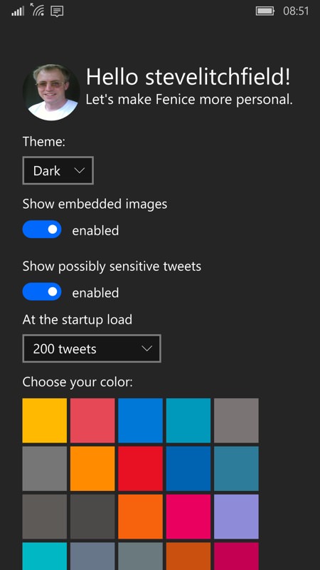
There are some helpful startup choices in terms of theme and colour scheme and then it's into signing into Twitter and your timeline. Of which more in a moment.
Some more settings to show off first, Fenice impresses by being very customisable and by everything being very 'Windows 10' - as you'd expect since this is a universal application and, once bought, should also work fine on a laptop or similar. There are some oddities though - just visible at the top on the left is the slider for text size, except that there's no preview - and the only way to see what the new slider position means is to manually close it from the Windows 10 multitasking carousel and then restart the entire application. Also slightly odd is the '5° button' - am I being thick here? What exactly is this??
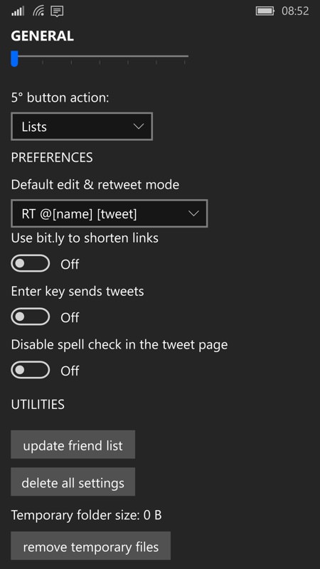
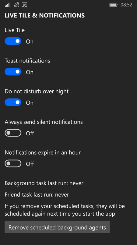
The cache clearing and background task controls are handy, though perhaps rather over the top - they're both very temporary measures, presumably to be used when troubleshooting.
And so to my timelines, arranged in the traditional tweets/mentions/DMs order and swipeable, horizontally. There are no per-tweet controls on-screen - instead the idea is to tap through and you'll find the necessary controls, plus background data like datestamp, posting app and tweet stats. It all works quite well - though not as slick as Tweetium perhaps, which has the best of both worlds in terms of instant sharing and detailed data.
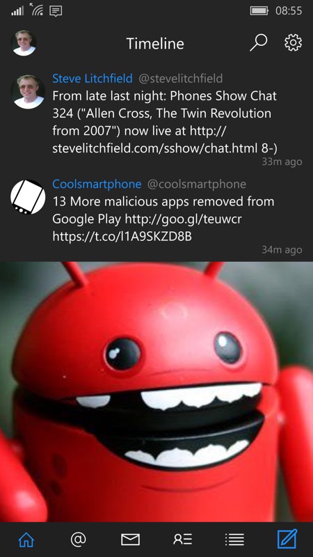

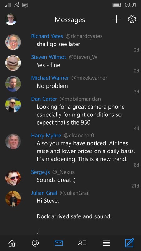
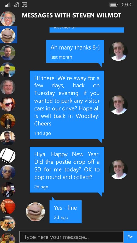
Things become slightly less traditional as you head into Direct Messages, with a message list giving way to a conversation view adorned by a left-side river of contact thumbnails. See the screenshots below, hopefully devoid of any personal information that might incriminate me (or one of my friends)!
Other tabs in the Fenice interface give way to Profile and Lists. I was impressed by the way one's profile can be edited in Fenice, though the character counter is both misleading and redundant:

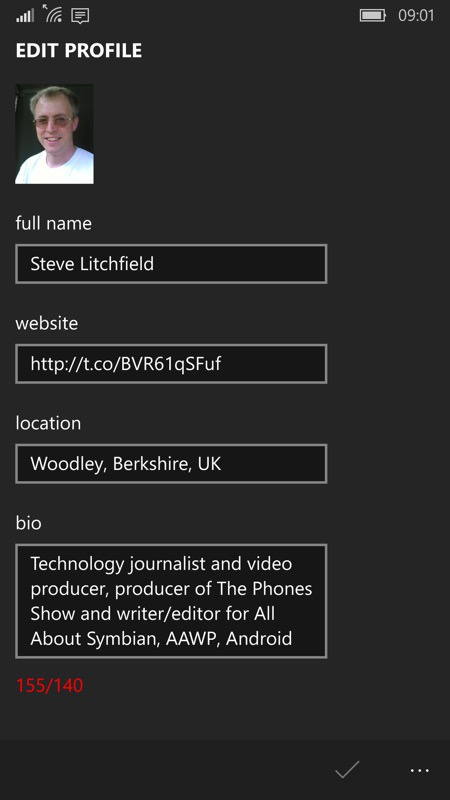
(Hmm.... I've been stuck at six a half thousand followers for two years now. Seems I've plateaued!)
But, having established that all's pretty functional in Fenice - we start to hit quirks and issues aplenty. I have to call the application out for its handling of photos - they're cropped left and right, in order to appear 'bigger' and give more prominence to the central subject (usually), but any image with textual content shows the cropping in a bad light. Here's an example from yesterday, covering Bowie's death. Note the missing text in the timeline version - tapping through then shows all of the image, scaled properly, in the tweet detail view.


Not a showstopper on its own, but annoying, given that there's no setting to turn off this cropping behaviour. The more text contained in an image, the worse the cropping seems. Below left is another bad example:

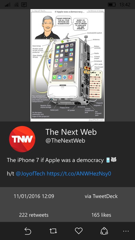
But there's more - images aren't zoomable, meaning that you can't pinch and zoom in on detail, even in the tweet page. Look at the densely annotated example, above, right. Multi-touch does nothing - a single tap does nothing - and in the end you work out that you have to double tap, which sends the image off to Windows 10 Photos (in this case, since I'm testing this on the Lumia 930 with Insiders Preview). Inside Photos you can indeed 'splay' to zoom in on detail, but it's all a far cry from having this basic functionality built into Fenice.
Then there are ugly artefacts when things go wrong - Fenice does not fail prettily. I went out of cellular coverage at one point and saw first a 'toast' error that was truncated and couldn't be tapped on - and this was repeatable on starting Fenice - then if you proceed anyway, all the panes are blank - and white! - despite the store of cached tweets and data mentioned earlier. There's clearly work to do here for the developer.


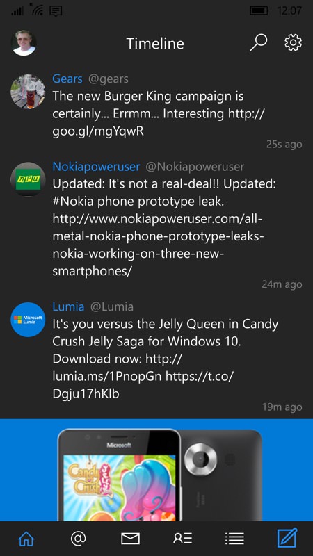
Then there are issues with timeline sorting - I lost count of the number of times that gaps appeared in my timeline, a couple of hours of missing tweets and no way to fill them in with a refresh of some kind. Just as annoyingly, the chronological ordering was usually messed up. You can see both issues in the screenshot below, left:
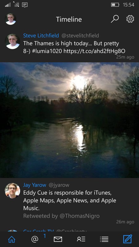
Then there are issues with attaching images to a tweet, with more taps than are strictly needed, transitions which send text flying across the screen as each pane is swiped in - fun the first time but annoying for the following 9,999 times and no way to turn these off.
When it works though, Fenice is attractive and clearly worthy of consideration - but it's only beta-quality at the moment, in my eyes. Much like Windows 10 Mobile itself, of course. Though the two aren't directly related!
Keep your eyes on Fenice for Twitter and by all means send the developer some purchase money, but don't expect a fully mature Twitter client yet.
Reviewed by Steve Litchfield at
