Review: Fliky UWP (Flickr client)
Score:
80%
Another day, another top notch UWP client for a major Internet property. In this case, Flickr, the photo hosting and sharing service. I've been a Flickr fan for half a decade now and getting involved with it on a Windows Phone has always been a bit up and down in terms of first and third party applications, with titles coming and going. Fliky is a new UWP client that looks good for the near future anyway, and with only a small gotcha or two on the uploading side.
Buy Link | Download / Information Link
As with Awesome Tube UWP yesterday, the concept of a 'client' for a service (taking what's available via Edge on the web and going one step further) seems a little unnecessary until you stop and look at the sheer experience. It's the same for most of the niche/banking/long-tail apps that are missing from Windows Phone/Windows 10 Mobile as part of the 'app gap' - you can access almost everything through Edge if you want to - but you shouldn't have to. So YouTube works via the Edge browser, as does Flickr, but both involve significantly more tapping and swiping, plus you have to put up with the browser address bar up all the time and whatever fonts Edge decides are best, irrespective of what it's showing.
And so to Fliky, a UWP client for Flickr, treading directly on Perfect Flicker's toes, though arguably doing a better job, which is why I'm recommending it here.
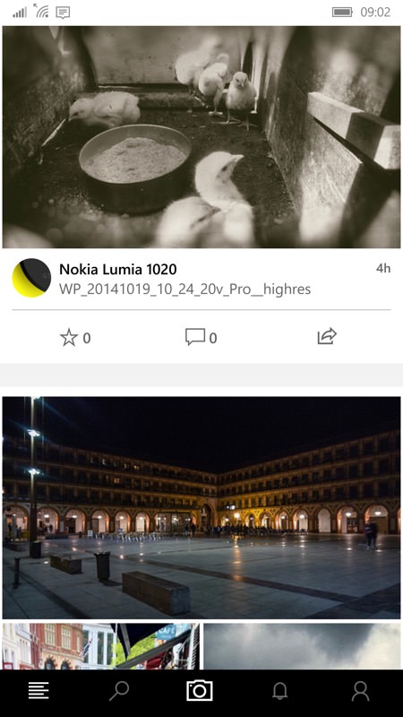
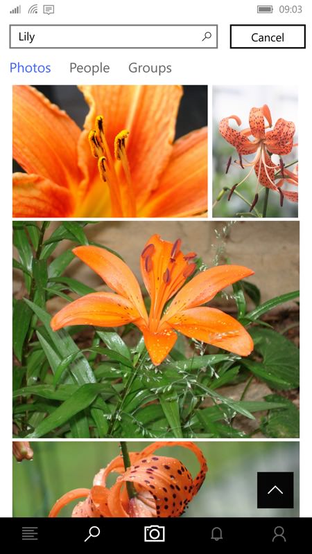
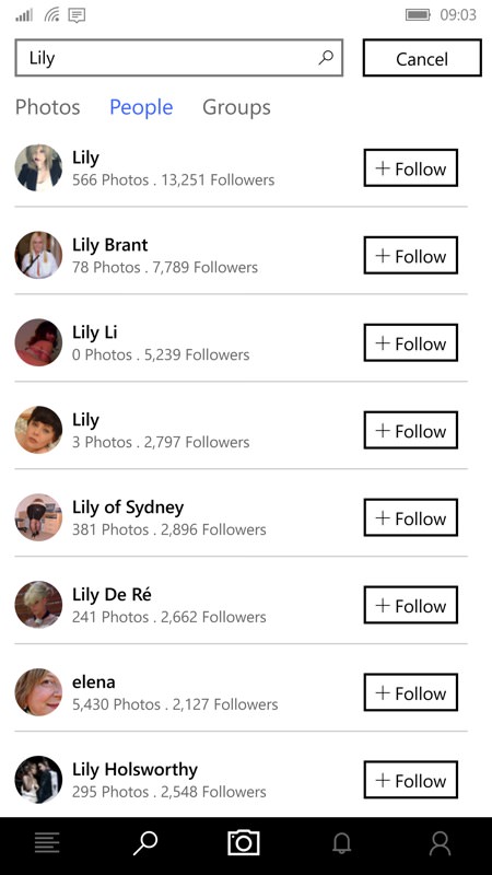
The usual views are available, from your Flickr 'home' (with photos from the people you follow), the ability to delve into specific groups, plus a search facility, helpfully partitioned to search within photos, people or groups. The fluidity here and the way multiple images download and render in parallel reminds me of the official Flickr client on other mobile platforms.

At first glance the content seems almost like a scrape or repurposing of the Flickr web site, but as you start interacting with the photos you realise that this is a full native experience. For example, in the screenshot above, right I've multi-touch zoomed into a nice Iceland shot such that the photo fills the phone screen, yet with the controls and information all still available, transparently. And yes, tapping the image again removes the controls, don't worry. It's a very slick and responsive experience.
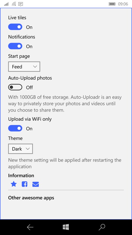
Everything so far has been very web-like in terms of background, i.e. white, but there's a dark theme that can be enabled and this puts you into a much more natural, battery-saving and luxurious experience, at least on AMOLED screened phones. As often happens with apps, you need to manually terminate and then restart Fliky to get this going, but this is normal and is a one-time inconvenience.
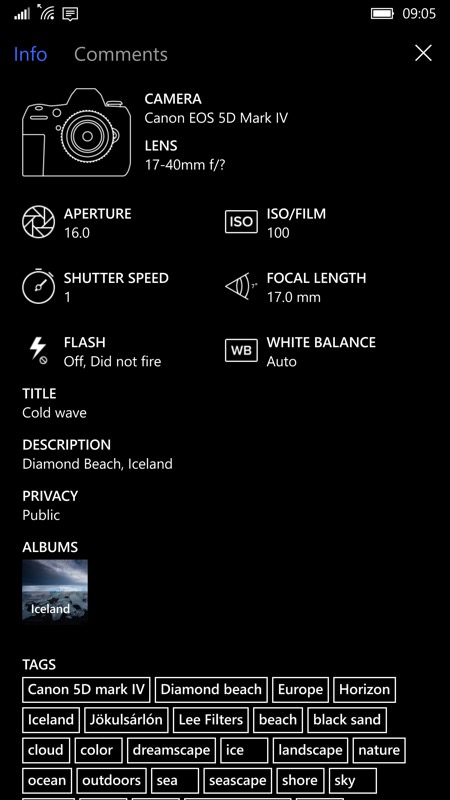
As you'd expect from a Flickr client, the basic EXIF data is available for any image, along with all the tags the uploader used - helpful if you're trying to work out why he/she has got so many views compared to your own uploads!
Talking of which, these are represented in the profile section, where you can filter between public, friends and family, or even expand out into specific albums, and so on. Your existing Flickr profile art is used, just as on the web and photos are presented in thumbnail fashion, in date or grid layout depending on what you're looking at.
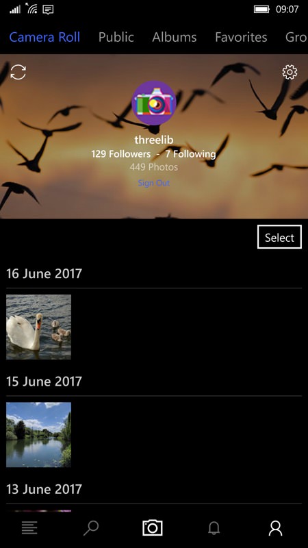
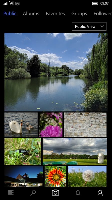
And then we're into actually uploading photos using Fliky - perhaps the most critical function of all in a client. And, sadly, this is where it goes a little pear-shaped, at least in the version being reviewed. The central botom control gives access to your photo gallery on the phone - just pick the one you want to upload, add a title and tap on 'Upload'. What could go wrong?
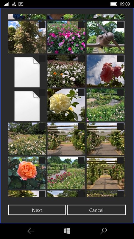
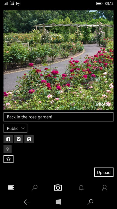
Actually, quite a bit. For starters, the UI only presents a square - and non-centred view of your photo, leading to uncertainty as to whether the upload will be of the full image. Next, the photo(s) get(s) uploaded in the background, which is fair enough, i.e. while you carry on using the UI. But unless I'm missing something there's no way to track the progress of uploads, and - worse - no way to see them once they're in place. You'd think that the 'refresh' icon in your profile view would refresh the view of your Camera Roll but no, this is actually a short cut to the auto-uploader facility, and no amount of tapping and swiping would refresh the views to show the photos uploaded.
Photos do show up - eventually in the Photostream, but the final ignominy is the photos that I'd carefully added titles to ended up with their filenames used on Flickr and not my edits.
Oh well, it's early days for this UWP app and the developer has a good track record - I'm sure there are bug fixes to come and I'm prepared to stay optimistic here.
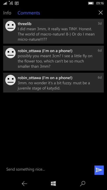
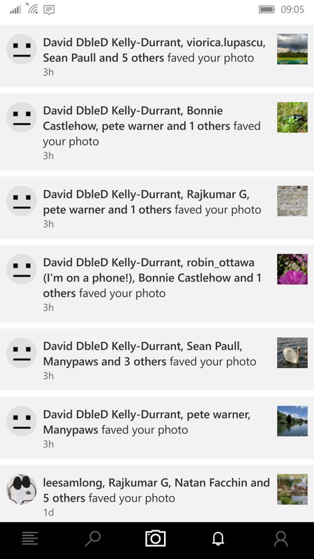
Meanwhile, the UI is a pleasure to use, keeping up with what others are saying about your own (or other people's) photos and generally getting involved. Flickr's not really a social network, but there are definitely social aspects.


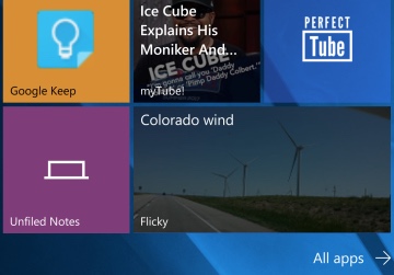
There's a live tile too, and a pretty one, with all sizes and cycling between some recent photos from your Flickr home timeline, bringin up first the image and then a faded version with title overlay. Perfect, and fun to see what others are adding through the day everytime you glance at your Start screen.

Finally, this being a full Windows 10 UWP application, this also works on Xbox, tablet, laptop and, here, on a connected Continuum secondary display - and on almost all views the full landscape orientation is used to good effect, so plug your phone into a large TV via cable or the wireless adapter and you have a good way to show off your Flickr photos to others.
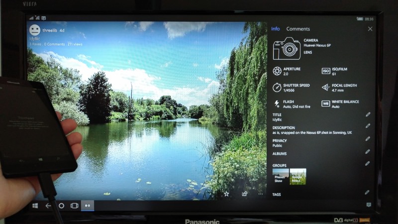
Upload issues aside, Fliky UWP deserves its 80% rating here. There are in-app ads which are £1.50 to remove (per Windows account) and I zapped these after 30 seconds, let's hope that the developer feels suitably incentivised to keep up the good work - with some bug fixes in the uploader section, Fliky could be insanely great. Right now, along with Perfect Flicker, it comes under the category of 'close, but no cigar'!
Reviewed by Steve Litchfield at
