Review: eBay
Score:
76%
It's an established powerhouse destination on the internet, but what I love about eBay (apart from the fact that I've finally managed to land myself a Winchester Filofax) is that it continues to strive and stay at the cutting edge. That includes online payments (PayPal), ticketing (StubHub), classified (Kijiji); or making sure that no matter what you are using when you decide to buy something at the digital flea market, there is a simple and quick eBay method to use. Which sets us up nicely to look at their Windows Phone application.
Version Reviewed: 1.13.0.0
Buy Link | Download / Information Link
While writing last week about The Guardian's mobile application I made the assertion that the mobile website was better suited for me than the app. In the case of eBay, the opposite is true.
The mobile website is working on a lowest common denominator principle, so we have a singe column site, with lots of full width list menus and little configuration or personalisation.
Role up to the server with your Windows Mobile eBay app, however, and it starts to look a lot more exciting. Once you create an account or log-in, in a familiar panorama view appears. Admittedly it only has two views: a front page with notes on any actions you need to perform and some popular searches; a second view called "My eBay" is where you'll be able to jump to the relevant parts of your account, such as: the items you are watching and bidding on, items you have won, and your eBay messages.
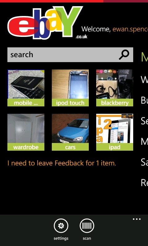

The minimalist opening panorama.
I also like that your recent searches, made on the phone, can be called up again, alongside any saved searches. The latter will alert you when a specific item is listed on eBay so you don't have to search every day in case you miss a listing.
Naturally when you find and click through to an item you can place a bid, read the feedback about the seller, and everything else you can do on the desktop. While a website still needs to think about cross-device compatibility, an application allows the developers much more control over what is presented to the end-user. When comparing eBay's mobile site and mobile app on the same smartphone, you can see the difference that a well-coded application can make - eBay is far slicker and speedier in the app than in the browser.
And then you have the little extra features. Being able to pin a search to your start menu for the paranoid, or even an individual auction is a smart use of the live tile system, although it would be nice to see some more activity on them - they're still static - and there is a lot of information I want to see quickly, be it the time an auction closes, or the number of new items in a search.
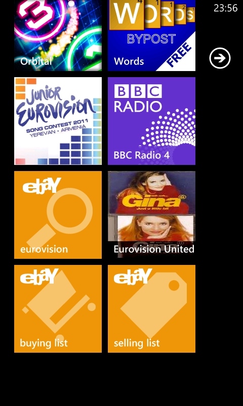
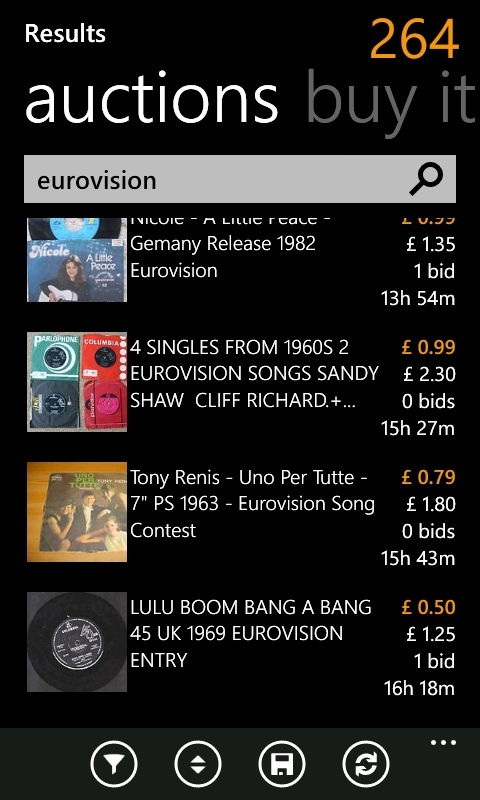
...Just a Little Bit, of auction action from the start screen.
The eBay application is a joy to use, it follows the Metro UI design principles so it feels welcome on Window Phone. It gets you to the information you want quickly, either through a live tile that directly links to a function, or opening the application and working through the panorama views. It wouldn't surprise me if the statistics show that eBay users with this app make more searches and spend more time on eBay.
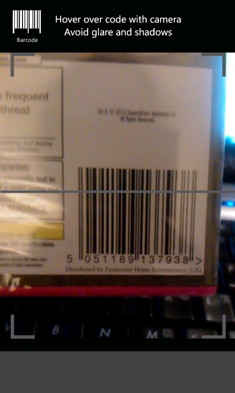
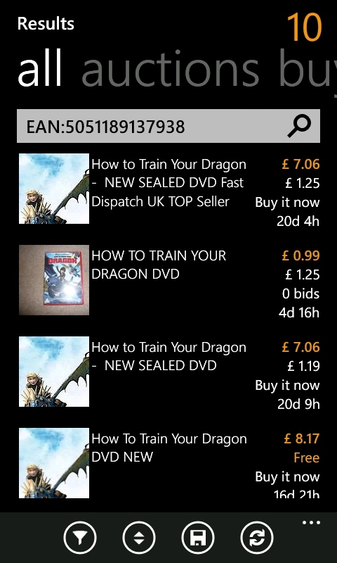
The barcode scanner in action.
With Christmas coming up, I tend to get a lot if inspiration while I'm out walking and cycling. Normally I scratch these down in a notebook, but with this app I can check online with a search, confident that I can keep track of anything I find, and I'm not going to lose out on biding if I'm not at my computer. I don't even need to do a full search, for many things I can simply scan the barcode, and eBay will list similar items on sale in the electronic bazaar. That's what makes a mobile app worthwhile, and this app is very much worthwhile.
Reviewed by Ewan Spence at
