Review: Nokia Lumia 800 - Part 2a - Camera
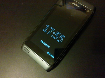
So far we've had an exhaustive run down of the Nokia Lumia 800 hardware from Rafe, including the background to its development. In this, part 2a of our Lumia 800 coverage, I look in some depth at the device's camera - has the size constraint meant a compromise too many? What's unique about this particular camera design? How does it compare to other Nokia hardware? And can quality and performance be improved further with software upgrades to Nokia's first Windows Phone?
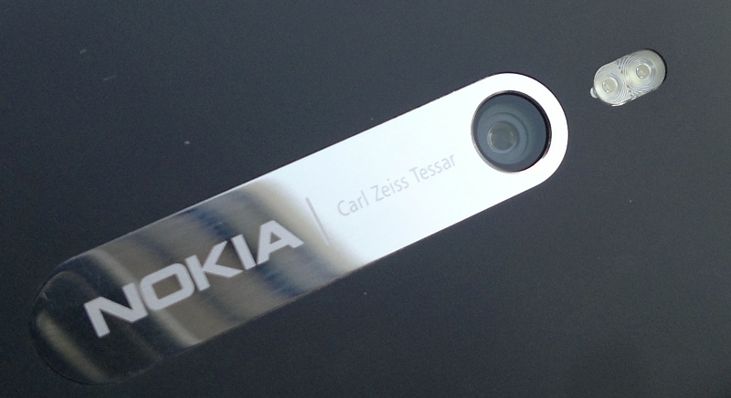
Camera hardware
We learned in part 1 of this review how certain components in the Lumia 800 were retained from the existing 'experimental' Nokia N9 - the 8 megapixel camera was one of these, with the result that the two devices possess identical units in terms of positioning on the device and in terms of hardware. Here are some of the camera unit highlights:
- although listed as an 8 megapixel camera, the rectangular sensor's actually 8.7 megapixels - 3552 by 2448 pixels, with the optical circle (the image from the lens) overlaid on the sensor area, as shown below. Nokia then takes a 4:3 image at 8 megapixels or a 16:9 image at 7.1 megapixels, as indicated by the shaded rectangles. Most phone cameras just chop the top and bottom off the 4:3 image to get a 16:9 aspect ratio shot, i.e. you lose information, but in this camera Nokia's 16:9 image includes pixels that would be off to the left and right of the full 4:3/8MP version. The bottom line is that the 16:9 widescreen photos end up at 3552 by 1998 pixels, i.e. 7.1 megapixels.
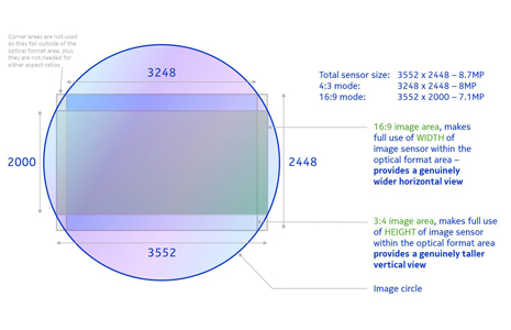 image credit
- much as Nokia would love to have kept the same camera as the N8's, size constraints were critical for this slim unibody design. The restricted height meant that the sensor also had to be smaller, 1/3" optical format, some 70% less surface area than the N8's, and the pixel size had to be reduced to 1.4 microns. To be fair, these statistics match the cameras in the competing Samsung Galaxy S II and Apple iPhone (to name but two) - the laws of physics prohibit a larger camera in such a thin device.
- the same size constraints mean that a Xenon flash couldn't be squeezed in (though Nokia did apparently want this originally for the N9/Lumia 800) - in the end, the latest generation dual LED flash was used, claimed to be 20% brighter than the previous generation.
- in order to improve low light photos, a wide aperture of F2.2 was used, meaning shallower depth of field but allowing much more light into the camera. The same aperture figure has recently been used on some competing devices, including the HTC Titan, reviewed here, for much the same reasons.
In other words, the Lumia 800 (and N9 before it) and other top smartphones of today all have cameras that are as good as can be achieved given the need for sub-centimetre device thickness. (The N8 gets away with a larger camera because it's allowed a sizeable camera 'hump' on the back.)
However competent the hardware, taking good photographs also requires sophisticated software these days, and both the different camera interfaces and image processing algorithms play a part in the Lumia 800 being entirely its own entity in terms of camera and camcorder results. Anedotally, photos aren't quite as impressive as on the N9, largely because the camera hardware and camera systems in Windows Phone aren't perfectly matched yet. Future updates to the phone will almost certainly improve camera performance, both in terms of colour balance and raw speed.
Camera interface
I loved the way the Lumia 800's camera can be started even if the device is keylocked, by pressing and holding the camera shutter button down. This may well cause infrequent camera activations inside a bag or case, but such rare occurrences are offset by the usability of being able to start the Lumia 800 in camera mode within two seconds from a locked state, ready to snap an interesting moment.
The camera interface itself is standard Windows Phone Mango, with on-screen digital zoom buttons (hint: don't use them when taking stills, as usual for digital cameras, though they work with caveats in video mode, as we'll see below) and a big settings icon. Tap the latter and you can take your pick from:
- ten predefined 'scenes' (optimised sets of settings) - most people will leave everything on 'Auto'.
- five predefined 'white balance' settings (e.g. 'Incandescent') - again most people will never get this far and will leave this on 'Auto'
- a range of exposure adjustments from +3 to -3 stops in 0.5 increments - useful when shooting into light or trying to create a special effect, if you know what you're doing...
- a range of four ISO settings, from 100 to 800 - best leave these well alone and let the camera software manage shutter speeds
- two different 'metering modes' - 'Frame average' and 'Centre spot' - for the camera to work out the best exposure - the default is centre weighted, but if you take a lot of landscapes you might like to change things to full-frame weighted
- four predefined 'effects', all quite basic: Black and White, Sepia, Negative and Solarise. None of which are likely to be used by anyone other than your kids messing around, I suspect
- four contrast levels, from 'Low' to 'Maximum' - best left alone, since you can always tweak contrast later on, on the desktop, if needed
- four saturation levels - again, best left alone, set on 'Normal'
- two focus modes - 'Normal' and 'Macro', with the latter hunting for focus much closer-up, though see the important note below about focussing
- four resolutions: '8MP 4:3'
That's a lot to fiddle with, though I was puzzled not to see a 'sharpening' setting too. Having said that, 99.9% of photos taken with the Lumia 800 will be shot by users leaving everything on 'Normal'/'Auto'. Which places extra responsibility on the manufacturer to get the defaults and automatic algorithms right, making it galling when something goes wrong (as you'll see below, under 'White balance').
One things stands out a million miles as a problem in the Lumia 800's camera interface though - as focussing happens, there's the usual flashing reticule, to let you know that the software is working. After which - you get a plain white solid reticule. But what does this mean? If a focussing solution has been found, you get this white reticule. If focussing has been a disaster (e.g, because you're shooting something really close up and aren't in 'Macro' mode) then you get... a plain white reticule!
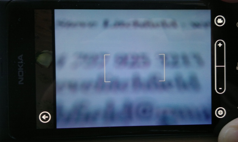
The upshot is that you haven't the faintest idea whether the focus worked out by the phone is any good. At WVGA resolution on the phone screen it's easy enough for all shots to look OK, but if focussing has gone horribly wrong then the first you'll know about it is when bringing it up on your large desktop monitor.
This is easy for Nokia to fix in software, of course - other Windows Phones remove the reticule if a focussing solution isn't found, so I've no idea why Nokia's version of the Camera application behaves differently.
Sample photos from the Lumia 800
Despite the promise of future updates, as you'll see from the example shots below, the Lumia 800 can take pretty good photos as-is. In each case, click on the thumbnail photo to download or enlarge it in your browser, to full 8 or 7 megapixel status:
A couple of super snaps, beautifully coloured and detailed, under ideal lighting conditions. As ever, with small-sensored camera phones, sunny conditions mean an almost total absence of digital noise and aberrations.
A couple of nice pet action shots, both taken under indistinct lighting. Pets, like children, rarely keep still, making focussing on them a challenge. The Lumia 800's focussing time is very dependent on light levels, varying from a fraction of a second (sunny) to two seconds (indoors) - but we just about coped, as shown here. The cat isn't perfectly in focus, but it's "good enough".
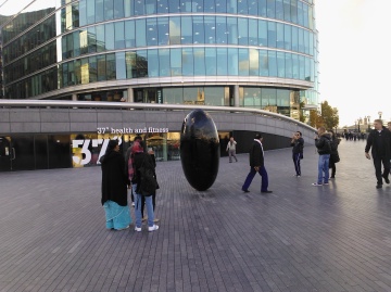
Testing colour capture at a florists - the Lumia 800 does a pretty good job; plus a cloudy London scene, a typical tourist shot
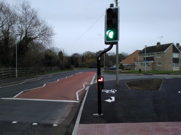
Looking at photos under low light conditions - at dusk, outdoors (you can see how dark it was really, by looking at the illuminated pedestrian sign); and indoors under weak internal lighting. Both with LED flash turned off, so that we can see the raw performance of the sensor. The second shot shows up the digital noise very clearly if you look closely - but it's what I would expect from such a small (1/3") sensor - even the mighty N8 would struggle to keep noise down under this lighting.
Staying with low light conditions, just before dusk on a winter's day, shooting towards the 'sun'. Shot in 7 megapixel 16:9 mode, as an example. Look really closely and you can see artefacts and the results of the (fairly mild) noise reduction and edge enhancement being used - but overall a shot that's quite acceptable under the circumstances.
Two night-taken, LED-flash-lit shots. The Christmas tree one is typical of an evening shot that many will attempt and is disappointing because of the relatively slow shutter time (1/14s, in this case) needed to get enough light into the sensor - the slightest movement of the phone by the person taking the shot (this was the best of four I tried) and the photo will be 'slightly' blurred. This, of course, is where Xenon flash comes into its own*. The second shot came out much better, partly because the proximity of the subject meant that the shutter time could be quicker (1/25s) and thus there was less chance of blur.
* which currently means settling for the Symbian-powered Nokia N8. The HTC Mozart does have a Xenon flash, but it's so weak and badly integrated that it's worse than LED....
A lot has been made of the possibility of camera phones taking over from traditional standalone cameras, with the likes of Samsung's old Pixon 12 and Nokia's N86 and N8 leading the way. An an ardent fan of the N8 in particular, even I'll admit that almost every photo I've taken with it would have been better to some degree with a decent (>£100) standalone camera. In other words, the N8 gets as close as it's possible to get and yet still ultimately just falls short.
The current crop of 1/3" and 1/3.2"-sensored camera phones haven't, therefore, got much of a chance. 70% lower sensor surface area and smaller pixels mean that, even with improvements in sensors themselves (including Back Side Illumination) photos produced from any of these devices are that far further from 'standalone' quality.
Which, in itself, isn't a huge problem - it's just important to downplay expectations, whether you have a Lumia 800 or HTC Titan - or even an iPhone 4S. In each case, take a sunny snap and you'll be quite happy, but results will go downhill to match the sun's arc in the sky.
Nighttime LED-lit snaps are, predictably, a disaster on all these phones - the slow shutter times and poor illumination mean that it's almost impossible to get a good photo, especially of people, who have a tendency to move!
White balance
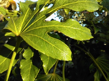
Although I was generally quite impressed by the Lumia 800's photos, given the size of the camera unit involved, there was one other issue worth mentioning. The current processing algorithms can be thrown by large areas of one colour. Have a look at this set of three close-up snaps of a fern leaf, taken on a cloudy day.


No, your eyes don't deceive you - the first image isn't taken on 'Negative'. This is how the 'Auto' setting for 'White balance' sees the leaf - and how a general user's photo might turn out. Quite horrifically wrong. What should be green is a nasty shade of... blue? Now, because I know a thing of two about such matters (a general user wouldn't), I headed right for 'White balance' in the Settings and changed the setting to 'Cloudy' and took the shot again (second photo above). Much better.
I still wasn't happy though, since the leaf was now too green - certainly not matching what I was seeing with my eyes. I tried again (third photo) with the 'White balance' set to 'Daylight' - no, I'm not sure how a general user would know the difference between 'cloudy' and 'daylight' either! The result was a better photo with colours which were more or less 'right', as judged by my eyes.
It's worth noting that, as you can see from all the photo examples above, the Lumia 800 camera usually gets its colours spot on - but occasionally, just occasionally it gets them very wrong - yet again, it's a software issue and one that can be addressed in an update by Nokia's camera gurus.
Verdict
Progress in smartphone cameras has been coming up against the laws of physics for some time now. The Lumia 800's 8(.7) megapixel, 7mm-high, F2.2 marvel does astoundingly well overall for an autofocus camera with multiple optical elements, considering its size. The slightly 'flatter' form factor compared to competing units makes for very wide angle shots (as you can see in some of the examples above), while keeping optical distortion minimal. It also means that the phone that plays host to it can be uniformly thin, with no unsightly humps or bumps.
Camera (and Nokia) obsessives will be disappointed that the Lumia 800's unit can't match the N8's (from the Symbian world), but then it's not meant to. The N8 was conceived as a flagship centred around a market-leading camera, while the Lumia 800 is both 'just' the first Windows Phone implementation by Nokia and also centred around the overall form factor and experience - that the camera is pretty darned good is something of a bonus. Software updates will fix the reticule and occasional white balance problems, hopefully.
Rumours abound of camera phone technology in Nokia's research labs that puts the N8 to shame - you have to wonder whether this might appear in a Windows Phone in 2012 - that, that will be the point at which the N8's ghost can be laid to rest for users who have been seduced by the Windows Phone experience.
PS. Over on sister site All About Symbian, I've compared the Lumia 800's photo results directly to those from the much-mentioned (above) N8 - if you want to see more photo samples/crops...
In part 2b of this continuing review of the Nokia Lumia 800's camera, I'll be covering its video capture, with a few surprises and, I suspect, controversial opinions!
Steve Litchfield, All About Windows Phone, 4 Dec 2011
Reviewed by Steve Litchfield at

