Review: Nokia Lumia 900 - Part 1 - Design and Hardware
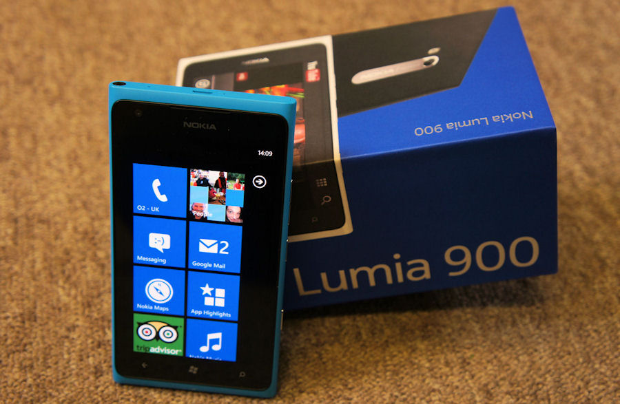
The Nokia Lumia 900 is an important phone, and one we're going to look at closely here on AAWP. To start off, let's look at the hardware and design of Nokia's North American variant, now available on AT&T.
I have one issue with the Lumia 900's design, and it's one of lineage. After the Lumia 800, the 900 feels a little bit... butch.
The Lumia 800's style continues to be one of its strengths - it also ensures that any mention of how the 800 looks is guaranteed to bring in at least one comment that it originated from the Meego-powered Nokia N9, casually forgetting that the styling tones go back to the Symbian-powered N8. Nokia set their own rules up to design their modern smartphones, and the Lumia 800 is the culmination of that.

I don't think that courage and independence has made the jump from to the Lumia 900. Unlike their first Windows Phone, the Lumia 900 has a number of design clues that could easily have been imposed on Nokia. Not by a single smoking gun memo, but by the nature of the Lumia 900 and its primary focus of being Nokia's big marker in the North American market.
That means we have a 4.3 inch screen size. Nokia does not have the sway in the US to say that a smartphone can have a smaller screen than the size of countless Android devices, so if it wants to market a smartphone as a leading smartphone, it's got to go big.
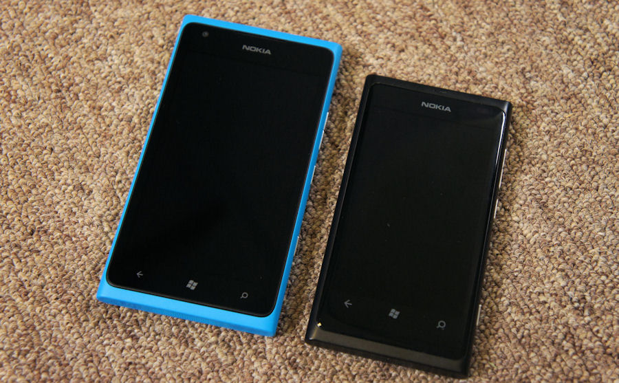
That has a huge impact on the device. It gives the 900 a unique selling point when compared to the 800, 710, and the soon to be available 610, but like any tightly packed smartphone, it leads to compromise. The clean curves of the Lumia 800 have been sacrificed. The glass screen no longer curves elegantly into the side of the device, losing two subtle effects, where reaching the edge of the screen was subtly indicated through the curve, and the illusion of the live tiles popping 'out' of the screen.
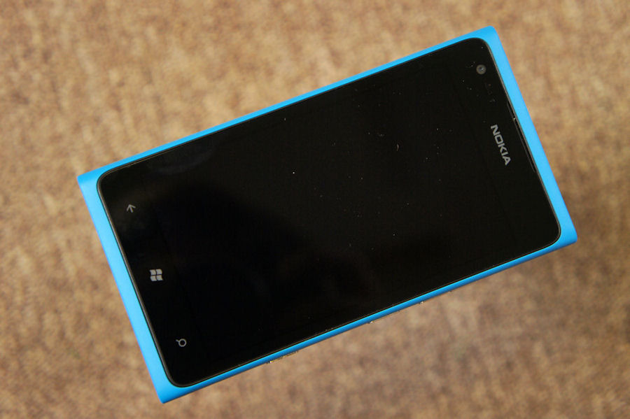
The unibody polycarbonate case has a small raised lip right around the edge of the screen, maybe half a millimetre high. This does let you know when you reach the edge, and gives you some haptic feedback while the muscle memory gets settled in with the new device, and I can see the practical side of this to help prevent scratches being made when the phone is laid down, but it's not elegant. It's just... there.

Nokia Lumia 900 compared to Nokia Lumia 800
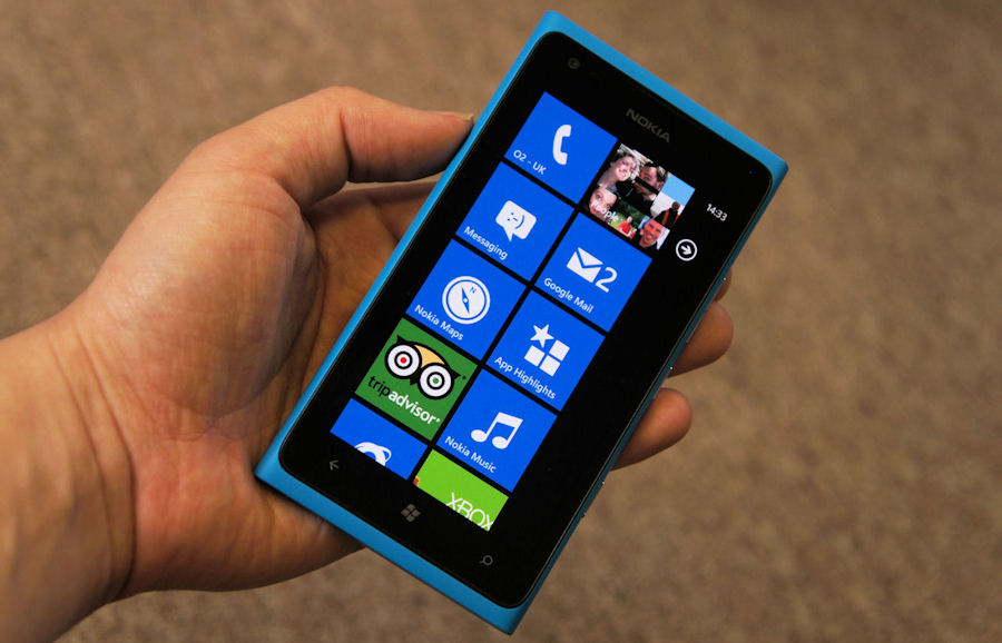
The Lumia 900 is a very masculine phone, probably the most masculine of all the Windows Phone devices I have used. There are curves on the edges, but it still feels stark in the hand, and when the bottom corner of the handset is resting next to the ball of the thumb in your hand, it doesn't feel comfortable or stable. Again, that's partly down to the size of the unit, which means there is more mass to handle, but it is noticeable.
It also reduces the viability of this Windows Phone being a one handed device. Thankfully, there's not a huge amount of the Metro UI that needs you to reach up to the top left/right corner of the screen, but it does happen. That was never an issue on the HTC Trophy or other 3.7 inch screened devices, but it's a tiny mark against usability in my mind.
But, it's what the American 'smartphone' market expects, and I've no issue with Nokia following the norm in their push to return to that market.
It has some nice side-effects as well, primarily in the battery. There's room in the casing for one of Nokia's largest smartphone batteries, with an 1830mAh capacity. That's partly offset if you use the "4G LTE" technology for data - the circuitry requires a bit more power to use than GSM and 3G data, but the resulting boost in working online is worth it.
Even then, the Lumia 900 will happily make it through a working day with reasonable use. If all you can find is 3G connectivity, then you are going to have a phone that comfortably beats the expected battery life of a smartphone in the new world.
Of course the hardware secret of the Lumia 900, like every other Windows Phone, is that with Microsoft's baseline, there's not a huge amount of variance in the platform, unlike Android. That means there's no option other than an 800x480 pixel screen. While iOS and Android devices run away packing even more pixels into the same space, any Windows Phone device will be left at the gate.
It makes for an obvious "this is worse" statistic if you go for a straight comparison, and many will. The impact of the Windows Phone strict specs can be left for another time, because there is no doubt that in terms of packing information in, the Lumia 900 will not come out on top. I balance that out with Windows Phone having never been designed to pack information in. It uses space and font to convey breaks in information, it has vertical and horizontal scrolling to lay everything out, and taps will take you to more information. That design is what allows the lower screen resolution to still work with a flood of information from Twitter and Facebook, incoming emails, and third party clients piping lots of text to the screen.

On the 3.7 inch screens I never felt I was missing out. There's a little of that in the 900's 4.3 inch screen, but it's actually more a case of "oh this is a little bigger and easier to read without my glasses" than "oh I want another four lines of my email to be on display." Your mileage will vary, but I've never felt crippled in terms of the built in applications and how data is shown to me.
Where you may notice this is in video playback. Zune already transcodes videos to a lower quality when you copy videos to your handset, but on even the streaming sites with high quality video (such as Vevo), you will notice slight pixelation of the images. If you're a big video consumer looking for good quality, the Lumia 900 is not for you (even more so as the 16GB of internal storage won't allow you to carry a huge amount of pre-recorded video).
There are two other hardware additions to take note of. The first is the inclusion of a gyroscope, to help with positioning and orientation of the phone. A number of applications, mostly third party apps, will make use of this - the astronomy package SkyMap is one, and shows significant improvement in terms of pointing at the sky to identify stars than on the Lumia 800, which was lacking the gyro. This should also improve the accuracy and latency of any augmented reality applications, so a nice bit of future proofing here, albeit one that doesn't have an immediate impact on my smartphone usage.
We'll have more on the Lumia 900 camera as we go through April, but for now note that it's the same Carl Zeiss unit with 1/3" sensor as reviewed by Steve for the Lumia 800. And, with latest firmware, takes excellent photos in all but low light situations.
I've always been a sucker for the smaller phone - given the choice of a Symbian-powered phone I went for the diminutive C6-01 over the N8, so my tendency when presented with the Lumia 800 or the Lumia 900 is naturally to go for the smaller sized unit. But it's very much a personal preference. The fundamental differences in technology, namely the front facing camera and addition of LTE, are smartphone consumption areas that I'm either not interested in, or can't fully utilise here in Scotland (in any case Wi-fi and home broadband is still my primary access point).
What is in no doubt is the physicality of the Lumia 900. Styling touches aside, because that is clearly a personal preference, this is a fantastically well built phone. The strength in the unibody construction is apparent, and it still creates a wonderful feeling of solidity across the smartphone. Perhaps it's not as obvious with the flat screen, but there are no creaking panels, loose door panels or hinged USB covers (the USB port is now exposed at the top of the handset, an arrangement I prefer in use over the Lumia 800, even if it spoils the design lines). I know the subsidised price is a 'false' economy, but people are going to pick up "the $99 smartphone" and the hardware is going to win them over. Let's ignore the fact that with an $80 a month contract the Lumia 900 will cost them the best part of $2,000 over two years (just like all the other smartphones on AT&T).
In terms of construction and physical feedback, the Lumia 900 is one of the best smartphones out there in the American market. Not one of the best 'Windows Phones', but one of the best smartphones, full stop.

See Also
Nokia Lumia 900 Gallery (image tour)
Review: Nokia Lumia 900 - Part 2 - Camera
Reviewed by Ewan Spence at
