Review: Phonly
Score:
81%
There's probably a reason why Google shut its 'Reader' product down halfway through the year - the majority of normal people just don't need - or want - a RSS aggregator, something to trawl hundreds of web sites and gather 'new' things. They have social networks to alert them of cool happenings, news sites to browse through over breakfast, etc. However, the outcry from bloggers and journalists showed that this particular user niche used Google Reader extensively and the continuing search for a replacement has resulted in the take off of Feedly as a service and, in the absence of an official Feedly client for Windows Phone, a number of third party clients - including Phonly here.
Buy Link | Download / Information Link
At this point you're going to be thinking that the concept rings a bell. And you'd be right - Nextgen Reader has been integrating Google Reader and then Feedly for years, so Phonly is coming up against a strong incumbent in this space. Does Phonly offer enough of a unique selling point to recommend it as the better client?
Phonly is certainly stylish - the panorama opens with a Flipboard-like magazine layout, taking stories from your own Feedly subscriptions (oddly, called 'Categories' here) that others have voted up and shared - this is a good call and, if you've only got a few minutes to spare, gives you something immediate and relevant to read.
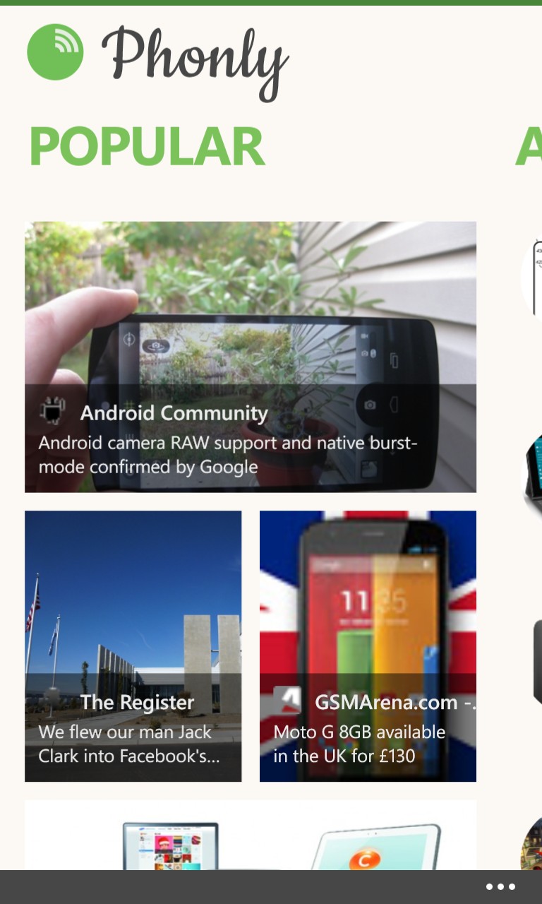
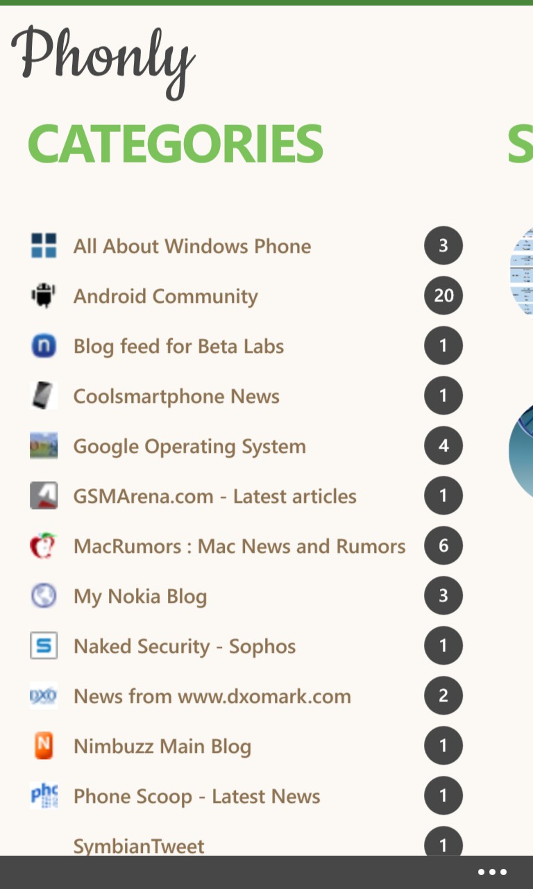
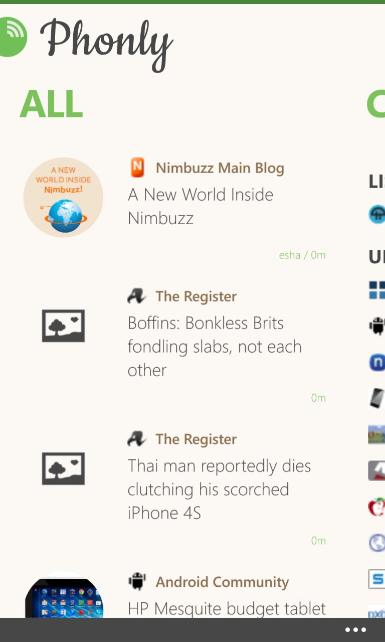
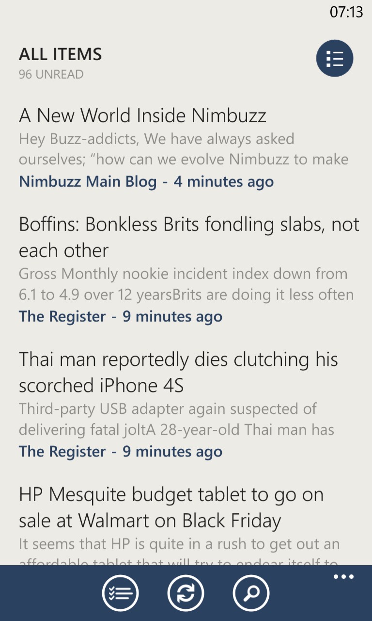
Swiping across from 'Popular', there's the traditional story timeline, across all (ahem) categories, sorted according to datestamp, so the newest and hottest items will be at the top. It's stylish, headlines only and with plenty of white space (though there's a way to change theme, see below), making something of a marked comparison to the denser, more text-heavy approach taken by Nextgen Reader - below are screens of both applications at the same point in (RSS) time:
Tapping through to read stories, things progress as you might expect, swiping from side to side moves between stories (by default, not marking them as 'read' - though see later for more on this) though you have to start your swipe from the very edge of the screen - perhaps an attempt to stop accidental swipes while reading on the move?
Using the bottom toolbar, stories can be 'saved' for later or have the original story URL 'shared' by email or to whatever social networks you have set up in your Windows Phone.
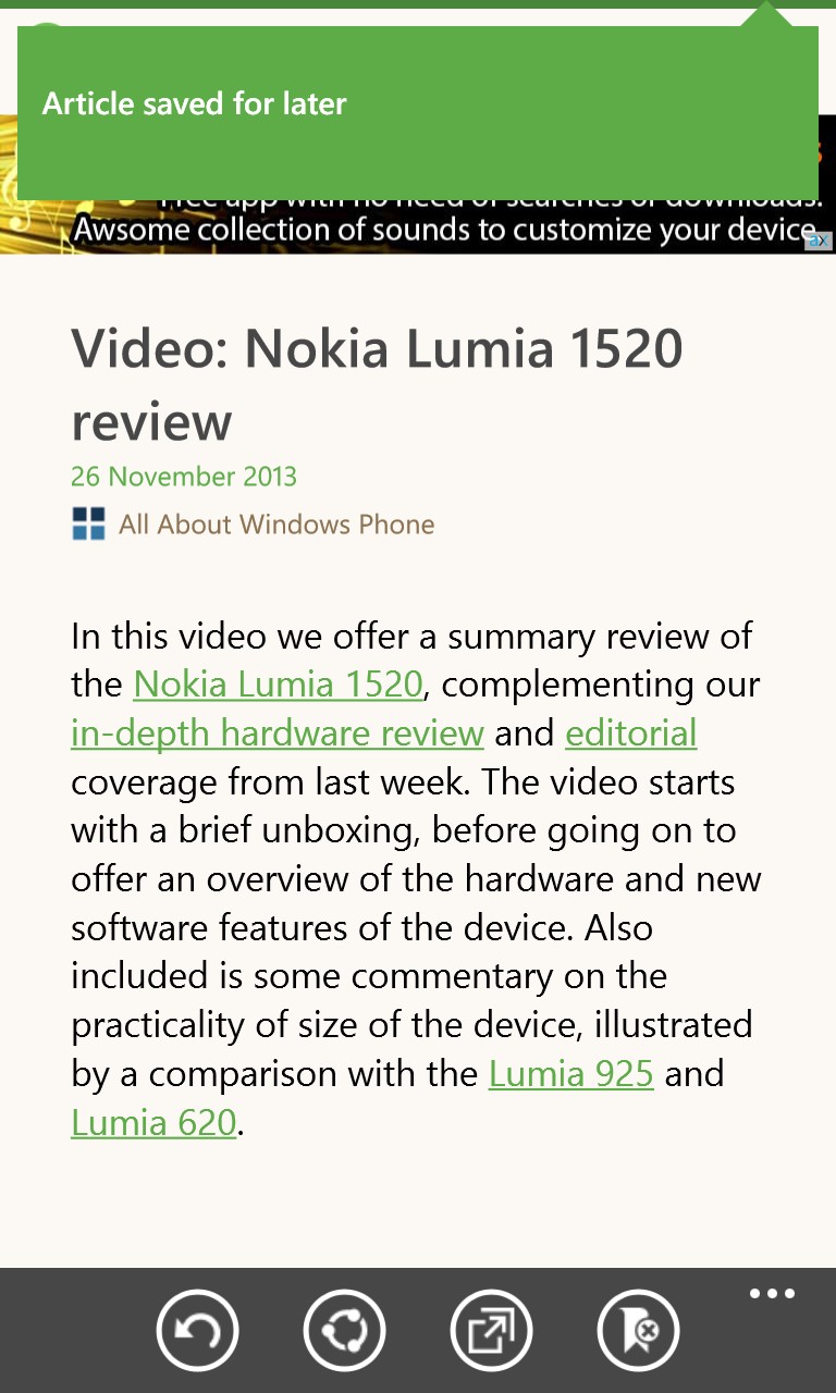
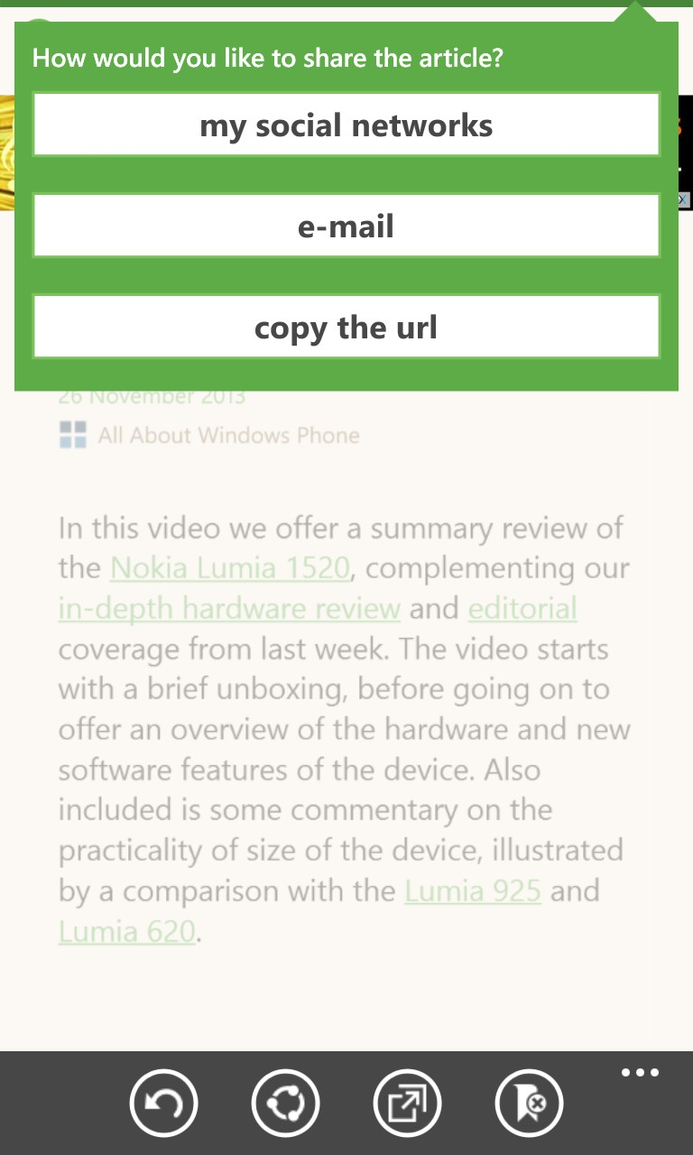
Obscured by the pop-ups in the screens above, but shown below, are banner ads in the free version of Phonly - these are incredibly intrusive, but obviously paying for the application (the 'remove ads' menu item takes you through to a £1.50 purchase in the Windows Phone Store) ditches these and Phonly is then a lot more useable.
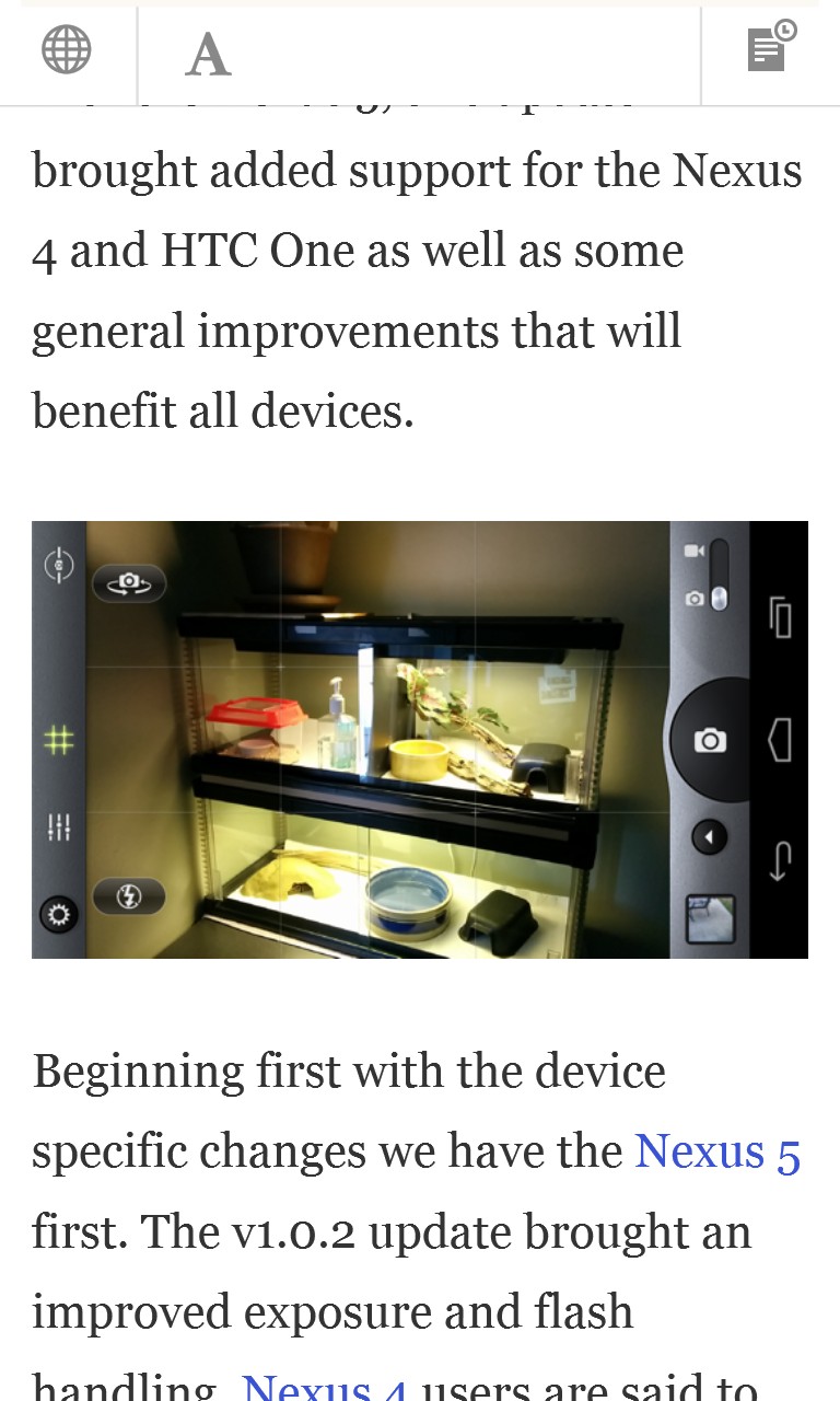
Articles are shown with whatever the RSS feed for that site included - sometimes this is just part of an opening paragraph, sometimes the entire article, with images, or something in between. If there's not enough text for you, tapping on 'Open' gives the option to open the full source site/story in Internet Explorer or (more usefully) in 'Instapaper mobilizer', a streamlined web view that strips out all the page content that you probably didn't want in the first place, such as the original site's ads, plus there's the option to save it to an Instapaper account for perusing later on some other platform.
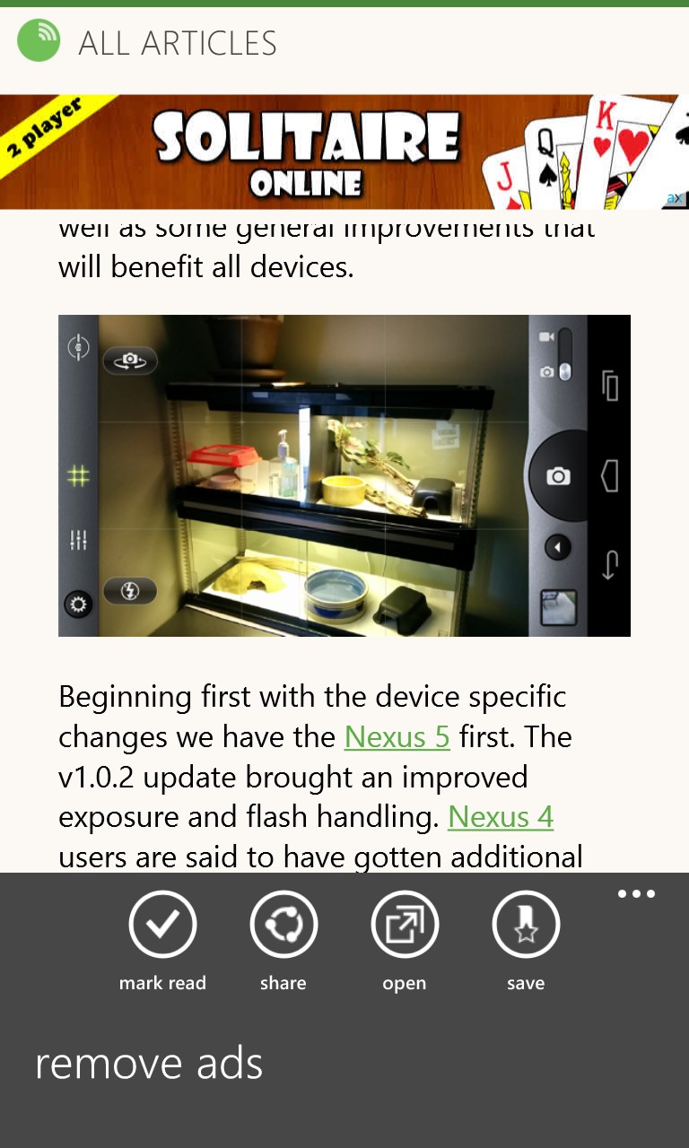
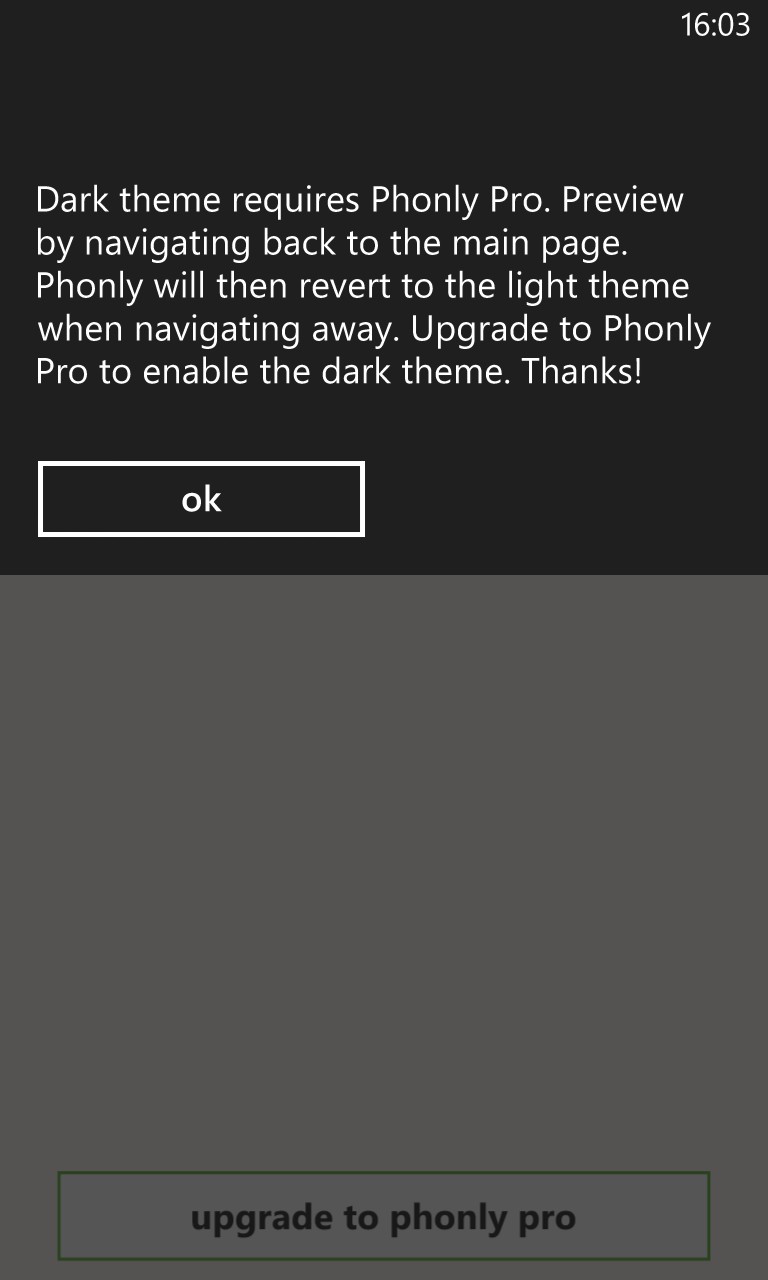
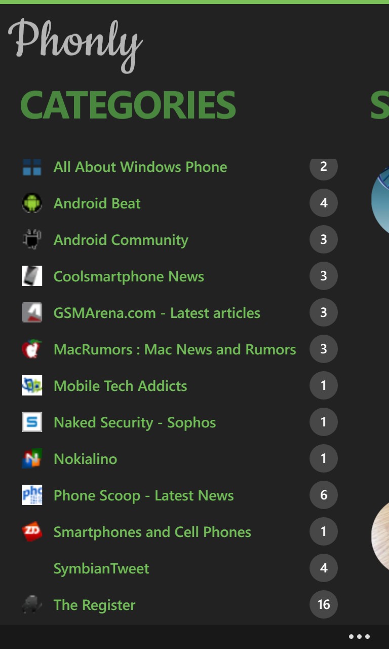
Regular readers will know that I'm a big fan of using dark themes where possible, to save huge amounts of power on all Nokia's AMOLED-screened Windows Phones. This is a setting here, as shown below, though it does require the ad-free, paid-for version - a very fair compromise, since I can't imagine anyone liking and using Phonly every day and not stumping up a quid or so.
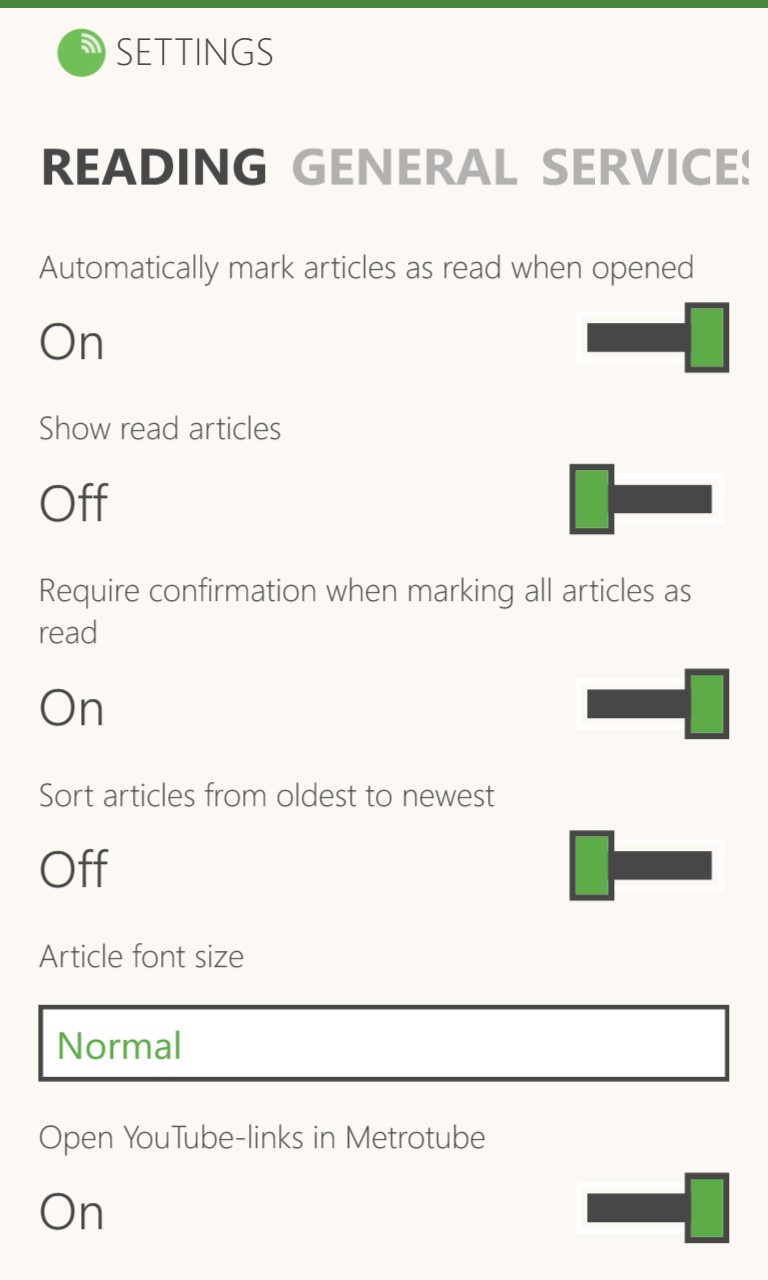
Also in the Settings domain are a huge wealth of things to fiddle with, all of which affect the way Phonly looks and works. The three most important are, arguably:
- Automatically mark articles as read when opened - this is a little confusing, since 'opened' here refers to bringing the story up on screen, rather than 'opening' it in IE or Instapaper, plus the default is, unhelpfully, set to 'Off', but once set this works well. You read the RSS content for a story, mentally acknowledge it and then swipe on, never to be presented with the story again.
- Article font size - shown in these screens is 'Normal', with 'Large' and 'Huge' also available, for anyone a little short sighted. Perhaps a 'Small' option might suit someone with 20:20 vision too - something for the next version?
- Enable background agent to update live tiles and lock screen - as you'll see, the Start screen can be populated with tiles for each feed (err.. I mean 'category'), but only if this is turned 'On'. The default is 'Off', which seems a little protective in this day and age - most other applications are far more aggressive about getting their agents in the 'system'!
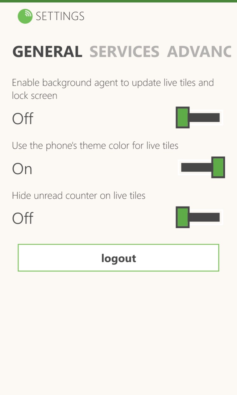
In case you were wondering, the 'logout' button (above right) is for signing out of Feedly - which itself uses Google OAuth - there's no 'Phonly' account of any kind.
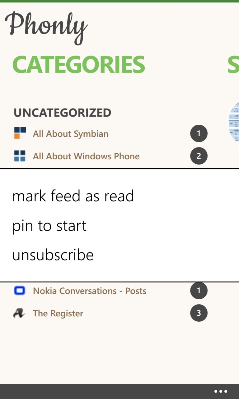
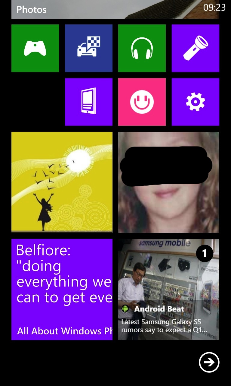
Any feeds (cough- categories) can be long pressed and there's the facility to 'pin to start'. This is quite a powerful system as you can build a section of a Start screen with tiles for each of your most watched feeds - headlines and (depending on RSS content) graphics then get updated and inserted on a periodic basis (every 30 minutes?)
It's certainly a quick way of keeping an eye out for something big happening, though of course you'll only see the top most story in each feed, so if something big does happen and then a newer story on that feed appears.... A numeric counter, overlaid on each tile, lets you know how many new stories are available on each feed, plus tapping on the tile goes straight to that feed, of course.
Phonly and Nextgen Reader are incredibly similar in functionality, right down to the live tile support. They're similar in price too and, assuming you need an RSS reader/aggregator (if you don't know, then you don't!), picking a winner comes down to trying both (they co-exist happily) and picking the one you prefer the feel of.
Of course, when Feedly itself comes out with an official client, both of these applications may be dead in the water, but in the meantime, you can download Phonly here in the Windows Phone Store.
Reviewed by Steve Litchfield at
