Review: Podcast+ Pro
Score:
77%
You'll recall that the world of Windows Phone podcatchers is a little crowded? My own round-up ran to about 5000 words and had to be split into two parts! Well, we now have yet another challenger, in Podcast+ Pro, currently free (though claimed to revert to commercial at some point) - it learns a lot of tricks from other clients, adds a few UI twists of its own and largely manages to get close to the top of the pile.
Buy Link | Download / Information Link
With so many competitors, many of which are very good, and knowing what I and other power users look for in a podcatcher, Podcast+ Pro is at least in a good position to cherry pick from the other UIs and features - and largely succeeds.
The best way to show Podcast+ Pro off is graphically, since it's quite pretty, especially with the custom wallpaper feature:
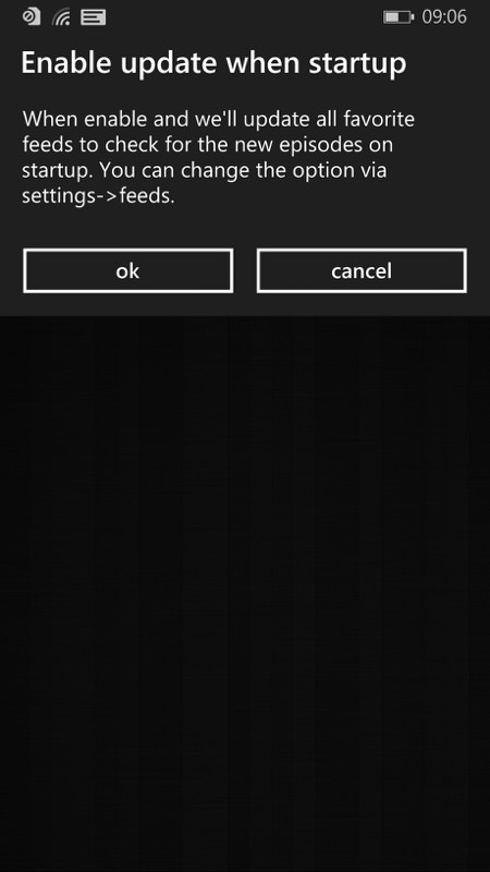
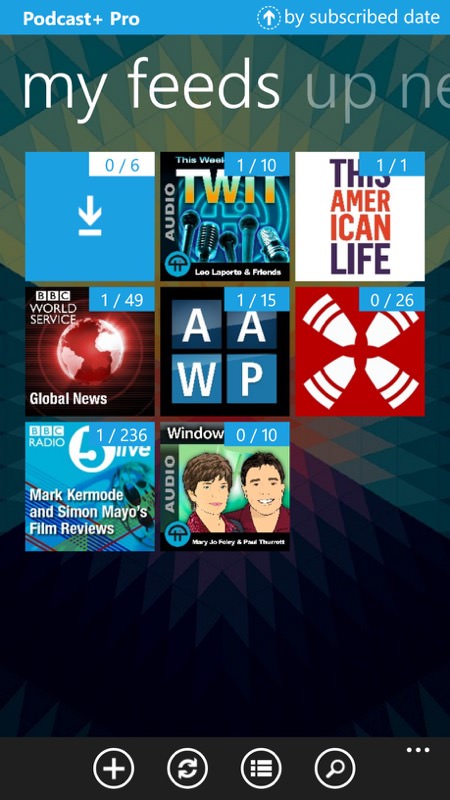
There are two ways to do podcast gathering - one is to run a background agent all the time (Podcast Lounge does this), another is to update feeds only within the application. Podcast+ Pro does the latter, but it works quite well, thanks to several concurrent downloads being possible, i.e. it can work well with multiple slow podcast servers... (right) the main podcast feed, which has multiple list/grid options and which you can also sort by various criteria...
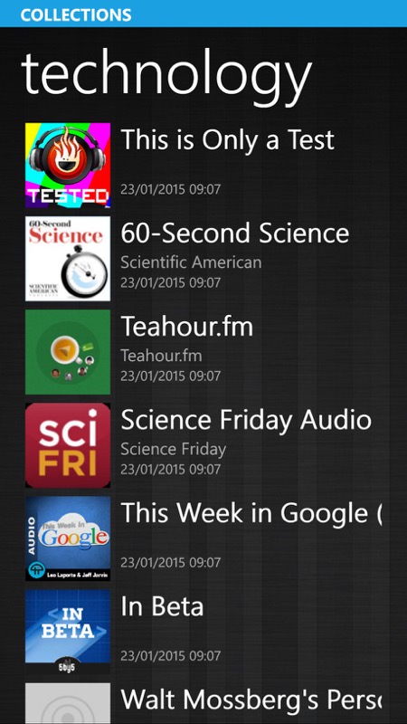
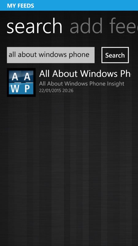
The podcast database is top notch, with collections of likely candidates and the presence of everything I searched for - including AAWP!
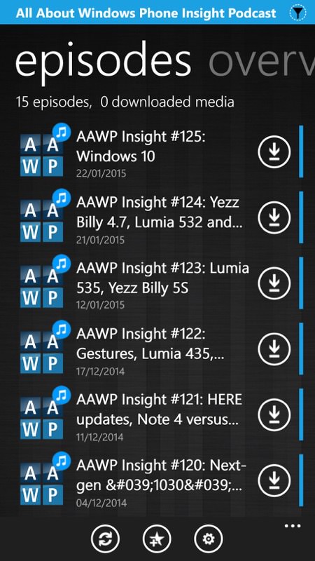
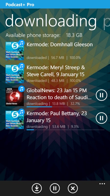
As you'd expect, the full details and contents of the RSS feed are available and it's easy to add a feed to your favourites/home screen; (right) a bevy of podcasts downloaded and downloading simultaneously...
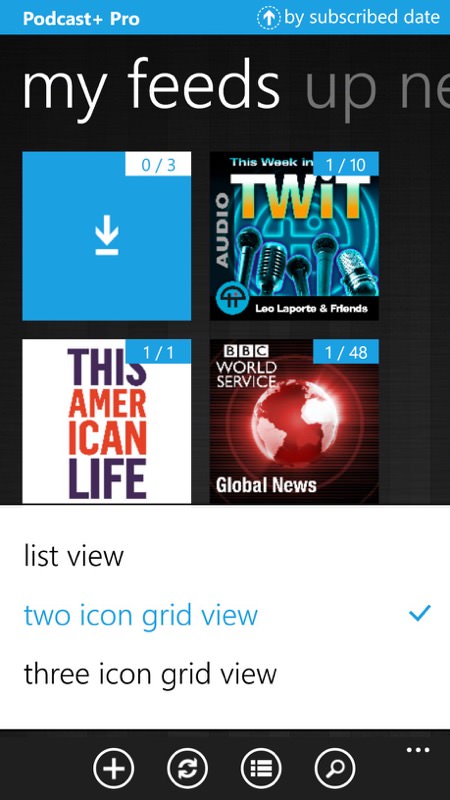
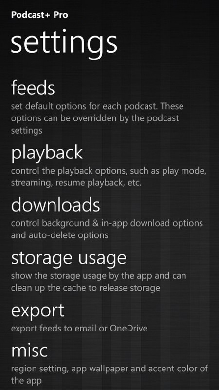
The three home screen view options - I preferred the three icon grid, fitting in more podcasts at once (of course!); (right) the settings are extensive in Podcast+ Pro, again learning from previous podcatchers and making sure that all functional bases are covered.
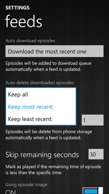
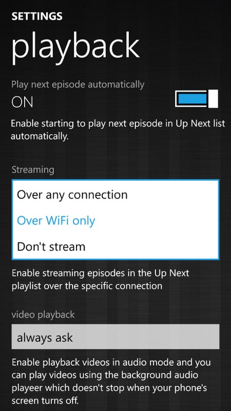
In particular, there are sensible defaults for new feeds and for automatic cleanup, plus options to work over cellular streaming (or not), depending on your tariff.
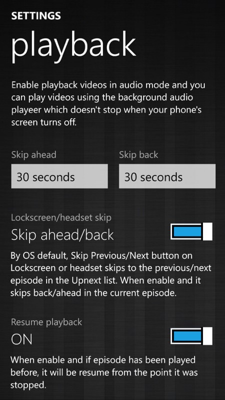
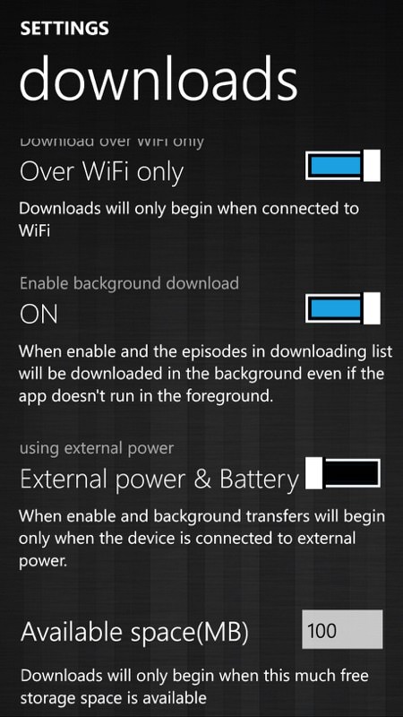
There's even customisable skip timing, plus the facility to alter what the Windows Phone global media skip controls do. Quite why anyone wouldn't want to 'resume' podcasts, though, is beyond me! An odd setting; (right) the default is, thankfully to finish background downloading and to do all this even if not on mains power. Windows Phone as an OS is very nanny-ish in this regard, as you know!
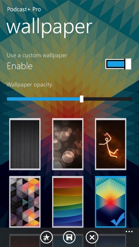
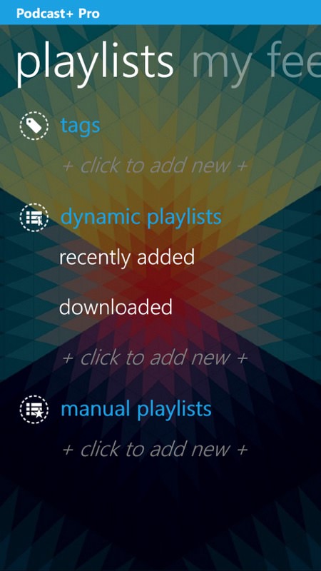
The wallpaper facility (see below) and (right) the playlists section, though most people will be more than happy with the 'dynamic' (auto) lists here, I think.
As you'll have noted from some of the screenshots above, I discovered that Podcast+ Pro has a wallpaper feature - adding a touch of class all round, with a dozen high quality wallpapers supplied, with the facility to load in your own image and - most of all - a slide to adjust the opacity, i.e. the amount by which the background shows through into the interface. Very nicely done indeed.
So far so good, but there are a few UI quirks which will throw anyone used to another podcast player. For starters, there's no 'play history' or similar. So you're in the middle of one podcast but get sidetracked into listening to another - how do you later get back to the previous one? If you're lucky, then it may still be in the 'downloaded' list - if not, then let's hope you can remember and dig out the podcast manually.
Similarly, there's no explicit 'now playing' view. Instead, a 'playing' panel is part of the 'up next' view/pane - this works well enough and you can find the highlighted podcast in the list and tap it for show notes, still with the playing panel at the bottom. Which is close enough, I guess - it just takes a little getting used to.
I liked that the developer has implemented protection against pressing 'back' one too many times to exit Podcast+ Pro by accident - this happens far too often in other multi-level applications and then you have to wait while it cranks back into action again. it would be nice to see this as a setting in the UI though, for those who don't like pressing back twice.
I also found Podcast+ Pro a little buggy, with downloads sometimes getting 'stuck' - in each case, restarting the application freed things up nicely. Plus the developer might want to invest in some English speaking friends - the language used is extremely 'pidgen' in places. For example, subscribe to a podcast and you get a toast saying 'Succeed to subscribe'!
But let's not forget the price (free) and the fact that Podcast+ Pro is very fully featured. With a little polish this could be in the top rank of Windows Phone podcatchers - it's already easily in the top 10.
Reviewed by Steve Litchfield at
