Review: Fitbit Versa (part 1 - overview and hardware)
Back in March (2018), I reported on Fitbit's UWP application for Windows 10 including support for the new 'Versa' smartwatch. Fitbit is one of the few accessory companies still believing in Windows 10 Mobile as a viable concern and their full range of trackers and smartwatches are supported by their UWP application. And the Versa is almost the perfect smartwatch, borne of five years of iteration (including the Pebble tech, which Fitbit acquired). Here are my first impressions of the hardware and of getting hooked up.
Buy Link | Download / Information Link
In addition to sticking with all three mobile platforms, including Windows, you also have to hand it to Fitbit for their hardware and presentation (I'll come to their software in due course). The Versa arrives cleanly packaged, with its charging dock and two sizes of strap:
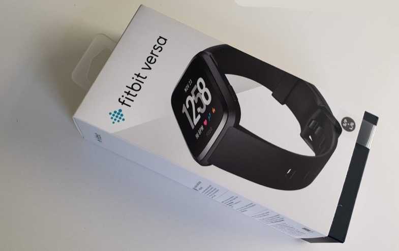
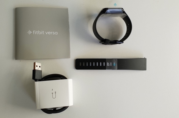
The strap thing is interesting - rather than make two different sizes of smartwatch (as Apple does), Fitbit simply supplies two different strap lengths. The smaller is fitted by default, but is too limiting for my average man-wrists, so I had to wrestle with the fiddly bobble-pin removal and re-attachment, to fit the longer strap. It took five minutes, but hey, it's a one-time thing and it's done now.
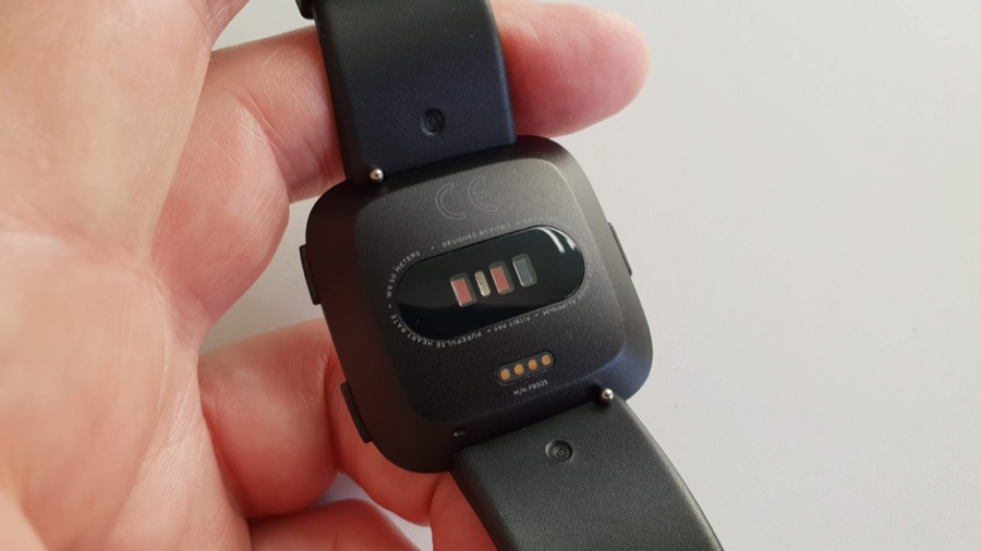
You can see the little bobbles (slide them inwards to release the strap pins) in the photo below, along with the optical and electrical sensors on the Versa's underbelly and the charging pins:
The Versa is incredibly light in the hand/on the wrist, at only 39g. The rounded corners and bevelled contours do a good job in terms of comfort and my only concern is the usual irritation of a watch strap on skin, something endemic to all watches and something that has to be allowed for if you want the functionality in the first place.
I had gone for the all-black Versa, on the grounds that it 'goes with everything', but you can get a variety of colours and a variety of strap materials, so do shop around if you fancy something less 'boring'!
The Versa is effectively always 'on', so there's no power button. When you take the Versa out from the box it's already pulsing 'download the Fitbit app' in about a dozen languages!
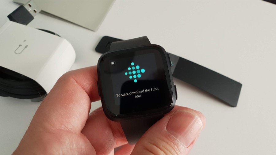
Now it's at this point that Windows phone users start to worry, since 'download the app' is normally code for 'you need an iPhone or Android phone', but not in this case. The Fitbit UWP application has been something of a star in the Windows world. Not for its speed - it uses middleware and so is definitely a little tardy to start and navigate - but for its mere existence in 2018. And, with only a few exceptions, everything that I looked for worked. Solving a few initial issues, I looked up the solutions online for the Fitbit application (e.g. for iPhone) and then there, in the UWP app for Windows, was the exact same function or setting.
In short, I was pleasantly surprised.
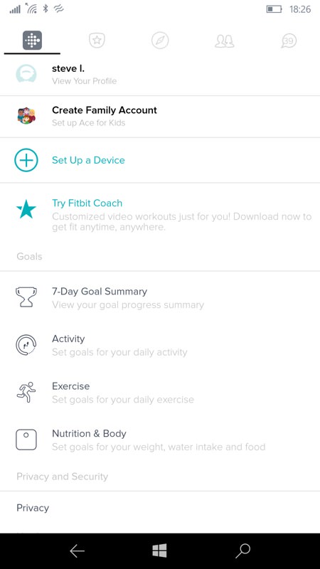
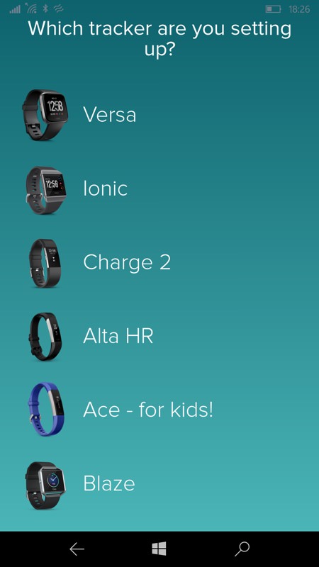
Going through the 'set-up' process, the Versa is the top/newest compatible Fitbit model (there are many others scrollable below, including the 'One' tracker that I've been using until now).
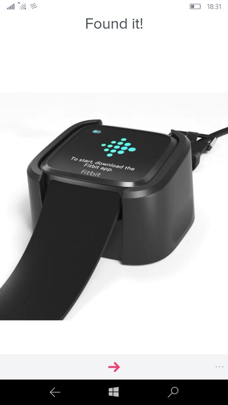
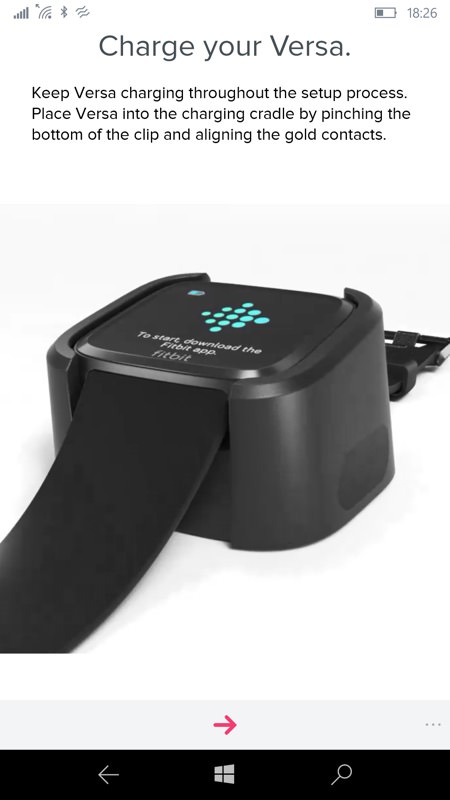
The Versa is automatically in (Bluetooth) pairing mode from moment one, and the application finds the smartwatch in seconds; (right) charging while setting up is highly recommended, since there's almost certainly going to be a firmware update for the watch as part of the process and that a) takes a while, and b) would be disastrous if the battery ran out halfway!
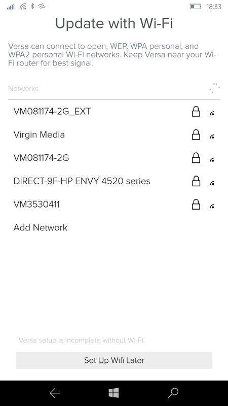
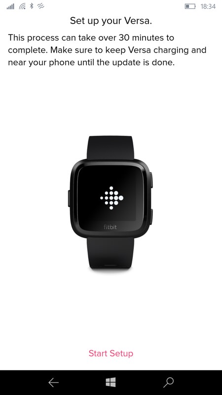
Unlike the earlier Pebbles and lesser Fitbits, the Versa is a full (if little) computer in its own right and you're prompted to manage its Wifi connection. This is used for many things, which I'll come to in a future review part, but updating its OS and apps over the air is part of it; (right) the set-up process (including updates) took 45 minutes for me, working with the IDOL 4 Pro.
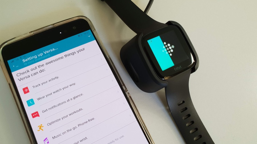
I also had the phone charging as well, in the end, as I wasn't sure how much it was doing as part of the updating process - certainly the phone screen stayed on. So both were powered throughout...
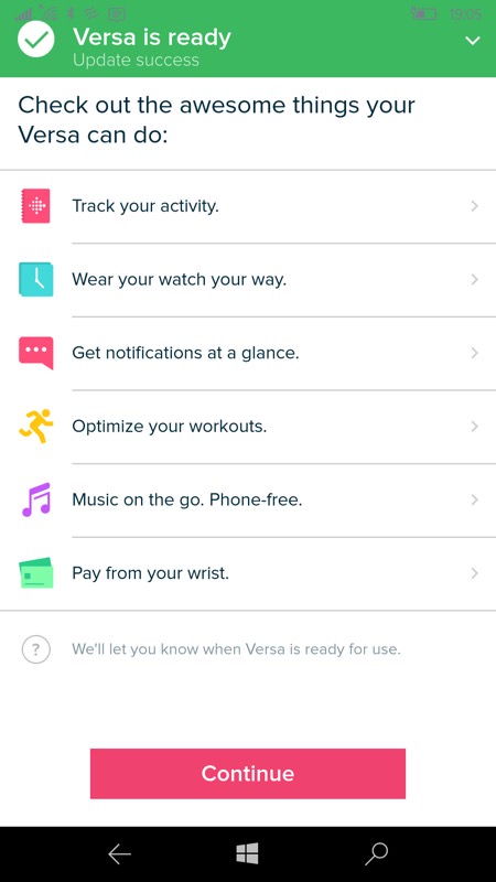
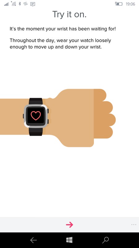
The Fitbit app advertises what the watch can do, but take some of these with a pinch of salt - I'll go over any limitations with Windows 10 Mobile in the next review part. But in short, notifications aren't quite as extensive as you'd like, paying for stuff is very limited in the UK even if it could work with the app (it can't, at the moment).
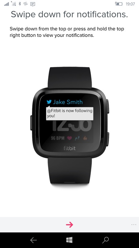
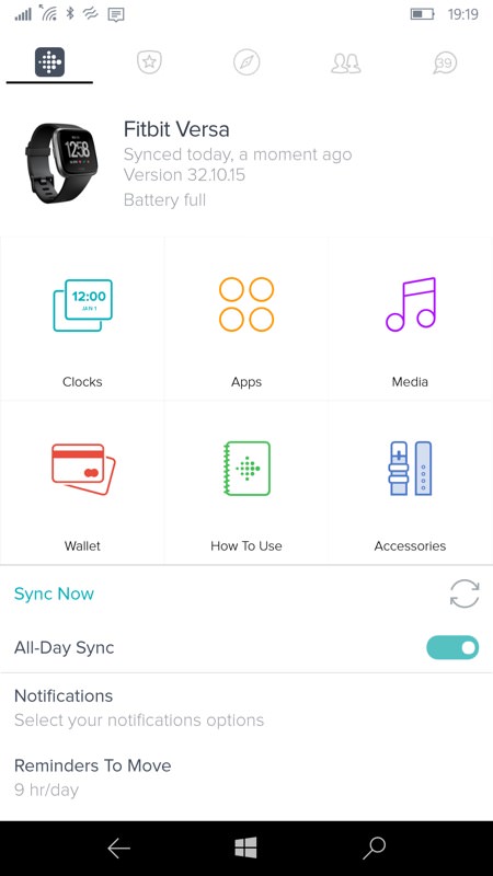
Fitbit does a great job of introducing the watch's UI, both in the app here and also on the watch itself, so you get the 'tour' twice(!) Don't get too excited by the Twitter notification, by the way, as that won't happen under W10M; (right) the 'home' control panel for the Versa in the Fitbit UWP application. Most of which does work!
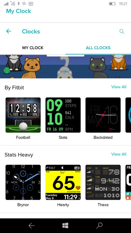
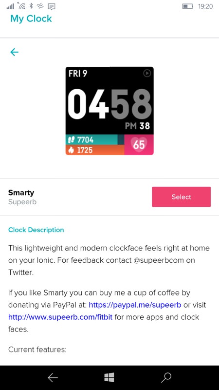
Setting a clock face is as easy as browsing and 'Selecting' something - I went for this one, with time, date, heart rate and steps/calories, with the bars for the latter two filling up during each day.
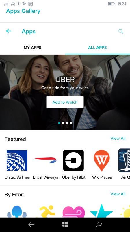
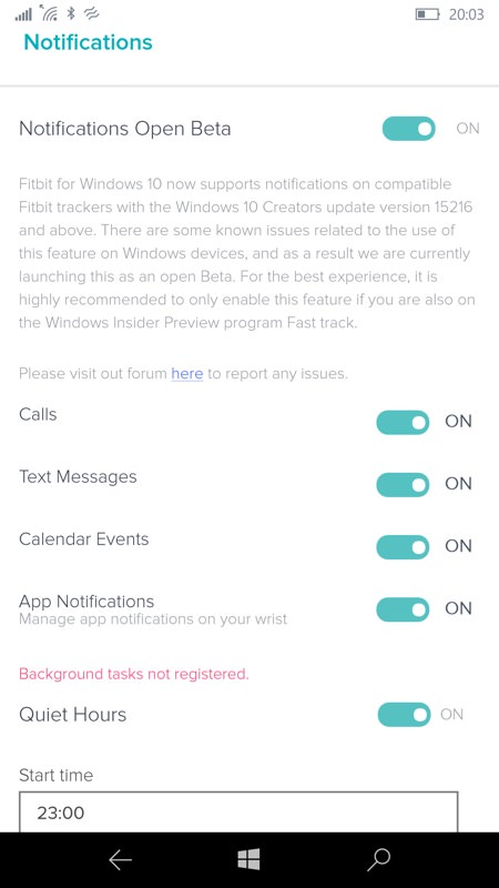
There are plenty of 'apps' too. I'll try a number out as I go through my Versa review; (right) heading into the Notifications control, it's apparent that the 'beta' status, the quoting of an OR branch that's not mainstream, and the built-in limitations for browser-based/PWAs under Windows 10 Mobile will all conspire to limit notifications to just the basics. Not that this is a major problem, I think I'd only want calls and texts to 'break through' anyway, though Twitter DMs would have been nice. Calendar events do come up, but not visually until you check the watch - more on this after more testing.
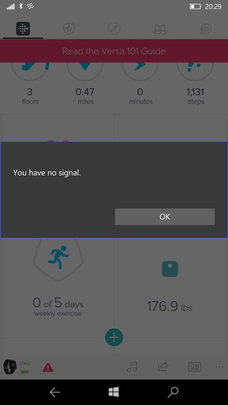
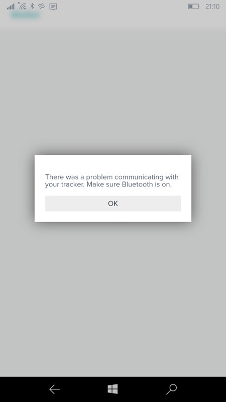
Ah yes, the error message. Occasional 'No Signal' messages, 'Problem communicating', and so on. In every case the underlying problem was OS or bug-related and not an issue with Bluetooth or Wifi. I think Fitbit should take a close look at their own error handling and not jump to blame the connections every time!
Don't get too hung up on some of the limitations or errors mentioned - on the whole I've really been enjoying the extra fitness dimension that the Versa adds to Windows 10 Mobile. With the UWP app still being updated each month and with the Versa itself on a similar firmware update cycle, things can only (hopefully) get better.
Over the next week I'm going to be putting the Versa and the Windows 10 Mobile application through their paces, for a full review in due course. If you have any questions about the Versa in this environment then fire away - I'm at your disposal.
Reviewed by Steve Litchfield at
