Review: Lumia 800 Part 3 - Communications and PIM
Score:
79%
So far, Rafe has given us his in-depth hardware review of the Lumia 800, and Steve has looked at the still and video capture performance of its camera. After months of everyday use, it's time to turn our attention to the software of the Lumia 800. Yes, most of the Lumia 800's built-in software is the same on all Windows Phone 7 devices, and so this is a review of the platform as a whole too. This part (three) of the review will look at communication and personal information management (PIM) software. Parts four and five will go on to look at Office, multimedia, exclusive Nokia apps, and much more.
Version Reviewed: 7.10.8107.79 (12070)
1. Calendar
The Windows Phone 7 calendar gives two main views: the panoramic agenda, to-do and day lists, and then the full month calendar view.
The full month view provides a great 'high altitude' view of each month. However, calendar entries are so small in this view that is impossible to read them, even when slightly enlarged in landscape view. One might expect that such an extreme view would have a pinch to view gesture, but the only controls available are vertical swipes to move from month to month, and tapping to view the agenda for a specific day.
While the month view is no good for giving a detailed read out of several days, you can get a sense of how busy the month will be from how many rows of text each day has. Plus it's actually pleasant to look at and doesn't overwhelm you, which many calendar apps tend to do.
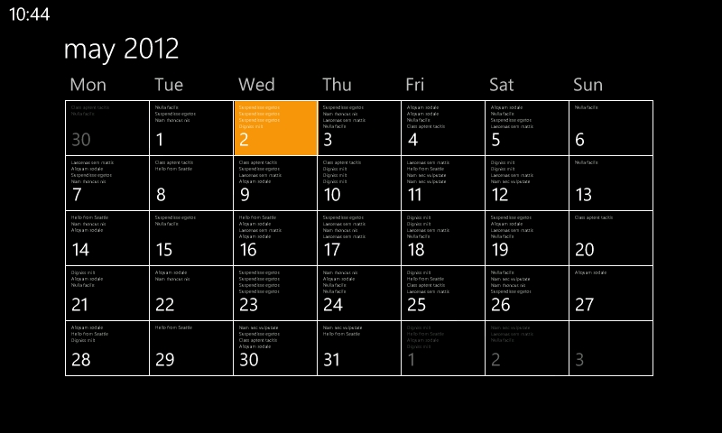
Full Month view in landscape.
In the panorama view, the toolbar gives you shortcuts to jump back to the current day, add a new entry, and go to the month view. Swipe the toolbars up, and you'll find the solitary menu option for "Settings". The settings page primarily lets you enable or disable all of the calendars you have subscribed to, and set which colour their entries will be shown in. These calendars come from the accounts you added while setting up the phone and can include Microsoft Exchange, Google, Windows Live, and Facebook. Remember too, that you can synchronise multiple Google calendars. There are also tick boxes to control whether to-do items are shown in the calendar, and to filter Facebook events to only the ones you've accepted.
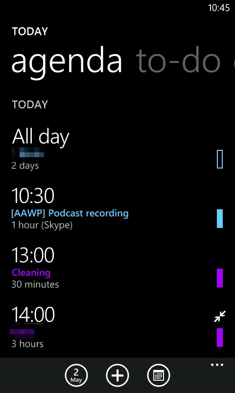
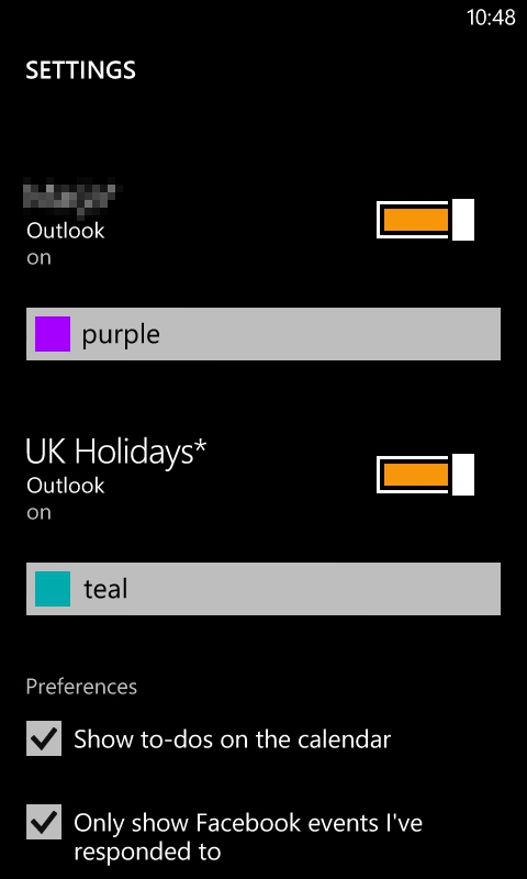
Agenda view and Calendar settings.
The day view gives you a time-bar chart of your day's events. This is handy to have if you want to do some heavy duty scheduling, but most of the time the simple agenda view will be sufficient.
The to-do section is a very simple task manager. There are no categories or nested lists, just a flat list of things in which you can long press on each item for a context menu that allows you to edit, delete or complete. Those options are standard, but there are two more options that are unusual and eminently useful, "postpone by one day" and "do today". Most of us will be glad of the former, I expect.
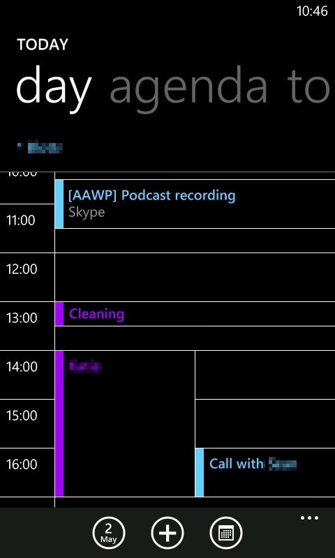
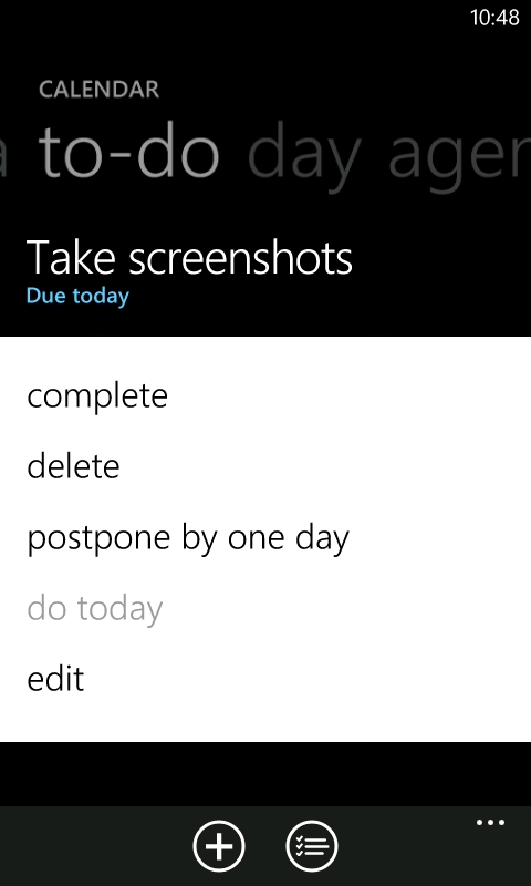
Day view and To-Do options.
Finally, Calendar is one of only two applications to have a full-width live tile. The tile displays the next scheduled calendar event with its time, and what today's date is. What it doesn't do is show you several events, or to-do items, at once. In turn, that means there's a lot of wasted space that could be put to better use by providing the user with an extended 'heads up' display of what's going in the next few hours of their life.
Overall, Calendar manages to strike a comfortable balance of usability and simplicity. The only 'advanced' feature missing is a search function, but there is a third party calendar search solution.
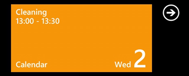
The underutilised Calendar live tile.
2. People Hub
As befitting the Windows Phone motto of "putting people first", the People Hub combines your contact management and social networks into one integrated experience. That means all of your contacts from Twitter, Facebook and LinkedIn will be integrated with your address book(s).
Contact Management
With Windows Phone 7's heavy dependence on cloud services, you cannot save contacts without having some sort of online account to save them to. This isn't too much of a problem because you need a Windows Live ID to use the phone at all, so new contacts will be saved there in the absence of anything else; e.g. a Google or Exchange account.
The first section of the People Hub panorama is the "All" section, which lists all of your contacts – headed by your profile photo and your latest status update. As with the application list, the contact list is separated into letter groups. Tapping any of the group headers brings up an alphabetic grid which lets you jump to anywhere in the contacts list. There's also a search icon (separate to the capacitive button used for Bing search). Also, the far end of the People Hub Panorama is the recent contacts list which is a four by two grid of tiles for the contacts you most recently interacted with. Also note that you can filter the contacts list to specific accounts.
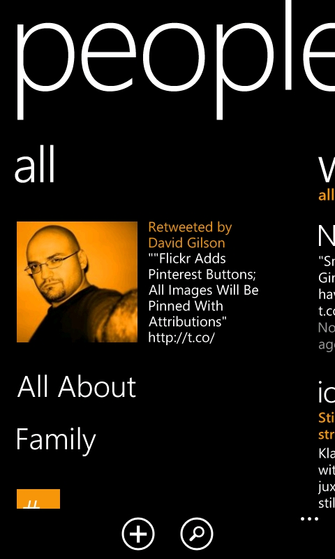
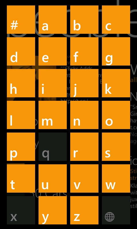
Beginning to browse your people and skipping through the alphabet.
Viewing an individual contact gives you just what you'd expect: a profile picture (accompanied by their latest social update) followed by a list of all of their contact details. However, it is all made to feel much more inviting by headings such as "Text" and "Call home", "Call Mobile" – rather than just dumping all the information in front of you. Also, if the contact has associated social network accounts, there'll be corresponding contact options such as "Write on [Facebook] wall" or "Mention on Twitter".
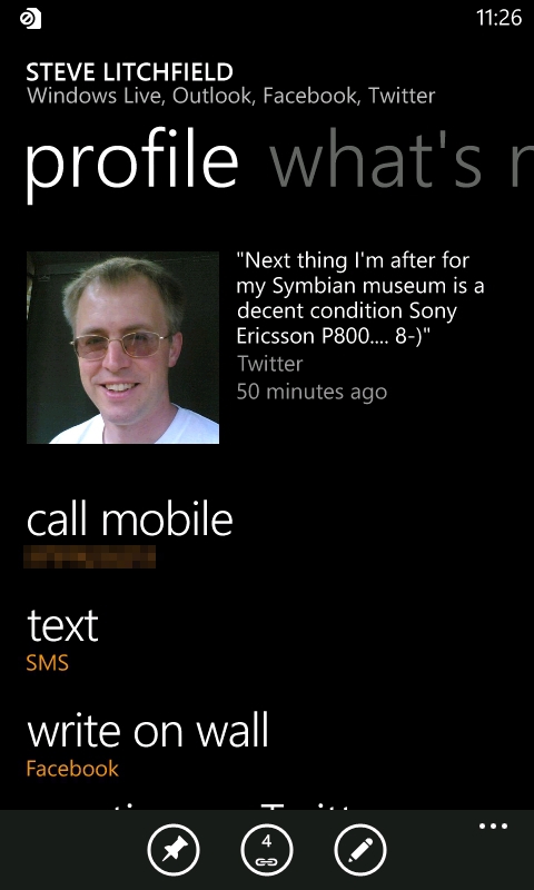
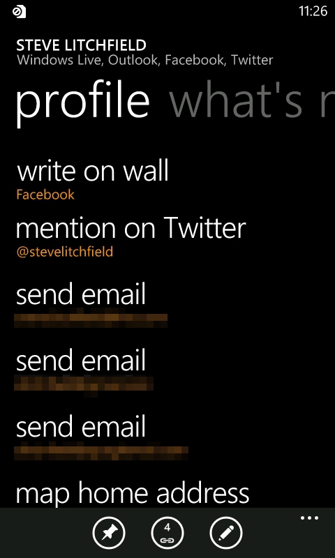
Viewing contact details.
In addition to being 'just' an address book page, contact profiles have panoramic views. After the contact details, we have the "What's new" section with a timeline of all their social updates. Next is "Pictures", where you can browse all of their Facebook albums; this is where I'd have loved to see Flickr integration too. Lastly, and perhaps most useful is the History section, where all of your SMS and email exchanges with that person are listed – social network communications aren't listed here though.
Individual contacts can also be pinned as a live tile of their profile picture. The tile will flip over to show their last contact or if you have a missed call or unread message/email from them.
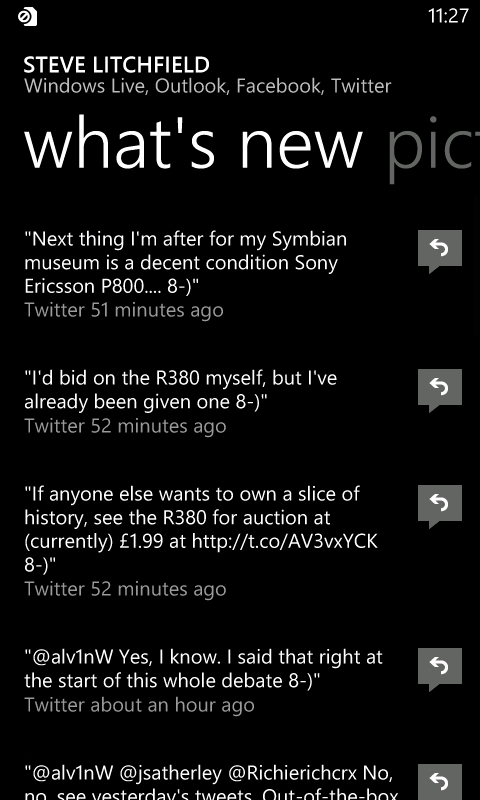
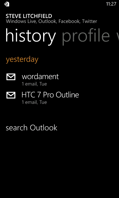
Viewing someone's social updates, and your communication log with them.
Finding and matching contacts
An area in which the People Hub shines is with its automatic integration of people in your social networks and your address book(s). In many cases, the software is smart enough to work out who is who on each of your PIM and social accounts and link together individuals' Facebook, Twitter, Linked accounts with your address book entry for them. The matching system isn't perfect though, and sometimes you'll have to manually link contacts. However, even this process is eased as the People Hub will often give you a list of suggested identities that it wasn't sure about.
Additionally, if you want to add a personal detail for someone whom you only had as a social network contact, an entry will be made on your Live/Google/Exchange address book – automatically populated with their name and profile picture.
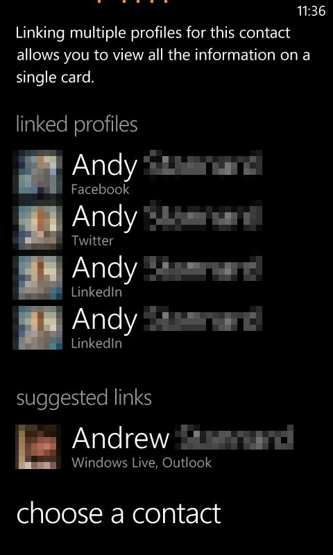
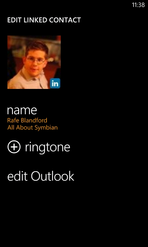
Adding details and linking contacts.
Groups
Another way to locate and manage specific sets of contacts is with the Groups function. The primary function of a group is to enable sending of mass email or SMS. If any group members have multiple phone numbers or email addresses, you can also configure which will be used for group-wide messaging. Groups have their own panorama, including a section with contact tiles and mass contact options, then a "What's new?" section where social network updates from group members are listed, and pictures view showing uploads from all members. Groups can be pinned to the Start Menu too.
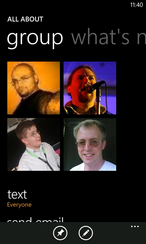
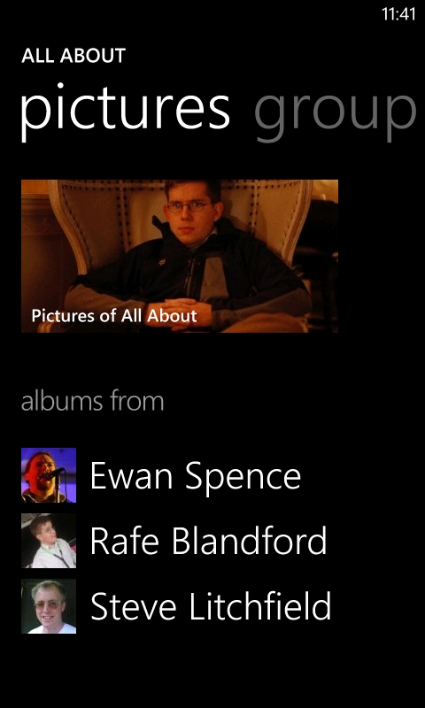
Groups and compilation of member photos.
Social Networks
The "What's New?" part of the People Hub is where all of the social networking action happens. It will show a combined timeline of updates from your Twitter, Facebook, and LinkedIn contacts, but you can filter down to one network at a time if you don't want to see everything at once. However, you can't opt for combinations as you can in the contacts list.
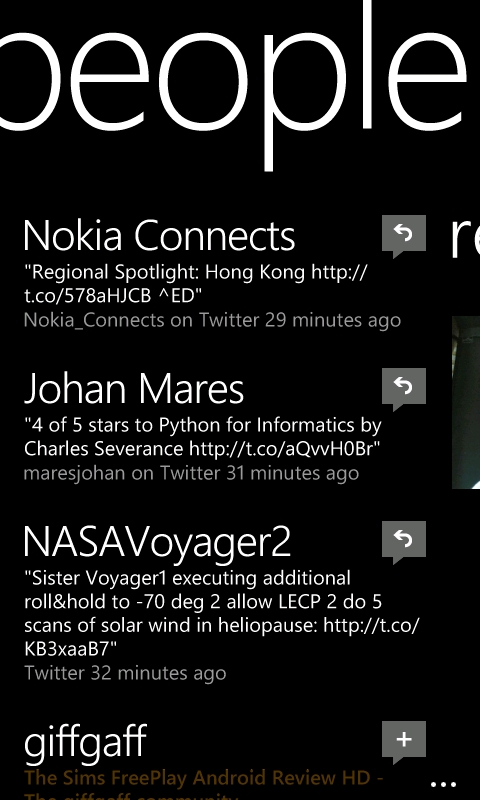
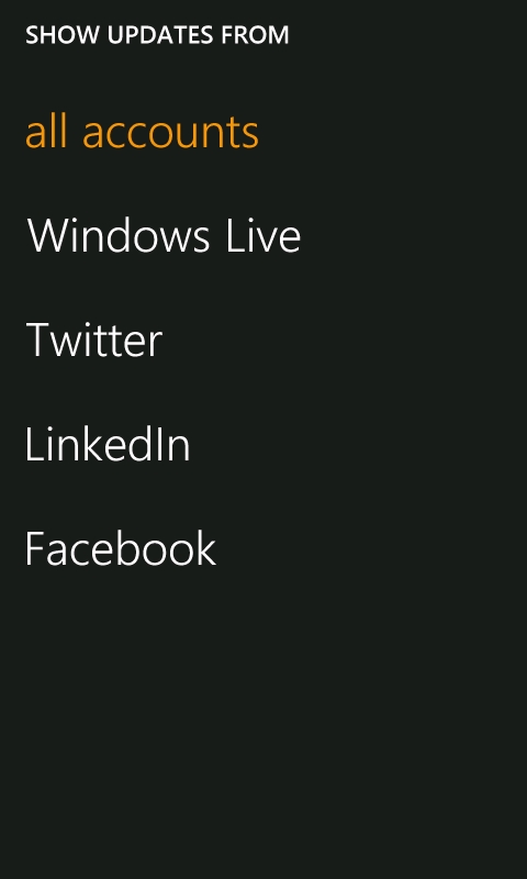
The People Hub Timeline and its filters.
All of the basic functionality is there; for instance, tweets can be replied to or retweeted, and Facebook posts can be liked or commented on. As far as social network clients go, I'd have to describe the People Hub as 'feature light' though. You can't quote tweets, you can't mark tweets as favourites, you can't view your Twitter lists, and you can't add or remove contacts on any social network. Nor can you use the Facebook messaging system as contact method, or restrict Facebook updates to specific groups.
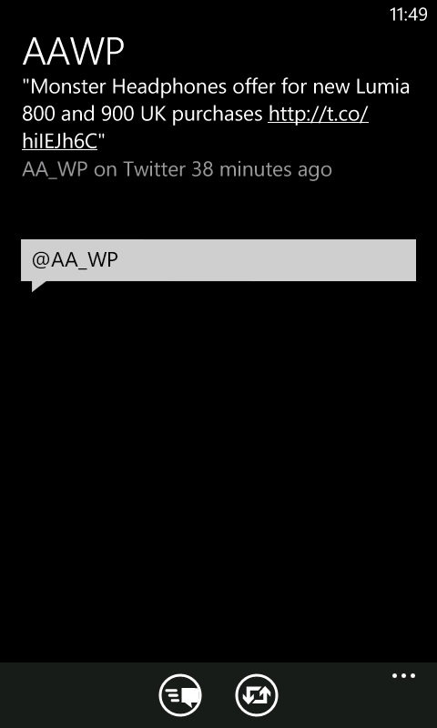
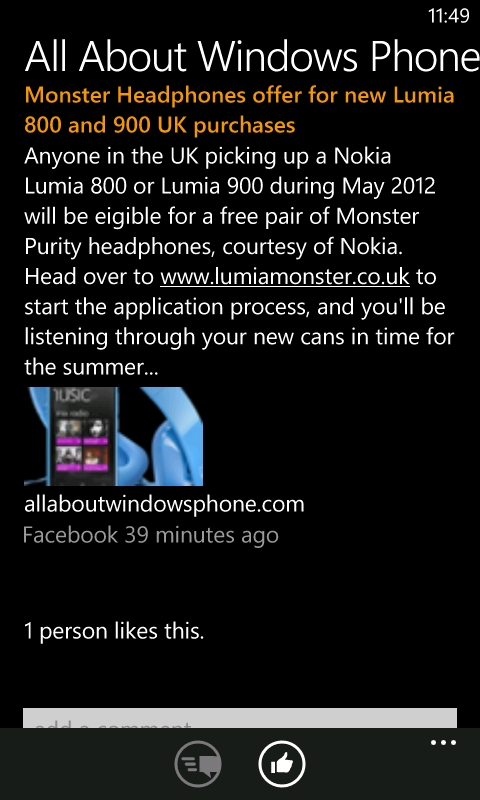
Responding to updates on Twitter and Facebook.
If you need advanced features, as mentioned above, the limitations of the People Hub will force you to go to third party applications for respective services. For example, Facebook's official application gives a comprehensive feature set, including messaging and a much more robust check-in system than is built-in to Windows Phone 7.
There will almost certainly have been a desire (on the part of WP7 developers) to keep the People Hub simple – in keeping with the overall design principals of the operating system. However, given its tight integration with contact management, it feels like such a waste to have to use a third party application in its place. If we need to get third party social network applications, it makes the People Hub somewhat pointless. Having said that, the basic functionality should be enough for most people and so social networks will be front and centre in their Windows Phone 7 experience.
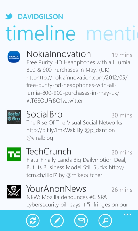
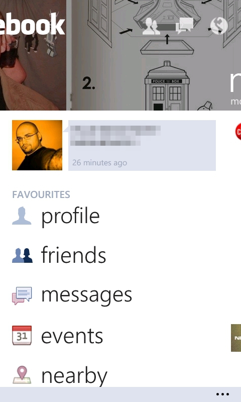
The official Twitter and Facebook applications.
'Me'
By default, you'll find a live tile on your Start Screen with your photo – this is the 'Me' tile, and it will occasionally flip over with social network notifications. Windows Phone 7 doesn't have push notifications from social networks though, so you won't always get a timely notification.
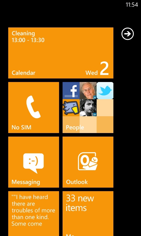
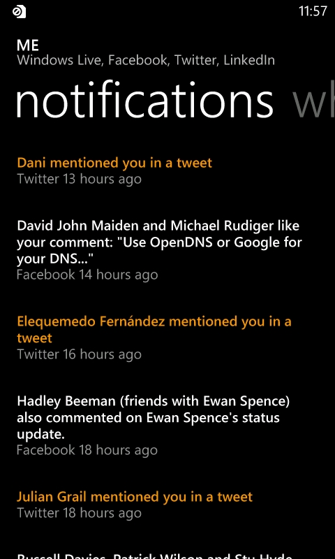
Getting notifications via the 'Me' tile.
Tapping the tile takes you to your profile page, from where you can post an update (to any or all networks), perform a location check-in, or set your chat status if instant messaging is turned on (more on this in the next section). Swiping to the side takes you to your notification history, and doing so forces the phone to check for new updates. Swiping again takes you to your "What's new?" timeline where you can review your social updates. Oddly though, you can't delete any.
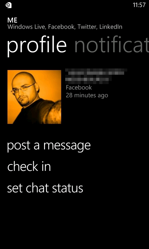
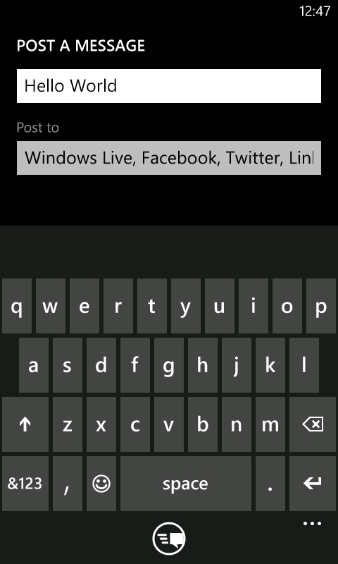
Your profile screen and creating a status update.
It's also through this social notifications list that you'll come across one of the other basic shortcomings of the People Hub as a Twitter client. When you view a Twitter reply, you can't see what they were replying to (and it isn't always obvious). [Though tapping on one of your individual tweets will display its replies.] This makes conversation tracking very difficult.
3. Messaging (and text input)
The Messaging application of Windows Phone 7 gives a simple threaded conversation view for each contact you're exchanging SMS, MMS, and/or instant messages with. Within a conversation, messages are shown in coloured blocks, their background colour follows your chosen theme, with received messages being slightly darker. When viewing a conversation, you have the option to change the contact number (or method) mid-flow. In practice, this will be used rarely, but it integrates nicely with the built-in instant messaging system.
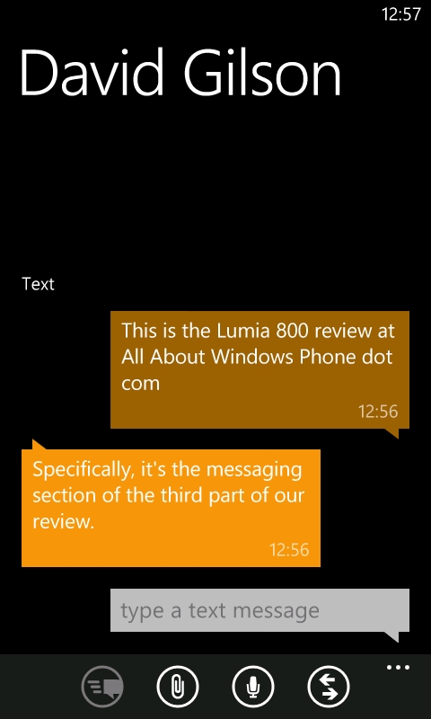
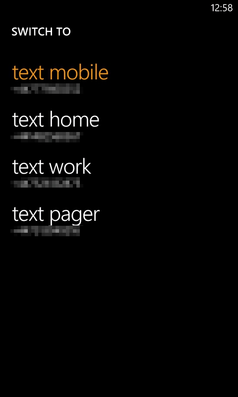
SMS conversation and switching contact methods.
When composing a message you can embed images, as long as you've configured the Lumia 800 for MMS (which should be easy with Nokia's Network Setup application). It's likely that this is where users will make the most use of Windows Phone 7's text entry, and so it's worth noting that the auto-correction system here is the best I've come across. The combination of key size (even on a 3.7" screen) and responsivity have made for the fastest touch screen typing I've ever experienced. Alternatively, you could use the voice recognition system to say your message. However, I feel that this system is still quite immature. Even in a quiet room, the accuracy is not enough to use on a regular basis. Also, you only have a limited time to say a message, but if you use the system again to say the rest of your message, it wipes out the text you already had!
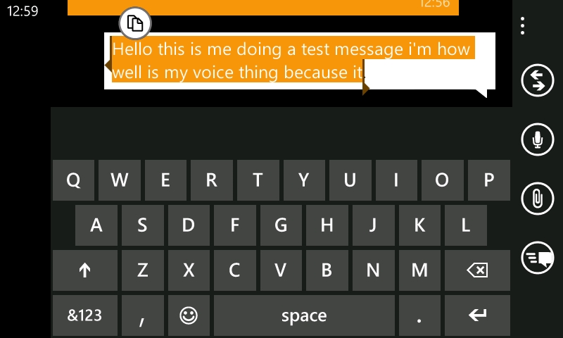
The landscape keyboard is extremely fast.
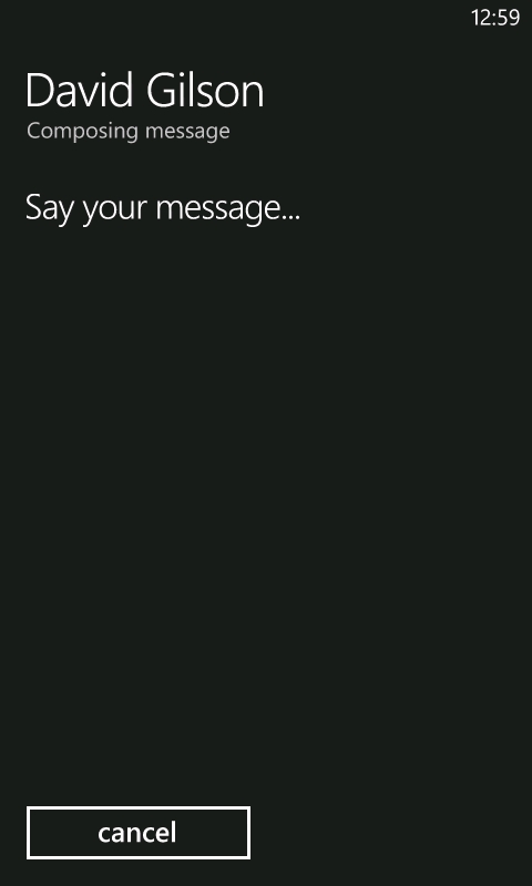
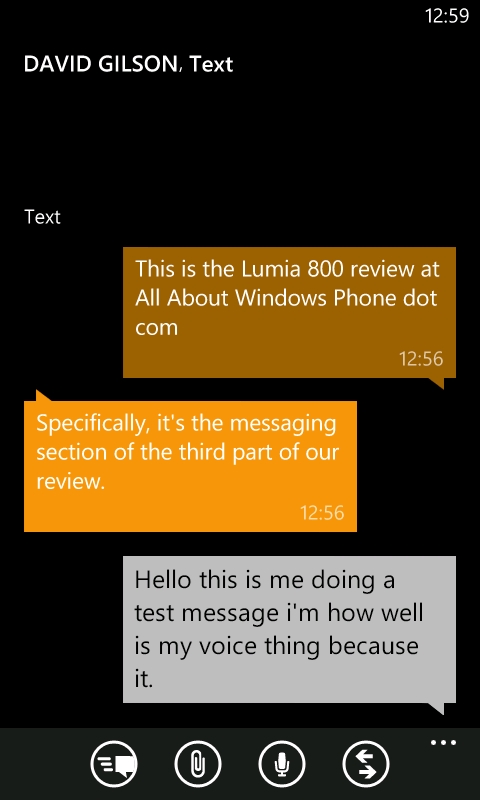
The less than perfect voice recognition system.
The messaging application has a two stage panorama, the first of which is simply titled "Threads", which encompasses both SMS/MMS conversations and instant message conversations, and your chat contacts are shown in the second section, called "Online". Windows Phone 7 supports instant messaging on Windows Live and Facebook. From either your profile page (the "Me" tile) or the Messaging application, you can set your online presence – including 'Offline' if you don't want to be disturbed.
The number of Facebook contacts that will appear online will depend on how you set up your chat visibility on Facebook's website. For instance, if you have restricted your visibility to certain groups, only online members of that Facebook group will appear online in Windows Phone 7.
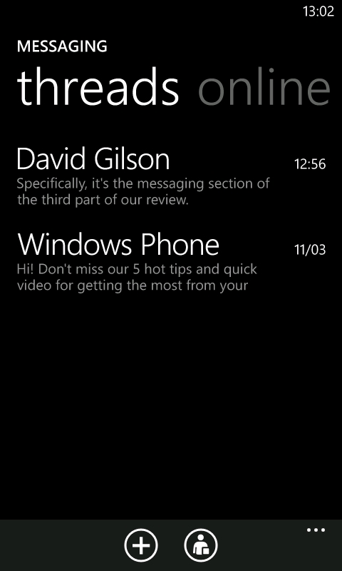
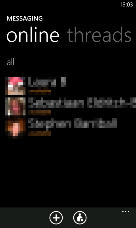
The threads and online views of Messaging.
Ancillary messaging options are available too. The settings page lets you toggle Facebook chat, SMS delivery confirmation (if your network supports it), and group texts. If you want to change the SMS ringtone though, you'll have to go into the main phone settings.
Finally, the Messaging live tile is most definitely lively. An unread message count appears on the live tile, and the emotion icon presents an ever more troubled look as the number climbs up and up. Confusingly though, if you tap the tile, but then leave the application without having read any new messages, the live tile unread count resets to zero – which could mean you forget to go back and read certain messages. Fortunately, the font colour of unread messages is the same as your theme colour, while everything else is shown in white, so you are not completely left without a prompt for attention.
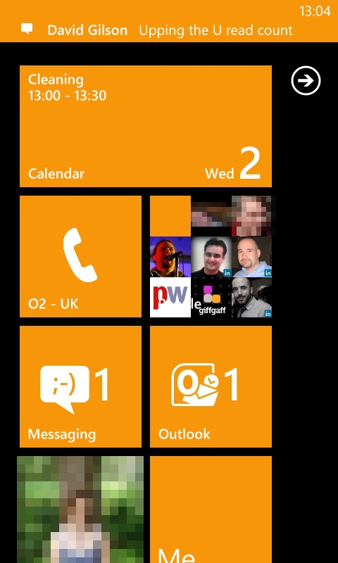
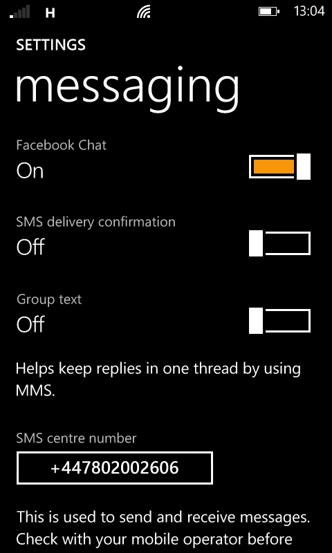
Messaging settings and live tile notifications.
4. Email
Email accounts are added to your Lumia 800 via the "Email + Account" settings page, and there's no shortage of options: Windows Live, Microsoft Exchange, Microsoft Office 365, Nokia Mail, Yahoo! Mail, Google Mail, plus any POP or IMAP service. Additionally, Windows Live, Exchange, and Google accounts also give you full PIM synchronisation. If you have multiple email accounts, you can create a "Linked Inbox" which will show the content of selected inboxes together.
Gmail introduced the concept of threaded email conversations to the masses and Android benefitted by uniquely having this in its native Gmail client. Now though, Windows Phone 7 has joined in on the action. As an email comes in, all of the other messages in that thread are shown as a collapsible list in your inbox.
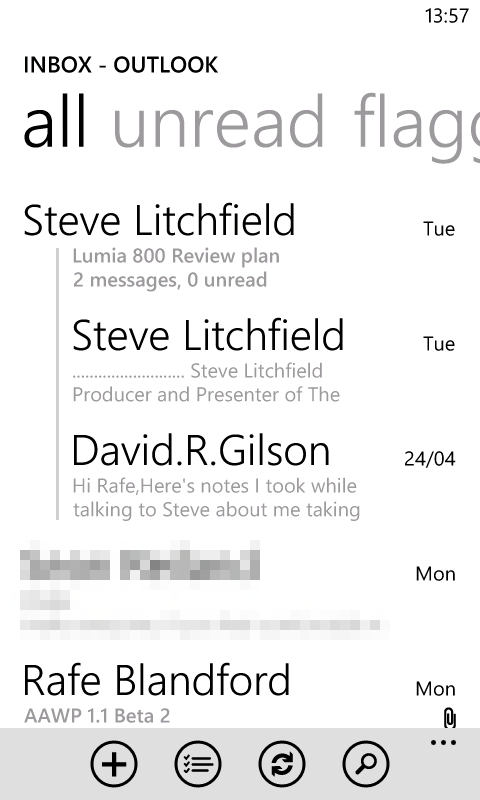

Linking inboxes and viewing message threads.
Windows Phone 7 can handle incoming attachments fine – as long as it's a supported file type. If it isn't, there's nothing to be done – I would have preferred an option to save such files to your SkyDrive account. Fortunately, Zip files are supported along with images, some MP4 video files, and of course Office files.

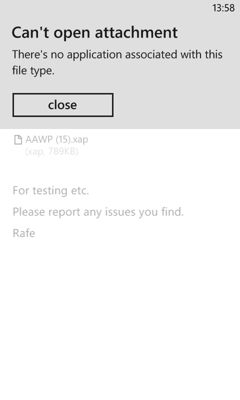
Dealing with attachments.
The situation for sending attachments is nowhere near as good though. Windows Phone 7 is limited to only allowing you to attach images – even videos are excluded. If you want to share another type of file, all you can do is send a sharing link for content stored on your SkyDrive account. Even Office files, which are relatively small, cannot be attached to emails. On one hand, this is really inconvenient, on the other hand, sending a link to collaborate on a document stored on SkyDrive means that multiple copies aren't being created which would need to be reconciled later on. However, you can store Office files locally on Windows Phone 7, and so it shouldn't be an automatic assumption that everything is held in the cloud.
Basic management options are all there, such as delete, flag, and move to sub-folder. There is also a search function which works for local mail, but also gives the option to search mail stored remotely on your server. However, I consistently found that the latter did not work. Talking of sub-folders, I also found that Email was unable to synchronise draft emails via Exchange.
Each inbox, or linked inbox, also has a live tile featuring the service icon and an unread message count. You can also opt to synchronise sub-folders and give them a live tile too. However, all of these suffer from the same 'quirky' behaviour as seen with the Messaging application, whereby viewing an inbox once resets the unread count to zero.
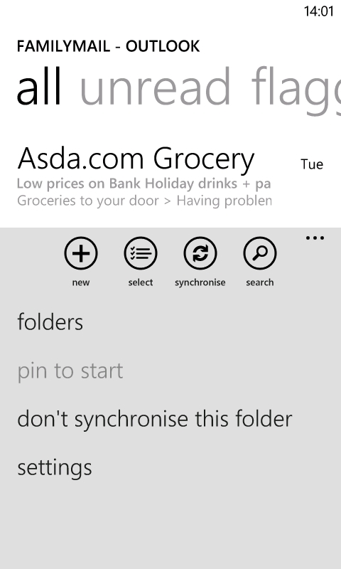
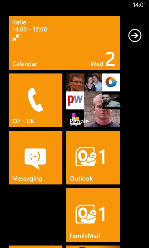
Synchronising sub-folders and pinning as live tiles.
5. Voice communication
Telephone
The phone interface with Windows Phone 7 holds no surprises. After tapping the tile, you're taken to the call history view – missed calls are highlighted in the theme colour, just like in the Messaging application. Unusually, there's no panorama here. Instead, four toolbar buttons take you to relevant screens. The first button lets you call your voice mail (if you've set up your inbox number), the second gives you the actual phone keypad, the third takes you to the People Hub, and the fourth lets you search your history.
The phone keypad has two modes that you can switch between – a regular numeric pad and a special functions pad, which lets you hold a call, add a call, switch on speaker phone and mute the call.
The Phone live tile gives a missed call count that also resets if you tap the tile without acting on the missed call. Usefully, you also get a voice mail icon if there's a message waiting for you. However, the icon takes a while to clear once you've played your messages.
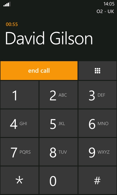
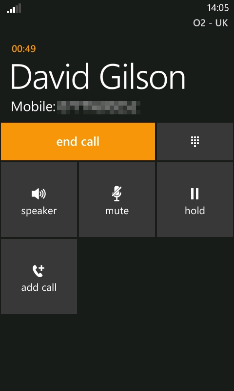
Making phone calls.
VoIP
Finally, we should mention that there is no built-in support for Voice over IP. However, third party voice and video calling is available via Skype and Tango.
_____________
In part four of our continuing review of the Lumia 800 and the Windows Phone 7.5 platform, I'll be looking at the Microsoft Office suite and file management options.
David Gilson, 2nd May 2012
Reviewed by David Gilson at
