Review: Aeries
Score:
88%
The world of Twitter clients is a strange one on any platform - after all, there are free clients for this social service from Twitter itself, there's the good mobile web version, and so on. And still developers keep popping up clients, not even deterred by the knowledge that they'll get blocked if they get too successful (100,000 users). The reason is that a Twitter timeline needs extremely efficient curation and presentation if it's not to overwhelm the user - in a crowded app genre, Aeries pulls out all the stops and ends up at the top of the pile.
Buy Link | Download / Information Link
As I say, it really is a curious app genre - at its heart, Twitter is a bunch of 140 character snippets of text from people you may or may not know. Yet, within this, there are images and links and nuggets of delight or wisdom - and Aeries does a great job at surfacing it all.
The official Twitter client for Windows Phone is actually pretty good, with almost all current Twitter features and tweaks, plus it works in light or dark themes, unlike the official Twitter clients for Android and iPhone, which insist on running in white. But third party clients like Tweetium and, here, Aeries, take things to the next level in terms of pre-caching and filtering content, presenting images and multimedia content, and more. Tweetium's very slick and came top of my last roundup (and yes, there's an update to that feature due), but it's limited in only working for one Twitter account unless you pay to upgrade it (after the initial purchase price), in being just as much focussed on the desktop version (it's a 'universal' app) and in a fairly uninspired live tile.
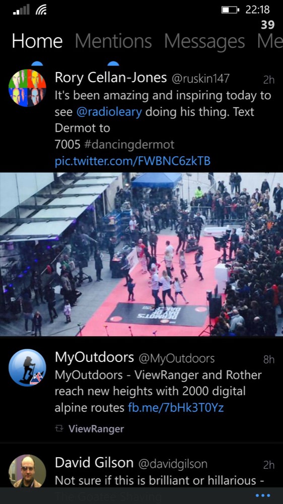
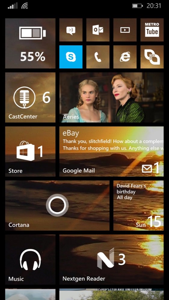
Aeries' full width images, attractive layout and (right) graphical live tile (showing a still from 'Cinderella' in this case)....
In contrast, Aeries offers full support for multiple Twitter accounts, is unashamedly just for the phone (so far), and pushes graphical content up to its live tile, ensuring an always interesting (and sometimes startling) Start screen view. I'm seeing the same across other platforms and app genres, by the way - the developer who comes along later can learn from the deficiencies of what's come before - if only because they start developing their creation because none of the other current options satisfied them personally.
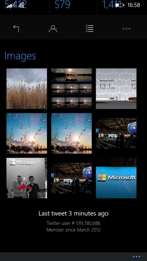

Aeries is graphically rich (and bandwidth be damned!) at every turn, here surfacing recent images from a user's Twitter account (this was a 'Moment' capture on a Lumia 930, by the way!)
Aeries turns out to be very customisable, from the three themes (dark, black, white) to three sizes of image in the timeline to three sizes for text, and then a barrage of options for inline buttons what to do when you tap and double-tap a tweet. Importantly, in terms of fitting more on-screen, you can also hide the page titles (i.e. the Twitter account name) and application bar (i.e. the bottom-of-screen controls) - these all help provide an immersive experience, especially on the AMOLED screens of the Lumia 930, 735, 1020 and 925 with a black theme applied - and it's then very power-efficent as well, for long Twitter sessions....
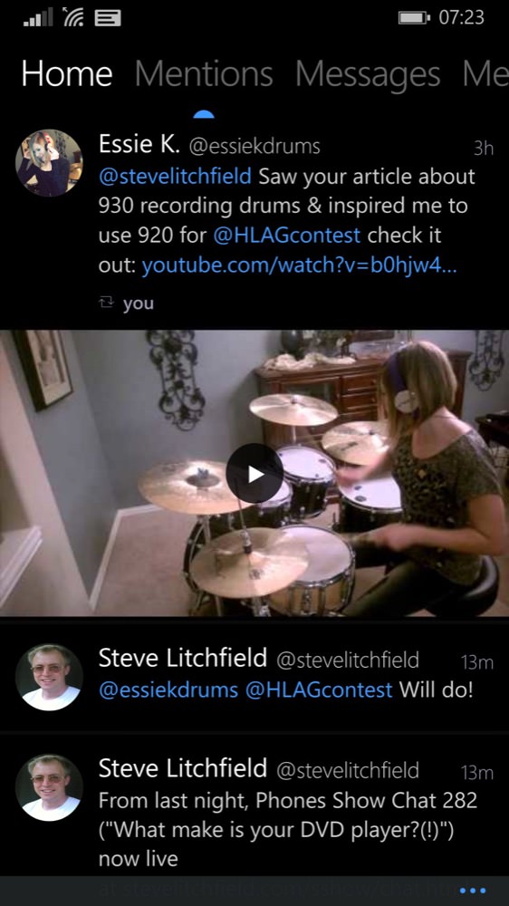

Even linked videos get thumbnailed and linked through to the YouTube client of your choice. In this case, because I've got two installed which use the exact same hooks, I get prompted. Most users would simply go straight through to Metrotube, for example.
Aeries appeared a few weeks ago, but I've been riding the updates, waiting for it to fulfill its potential, especially in terms of background operation. The familiar Windows Phone 15-to-20 minute cycle for background agents is at work here, so that places a slight currency limit on any tweets gathered, but it still means that you're within a quarter of an hour of 'now', even if Aeries isn't obviously 'open' at all. For the live tile, this means that graphical content can be cycled from the relatively recent past, attracting your attention on your Start screen and hopefully drawing you in - to Aeries and to Twitter itself.
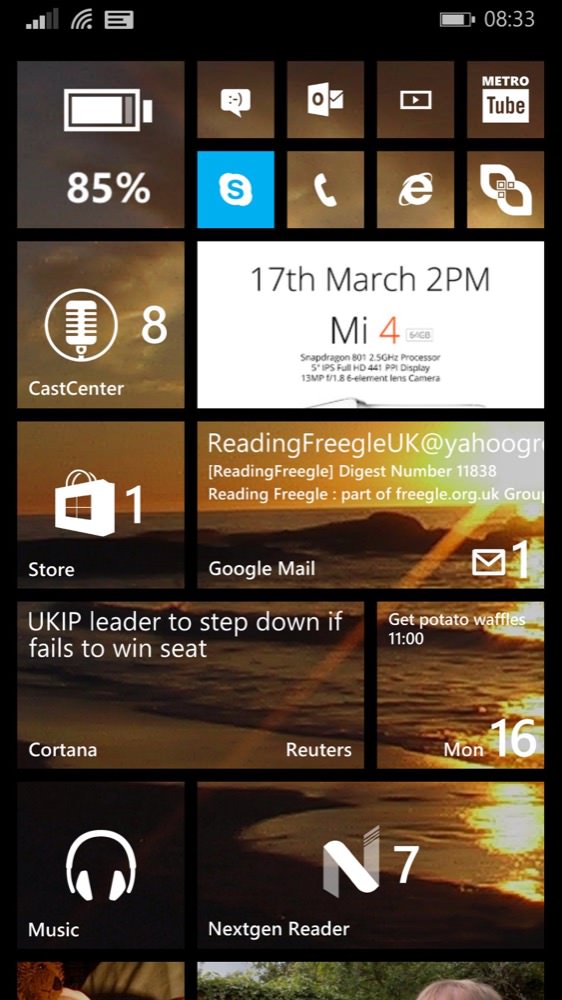
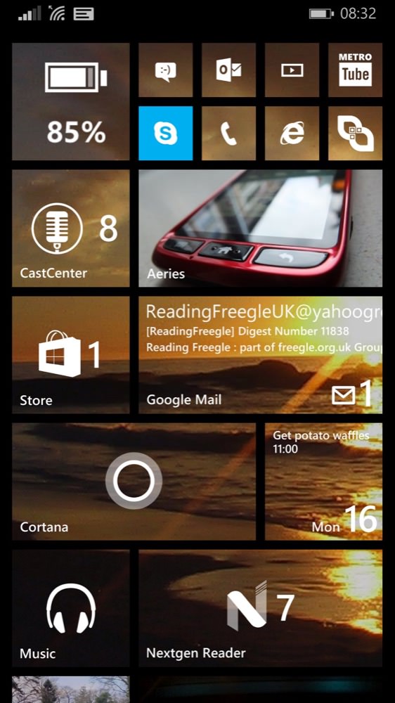
Two examples of Aeries pushing graphical content through to the live tile - recent images are cycled through, and up to date to within 15 minutes of 'now' even if the application hasn't been in the foreground recently.
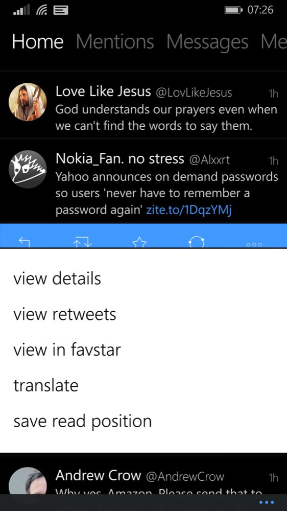
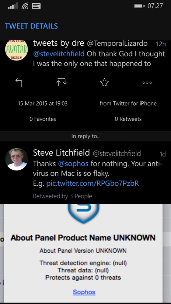
Tapping on a tweet, by default, brings up the blue quick actions bar, and then if you need something else, the '...' brings up the shown (white) pop-up menu; (right) 'view details' brings up the conversation view, where you can see what a tweet is in reply to, again with inline graphics if relevant.
The workflow of tapping through a tweet into its details or conversation view is perhaps a little more laboursome here than in the official Twitter client, but only by default - if you do a lot of diving in, the flexibility of Aeries means that you can set up a single tap on a tweet to go straight to this view - it all depends what you want.
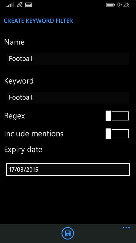
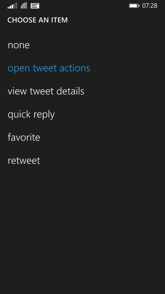
Two of Aeries most interesting features: left, setting up filters to block things you're not interested in - very useful if there's a big event of some kind on; (right), absolute customisation of what taps and gestures do - you can set up Aeries to behave exactly as you want...
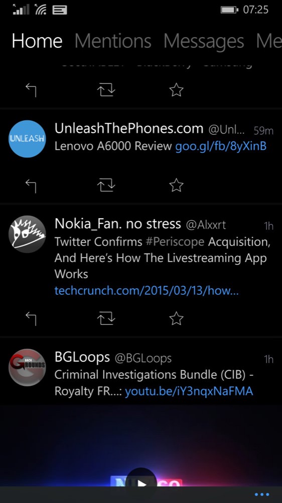
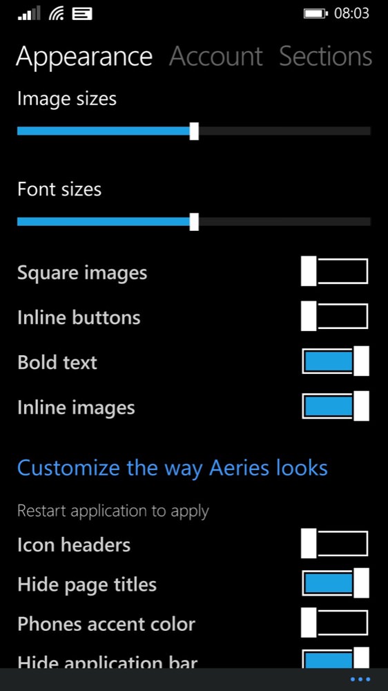
There are a huge number of combinations of display options too, including showing inline buttons, here on the left, making for quicker interaction at the expense of showing fewer tweets at once.
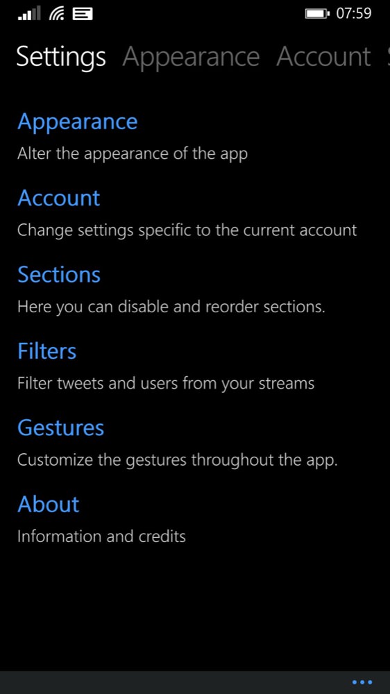
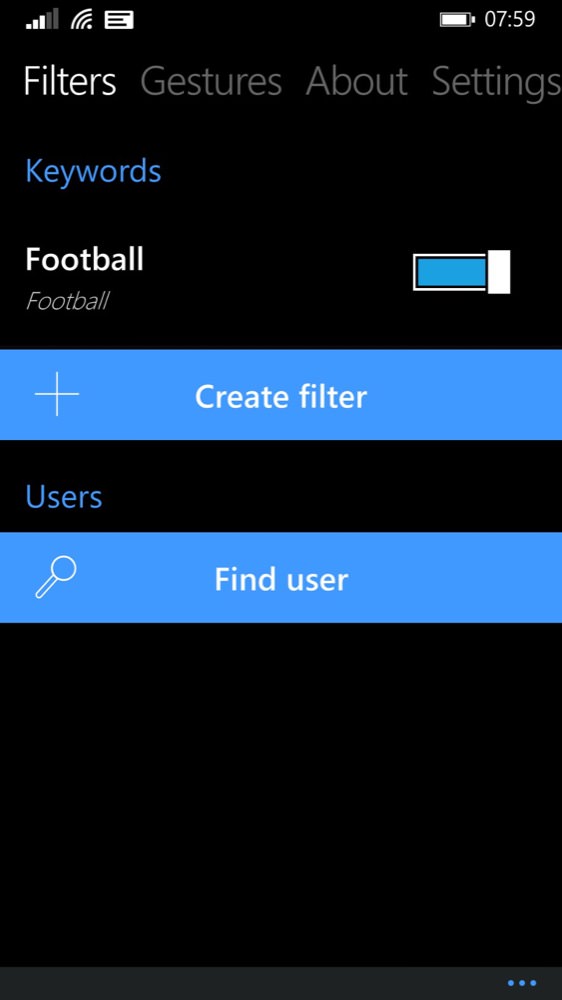
The Settings hierarchy is, cleverly, organised so that you can browse it by diving in or by swiping across a panorama - both are equivalent; (right) for example, four swipes left and I'm at the Filters section. Why don't all Windows Phone applications make it this easy?
If there are a lot of Settings-level screenshots above then I make no apologies - the customisability of Aeries is a core strength. Multiple account support is important, though no demonstrated here because I only use the one. 'Sections', above, lets you pick which columns you want shown in the main UI. Personally, I don't use Twitter 'Lists', for example, so I deselected that in 'Sections', ditto 'Retweets' and 'Favourites'. With these three removed, my Aeries UI then becomes a simple and traditional three column affair.
Key to Twitter on a mobile OS with restrictions on user app multi-tasking (like Windows Phone) is that, when brought to the foreground, tweets don't have to be downloaded en masse since the last time you looked at the application. As with the best Windows Phone applications, and as hinted at in conjunction with the live tile action above, Aeries has a separate background agent that pre-fetches tweets every 15 minutes, so that when you do tap back into Aeries (via its live tile, via Action Center, via its app shortcut or via the multitasking carousel), the tweets are very nearly up to date and it's only a second or so to grab any last stragglers - Twitter's own streaming mechanism is employed too, so that new tweets simply appear at the top of your timeline, should you leave Aeries open and be gazing at it err.... lovingly(!)
Twitter clients seem to be an application genre that's stronger on Windows Phone than on Android or iOS, at least in my experience. Perhaps part of it is down to the responsiveness of the OS working well with the tactility of a Twitter timeline, perhaps part of this is smoke and mirrors due to the glossy high contrast screens on the top-end Lumias looking particularly splendid with a black themed Twitter interface. Either way, Aeries makes the most of all this and the experience is first class.
Highly recommended, Aeries is a small commercial purchase but well worth it.
PS. If you're interested in the man behind it, check out my interview with Brad Stevenson here, from a few weeks ago, during its beta phase.
Reviewed by Steve Litchfield at
