If the idea of showing off my Start screen to the world (ahem) rings a bell, it's because AAWP did a feature along similar lines back in January 2013, well over three years ago. A lot of water has flowed under the bridge since then, not least the arrival of a major new OS version, with associated applications, so I thought it high time to revisit the feature.
Of course, the whole point about smartphones is that they're personal and your favourite apps and your interests will be different to mine, so take everything here wth a pinch of salt. But I'd had multiple enquiries, from new Windows 10 Mobile users, about how my Start screen was set up, with the idea that they could get some ideas. So here goes...
I should warn you at the outset that there's one big feature of the Windows Phone/W10M Start screen set up that I can't stand - and don't use. And that's folders. Sorry if you're a folders fan, but my view is that if you relegate applications to tiny entities in a folder then you don't get to see proper live tile information and you certainly don't appreciate the beauty (in some cases) of the graphics and data on display. Plus you're forever tapping to expand the folder and then contract it again. My view is that the Start screen should represent all the applications and information you use every day and then everything else can live happily in the main alphabetical applications list, ready for access as and when needed.
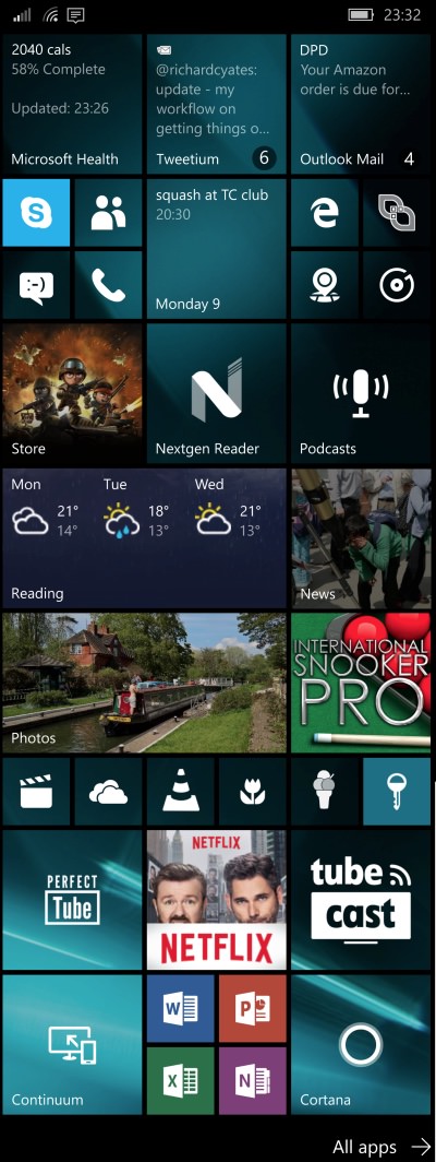
But that's just me. Anyway, without further ado, here's my current Lumia 950 Start screen. It changes from week to week a little, but here's a snapshot in time, at least.
(I've laid it out in one strip and with commentary down the right hand side - if you're browsing this on a very small screen then you may see all the text beneath the image - if you're browsing on a very big screen then there will be some white space beneath the text!)
 Although most tiles will go to 'double wide' and a lot will show more information, you also then get to fit less of them in with a single glance, so this is always a compromise.
Along the top we have Health, cycling around my activity stats for the day (here driven by the motion chip in my Lumia 950 and not from a wearable); plus Tweetium, still the best Twitter client even if the live tile looks a bit ordinary - the live tiles cycles through mentions and DMs as needed; Outlook Mail, showing the most recent email received.
Next, it's Skype (whose live tile is useless, so I keep this to the smallest shortcut size), along with related apps, People, Messaging, Phone; Outlook Calendar shows the next appointment (and yes, I too can't believe that Microsoft hasn't yet given it the ability to show more than one!); and shortcuts to the Edge browser, to QR Scanner+ (for turning bar codes into links, etc.), to Windows 10 Maps and to Groove Music.
The Store client is a given and I do like the way it peps things up with a taste of one of the highlighted apps or games; Nextgen Reader is still the best Feedly client on any platform, though the live tile has stopped updating on my Windows 10 Mobile device - something for the developers to fix? Podcasts isn't the best podcatcher by a million miles, but it does sync both podcasts and play position between devices and is built-in, so comes in handy for someone like me, who has to switch between devices at short notice. (Pocket Casts also works here, but that doesn't quite play ball as well with the Windows 10 Mobile media controls.)
Microsoft Weather offers several live tile variations, but I like the three day forecast in the double-wide tile here; Microsoft News does a good job of highlighting a news story of interest and adds extra colour to my start screen. It may not be as comprehensive as the BBC's own news efforts, but anything important if always here.
Photos is set, for me, to show favourite images and then this cycles around photos I always like to see - again drawing me in; while International Snooker Pro remains my favourite mobile game, perfect for whiling away bored moments while out and about - and because no two games against the AI are ever the same, I never get tired of it.
There then follows a whole strip of shortcuts, live tiles at their smallest size - applications that I only use every few days: Films & TV (for watching my videos on microSD mainly); OneDrive; VLC; Flickr Central; MyAppFree; MetroPass.
Ah yes, then streaming video apps. I do use these several times a day, but wouldn't want to put them higher on the Start screen because they distract me from working too easily(!): Perfect Tube; Netflix; TubeCast.
Finally, there's Continuum, which doesn't really need a live tile yet, but I live in hope that Microsoft will develop it more (and convince me to use it more); obligatory shortcuts to all the Office mobile apps (even I only use each once a week if I'm honest); and Cortana (which doesn't need a link of its own, since it's also tied to the Search control in Windows Phone and Windows 10 Mobile, but again I live in hope that Microsoft will do more with its live tile, so I'm keeping an eye on it!)
________
So there we go, that's my current Start loadout. What about yours? Care to share in the comments below? I'm sure many of you can come up with more creative and prettier set-ups than my own!