Review: Nokia Lumia 1320
Score:
78%
The Nokia Lumia 1320 is, it has to be said, pretty good value - positioned in the burgeoning 'phablet' market (i.e. doubling as phone and tablet) and with relatively few compromises, it can be found in the lower half of the price scale (£238 SIM-free and delivered in the UK, for example). When you think of the converged capabilities and software package, the 1320's main competitors in the value money stakes are, appropriately, its own predecessors.
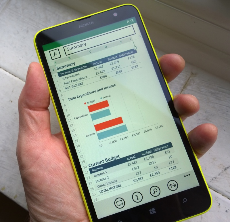
Getting good use out of the Lumia 1320 with Office making great use of the bigger screen...
The Lumia 520 has been the ultra-budget surprise best seller, the 620 the budget all-rounder with the highest specification, and the Lumia 625 the larger screened budget alternative. The 1320 very much continues this tradition of bringing all the smartphone basics in Windows Phone 8/Lumia Black guise in at a price which is hard to ignore, but this time with an eye on the 'phablet' market, already successfully tested with the likes of Samsung's Galaxy Mega 6.3 and Sony's Xperia Z Ultra, all true phone/tablet hybrids. (Note that devices like the Samsung Galaxy Notes are now considered almost mainstream phones, such has been the increase in 'sweet spot' in terms of screen size in recent years.)
The Lumia 1320 is as huge as a 6" screen makes it sound, even bigger and heavier than the higher specified sister device, the unibody Lumia 1520, reviewed here. Although the 1520 plays in the same market, size-wise, it's got premium pretensions (e.g. the 1080p screen and top spec camera), and the prices are very different (roughly double, SIM-free).
Whether you can live with the size in the first place is, of course, a very personal decision. Pocketing the Lumia 1320 isn't trivial, it's too big to be 'holstered', making it (and its phablet competitors) something that has to be carefully micromanaged as you move around in your daily life. Maybe a particular coat pocket in some seasons, maybe a man-bag or handbag in summer, but there's no getting round the fact that this is a substantial lump of glass, plastic and battery chemicals.
This last is very relevant since the 1320's surface area means that Nokia has been able to squeeze in a relatively large (and therefore heavy) 3400mAh cell, enough to power the Lumia 1320 for two days of moderate use without breaking sweat. And I defy even the most ardent power user to drain the 1320's battery in a single day. The battery itself is sealed in, as on the Lumia 625, though unlike in the latter's case, at least you don't get tantalised, on removing the back cover, by seeing part of the battery exposed to the air!
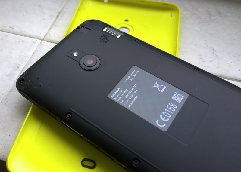
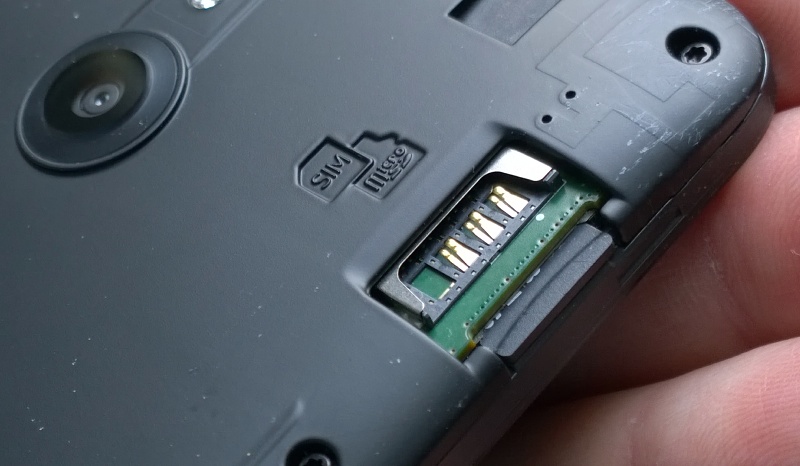
It's debatable whether a removeable battery option is needed on a device with such long battery life in the first place, of course. That the back cover comes off is more a result of the construction used here - the cheaper 'bolt it all together and fit a plastic shell around the innards' approach, as opposed to the more intricate 3D jigsaw that is the 1520's unibody system. Possible advantages of this system are that the microSD expansion slot and micro SIM slot can both be hidden inside the phone's outer shell (but easily exposed when the back cover is off), and that swapping the cover for another of different colour makes for a very easy way of customising your phone on a daily basis.
In place, the (in this case) bright yellow cover sits very securely, though there is the occasional creak of flexing plastic if you press in on the back cover, pinching against the display. Which is where we point to the tradeoff between a two part approach here and the unibody approach of the Lumia 1520.
The main hardware features worth noting here are the display, the control keys, the side buttons and the camera. The display is first and foremost, of course, and is - bluntly - astonishingly good, considering the 1320's price point. It's bright and colourful, and the use of ClearBlack Display polarisers makes a massive difference in terms of contrast, especially keeping blacks 'black' and keeping things visible outdoors:
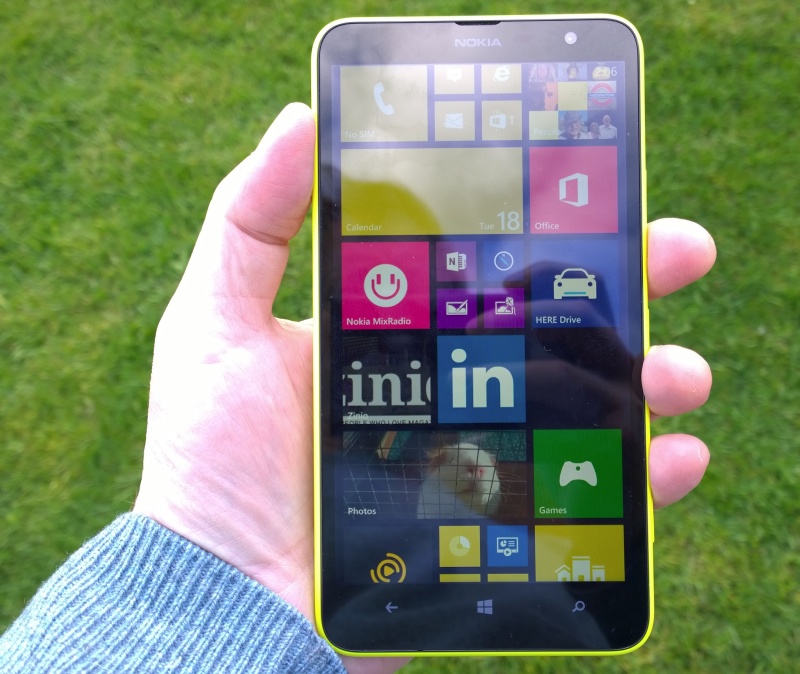
Taken in hazy sun, CBD polarisers doing a great job at cutting down reflections...
Also notable is that the display is, as usual for Nokia's smartphones, full RGB, as opposed to the 'pentile' layout used in many competing devices across the market. Pentile displays have only half the number of red and blue pixels across the screen's width, but the system is often used as it's supposed to give AMOLED displays a longer life. So, when talking about screen resolution, you also have to take into account whether you're talking about RGB or Pentile layouts - I'd argue that 720p RGB (as here) is just as clear and crisp as the 1080p pentile screens on quite a few flagship phones.
It's true that the mathematical pixel density of the Lumia 1320's screen is relatively low (about 245ppi), but it's still very crisp and clear to my eyes. You'd have to have perfect eyesight and very demanding needs in text-heavy views in order to find any shortcoming here.
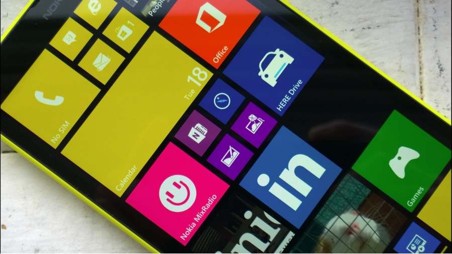
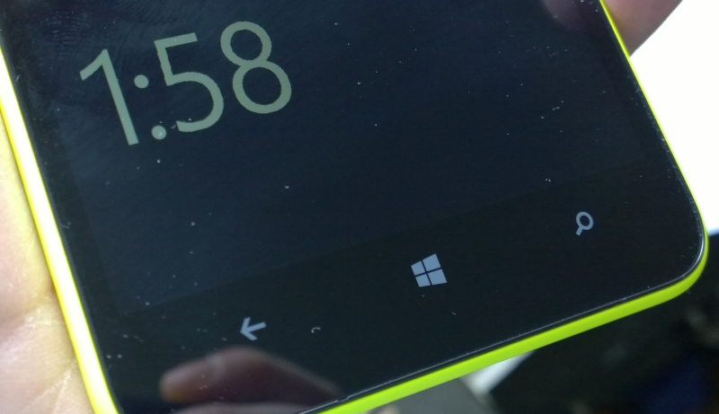
The auto-brightness algorithm works very well, as is usual with Nokia's Lumias, there's 'Glance' always-on information (surprisingly, and as on the similarly LCD-screened Lumia 920) and the whole assembly is hopefully very tough, since Gorilla Glass 3 is fitted.
The capacitive control keys are slightly more compromised, in that there's no backlight for these. Instead, they're simply printed in faint silver - and not even reflective. It's hard to see how much this saved on the bill of materials, but I suppose every little helps and most users will get used to where the capacitive keys are extremely quickly. In fact, it may even be a boon, since in some applications (e.g. Netflix) backlit control keys are a real pain, glaring out when you want them to disappear.
I'm similarly ambivalent about the right hand side buttons: volume up/down, power and camera. These are very neatly matched to the colour of the back shell (in this case, bright yellow!) and are effectively invisible to the casual look. This is good because the device looks very neat indeed and occasionally annoying because you'll try and pick the phone up without touching the power button and will activate it by mistake. The volume keys work very well and the shutter button is very good, with better feel than on some competing 'flagship' smartphones i could name.

Ah yes, the camera - after the display, one of the biggest ticket items in a smartphone build. On the Lumia 1320, we're talking about a 1/4" sensor, so one step down from the usual 1/3" on most generic top flight smartphones. However, as you can see from the samples here, in most light conditions the results are absolutely fine, with minimal noise and good colours. Where the 1320 camera falls down is the same set of scenarios where almost every other smartphone camera fails - low light and moving subjects (cue Xenon rant).
For each Lumia 1320 photo sample, click on the thumbnail to download the 5MP JPG original, for further study.
After using the Lumia 1520 a little and the 1020 a lot, it feels a little backwards to be using a Nokia phone camera with no OIS, no oversampling/zooming later, and no Xenon flash - but the 1320 is certainly up with everything it's competing with in the camera department and can't be thought of as a weak point. The front facing camera is 'only' VGA, but is still good plenty enough for video calls.
Video capture is also devoid of OIS assistance and there's no 'Rich Recording', so presumably the appropriate chipsets and extra microphones needed are omitted for price reasons, but results are still very good indeed, especially allied to immediate playback on the large and clear screen - video capture isn't an area in which any buyer will be disappointed, either.
Inside, the Lumia 1320 is the first Nokia Windows Phone device to use the Snapdragon 400 processor (running at 1.7 GHz). This, along with the 1GB of RAM, is a step down from the Snapdragon 800 used in the Lumia 1520, but Windows Phone 8's UI runs so silkily on even the lowest specification devices (in contrast to Android) and the step down is unlikely to be noticed by the majority of consumers buying the device. The processor here has similar performance to the Snapdragon S4 used in the previous generation of high end devices (e.g. Lumia 920, 925, 1020). In real world terms, there's only a relatively small performance difference between 1 GHz, 1.5 Ghz, and 1.7 GHz dual-core devices on Windows Phone.
Also missing from the chipset is any support for Qi wireless charging - so there are no internal coils or contact points for an add-on Qi charging shell. Qi is definitely not ubiquitous yet across the mobile world, but its absence here is still a minor disappointment, even if an understandable one at the price point.
NFC is axed too, in the drive to keep the Bill of Materials down. Two years ago, when many Nokia smartphones were being announced with NFC, I'd have guessed that NFC would be in everything by now, but it's fair to say that, as of mid 2014, NFC has seen slower adoption than most people (including me) had predicted and I doubt many 1320 owners will miss it that much. For example, NFC wireless contact points usually have a corresponding QR code and this is accepted happily by every Windows Phone camera-equipped device.
One wireless technology that is thankfully intact at this price point is LTE connectivity, i.e. 4G, something that has been missing on some of the previous Nokia budget Lumias. Yes, it's horribly dependent on 4G rollout in your country, but it's great to have the option, at least.
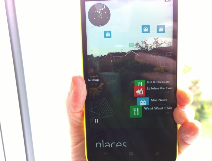
Also included is the digital compass that's needed for the various augmented reality applications that Nokia likes to play with, not least being able to use the heads-up view in HERE Maps, seeing places of interest swish by in real time against the view behind the phone from the 1320's camera.
Storage is 8GB internal (of which less than 5GB is free out of the box), plus microSD expansion, always good to see. Windows Phone is somewhat limited in how it uses microSD cards - essentially these are for captured photos and videos, plus sideloaded music and movies. Which is all very well, though (at least until the Windows Phone 8.1 update) applications have to live on the limited internal storage and I can see a few of the larger Windows Phone games eating this up far, far too quickly. With current game sizes, I'd have preferred 16GB plus microSD as the preferred configuration for Windows Phone 8 in 2014.
Overall then, a very well picked set of hardware components by Nokia - nips and tucks have been made across the board but in such a way that there's nothing missing that's a showstopper.
In terms of using Windows Phone 8, itself very much a known quantity now, the larger screen means that, in some cases, more can be fitted on. In other cases, you get larger text and graphical elements. Here are a few sample metrics:
|
Standard 768p display at 4.5" |
720p display at 6" |
|
| Start screen | 28 square 'slots', or 7 single height 'rows' |
66 square 'slots', or 11 single height 'rows' (each six wide, shown below) |
| Application list | 10 entries fully visible | 13 entries fully visible |
| Internet Explorer | --> | Content 25% larger - set largely by page widths and design |
| 5 emails (sender, subject, 1 line of content each) visible | 5 emails (sender, subject, 2 lines of content each) visible | |
| Twitter (official client) | 3 to 4 tweets shown (at font size 'large') | As for the 4.5" screen, but setting font to 'medium' on the 6" screen produces similar effect, but with 4 full tweets shown all the time |
| Photos | 24 Camera roll thumbnails shown on screen at once, but with bottom 4 masked by the toolbar | 24 thumbnails shown on screen at once, bottom 4 only partially masked |
| Messaging | 5.5 (approx) messages/threads shown at once | 7 (approx) messages/threads shown at once |
| Office | 150 cells shown of my test spreadsheet | 164 cells shown, and with slightly larger fonts/scaling |
You get the idea. The situation's not as simple as displaying whatever Windows Phone would normally show, but larger. This is part of the equation, certainly, plus there's the slightly different screen aspect ratio (15:9 rather than 16:9), plus Windows Phone and some of its applications are coded to use relatively smaller fonts, in order to fit more on screen while preserving the physical size of fonts on smaller devices. Yes, it's complicated. See our article on screen optimisation under Windows Phone 8 here.
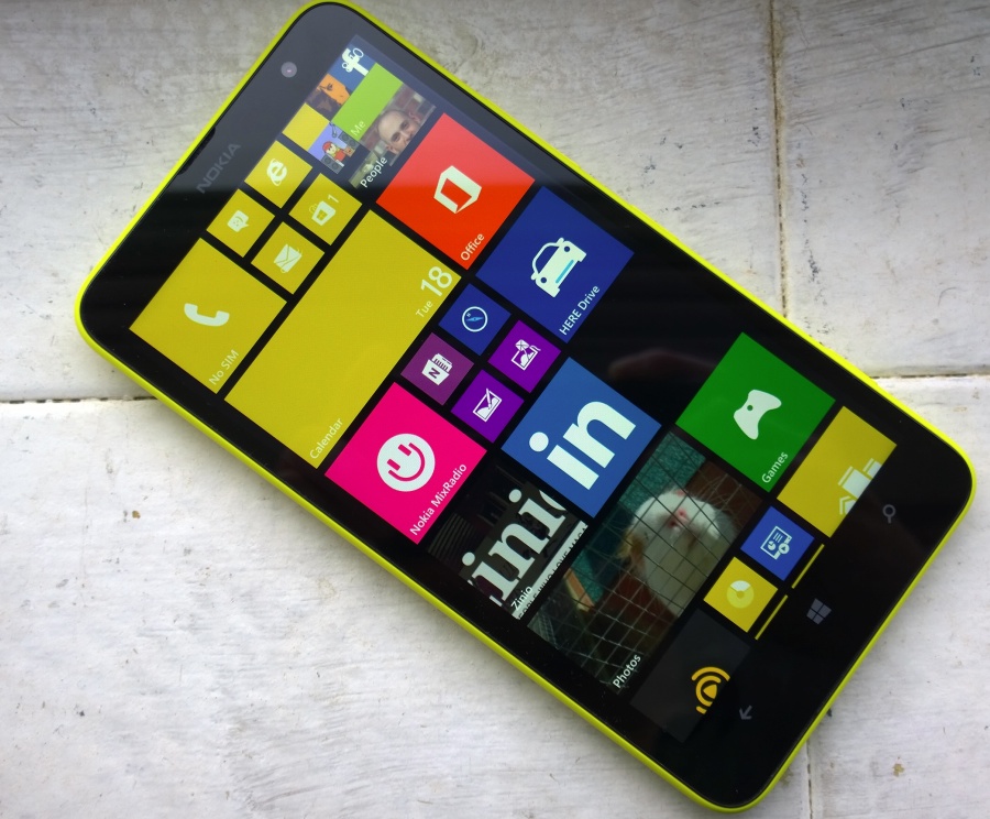
The Start screen is the most obvious beneficiary of the bump in screen real estate. Although the number of horizontal pixels is actually lower than on the smaller 4.5" screens of the Lumia 920 et al, the area covered is large enough that Nokia has enabled an extra column of double-wide tiles, as shown above. Although there's not yet a tile size to span the whole width of the screen in this layout (that's coming in WP 8.1), some pretty useful layouts are possible, with most applications supporting small, large and double-wide live tiles, often with two 'faces', as is common in Windows Phone.
One interesting feeling I got while using the 1320 was that the tweaks and differences were a better fit for this hardware than the same apps and OS font decisions on the Lumia 1520. The latter's 1080p screen undoubtedly has the potential to go further in terms of custom views with more detail, while the 'mere' 720p screen on the Lumia 1320 is still a good fit for Windows Phone at this OS version.
The application set on the Lumia 1320 contains no surprises. It's Nokia's Lumia Black tweaks to Windows Phone, plus its usual 'Nokia Collection' apps. The usual suspects are here, including HERE Maps and HERE Drive, though not in their '+' variants, meaning that the latter will only have free real time navigation in the buyer's home country (set by SIM card when first started). Nokia MixRadio's here, of course, plus PhotoBeamer, but not Nokia Camera.
This last is perhaps not surprising, since the 5MP camera would only benefit from the newer interface for real photography enthusiasts - who probably aren't in the target market for the Lumia 1320. Meanwhile the standard Windows Phone Camera application does a capable job, as shown in some of the photo samples above. Obviously, Nokia Camera can be downloaded if required from the Nokia Collection in the Store.
One of the highlights of Windows Phone on larger-screened devices is the presence of the 'full' Office Suite - this works particularly well on the Lumia 1320, as shown in the photograph at top of this article. What would be the icing on the cake would be support for Bluetooth keyboards, but this doesn't seem to be possible (yet) in Windows Phone 8.
As ever, the lack of a built-in YouTube client is disappointing in this day and age. The commercial Metrotube works well though, showing off the 1320's surprisingly good CBD display, though playing audio of any kind does highlight another slight compromise - the mono loudspeaker is smaller and weedier than that in the Lumia 1020 and 925. It's acceptable, but never impresses - a smaller and cheaper loudspeaker surely can't save Nokia more than a dollar, but we guess that it all adds up.
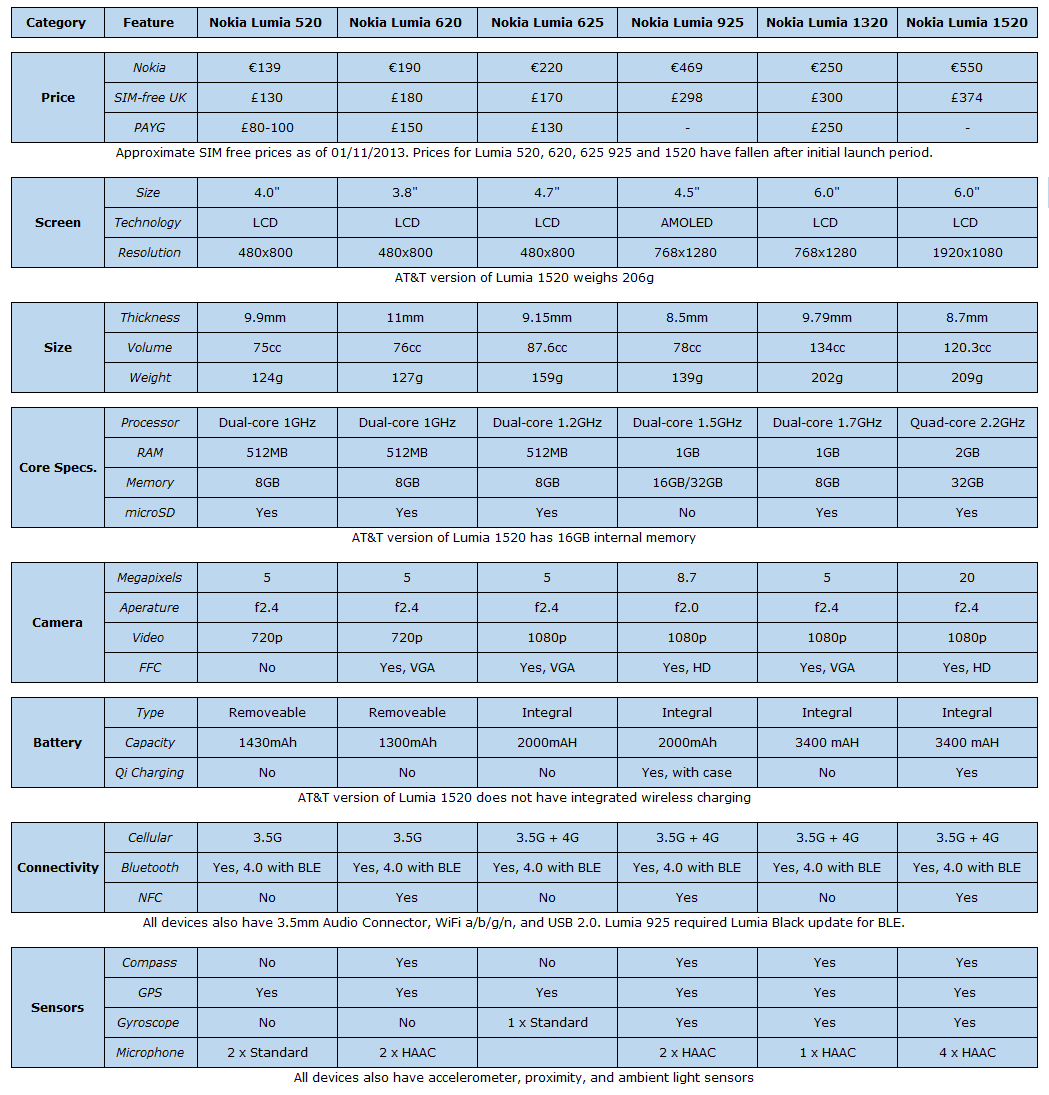
As a guide to where the Lumia 1320 fits into some of Nokia's current (though about to change, with new releases now only a month or two away) device line-up, here's Rafe's handy table from his 1320 video review:
Summing up
The fascination for 'design/build your own smartphone' projects around the Web should highlight, at least, the fact that any smartphone design represents a large swathe of compromises. Overall size and styling, specific flagship features (e.g. big camera), the requirements of the target market and, above all, price. In this light, Nokia's designers have done well with the Lumia 1320, everything that could be cut has been left out and everything that really should be included in a 2014 phablet has been left in, all in a colourful and pretty robust design.
The question then becomes not 'Is the Lumia 1320 a good product, great value?' but 'Do you want a phablet in the first place?' As intimated above, they're harder to pocket and manage on a day to day basis, with the flip side being a screen that's far easier to see, especially for those with less than perfect vision. The 1320 certainly has competition, in the Samsung Galaxy Mega 6.3 mainly, whose specifications are uncannily similar. Yet the Mega 6.3 hasn't sold in huge numbers, in contrast to the more expensive (and now mainstream) Note range - it seems that an extra centimetre all round really does put many people off when it comes to carrying a phablet. It remains to be seen whether the Lumia 1320 will meet a similar niche reception.
Around the corner are new Nokia/Microsoft Windows Phone devices, of course, with an event rumoured for the end of April 2014. At the very least, I'd be looking to a successor to last year's more reasonably sized, ultra-budget (and high selling) Lumia 625 (and, stretching further back, to the also high selling 620). Imagine a Lumia 630 with 5" screen and the other specifications from the 1320 here, coming in (to take a UK example, as a typical Western market) £200 SIM-free or £140 on pay-as-you-go? Much as I admire what Nokia has achieved in building down to a price with the 1320, I can't help but feel that sales success will lie slightly further down the size spectrum...
See also
Rafe's video review of the Lumia 1320
Reviewed by Steve Litchfield at


