Review: Nokia Lumia 1520 (Windows Phone 8.1)
Yes, Rafe reviewed the Nokia Lumia 1520 'phablet' back at the end of 2013, but with what's almost certainly going to be the 'final' version of Windows Phone 8.1 now on the device (via the Developer Preview programme), I contend that it's high time the device was re-evaluated. Partly because the huge OS update transforms the device and partly because I wanted to have my say - not least because I've had six months of phablet use in the form of the popular Samsung Galaxy Notes to act as a reference point.
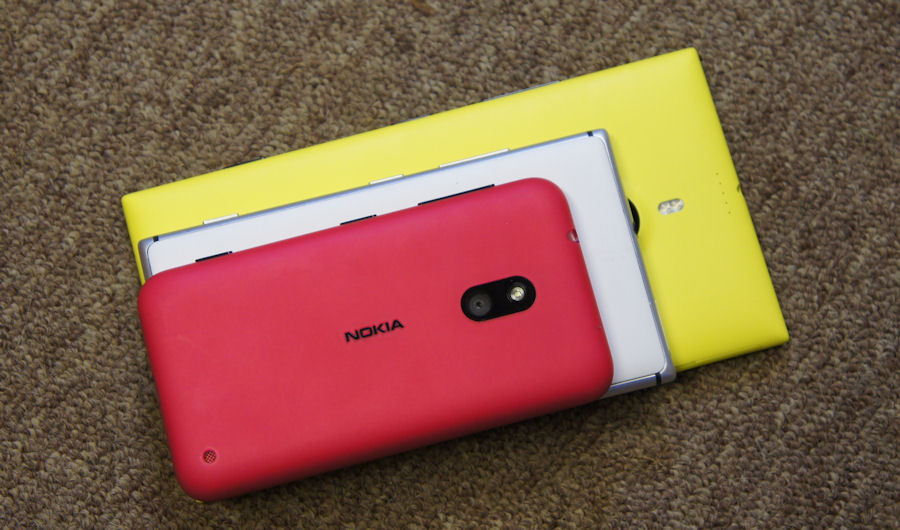
Nokia Lumia 620 (top), Lumia 925 (middle), and Lumia 1520 (bottom)
We should start with what Rafe had to say, back at the end of 2013 though:
With the Lumia 1520, Nokia has once again delivered a superb piece of hardware, further burnishing the company’s reputation for design excellence and innovation. The Lumia 1520’s camera is something quite special, getting close to the experience and quality of the Lumia 1020, without any form factor compromises. The overall feel and design impresses too, with an attention to detail that offers moments of delight. But the biggest stand out – exactly as it should be on a device in this category – is the screen, which is, quite simply, the best we’ve seen on any smartphone....
...If you’re looking for a new Windows Phone device and wondering whether you should pick the Lumia 1520, then the question you need to answer is whether you want a large screen smartphone. The benefits of a larger screen are largely self-evident, so it’s really about considering whether you can live with the downsides that come with a bigger device. The ability to carry it with you conveniently and comfortably is chief amongst these because the biggest merit of any smartphone is the way it can always be with you, never more than a second or two away. Any device the size of the Lumia 1520 starts calling that attribute into question.
If you’ve already decided you want a large screen smartphone, but haven’t settled on a particular platform, then the great design, excellent build quality, outstanding screen, and industry leading camera make the Lumia 1520 one of the most compelling choices in terms of hardware. Pick out almost any element of the hardware and you’ll find the Lumia 1520 at, or near, the top of any ranking. However, as has become a familiar refrain for the Lumia range, it’s likely that any purchase decision will almost certainly be driven by the software. The decision isn’t about whether you want the Lumia 1520’s hardware - you do - it’s about whether you want Windows Phone.
All of which is still very valid, of course. In fact, Rafe also made various references ot a possible Lumia 930, a device which we now know is reality (and imminent, for review). But the 1520 remains - for now - at the top of Nokia/Microsoft's portfolio. Yes, the 1020 has a better camera, but in every other regard the 1520's specifications are superior. In fact, the 1520 still outspecs the new Lumia 930 in every way, I'd argue.
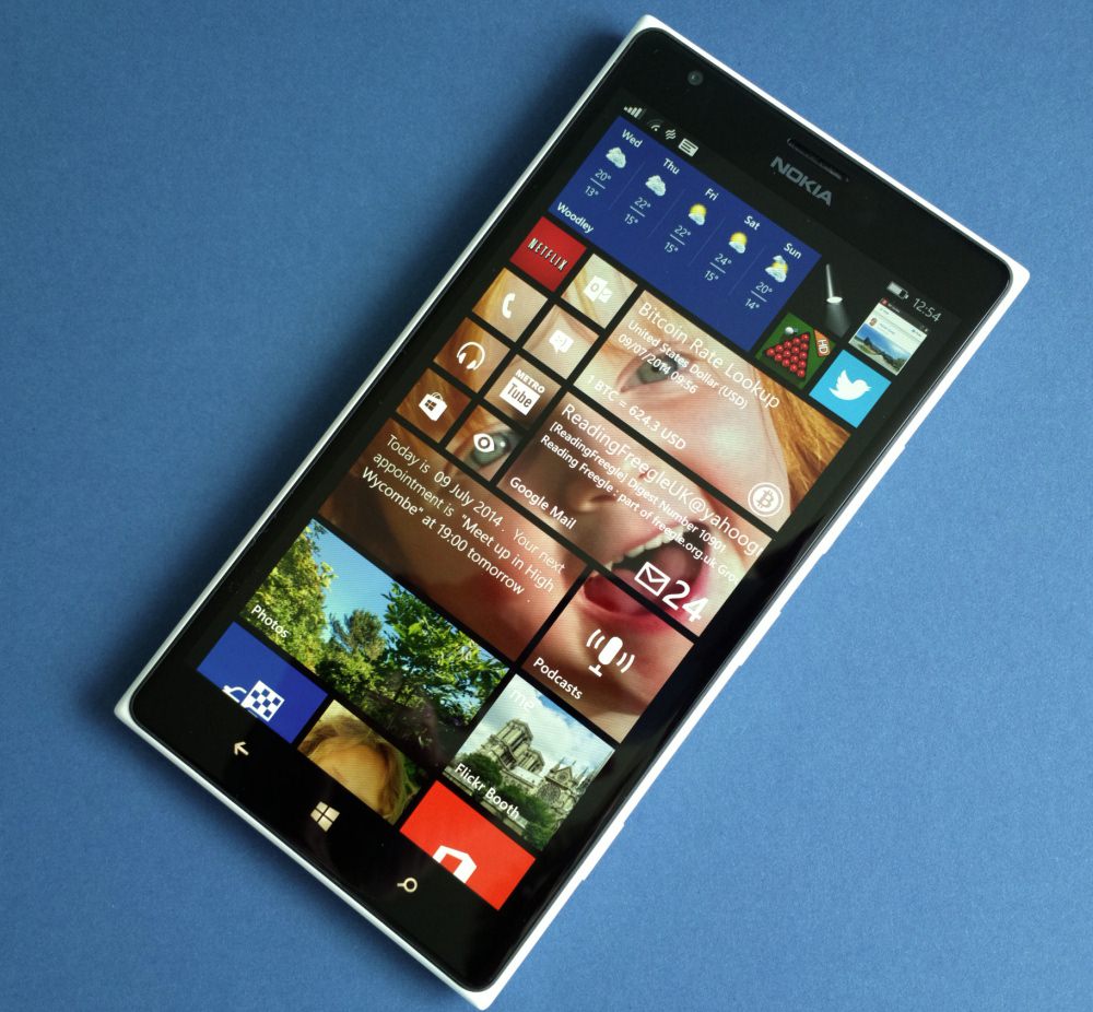
Add in that you can now buy the 1520 for about £350, brand new and SIM-free (it was £550 when Rafe reviewed it originally) and you have something of an outright bargain - if you can live with the size.
Size is everything, you see, to quote the popular cliché(!) At least with this device. Previous generations of device, even the Galaxy Notes (with 5.5"/5.7" screens, typically) have been just small enough that trouser back pockets, belt pouches, and so forth were possible places to carry them. (Top shirt pockets have long been out, of course.) With the 6" screen here, plus a centimetre of bezel top and bottom (understandable, with the controls and sensors all embedded), carrying possibilities now resolve to just front trouser and inside jacket pockets. Or perhaps to a 'man bag' or similar. Which, depending on how you want to use a combined smartphone/tablet, will be a subjective call, of course.
Related to size is grip - I've lost count of the number of people who have said that they loved the Lumia 1520 but had to get rid of it because they kept dropping it. Part of the problem is that the size means that your hand can't fit around the perimeter (touching finger and thumb), though in fairness, most people can't do this with the Galaxy Note II/3 either. The other part is that the 1520 is made of comparatively shiny polycarbonate - a more grippy finish would have helped practicality here. The obvious solution is to keep the Lumia 1520 in a case and, with that in mind, I'm planning a case roundup for AAWP. However, a case also makes the device even bigger, by an extra millimetre or two all round, possibly exacerbating the issues.
In fairness, having been using the Lumia 1520 for a month (with Windows Phone 8.1, the reason for this re-evaluation), I haven't once dropped the device - or even felt like dropping it. For me, the extra size and weight (a monster 209g) somehow help my brain and fingers adjust to the fact that I'm holding something that must be treated with extra care. Think of how you hold an iPad mini, for example - this is closer in size, feel and use to this than to a traditional 4" screened 'phone'. I've never dropped an iPad or Nexus 7, and (touch wood) I've never dropped the 1520. So take the slippery nature with something of a pinch of salt.
Once size and the portability issue are resolved(!), there's a huge amount to like about the Lumia 1520. Taking the device to a recent tech event, the 1520 proved to be the (surprising) star, with everyone completely blown away by the clarity of the screen. We talk of resolution and CBD and other factors, but there's more here than even those parameters. As Rafe explained in the original review text:
Screen size and screen resolution seem to be the primary characteristics by which smartphones displays are judged. The Nokia Lumia 1520 scores well in both these categories, but we’ve always felt that the quality of the screen, and implementation of related companion technologies, often have a greater impact on screen usability, and therefore result in more meaningful differentiation between competing devices.
The Lumia 1520 display is built around a high quality LCD IPS panel, which gives a good base to build on, but it’s really the way Nokia implements the screen stack that makes the Lumia 1520 stand out from the crowd. Nokia describes various aspects of its screen technology using generic descriptive names: ClearBlack Display, high brightness mode, sunlight readability enhancements, and super sensitive touch.
ClearBlack Display is really an amalgam of several different technologies related to the way different layers of the screen are combined together, but the most important element is the inclusion of circular polariser and retardation layers between the surface of your phone and the LCD display, cutting down on screen reflections.
High brightness mode, which increases screen luminance by 20% in sunny conditions, and 'sunlight readability enhancements', which tune screen content in response to input from the ambient light sensor, are both also critical in improving screen visibility outdoors.
The last tech mentioned above is particularly important. 'Sunlight readability enhancement' is enabled by Apical’s Assertive Display technology. Rather than tuning the screen as a whole, the display is tuned on a pixel by pixel basis. The video below shows how the updated technology was demonstrated at a 2013 event:
It's easy to be blown away by acronyms and buzzwords, but the CBD/Assertive tech, in conjunction with what is already a very high quality RGB 1080p LCD panel, makes for the best all round screen I, or indeed anyone, it seems, has ever seen on a mobile device - bar none. And yes, I've reviewed the LG G3, with its QHD panel - very impressive, but the 1520's display is far clearer out in the real world.
In terms of the display then, the 1520 can't be beaten. Other hardware highlights include a really loud speaker - it may not have the fidelity of the speaker(s) in the HTC One and One (M8), but it's loud and clear and perfect for podcast listening, voice speakerphone use and sat-nav instructions. In terms of internals, the Snapdragon 800 and 2GB of RAM really drive applications along - in fact, the limiting factor in the Windows Phone experience is ever more the speed of the transitions - if only there was a way to tweak these or even turn them off?
Storage is taken care of in much better fashion that it was on the Lumia 920, 925 and 1020, by virtue of the microSD support - simply route all new captured media to card, put all your sideloaded media there as well and, with Windows Phone 8.1, even put some of your larger applications on card as well, leaving the bulk of the internal 32GB disk free for everything else you might want to do. With a fully loaded 1520 (i.e. all my games and apps, all my usual media), I've still got 17GB free, and this with a relatively modest 32GB card inserted.
Finally, on the hardware front, there's the camera, using the same oversampling techniques as on the Nokia 808 PureView and Lumia 1520, but this time in a smaller 1/2.5" 20MP sensor. Initial camera tests were a little disappointing, but a) that was in direct comparison to the camera-specialist Lumia 1020, and b) the results are now even better with both new versions of Nokia Camera and the core OS under the device's belt.
As evidence, here are some samples captured in the last week or so, click on each thumbnail to download the 5MP oversampled JPG:
Stunning colours and clarity...
Caught the bee in action! Taken in weak sunlight at dusk.... Not a perfect shot, but you try focussing on something tiny and moving!
With overcast skies, raindrops on a bench, looking at raw detail and texture...
Reframed slightly using the oversampling system, this cute little lass...
At maximum lossless zoom (about 2x), so no oversampling, but still a very clear shot....
Although for absolute quality and flexibility, you can't look further than the Lumia 1020, the Lumia 1520's camera does get very close indeed now, in terms of results, and with a shot to shot time of only a second, getting round the 1020's main drawback (speed). In fact, it's so good that Nokia has standardised on this 1/2.5" unit for the next generation of flagships, including the Lumia Icon and 930.
That the camera has gotten better with firmware and application updates isn't surprising, of course - I predicted as much back in my original pieces at the end of 2013. But it's gratifying to see the 1520's camera potential fulfilled.
Video recording's terrific, with OIS working better on this smaller hardware than on the 1020's monster optics, plus the four HAAC microphones mean perfect audio capture in all conditions, with some directional capabilities, as detailed/demoed here.
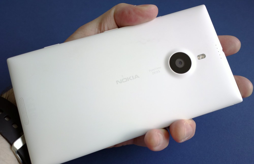
That's the hardware anyway - or at least the highlights. See Rafe's original review text for smaller details and design insights.
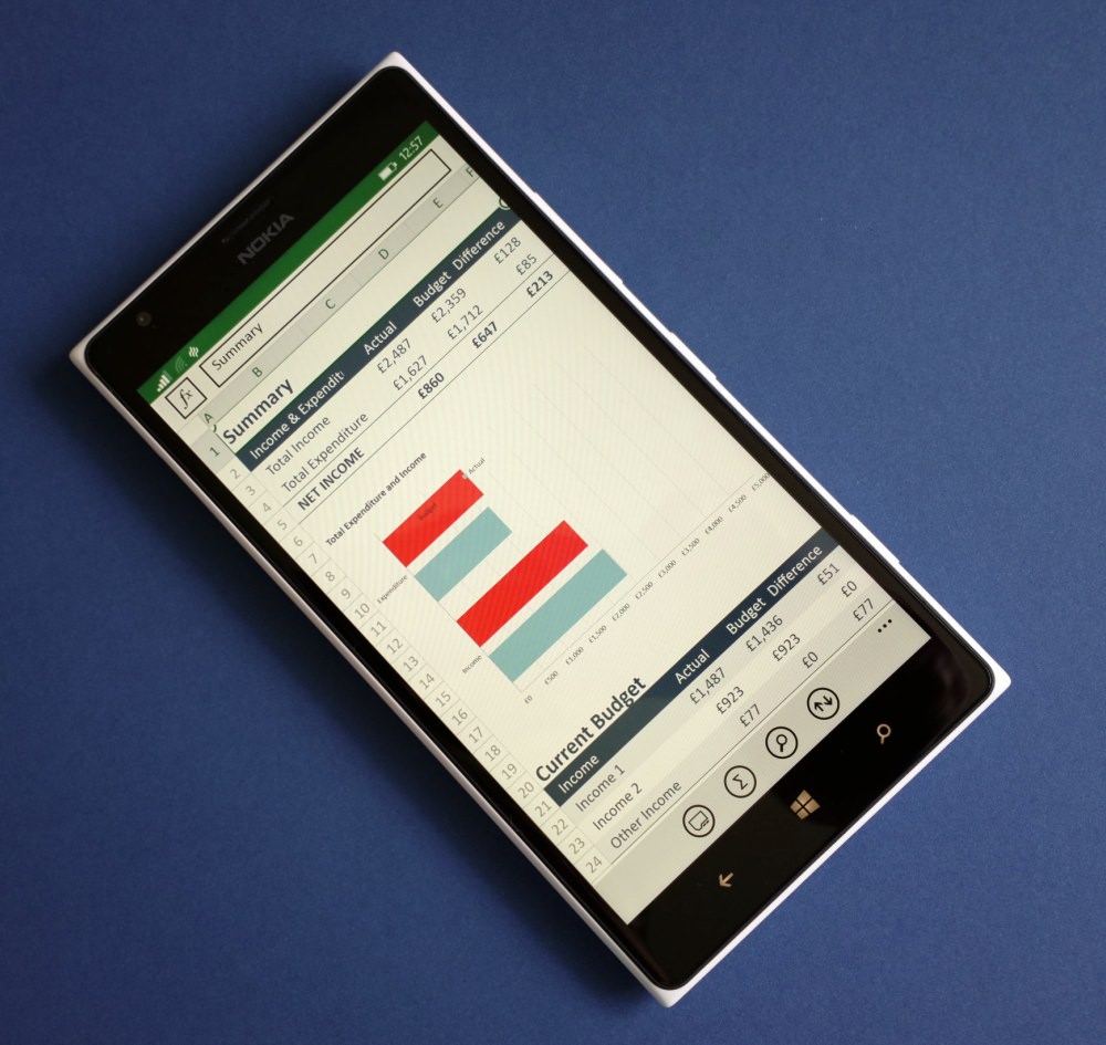
Part of the reason for the re-review on AAWP is because the presence of Windows Phone 8.1 has transformed the Lumia 1520's interface. When originally encountered, I'd estimate that 70% of the applications and UI were effectively just the standard Windows Phone 8 system magnified to fill a 6" 1080p screen. As I showed in this feature though, the latest Windows Phone 8.1 has worked in a lot of system wide tweaks for the larger screen, slimming down toolbars and fonts where needed, in order to make room for more content - often much more. Here's a good example, looking at the Office hub:
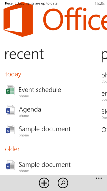
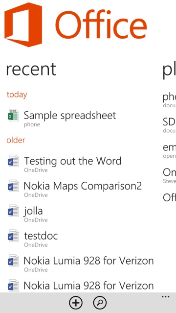
Quite a dramatic improvement and this sort of thinking extends throughout most, though not all, applications and screens on the Lumia 1520. There are notable exceptions, usually in legacy third party applications but ooccasionally in Microsoft first-party titles like 'Podcasts'. However, in fairness, the full "Lumia Cyan" package hasn't yet hit, a rounding-out firmware update that's expected any day now, and it's entirely possible that the last remaining large-fonted applications will be finally sorted on this 6" screened device.
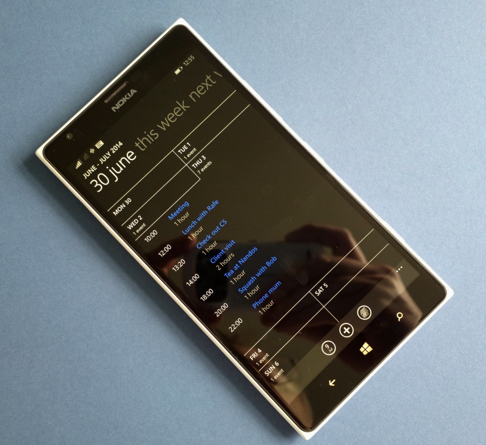
I demonstrated a couple of days ago how the increased screen real estate and resolution on the 1520, in conjunction with Windows Phone 8.1, could be put to good use in providing always on 'now' information and valuable shortcuts. Quite simply, from Start screen to Action Center to the in-app-experience, the Lumia 1520 is now a world away from the relatively primitive Windows Phone we saw back in the days of the 3.7"-screened Lumia 800 (anyone remember that?!!)
Special mention should also be given to niceties like double-tap to wake, almost essential with a device this large. Trying to pick it up and then locate the screen lock button is a bit of a pain, but with the 1520 laid flat on a surface, you can unlock the screen with a double-tap and then the usual swipe, with no button pressing needed at all. I realise that double-tap-to-wake isn't a Nokia exclusive anymore, but it's certainly a valuable feature on the 1520.
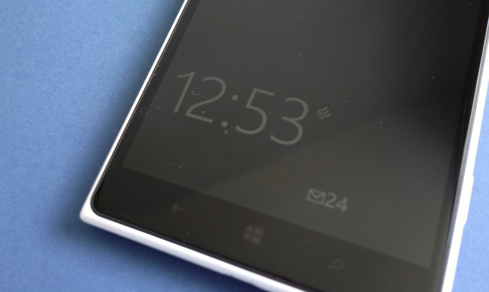
Nokia Glance too, the low intensity persistence of display of time, next appointment and any notification icons (all customisable), is really useful. There's a battery hit in keeping this on all the time on a LCD screen, since the backlight has to be active, albeit in a low power state, so I compromise and use the 'Peek' mode, where a wave over the top-of-device proximity sensor brings up the Glance display for few seconds.
Battery life from the integral 3000mAh cell is very good, with the latest Windows Phone 8.1 build helping keep the 1520 going throughout a busy day with ease, though the standby drain of the OS is sufficiently high that going far into day two is unlikely. I wouldn't rule out further optimisations, but at this stage I suspect that Windows Phone's battery greed is what it is. Still, it's definitely nowhere near a showstopper, certainly on the 1520, helped by the built-in Qi charging, meaning that as long as your home and/or office are equipped with a pad each, you can essentially keep the 1520 topped up all the time with almost zero inconvenience. Wireless charging still isn't ubiquitous, but for anyone who's used it for a while, it dramatically changes your view on battery and power management.
___________________
When the Lumia 1520 was announced, there was general astonishment from the tech community that Nokia had gone well beyond the current Galaxy Note 'phablets', right up to 6" screen territory. Was this the same Nokia we'd all grown up with? Put a Nokia smartphone from 2006 next to the 1520 and the logo is, quite literally, the only similarity. However, there's forethought here and across the mobile industry we're still seeing screens increase in size, to the extent where LG's new mainstream G3 has a display that's almost identical in size to that of the first Galaxy Note 'phablet'. And there are now numerous phablets at 5.7", 6" and even larger, filling out the space left beneath traditional tablets like the iPad mini and Google Nexus 7.
In such a landscape, Nokia's Lumia 1520 no longer seems that bit an outlier. Yes, it's still just as hard to pocket and, arguably, to hold, but the same objections apply to much of the competition. What's happening across the industry is that the use case for smartphones has been changing, with media consumption (often driven by YouTube or social networks, but also including the likes of Netflix) and gaming playing an increasing part in people's mobile lifestyles. Both of which need as big a screen as possible, of course. And with the benefits gained outweighing any inconveniences.
The Nokia Lumia 1520 already won high praise from us, back in 2013, even at £550, with only a few caveats. At £200 less and with a system wide major software update in place, the Lumia 1520 is now quite astonishing value. If you're a Windows Phone enthusiast and don't own one, then have a think about your smartphone lifestyle - is there room on your person for this mobile computing beast?
Reviewed by Steve Litchfield at


