Review: Nokia Lumia 530
Score:
72%
The Nokia Lumia 530 is here - and, showing the long time scales upon which phones are developed, there's no mention of 'Microsoft Mobile' anywhere on the box - you actually have to remove the battery to see the first evidence of Microsoft's involvement in the hardware. It's the new bottom end of the Windows Phone range and in some ways it shows, but there's still plenty of value for money for buyers.
After the release of the sub-£100 Lumia 630, I went on record as saying that the 630 was originally the 530 internally at Nokia and the model got bumped up a notch in the naming system at some point, so convinced was I that the 630 was the 520's spiritual successor. It turns out that I was wrong - regardless of where the 630 sits, spiritually(!), the 530 is now the new bottom end of the Windows Phone range from Nokia/Microsoft, compromising intelligently in all but one case from the best selling 520's specifications, in order to achieve a lowest street price of as low as £40 on pay-as-you-go in the UK, at launch, and no doubt regularly under £50 across the board as we get closer to Christmas.
Regardless of what negatives I might come up with below, it's worth stopping to let the price sink in for a moment. Remember that all the Windows Phones now include full offline voice-guided sat-nav, full Office editing software, plus a smartphone UI that's arguably more responsive than any other in the mobile world.
The only flies in the ointment here come from competition within the Lumia range - last year's 520 is just as cheap now, if you can find it, and offers a higher specification all round, while the newer 630 is as up to date as the 530 in terms of OS and chipset, but with much better display and camera. And, being controversial, I'd argue that the old Lumia 620 and 625 are even better than any of these, again for not much more money. Though 'old' is the operative word here, in that the 530 has a newer chipset and will be supported/available for longer.
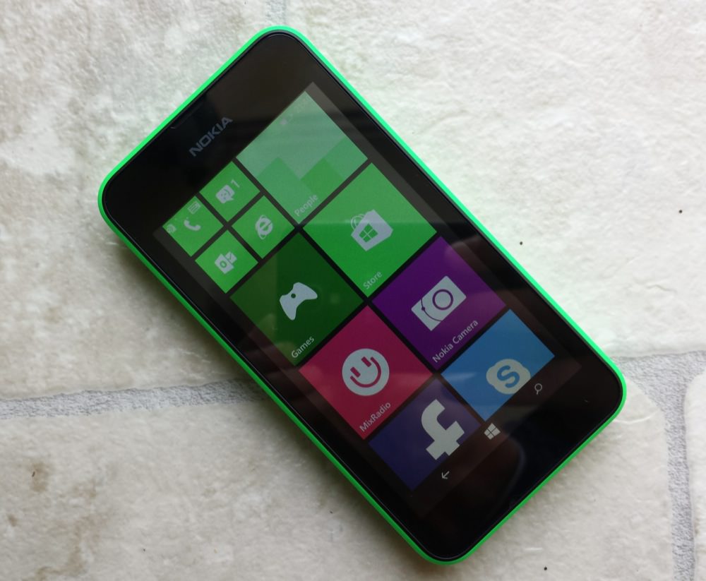
But let's consider the Lumia 530 on its own merits. it feels very solid in the hand, with display nicely centred in the front face and the body of the phone sitting in the usual 'bucket' shell for low end Lumias. The big advantages are that different colours can be used for these, even swapped day to day if desired, plus there's the possibility of having a replaceable battery (not always a sure thing, as the 625 showed, though) and easy microSD and SIM access without having to deal with side-loading trays.
One normal disadvantage is that the solidity of the phone suffers from this two part approach, but the Lumia 530 is very solid indeed, with no creaks or uncertainties whatsoever. The front glass isn't Gorilla Glass (so that's the first design compromise driven by the build cost), but is smooth enough to use and I thought I detected an oleophobic coating - it's certainly less sticky than the 520's screen.
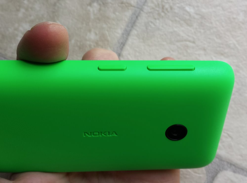
The three side buttons (volume up/down, lock/power) are part of the shell and obviously perfectly colour matched. The 'bucket' here is nicely curved, matching the typical human hand very well - contrast this with sharp edges on the Lumia 520 and 630, for example. The camera on the rear has a slightly raised edge, protruding beyond the plastic shell, ensuring that putting the phone down on a dirty surface shouldn't pollute the camera glass too much.
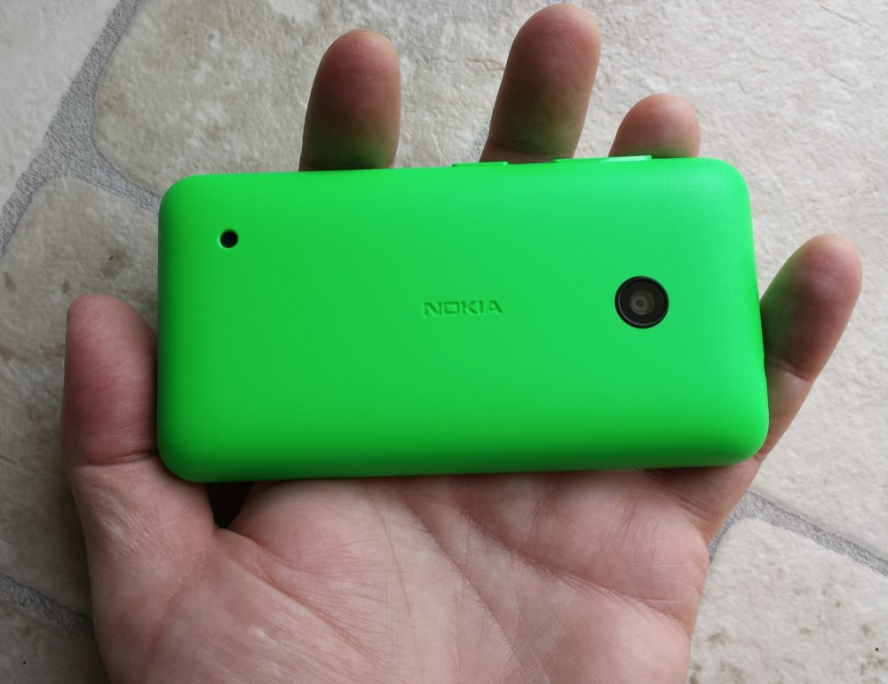
Getting the back shell off isn't trivial - you either use strong nails or push on the camera glass (and then remember to wipe the latter later!) - but reveals a standard BL-5J battery (the same as in the 520) and microSD and microSIM bays - inserting anything into either of these means removing the battery. Which isn't a massive problem but do note that a further cost cutting measure on the Lumia 530 means that there's no ultra capacitor onboard to keep the system clock going in the meantime. So, after perhaps putting in a new microSD, you have to manually set data and time. Or, at the very least, check that this comes across OK from your mobile network.
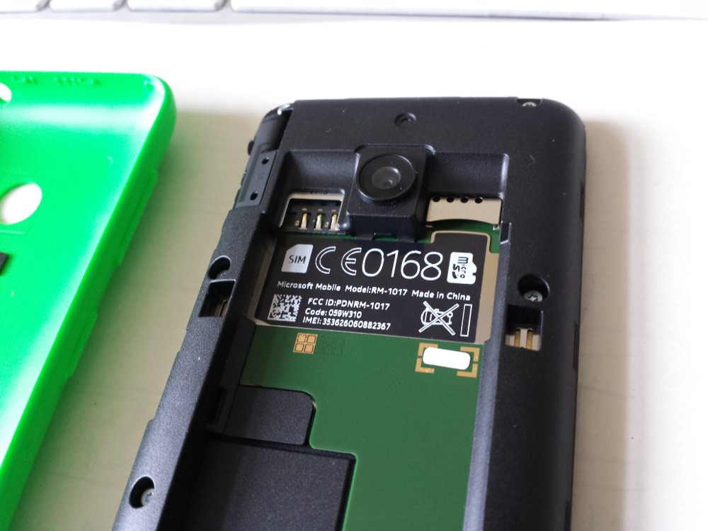
None of this will be an issue to the target buyer, of course. Most newcomers to smartphones and non-geeks are rarely aware if their phone even has a microSD card and most are oblivious to the fact that SIM cards can be taken out of phones!
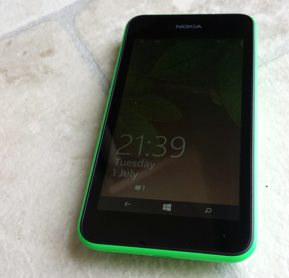
Turning the Lumia 530 on and going through the usual Windows Phone 8 set-up sequence (account, wi-fi, and so on), it's evident that the 530 has the first generation virtual controls (back, Start, search), with no way to swipe away the navigation bar. As things stand, the 4" screen is thus reduced down to 3.93" all the time, though it's very likely that a firmware update in the near future (probably to 'WP 8.1 Update 1') will enable this navigation bar to be hidden and then swiped up again later, when needed.
The flexibility of having a software-filled navigation bar is partly used here, in that the icons rotate as you rotate the handset, so that they're always 'right way up', but without a way to hide them altogether, the current experience is a little frustrating. At least there options in Settings to set the background colour or to make the nav bar transparent - in practice this rarely worked as I thought it should, but there's zero point in getting upset because this functionality is all going to be improved shortly anyway.
The next - and biggest - compromise for the sake of build cost has been to use a cheap TFT display rather than the IPS panels on the likes of the Lumia 520 and 630 (the latter with an additional ClearBlack Display-lite linear polariser, itself a far cry from the full CBD circular polarisers seen on the top end and mid range models). Indoors, for casual use, this isn't an issue, with content on screen being clear and crisp enough (FWVGA, so 854 by 480 pixels, with RGB pixel layout), albeit with some 'tearing' as content is swiped around (no 'PureMotion' enhancements here, and quite a slow screen refresh rate).
The problems come when you venture outdoors, with the reflectivity of the plain glass and the relative lack of power of the TFT panel being more of an issue. With the brightness set manually to 'High' (in yet another compromise for the recent low end Lumias, there's no ambient light sensor, so everything's under manual control), the 530 is workable outdoors in all but direct sunlight. However, when the sun's out and you want to be enjoying the fresh air and perhaps taking a few photos of family and friends, the screen is at its hardest to see, making framing snaps harder than it should be. Sometimes it's even hard to see the shutter firing icon. And no, there's no physical shutter button either, in common with many other low end devices now.
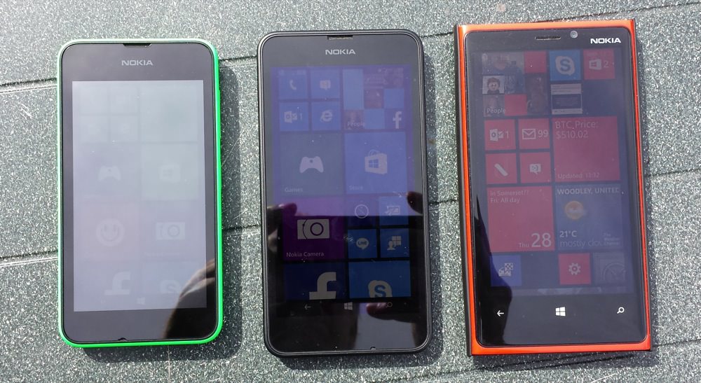
From left to right, Lumia 530, 630, 920. 'Plain glass TFT' vs 'IPS LCD with ClearBlack Display 'lite' linear polariser' vs 'IPS LCD with ClearBlack Display circular polarisers'.... In truth, the 630's screen looks to fare well here, though other angles reveal the truth.
Particularly interesting on the imaging front is that Nokia has gone for a 5MP fixed-focus camera, rather than the 520's auto-focus component. Now, as a photography purist I should be horrified, but in exactly the same way as I felt for EDoF back in the day (2008 era Nokia), for the market demographic who will be picking up the Lumia 530, i.e. 'normobs' with very little photographic ambition in the grand scheme of things, a really good fixed focus camera might actually do a better job than an auto-focus one. After all, how many of us have seen people struggling with blurry out-of-focus images on their cheap smartphones? Usually because they assumed the shot was taken when actually the software was still focussing, and so moved too early. With a fixed focus camera unit, the user just points and taps and they're done. Zero focussing delay, zero things to go wrong.
The proof is in the pudding, of course. Now, we're still only talking about a smallish 1/4" sensor and no doubt little expense has been lavished on maximising image quality at any stage, but even so the results are pretty good for a smartphone retailing at the very bottom of the price spectrum. The depth of field, in good light, is from about 30cm to (effectively) infinity. As light levels drop, the depth of field reduces, of course, with distinct blurring at the distance end of the scale.
Here are some Lumia 530 camera samples, click on each to download the original JPG for your own analysis:
With depth of field that's as reasonable as this, one has to wonder why Nokia bothered with the whole 'EDoF' experiment in 2008/9... Even moderate macros (e.g. the budlea flower above left and the guinea pig below left) come out quite acceptably.
On the right, a real low light shot, it was pretty dark, as you can see by the shop lights. In fact, the supplied Nokia Camera application would let me shoot more realistically - this was just on defaults....
Of extra note is that, as on the Lumia 630 and 520, there's no LED flash. The thinking is that LED-lit snaps on such low end camera hardware wouldn't be enough to produce great results, so why bother, but it's a shame that 'torch' functionality is not then possible - there are many such utilities in the Windows Phone Store that make use of a LED flash component in this way.
Video capture is at 480p, i.e. the same vertical resolution as the Lumia 530's screen. So something of a bare minimum that works well when played back on the phone, but it's obviously going to look blocky and sub-optimal on even the most modest desktop and TV panels. Happily, most target users will never do this, so 480p is one of the compromises that makes sense here.
Again I have to emphasise that the display deficiencies mentioned above also come back to bite the user when taking photos or videos outdoors, since it's very hard to see the interface itself or indeed the subject, i.e. what's being photographed. Especially given that conventional wisdom is that the sun should be roughly behind you when snapping a subject, exactly the conditions under which it's hard for the TFT screen to be visible.
Other components have been well chosen too - the mono speaker in the 530 is very loud, just as in many other budget Nokias. Fidelity may not be top notch, but podcasts, speakerphone, sat-nav instructions are all very loud and very clear. The one design gotcha is that the speaker is set to output through a small hole in the back cover, a hole that it's way too easy to block, with the palm of your hand or by putting the Lumia 530 back-down on a flat and/or soft surface.
As with the 520 and indeed the more expensive Lumia 630, the front facing camera is eschewed in the 530 - which makes no sense, in today's selfie-obsessed world and with Skype video calling built so tightly into Windows Phone nowadays. All very strange, surely a cheap FFC would only add a dollar to the build cost?
I mentioned the lack of an ambient light sensor above already - also missing is a proximity sensor, so there's no auto-shutoff of the display when you hold the Lumia 530 up near your face to take a call. Nokia/Microsoft has thought of possible issues though, with a software optimisation detecting unintentional face contact with the screen and turning the display off while contact is maintained.
As a Windows Phone 8.1 smartphone, the pros and cons of the marque are well known to AAWP readers. 8.1 isn't perfect, but it's a smooth UI that's hard to bring down, especially for inexperienced newcomers to smartphones, those who wouldn't know their multitasking from their location tagging. With the OS stepping in at every stage to make sure things keep moving, even with 512MB of RAM there's just no slowdown, whatever applications or web pages you hit the phone with.
It's true that there are some games which still require 1GB RAM, but these shouldn't appear in the Store for devices like the Lumia 530 and so new users shouldn't be confused.
Internal storage capacity is just 4GB, with 1GB free out of the box, untenable (as on the HTC 8S) in the pre-Windows Phone 8.1 age, but add a meaty microSD (16GB or 32GB are now very cheap indeed) and all downloads and installs happen on the extra silicon. No card is supplied in the box, which is a shame, as it will require some extra buying effort on the part of the new user. I can't help but wonder why a trivial 4GB card (under a dollar now?) wasn't included in the package - or at the very least a piece of paper saying 'Your phone requires a microSD card if you want to do stuff!'
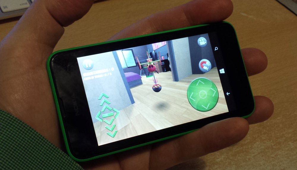
Battery life was splendid here, helped enormously by both the efficiency of Windows Phone 8.1 and the relatively small screen limiting the ambition of which applications were used day to day. With what amounts to a sub-4" display, lengthy web browsing and social network sessions are unlikely, with the fixed focus and low-res video capture camera, this is unlikely to be called on that often too, and the biggest power drain overall for the target market will probably be games.
Verdict
As I was writing this review, news came of the first sub-£40 pay-as-you-go offers on the Lumia 530 in the UK. It seems that pricing breakthroughs are where the Lumia 530 is at - and will continue to be. Sub-£50 Android phones are uniformly horribly built and specified, so the Lumia 530 seems to have the bottom end of the market well and truly sewn up, with only a few compromises mentioned above (display, chiefly, plus the lack of a front facing camera) perhaps available to irritate.
The Lumia 530's main competition sits at a slightly higher price point - the Motorola Moto E, for example, at £80 or so, with very similar specifications (a very slightly higher resolution screen and auto-focus camera are the main differences) and Android 4.4 on board. You could argue a winner between this and the 530 for a long time and not get anywhere - it's as much a choice of which OS, UI and ecosystem someone wants to join.
At (say) £40 or £50 on PAYG (in the UK) and a nominal £7/month on contract, the Lumia 530 is pretty much unbeatable. And, despite the lack of Gorilla Glass, it's also pretty durable, with the solid plastic build, plus the front face protected by a thin ridge of black plastic that goes all the way around the screen. So - add it all up: low cost, durable, an OS that's hard to abuse, good for casual gaming, colourful back cover options. This is the perfect first smartphone for a kid or teenager, say anyone under 14, in Western markets.
The sheer number of compromises in the 530's specifications had me predisposed to dislike it, but the cheerful colour and easy replaceability won me over. Not for myself to use, or any other AAWP readers personally, but I'll bet you can think of at least one person in your family tree for whom the 530 will be absolutely perfect.
Reviewed by Steve Litchfield at


