Review: Nokia Lumia 830
Launched at IFA 2014 and available for just over a week now, here's my review of the new 'Nokia Lumia 830' - if you look very, very closely at the small print, there's mention of 'Microsoft Mobile' (expect future Lumias to have Microsoft much higher in the mix though). Billed as an 'affordable flagship', the 830 does get most of the way to fulfilling this claim, perhaps only falling short at the moment because the software that enables much of its main USP is currently missing in action.
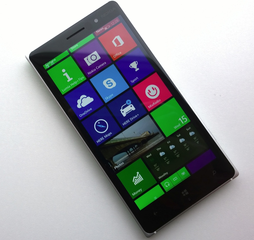
Even though I have gently taken the mickey out of Microsoft’s marketing tag line for this, the Nokia Lumia 830 - the 'affordable flagship' - I can see where the company was going here. In fact, Microsoft has made it really easy to analyse, in that the Lumia 930, the previous ‘flagship’, which I reviewed here on AAWP, is so similar in so many ways, and yet more restricted in some aspects. Have a look at this table of differences and you'll see what I mean:
| Differences(!) | Lumia 930 | Lumia 830 |
| Launch price, SIM-free in the UK | £450 (ish) | £300 (ish) |
| Screen | 5" AMOLED, 1080p (pentile) | 5" IPS LCD, 720p (RGB) with 'display memory'/Glance screen |
| Processor | Snapdragon 800, 2GB RAM | Snapdragon 400, 1GB RAM |
| Storage | 32GB (sealed) | 16GB plus up to 128GB on microSD |
| Imaging | 1/2.5" 20MP oversampling | 1/3.4" 10MP, ultra fast focussing |
| Battery | 2420mAh, sealed | 2200mAh, removeable |
| Size, weight | 137 x 71 x 10mm, 167g | 139 x 71 8mm, 150g |
The 'wins' above for the 930 are nominally its screen - though I'd argue that 720p RGB is actually higher resolution than 1080p pentile - in the processor and RAM - though I'd argue that there's little difference in real world experience or performance, and in the imaging department, though in my own tests the 830's newer sensor, newer OIS and newer image processing gives better results in terms of both detail and colour handling than the 930.
The 'wins' for the 830 are more significant - the expandable storage, the removeable/replaceable battery, the lesser weight, and most of all, the price. Quite a bit of intelligence seems to have gone into the Lumia 830 in terms of deciding on design, what components and features made the 'cut', and so on. Rather than the budget approach of 'what can we get away with?' and the top end approach of 'let's throw everything in and see what sticks', the 830 seems almost a perfect combination of what the enthusiastic Windows Phone user really needs.
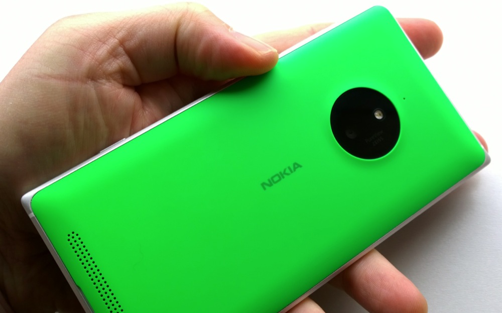
Design, materials
Based on the aluminium design found in the likes of the Lumia 925 and then refined for the 930, the 830 is extremely solid - you've seen the videos of people bending the iPhone 6+ - the aluminium used here looks and feels a lot thicker, mapped around a solid polycarbonate chassis. Drop the 830 and you'll take a small chunk out of the aluminium outer edges - but the phone will keep on working and will stay in one piece. The rim does have iPhone 4-style cutouts, breaking up the metal, and it's not clear whether these are because the metal is part of the RF antennae or not. I didn't have a problem with reception at any point, though.
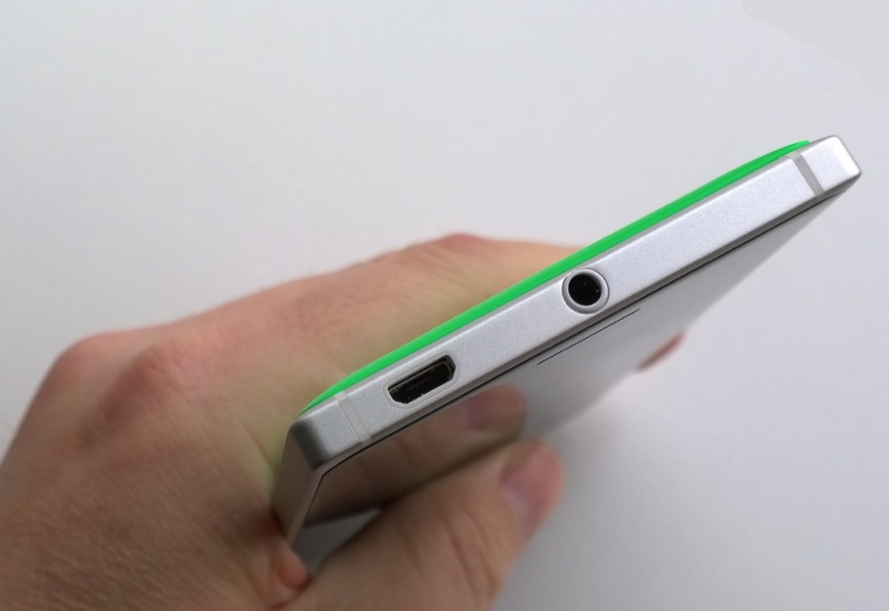
Although not traditionally a fan of the square edged design, the corners and edges here are rounded just enough that they don't hurt the hand, and this is helped by the '2.5D' glass and back cover, both of which curve up gently, again softening the edges. The plastic back cover is retained by around a dozen small clips and these do take a little patience when replacing the cover - it's surprisingly easy to 'miss' one and have part of the cover standing proud for a few hours until you notice it! The review cover was green, but as you might surmise, given that the 830 also comes in orange, white and black, it shouldn't be too hard, in due course, to source yourself another colour and choose the cover to match your outfit or mood(!)
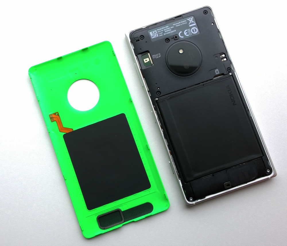
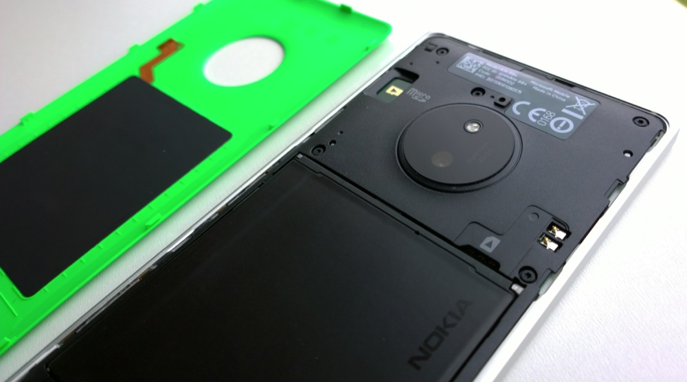
Under the hood. Note the Qi charging coils inside the cover, plus the matching pins for this on the main phone. Also note the microSD slot, top left of the phone in the photo...
Build quality and design are top notch here, the metal is just rounded enough that the edges don’t hurt the hand, the 2.5D glass curves away neatly, mirrored by the curve of the pop-off back cover. Here in shocking green - I think I might get myself a plain black one!
Button placement is traditional for mid-to-top end Lumias, including a very nice camera shutter button - easy to find without looking and positive in action. Rather than go with on-screen navigation controls (as per the cheaper 735), there are proper capacitive Windows Phone controls below the display, meaning that all the content can be shown all the time, etc. A much more efficient use of frontal real estate and less confusing to the end user.
The only odd placement is the microUSB data/charging port, now on the left of the top face. While handy for some people charging or syncing on a desk, this will be unpopular with anyone wanting to put the Lumia 830 in a car dock, for example. The left and bottom edges of the 830 are thus unadorned by any ports or controls.
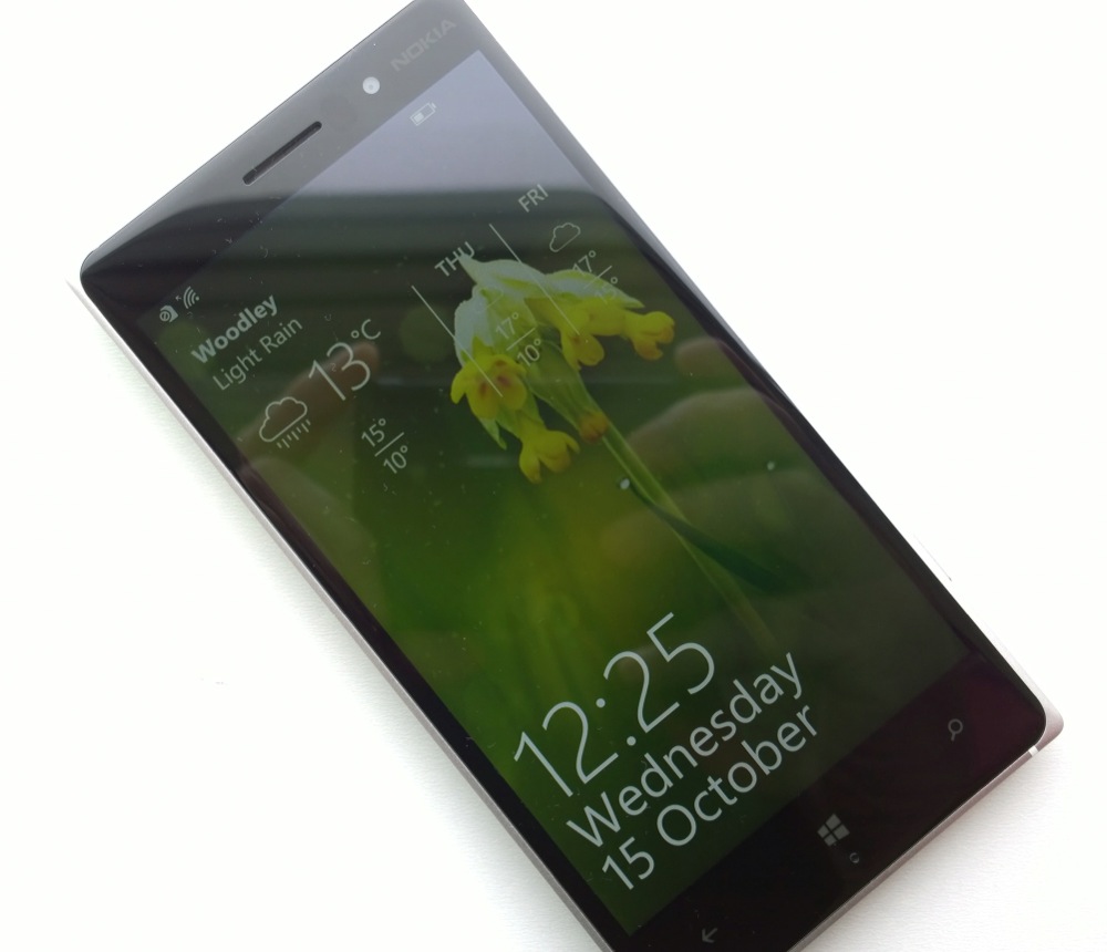
Display matters
The Lumia 830's screen is gorgeous - it's 'only' 720p but is a full RGB matrix (IPS LCD) and not pentile (as on the 1080p 930), and with all of Nokia’s ClearBlack Display and Sunlight Readability enhancements thrown at it. With a pixel density of over 280, with super outdoor visibility and with brightness and colour warmth customisable in Settings, I simply can't see anyone complaining about the 830 display. For any reason. Ever.
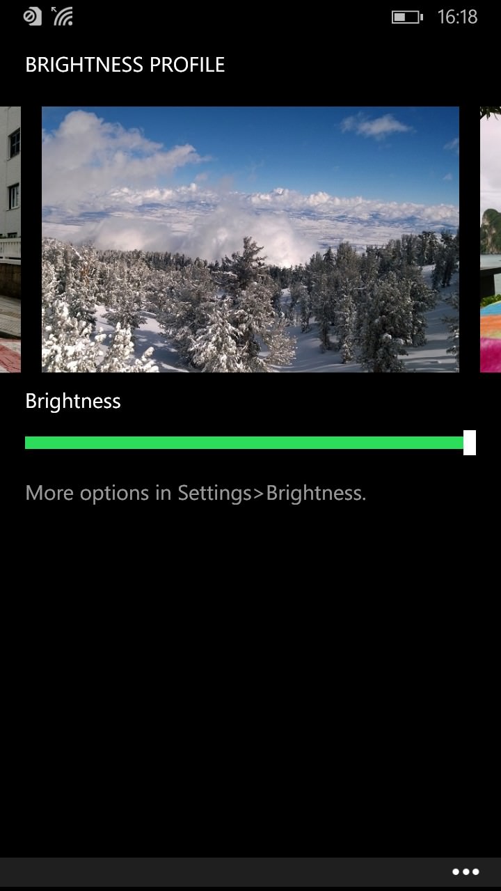
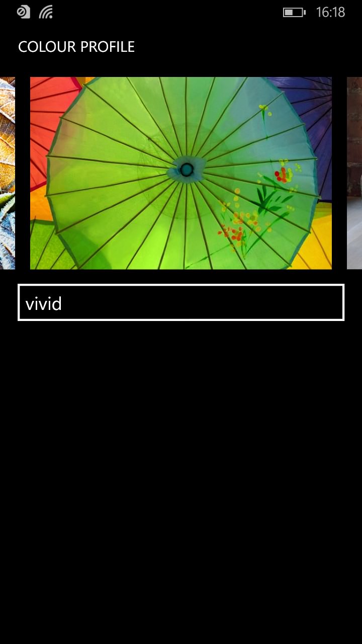
Adjusting both brightness and colour profiles in settings, to suit personal preferences.
As with many mid-to-top end Lumias, Nokia has used an oleophobic coating on top of the latest Gorilla Glass, meaning that the screen is pleasant to use and tough. Anyone remember the days of soft, 'draggy', fragile resistive touchscreens? We've come an awful long way.
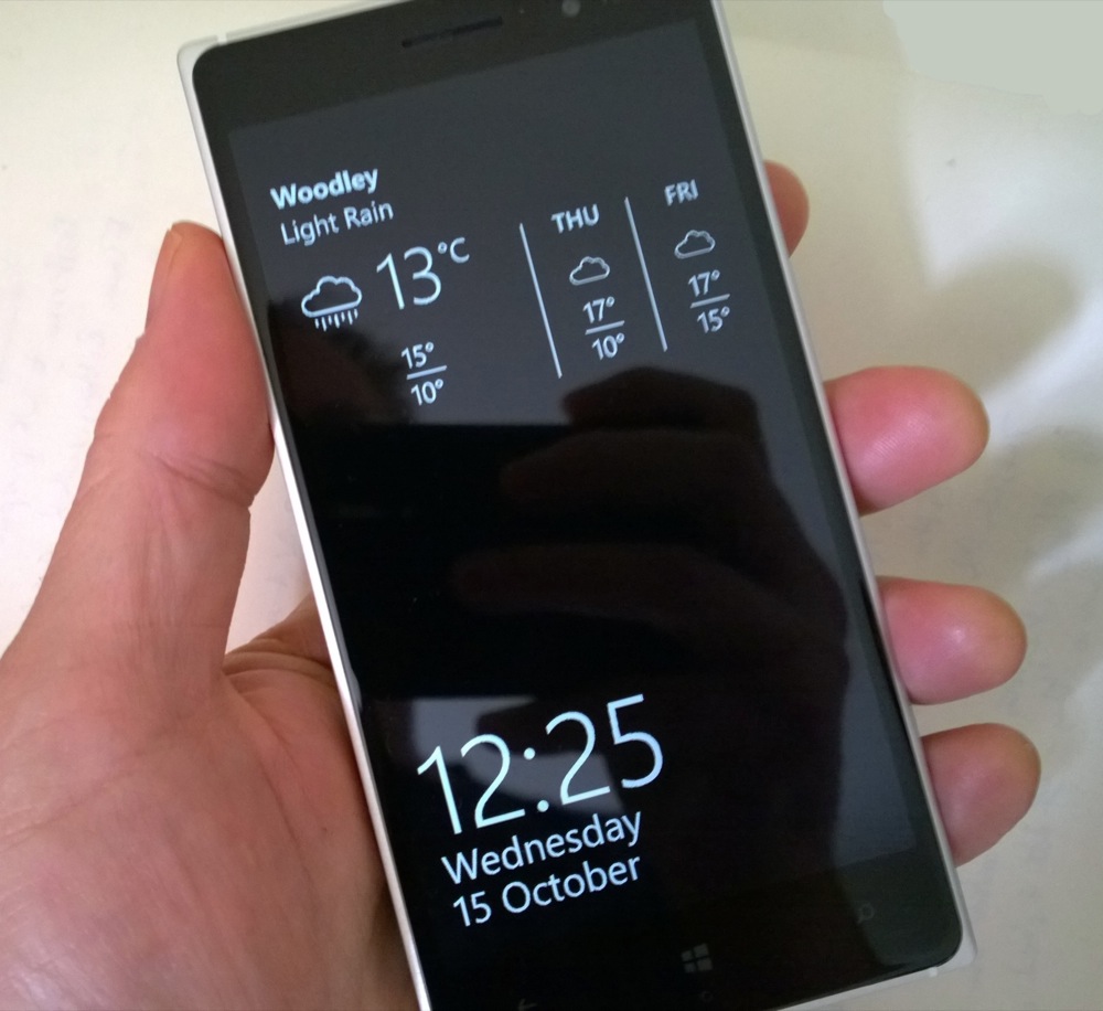
Even with the screen 'off', Glance screen can be used to provide always-on time, date and notifications. This functionality relies on specific chips behind the panels and only about half the Nokia devices have these - thankfully, the Lumia 830 is one. With the latest Glance improvements (weather, fitness integration), it's possible to have your Lumia look like this much of the time, for example:
As with the Lumia 930, someone at Nokia or Microsoft (hey, aren't they the same these days?) has made the decision not to offer the traditional 'two wide' Start screen as an option on these 5"-screened phones. In other words, the 'Show more tiles' option from smaller phones has been hard-coded to 'on' and the option taken away from the user. Now, while this does present the maximum possible flexibility and the maximum information, some live tile content is now too small for anyone with less than perfect eyesight.
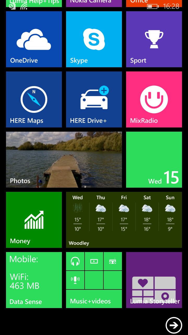
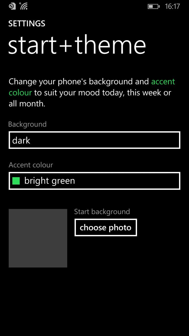
Showing the maximum, 2-wide tile sizes, with typically small fonts and graphics - a 'less tiles' option would have been welcome...
What's needed is for a) Microsoft to put the option back into Settings (maybe under 'Ease of access', since this is an accessibility thing?), and b) Microsoft to enable triple-wide live tiles, i.e. spanning the full width of the 5" screens, plus c) developers allowing for these new screen resolutions/sizes in their font choices for live tile design. Ah well.
Applications
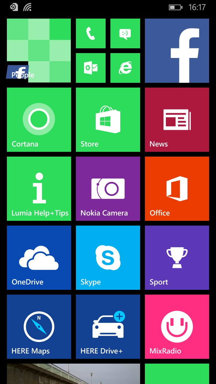
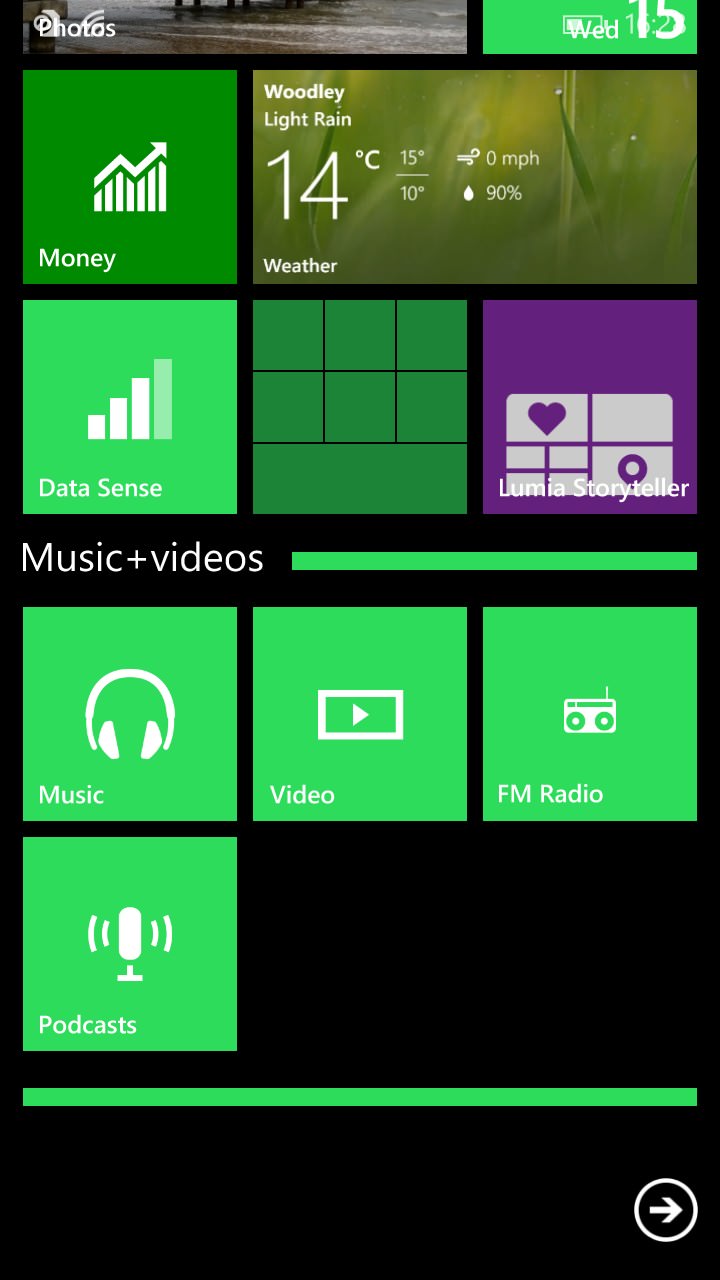
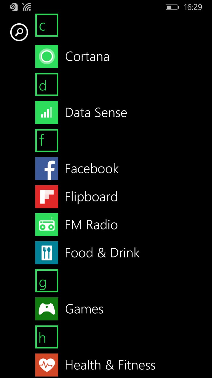
The top of the default Start screen and (right) the bottom, showing one of the example app folders expanded out...
The application set in the Lumia 830 is bog standard Windows Phone 8.1 Update 1, so very fully fleshed out, apart from the usual Google-services-shaped whole (Google+, YouTube, Google Maps, Hangouts, etc.)
- Cortana is front and centre and working well, though Microsoft is still tinkering with the back end, of course, plus rolling out new features and to new countries as the year rolls on.
- Flipboard, new in the Store, is pre-loaded - it's a glossy news and feed reader, though nowhere near as customisable as popular tools like Nextgen Reader.
- Lumia Selfie is also loaded, of course, this debuted effectively with the Lumia 735, and is a reworking of the old Glam Me.
- MixRadio is still here, newly facelifted and seemingly still very much part of the Microsoft stable.
- Podcasts is here and just as workable for new users. It's good enough that only the 20% most hardened podcast fans will need to look for a third party alternative.
- Shazam is licensed and built-in, linking matches through to both 'Nokia Music' and 'Xbox Music', which is confusing. I thought the former had gone away?
- plus all the MSN (were Bing) content applications, all quite impressive to get for free, built-in.
Showing the maximum, 2-wide tile sizes, with typically small fonts and graphics - a 'less tiles' option would have been welcome...
The one high profile addition turns out to be something that’s err…. not actually in the review devices. At least not yet.
Lumia Camera (ahem) and imaging
You see, the 830 was launched in a blaze of glory, proclaiming that the new Lumia Camera app would make full use of the smallish-ultra fast optically stabilised camera to enable Rich Capture - that’s HDR that’s adjustable after the fact - and Dynamic Flash, letting you mix how much ambient and flash-derived light are used in a photo, again after the fact. And all with ultra fast shot to shot times, with any processing or saving performed in the background. Sounds brilliant, and apparently all automatic for the user, who just takes the shot and everything’s offered when they come to view, edit and share later on.
Except that Microsoft’s QA people haven’t actually approved Lumia Camera yet, it seems. I can only guess that the delay is to make sure the new app works well on the existing 1520 and 930, but it’s frustrating for a new 830 owner waiting to make full use of their hardware. Still, another month and the situation will be sorted out, I’m sure. We'll do a new feature on Lumia Camera when it appears.
From my extensive camera comparison piece earlier this week:
With only a 1/3.4" sensor, I wasn't expecting miracles from the Lumia 830 and, obviously, in my demanding test scenes below, it did prove limiting in the long run. But not before the new device's camera had rather impressed me. Remember, this isn't about beating the 1020 - no other phone camera on the planet can do that - this is about getting as close as possible while opening up new avenues in imaging.
Now, I can see what Nokia was trying to do here. The principal area of concern with the oversampling cameras in the 1020, 1520 and 930 was that the shot to shot time was too slow. For starters, there was the slight delay after taking a shot, during which time you could do nothing to grab the ‘next’ moment*. More importantly, any kind of burst or HDR/rich mode was massively impaired, unless the software was prepared to forego the oversampling and simply take a low grade grab of the sensor. With intelligent bursts and multi-shot modes becoming more and more popular, the thinking must have been to use the best of Nokia’s image processing algorithms, the best of its OIS expertise, then apply both to a traditional 1/3” (or so) sensor that:
- could be sampled fast enough that true burst and multi-shot effects became possible
- didn’t demand a thicker phone or a camera hump
* and yes, Nokia 808 fans will point out that the Symbian-based 41MP oversampling phone could take almost instant shots - but that was at the expense of a custom image processor that tools years to develop and fine tune.
The hardware portion of this equation is now in place with the Lumia 830 - focussing and capture is already quicker than on the larger-sensored devices, as you’d expect. Startup is still slow, at up to four seconds, but focussing is then effectively instant and shot to shot times are less then two seconds. However, this is nowhere near fast enough - certainly not to justify the reduction in sensor size from the pretty good camera in the likes of the Lumia 930 and 1520.
What’s needed is the second part of the equation - Lumia Camera, effectively a complete rewrite of Nokia Camera that starts much more quickly (not least because it doesn’t have to allocate RAM for oversampling), which auto-focusses constantly, which can take shots at the rate of several a second, even at full quality, and which has both Rich Capture (HDR) and Dynamic Flash multi-shot (mix ambient and LED flash lighting after the fact) modes.
Still, new software notwithstanding, the Lumia 830 still has a pretty impressive camera, for its size. I've gone into detail in terms of samples and verdict in the 830/1020 comparison piece. In summary, the camera, despite the smaller form factor, has Nokia’s thinnest ever OIS system and a top notch set of image processing algorithms that produce excellent 8MP shots in 16:9 in all light conditions. Only my usual bugbear - moving subjects indoors and at night - is an issue. Otherwise, I’m very impressed by the 830’s imaging, and will be more so when Lumia Camera arrives!
The presence of a 'camera island', reminiscent of the Lumia 1020's, isn't strictly necessary, since the camera unit isn't that big, but the visuals do lend a clue that there's an emphasis on imaging that you might not otherwise expect or remember. Interestingly, there's only single LED flash, rather than dual, perhaps indicating that, once Lumia Camera is here and the mix of ambient versus LED illumination can be adjusted, there's not so much need to flood the subject with light as usual? Watch this space!
Video capture is also excellent, and stabilised, of course. Here's a sample (remember that YouTube degrades things a bit, but you'll get the idea):
Audio, battery, storage
Elsewhere on the Lumia 830, outputting through a grille in the back cover, is a reasonably loud mono speaker. The tone isn't that rich, to be honest, but in such a thin device, some compromise is perhaps to be expected. It's still quite loud enough for speakerphone calls, podcast listening and sat-nav instructions in a moving car.
The battery is capable enough at 2200mAh and easily removeable, which is good, although to be honest it’s so hard to find replacements for some of these new Nokia batteries that they might as well be sealed! Anyone else remember the day when Nokia batteries were largely standard and ubiquitous? Maybe the 'BV-L4A' will become available on the open market? Here's hoping. And being able to 'pull' the battery in the case of something going horribly wrong is certainly easier than having to look up the various button combinations for a soft reset of a Windows Phone online!
Any worries over battery capacity can be further alleviated by noting the Qi charging built-in out of the box. These are clearly visible inside the back cover and should enable all 830 owners to keep their phones at or near 100% much of the time. Qi charging really is the way of the future, you know, so it's great to see it once again provided as standard.
The Lumia 830's storage capacity is fine, with a generous 16GB internal - a lot in the mid range, of which well over 11GB is available out of the box, plus microSD up to 128GB (no card is supplied in the box, which is a bit stingy, but I guess most owners will pop in something meaty and expensive anyway?) Windows Phone 8.1 is good at parcelling apps, media and captures off to microSD, in fact a lot better than Android, so the storage system here makes a lot of sense.
Verdict
At £300 (all in, in the UK at the moment) and without its unique imaging software, the Lumia 830 is nice enough, if a little pricey - with Lumia Camera onboard and making full use of the tiny but fast and powerful camera, and hopefully nearer £250 within a month or two, the Lumia 830 will stand up against its ‘affordable flagship’ marketing tag with its head held even higher.
Reviewed by Rafe Blandford, Steve Litchfield at
