Review: Nokia Lumia 800, Part 8 - Summary and Conclusion
Score:
80%
The Nokia Lumia 800 was a landmark device. While there were many Windows Phone 7 devices before it, it was Nokia's first product after the partnership with Microsoft, and its unibody design was the first Windows Phone 7 device to really capture the attention of the technology press. As such, our in-depth review series has examined all aspects of the device, and has in some ways been as much a review of Windows Phone 7 as it has been the Lumia 800 itself. We now pull everything together to summarise each review section and close by each member of the AAWP team passing verdict.
Version Reviewed: 7.10.8107.79 (12070)
Summary
Part 1 - Hardware
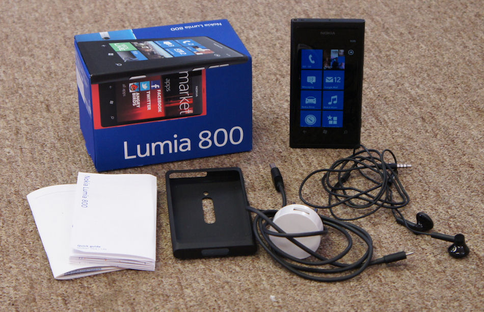
Nokia Lumia 800 and box contents
Reviewed by Rafe, 80%.
The design and styling of a phone is critical, but depends a great on personal preferences and opinion. The Lumia 800 has an advantage here - it's instantly recognisable, with a certain x-factor, marking it out as one of the best phone designs of the last few years. Amongst the style conscious its very freshness, that sense of something new and different, could be a key point in its favour.
Part 2a - Camera
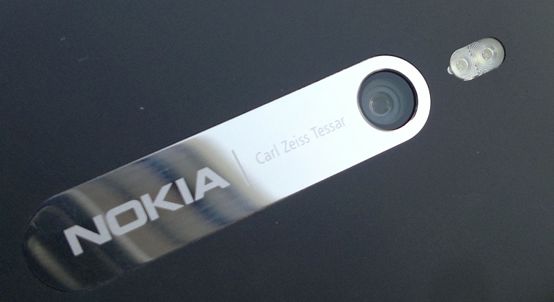
Reviewed by Steve, 82%.
Progress in smartphone cameras has been coming up against the laws of physics for some time now. The Lumia 800's 8(.7) megapixel, 7mm-high, F2.2 marvel does astoundingly well overall for an autofocus camera with multiple optical elements, considering its size. The slightly 'flatter' form factor compared to competing units makes for very wide angle shots (as you can see in some of the examples above), while keeping optical distortion minimal. It also means that the phone that plays host to it can be uniformly thin, with no unsightly humps or bumps.
Part 2b - Camcorder
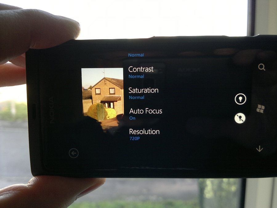
Reviewed by Steve, 82%.
The Lumia 800 makes an excellent video capture phone for the amateur and should produce reasonable results in almost anybody's hands. In a semi-pro's hands, with good enough lighting and with a little focus lock trickery, it should also be capable of performing well - once the audio has been sorted out!
Part 3 - Communications and PIM
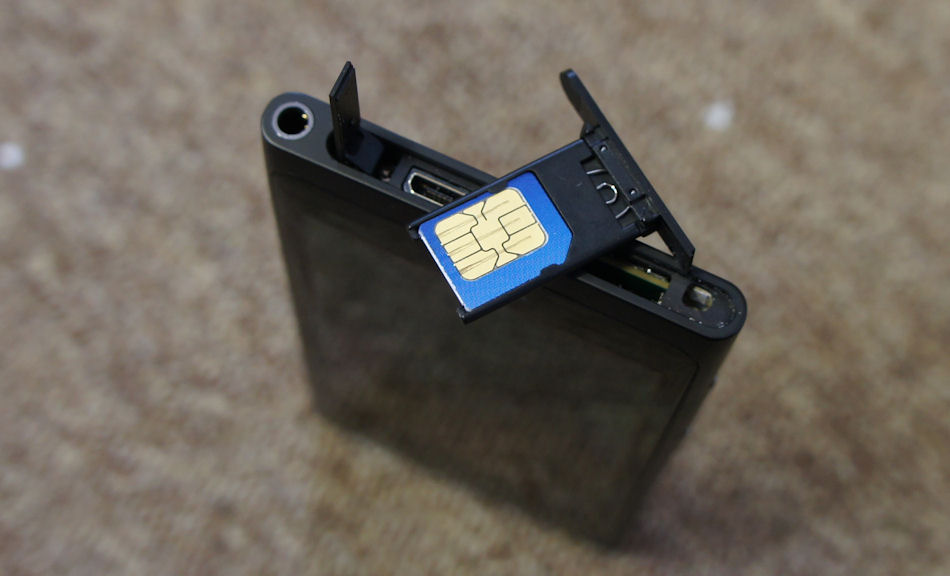
Reviewed by David, 79%.
Overall, Calendar manages to strike a comfortable balance of usability and simplicity. The only 'advanced' feature missing is a search function, but there is a third party calendar search solution.
There will almost certainly have been a desire (on the part of WP7 developers) to keep the People Hub simple – in keeping with the overall design principals of the operating system. However, given its tight integration with contact management, it feels like such a waste to have to use a third party application in its place. If we need to get third party social network applications, it makes the People Hub somewhat pointless. Having said that, the basic functionality should be enough for most people and so social networks will be front and centre in their Windows Phone 7 experience.
There will almost certainly have been a desire (on the part of WP7 developers) to keep the People Hub simple – in keeping with the overall design principals of the operating system. However, given its tight integration with contact management, it feels like such a waste to have to use a third party application in its place. If we need to get third party social network applications, it makes the People Hub somewhat pointless. Having said that, the basic functionality should be enough for most people and so social networks will be front and centre in their Windows Phone 7 experience.
Part 4 - Office Hub and File Management
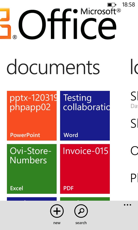
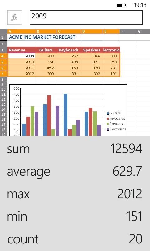
Reviewed by David, 70%.
[The] mobile version of Word is an eminently usable implementation of the standard desktop word processor, despite the features it lacks compared to similar products on other platforms.
Repeating formulae [in Excel] is a fundamental part of any spreadsheet, and so Microsoft earns a serious reprimand from me for limiting its Windows Phone implementation so badly. I've seen Microsoft staff excuse this on support forums on the grounds that mobile clients are always limited. However, EVERY other mobile spreadsheet application I've used since the 1990's could do this [copy and paste formulae]. There's no excuse for an oversight which (as good as) makes mobile Excel worthless for serious use.
PowerPoint is the weakest of the Windows Phone 7 Office Hub, only offering the ability to make slight tweaks to files. It's also limited by the platform's lack of TV-Out. On the whole, this isn't a disaster for the Office Hub as heavy PowerPoint use probably only corresponds to a minority of users – which will be of little comfort to you if it is something you need.
OneNote is the jewel in the Office Hub crown – which is appropriate given that smartphones are more suited to grabbing impromptu notes rather than typing full documents. Its status is knowingly reflected by having been given a section of its own in the Office Hub. It is also the best mobile implementation of OneNote that I've come across. For example, the Android version lacks the ability to indent items and has zero text formatting functions.
Part 5 - Web Services and Bing Search
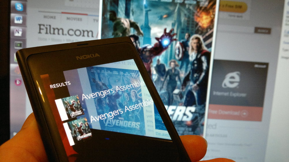
Reviewed by David, 74%.
The very fact that this service [to reinstall past applications via the web] exists at all is to be applauded – it's a step in the right direction, albeit limited, to make restoring and setting up a device a little less painful.
The 'Find my phone' service is perhaps the biggest unsung value added feature to the Lumia 800 and other Windows Phone 7 devices. In short, it provides a service to remotely locate, lock and wipe your device. This mirrors the same functionality that was introduced to the iPhone, while Symbian and Android have similar solutions implemented by third parties for a price.
The Bing Search magnifying glass button on all Windows Phone 7 devices links you not just to Microsoft's web search, but to a range of services that allow you to find information about your local area; and the products and content around you.
Part 6 - Picture Hub
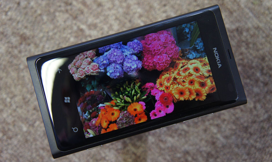
Reviewed by David, 80%.
The Picture Hub brings together all of the photos saved to, and captured by, your device. In addition, it brings all of the photographs and imagery in your social networks togeether in one cohesive user experience, along with affording you the ability to share your own photos, and more.
The camera roll is pleasingly simplistic, offering just a scrolling grid of all the captured images stored on your device. The only menu option here is to turn on auto uploading of images to SkyDrive. This option is also found in the list of Picture Hub settings. The idea of automatically uploading images is, in principle, good – and matches similar features found on competing platforms.
Viewing images is straightforward, with little user interface to get in the way. Pinching and double tapping gestures are supported for zooming, as are drag-to-move and swipe-to-next image gestures.
Part 7 - Music and Video Hub
.jpg)
Reviewed by David, 70%.
The Music + Video Hub and the Picture Hub are yet more types of application that benefit from the Metro UI design. Browsing and searching for content is made easy by swiping through the various pivots and the use of live tiles. The pop-up media controls are a clever way to integrate media controls without forcing the user to leave the application they're currently using. Also, the flexibility of having live tiles for any type of content allows you to quickly access the things that are important to you.
There is also the big issue of having no USB mass storage mode, and the enforcement of having to transcode videos. It is interesting to note that early versions of the Windows Phone 7 connector for Mac had an option to disable transcoding, which begs the question of how necessary this time consuming operation really is. The absolute requirement for Zune software is a great imposition on users, whether they want to connect their device to a friend's PC (who doesn’t use Zune) or connect to use a Linux PC. It should not be forced upon us, and smartphones should be able to work independently of a desktop operating system.
Nokia Exclusives Round-Up
![]()
The way in which producers of Windows Phone 7 handset makers differentiate themselves is by providing an exclusive collection of applications. In the light of its partnership with Microsoft, Nokia has gone all out to add value to its Lumia devices with its set of exclusive applications. From mapping to music, ebooks and news, there's something for everyone as we present our round up of everything you can get out of, and put into, your Nokia Lumia device.
Verdict
Rafe
With the Lumia 800, Nokia have delivered, in hardware terms, a standard Windows Phone device wrapped in an outstanding design. The polycarbonate unibody case and curved glass of the Fabula design language heralds a device that is attractive, durable and immediately recognisable. The internals, which are based on a reference design from Compal, reflect the rushed development timescale of the device. Consequently, there's no front facing camera or g-sensor and some features that Nokia's Symbian smartphone owners are accustomed to, such as pentaband 3G, USB OTG and FM transmitter, are not present. The majority will not notice these absences, but some may wish to wait until later this year when the first fully Nokia-specified Windows Phone device makes an appearance.
On the software side, Windows Phone 7.5's Metro user interface provides the base for a user experience which fits well with the touch interaction model and a genuinely fresh design pattern. The use of Live Tiles and hubs moves the application model away from a silo-ised app-centric approach, to something that is at least a starting point for a more fluid and dynamic task-centric approach.
The relative youth of the platform does mean there is plenty of room for improvement, from larger items, such as the way missed notifications are handled, to more minor issues, such as allowing multi-selection of pictures. Similarly, there are gaps in platform APIs, which does place constraints on what third party apps can do (e.g. native code, intra-app data sharing, access to recorded videos). Furthermore, some third party developers are not exploiting the capabilities that are available, which creates the perception of lack of functionality. For example, background agents and push notifications can mitigate the absence of full native multi-tasking, but are not always fully utilised.
Taken as a whole, the Lumia 800 is an extremely capable and attractive device that gives Nokia a strong entrant in the competitive smartphone market. Its delivery just 278 days after the announcement of the Nokia-Microsoft partnership was nothing short of amazing, giving Nokia the time and credibility to undertake its strategy transition.
In my view it is, overall, the best Windows Phone device currently available, and makes a strong case for being the best choice on the market for the first time smartphone owner. Those looking to move from other platforms should be aware that Windows Phone, like any platform, has its strong points and weak points and that their awareness of them will be dictated by their own usage requirements. For me, the Lumia 800 has become my personal daily device, from a choice of almost every smartphone on the market.
Steve
After four months of Lumia 800 use, off and on, I have to confess that it's been more off than on. The problem with the 800 is that it's the smartphone equivalent of a trinket. It's very pretty, lovely to handle, the camera is better than many people give it credit for, the user interface runs at huge speed and is impossible to slow down - it's genuinely a pleasure to pick up and this is something I do once a week.
However, whenever I try and use it as my main smartphone I get let down badly. There are multiple problems, starting with Windows Phone's voracious battery consumption. The built-in 1450mAh battery does its best, but you can't swap it out when empty and so when it's gone, then you're dead in the water. In practice, hit with my usual diet of podcasts, social updates, email, music listening, photography and some gaming, the Lumia 800 was dead by tea time. The second big issue for me was the lack of multitasking for third party applications. Just as on the iPhone/iOS, if you want something to update content, you've got to bring it up on screen and leave it there. Watching dots fly across the screen... Coming from a Symbian (and, to an extent, Android) background, not having content grabbed in the background and ready to read (or listen to) was a big, big shock and a real time waster.
Other niggles I can work around, but these two are the big ones and immensely frustrating – even more so because I really, really wanted the Lumia 800 to work for me. I love the design, after all - perhaps future software updates can improve battery life? Perhaps even address some of my multitasking complaints? Here's hoping.
Ewan
The Nokia Lumia 800 was not dealt a good hand. It was Nokia's first Windows Phone, it was designed and built to an incredibly tight timescale (measured in months), and every single thing that was perceived as 'missing' from Nokia's Symbian and Linux derived handsets would lead to a death by a thousand cuts from Nokia fans (err, points at Steve...).
Yet through that all, the Lumia 800 delivers.
Nokia's design strength is the big differentiator. In a world overrun with black slab touch-screen smartphones, the Finnish company delivers a (only sometimes) black slab touch-screen smartphone that people wanted to see, to touch, to hold, and to use at least once. Getting that first experience right meant it gave people the confidence to explore Windows Phone.
Does Metro UI leave enough scope to tweak and hack your phone to an inch of its digital life? No. Does it give the average smartphone user enough options so they can manage their life? Almost - it's very much geared to social networks and content consumption, perhaps less so for creating content. And this is what I like - it's not trying to be a pocket computer (which is one of the few areas that made Windows Mobile a little bit too techy for me), it's trying to be something different.
Does it have areas for improvement? Every phone does, and it's down to the individual if certain areas are deal-breakers. I'm perfectly happy with the battery life, and it gets through a day of how I use my smartphone. Let the built in applications (such as the People hub) get on with what they were designed for and you do stay connected for the day. The method of multi-tasking used by Microsoft (and in Apple's iOS) makes sense to me. Would it be nice for third-party apps to join in the fun? Yes, but Microsoft are keeping a close eye on the user experience of Windows Phone, and that over-rules the hacker ethos that some reviewers are using to examine the handset.
Windows Phone is a smartphone operating system for the masses. And, while the Lumia 800 is not the behemoth breakout success, it's given Microsoft respectability, it's given Nokia a hit phone, and it's given me an unrivalled modern smartphone experience. It's not perfect, but nothing ever is.
David
Windows Phone 7 faces a dual challenge – not only is it late to the mobile party and as such has a lot to catch up with, but it is also radically different from existing mobile user interfaces. That difference in interface has been initially divisive, but I expect it will become more accepted by the masses as Microsoft push Metro UI in both Windows Phone and Windows 8.
Obviously, the thing that most marks the Lumia 800 out from competing Windows Phone 7 brands is its highly attractive polycarbonate unibody design. However, more sets the Lumia 800 apart from the competition than that. The camera performance is outstanding, compared to all but the very best camera phones. While the loudspeaker is a tad tinny, its position on the base improves audio quality by not muffling the speaker while the Lumia 800 is laid on its back.
It should be acknowledged that the Lumia 800's hardware design came from the Nokia N9 (running MeeGo Harmattan). It is then even more impressive that the Lumia 800 shows off Windows Phone 7 so well. Its harsh 90 degree corners subconsciously facilitate the marriage between hardware and square live tiles, along with the reduced air gap screen which makes the user interface look like it's floating on the surface of the screen.
Windows Phone 7.5 still has some issues and shortcomings, but as long as you don't mind the lack of USB mass storage and imposed use of Zune Desktop software, few problems are insurmountable. Bear in mind that my outlook has come from eight months of persistent Windows Phone 7 usage. New users who are expecting to do things as they were done on other mobile operating systems will most likely go through a period of frustration, just as I did.
Reviewed by David Gilson at
